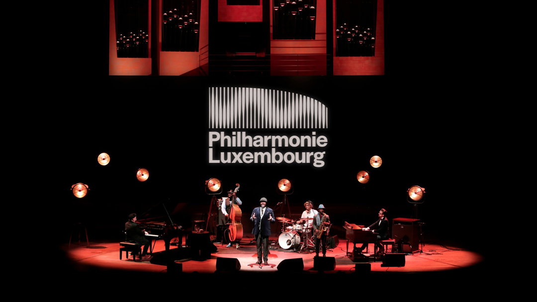
Before NB Studio began work redesigning Philharmonie Luxembourg, passersby were familiar with the building, “but so many had no idea what actually went on inside,” design director Sam Pittman says. There’s a couple of reasons for this. While classical musical lovers worldover might be familiar with the Luxembourg Philharmonic Orchestra, NB says younger audiences are less tuned in. There’s also the expanded range of services the Philharmonie operates across, including events and an offering for kids.
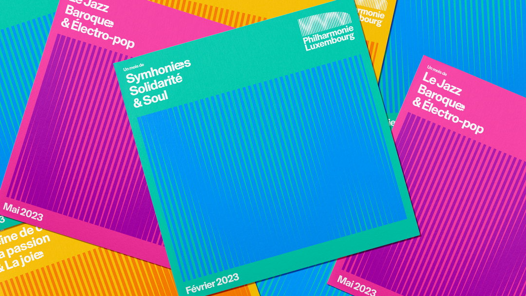
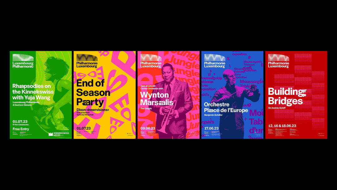
NB Studio has launched a complete refresh of the brand’s architecture, including a new name (replacing Orchestre Philharmonique du Luxembourg) and design system, restructuring its multiple offerings under one master brand.
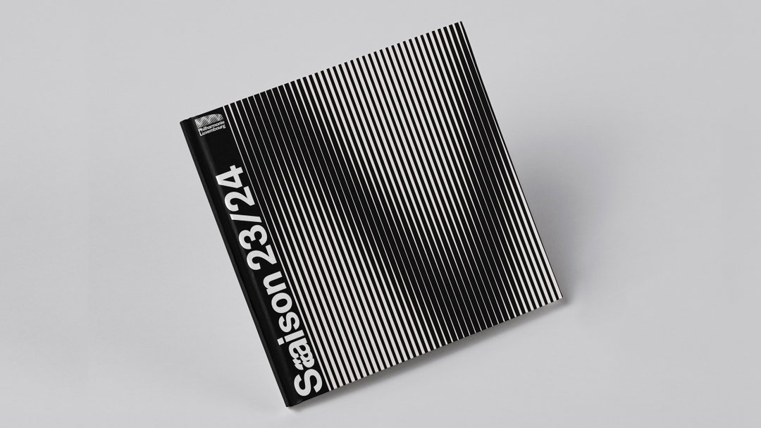
The first key change is the logo, which, like a few other relaunched music and event brands this year, responds to music. “From the get go, we knew that we wanted sound to play a major role in the identity, it’s the lifeblood of the Philharmonie – and working with a digital first mindset allowed us to pair sound with animation, but not in a traditional manner. Our generative tool utilises the real life waveform to drive the animation, bringing the brand to life through music,” Sam explains.
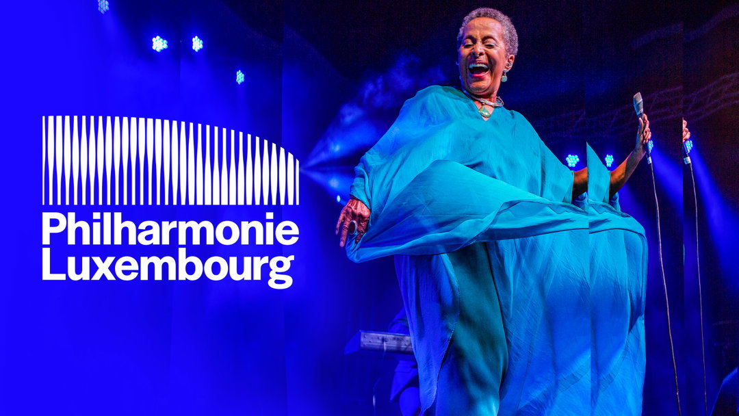
NB Studio: Philharmonie Luxembourg (Copyright © NB Studio, 2023)
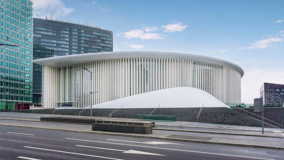
Elsewhere, NB has turned to the well-known architecture of the Philharmonie; the logo replicates the building’s columns, designed by Christian De Portzamparc. A generative logo animation tool has then been developed with creative coder Patrik Hübner, using JavaScript, WebGL and Vue.js. Whenever sound is fed into the brand mark, the tool generates reactive wave patterns that flex depending on the genre. “The tool is a huge step forward in the Philharmonie’s digital transformation programme,” Sam adds. “Every brand exists in the digital world, yet the guidelines of the majority still solely exist for static applications, the tool moves away from this way of thinking.”
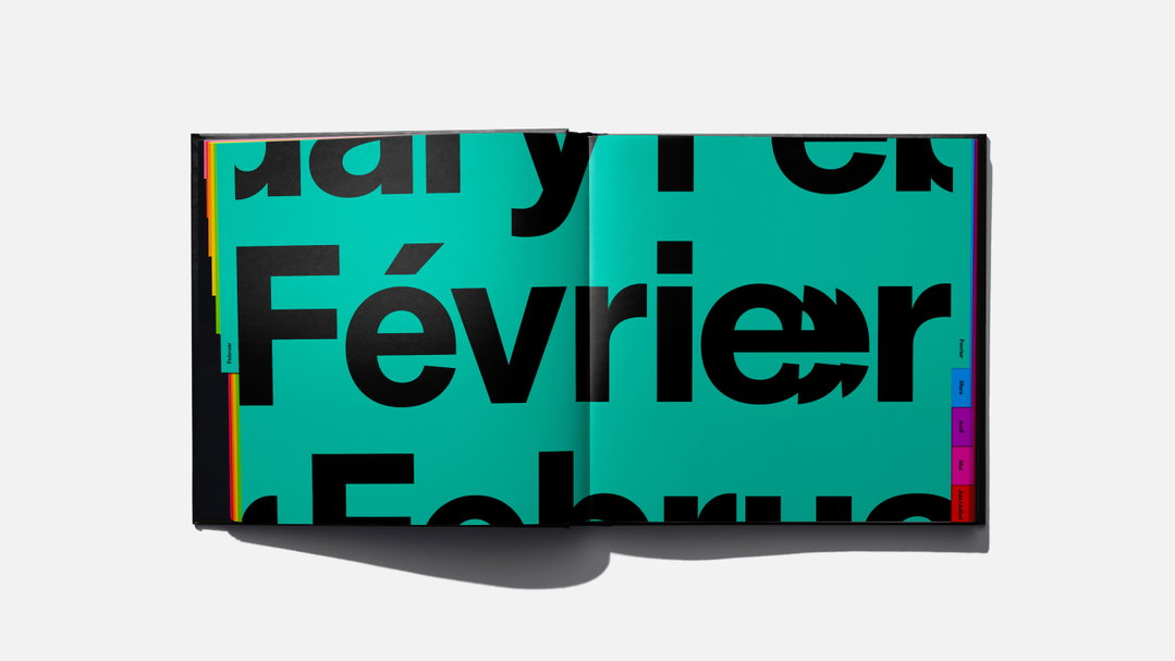
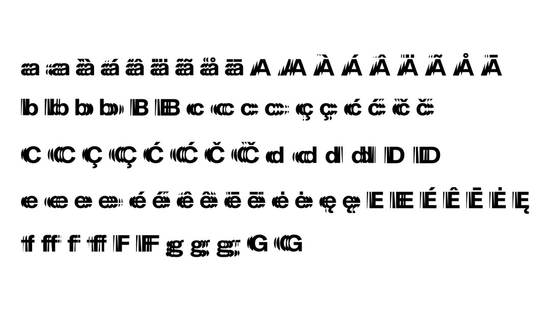
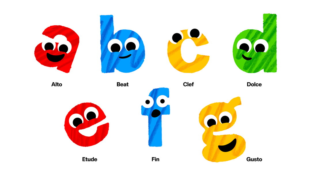
The line-based logo also informs the typography. A release explains: “Based on the idea that all music is experienced through vibrations, the letters that make up the musical scale (a to g) resonate across the page or screen.” Rabbit Hole has produced animations for the kids-facing side of the brand, which features letterforms playing instruments, among other lively elements.
GalleryNB Studio: Philharmonie Luxembourg (Copyright © NB Studio, 2023)
Hero Header
NB Studio: Philharmonie Luxembourg (Copyright © NB Studio, 2023)
Share Article
Further Info
About the Author
—
Liz (she/they) is the senior editor at Insights, a research-driven department within It’s Nice That. They previously ran the news section of the website. Get in contact with them for potential Insights collaborations or to discuss Insights’ public-facing reports.