Dice goes purposefully DIY for a “fanmade” rebrand, with a stick-and-poke-inspired logo
“Fans don’t make corporate logos; they make zines”; Dice ECD Patrick Duffy on leaning into DIY aesthetics for the project.
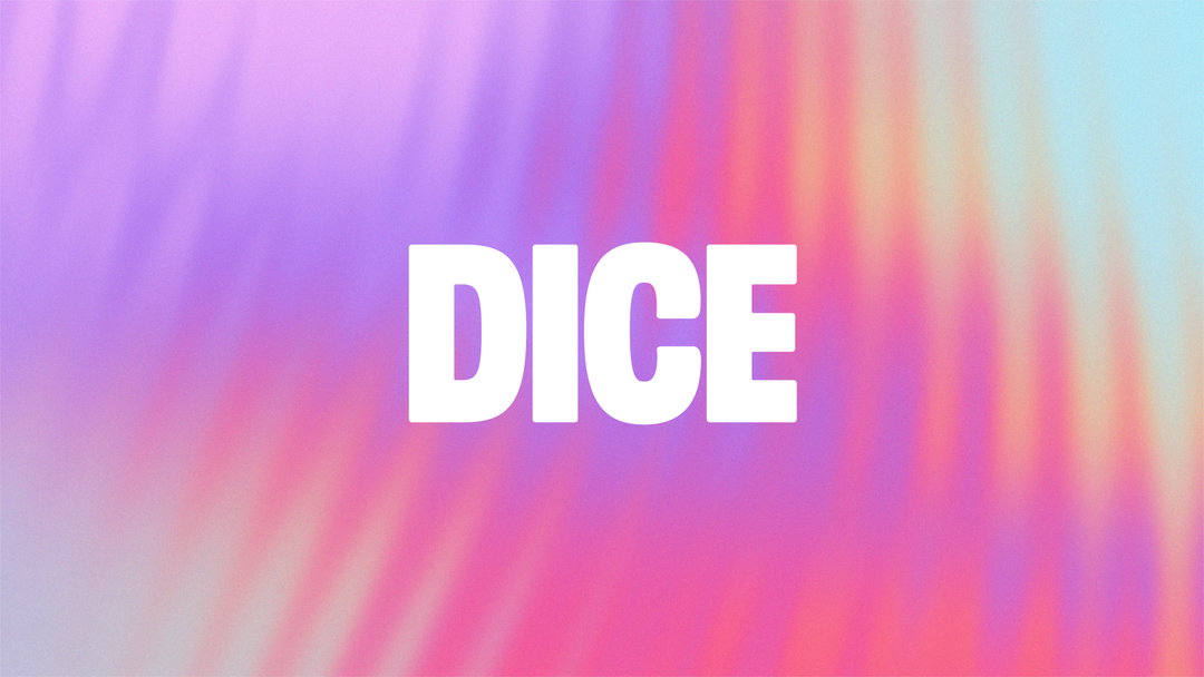
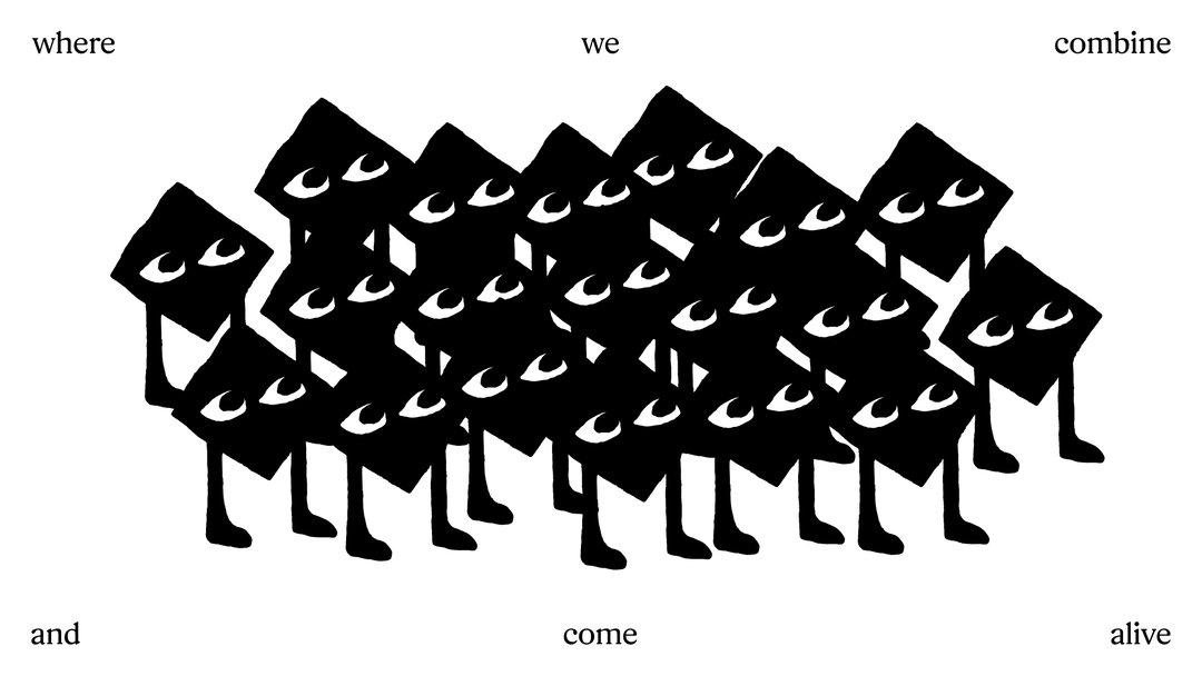
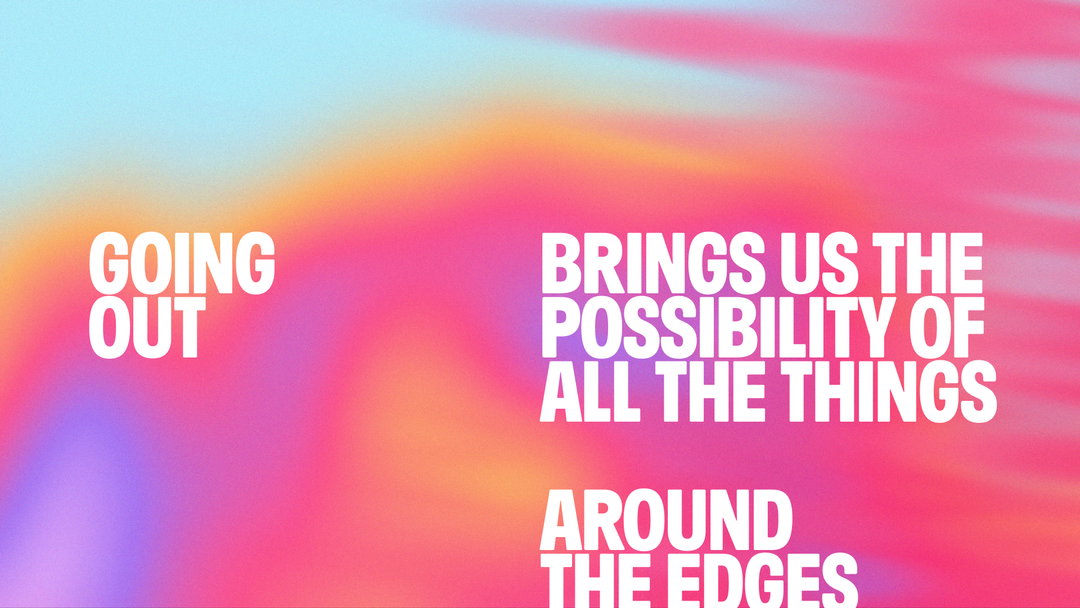
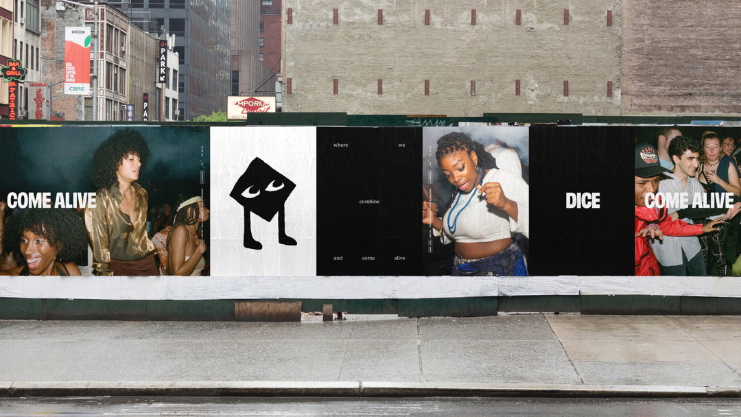
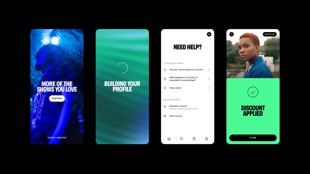
Relatively hot off the heels of its last rebrand in 2019, event discovery and ticketing platform Dice has just launched another one, again designed in-house. This rebrand pointedly aims to avoid trends – nothing “generative”, “adaptive”, or “corporate” says Dice ECD Patrick Duffy – and digs deeper into a focal point on the last refresh: repping music fans. Through its new logo, a sketchy diamond-shaped “fan”; colour fields, based on the flow of energy at gigs; and wider assets, including a short film paying homage to going out, the rebrand is built around the idea of bringing the music fan to life. “Once we landed on this articulation, everything else flowed like lager down the slope at Brixton Academy,” Patrick confirms.
Imperfection is at the heart of the work. The logo, which began its life as a sketch on a train journey, has retained the look of just that. Although arriving on this endearingly rough and ready final product required more leg work than the story suggests, the cute diamond with legs was one of hundreds of notebook sketches. Before that, Patrick says: “We’d been exploring all sorts of heady stuff: homo troglodytes, Chauvet Cave, incorporeality, higher states of consciousness, Analord tracks, Phillip K. Dick, DMT, soundwaves… but in the end, we realised that we’d disappeared up our own arses. We just wanted something that represented our audience. something that looked like someone that you’d want to go to a show with, hang out with.” Dice worked with Animade and animator Boy Tillekens to bring the logo to life and produce animations.
Dice: Dice rebrand (Copyright © Dice, 2022)
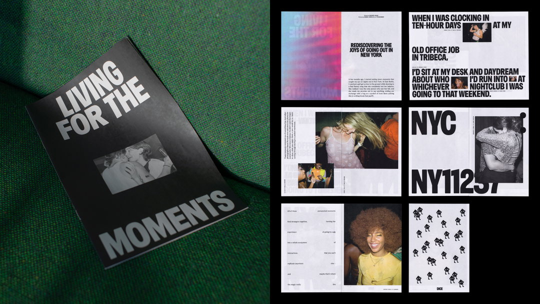
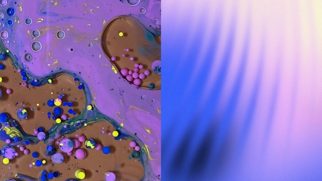
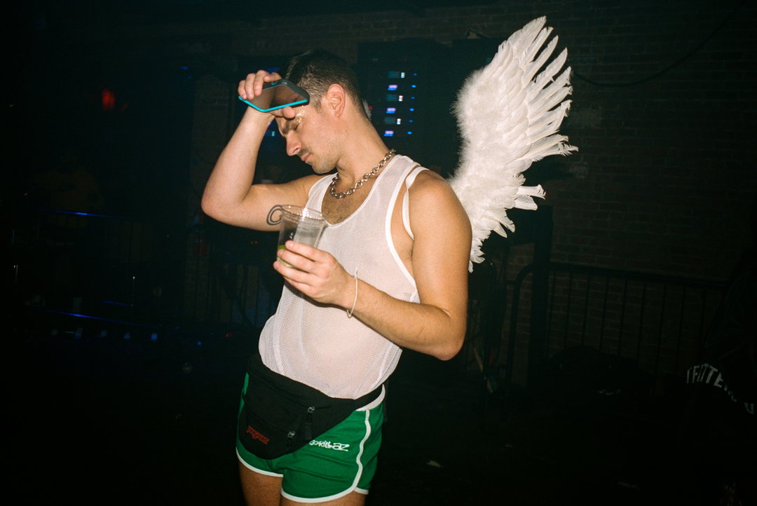
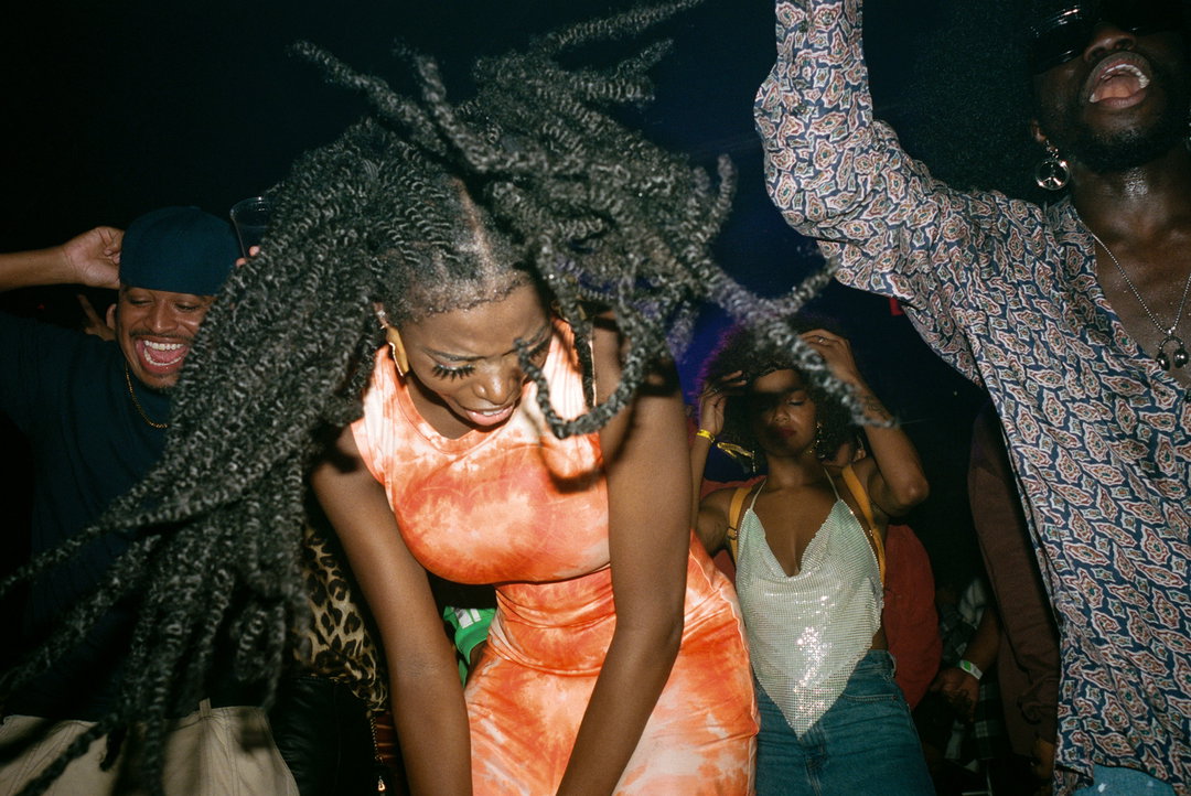
Other elements of the identity, such as the colour fields visualising the feel of attending a live show, are similarly handmade in design, developed by Anni Haugan on the design team from an original set of “Vibrations” in the 2019 rebrand. Currently appearing across the branding and alongside the wordmark, these colours started with a bucket of paint, oil and water before the design team touched After Effects. Other additions to the Dice brand include images from photographers Tim Barber and Daniel Arnold, offering something “as raw and unstyled as a great night out”, adds Patrick. “Everything we made had to tap into that reality.” A short film created for the rebrand launch, voiced by Murkage Dave, captures the same ethos.
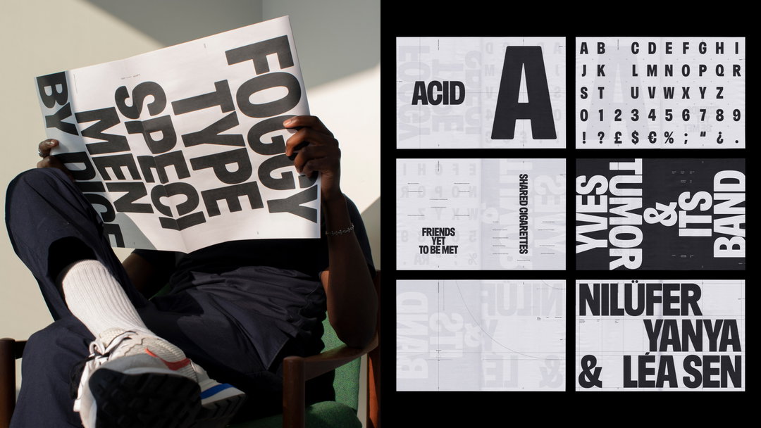
“Everyone needs a bespoke typeface these days don’t they?” says Patrick. Dice continued the homegrown feel with typeface Foggy for this necessary final component, which pays homage to “workplace legend” global head of music, Andrew Foggin. “It’s the kind of type that could blare out of a gig poster or deliver a meaningful epithet,” Patrick states. Stewart Walker, Dice’s head of design, worked with Oh no to land on something that felt visually linked to the new wordmark.
While three years might feel like a short life on an identity, Patrick states the urge to revamp came from wanting to “go a level deeper” and bring the fans closer to the brand. “We wanted it to feel like something a fan had made. Fans don’t make corporate logos, they make zines, stick-and-pokes and placards. So we dived into that world, got our pencils out and tried to bring everything back to the most pure and simple expression of fandom.”
GalleryDice: Dice rebrand, photography by Daniel Arnold and Tim Barber (Copyright © Dice, 2022)
Hero Header
Dice: Dice rebrand (Copyright © Dice, 2022)
Share Article
Further Info
About the Author
—
Liz (she/they) is the senior editor at Insights, a research-driven department within It’s Nice That. They previously ran the news section of the website. Get in contact with them for potential Insights collaborations or to discuss Insights’ public-facing reports.