Spy Studio rebrands The Courtauld, marking its reopening after a three-year closure
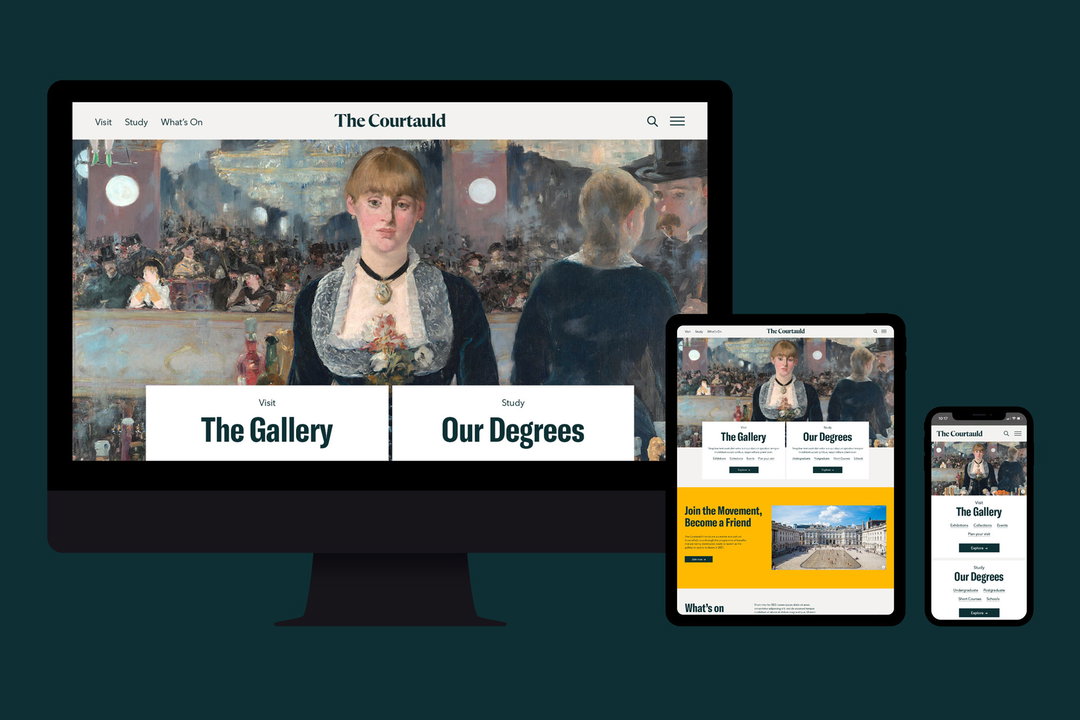
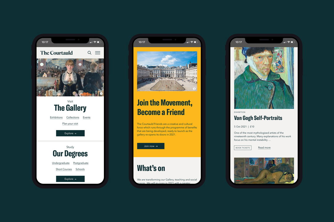
The design studio has repositioned the brand and website to bring the organisation’s many strands together, into a more “impactful whole”.
Share
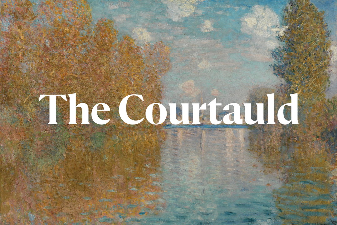
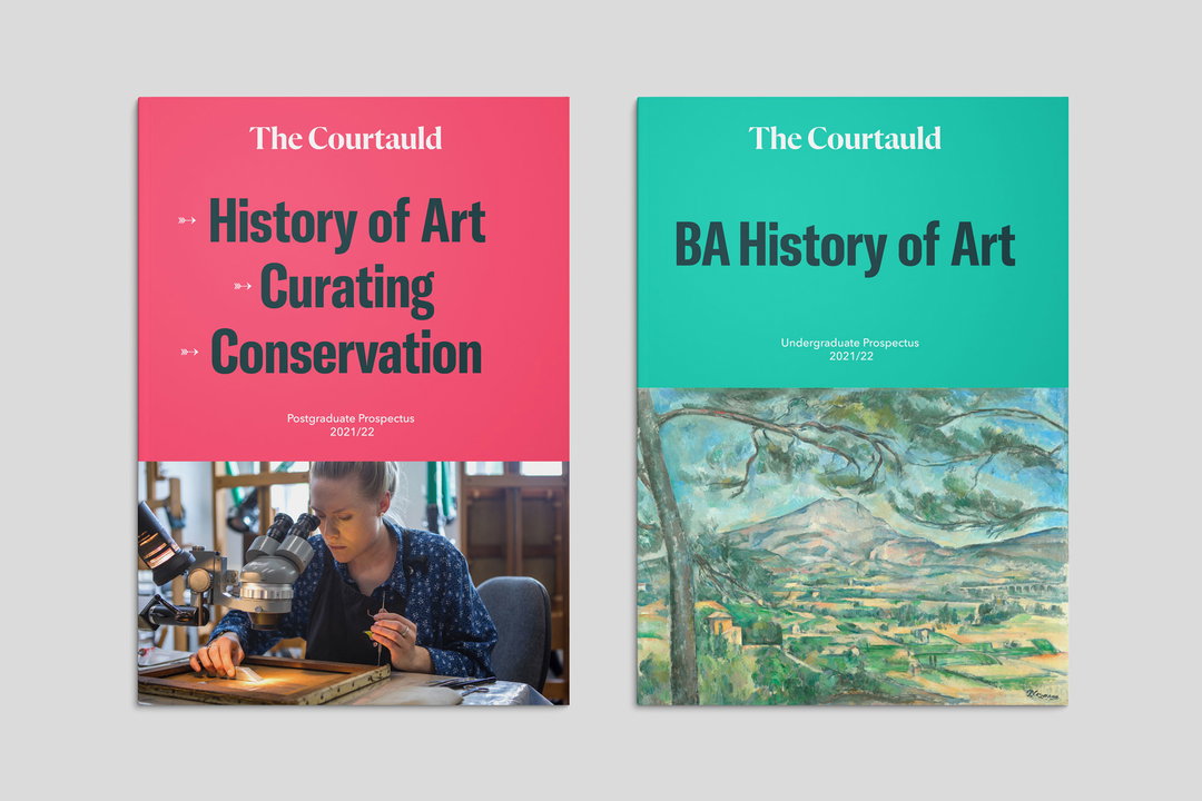
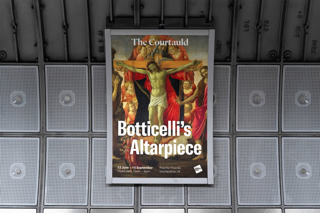
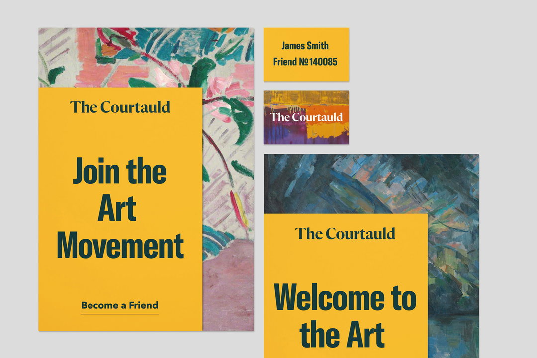
As The Courtauld Gallery opens to the public following its closure in 2018, so too does the work of London-based Spy Studio on its rebrand, which can be viewed alongside the gallery’s extensive refurbishment. To reposition the renowned arts centre, Spy Studio took the many strands of The Courtauld – today a public gallery, art collection, academic faculty and independent college – developed by various teams, often using different logos, and united them as a cohesive brand.
“The Courtauld, although truly renowned, had over the years become seen as stuffy, complicated and a bit old fashioned,” Spy Studio’s co-founder Ben Duckett tells It’s Nice That. To reflect The Courtauld’s cornerstone belief in “art for all”, its rebrand is driven by clarity and inclusivity, “making The Courtauld more transparent and accessible to as many people, regardless of age or background, as possible”.
Spy Studio: The Courtauld rebrand (Copyright © The Courtauld, 2021)
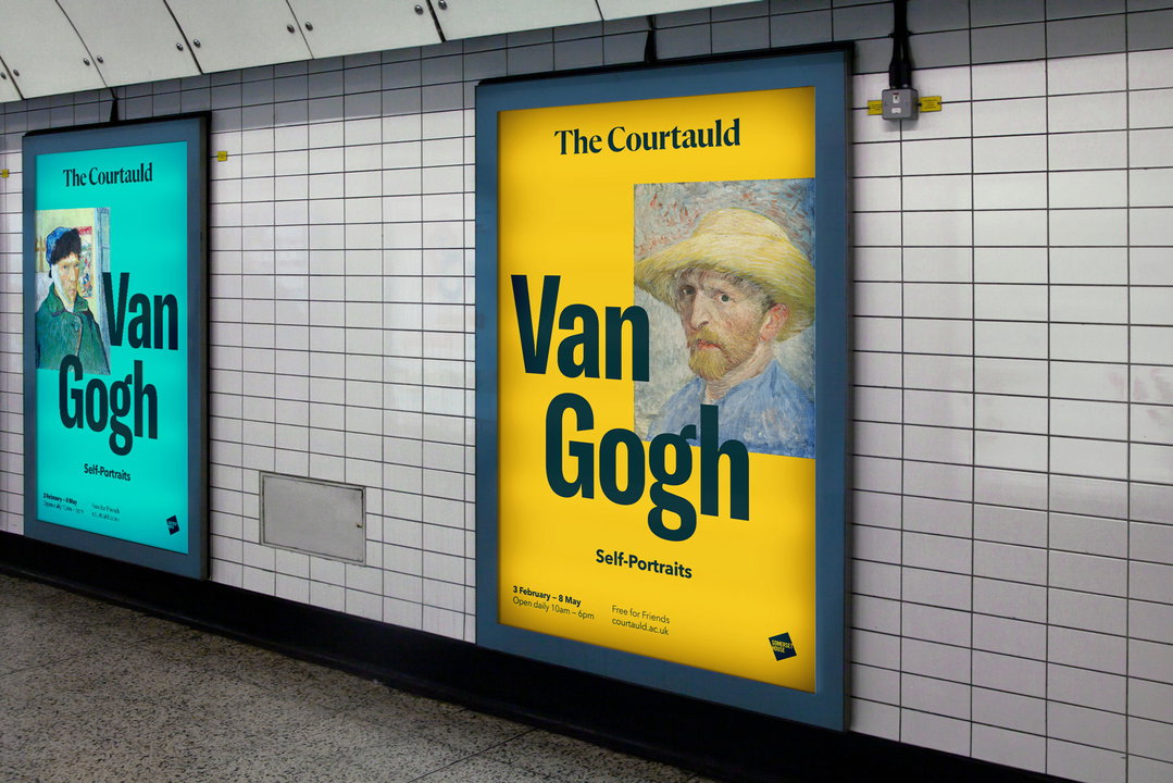
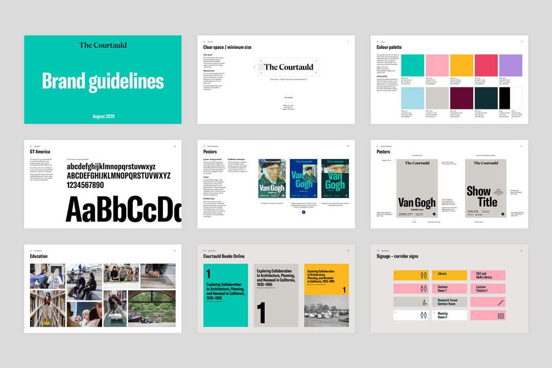
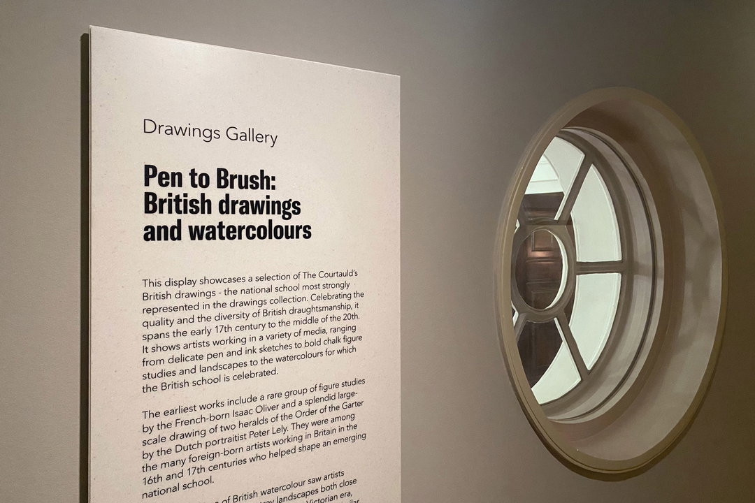
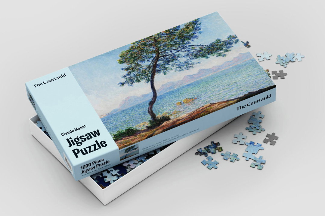
To counteract any lingering perceptions of outdatedness, Spy Studio has incorporated a more “surprising and vibrant” colour palette, drawing from the wealth of colour references in The Courtauld’s own collection. These palettes are employed throughout the typeface and as blocks to keep materials warm and lively. Flexible grids were used to allow type and imagery to flow, implying openness. Language across the gallery and website was also made “less academic”, so texts can be “pithy and relevant to the differing audiences they are appealing to”.
The rebrand includes a website, gallery signage, wider branding and wordmark. The latter of which “echoes [The Courtauld’s] chiselled sandstone building whilst being reminiscent of hand-drawn lettering”. Like the rebrand itself, “reflecting an air of history with a contemporary edge”.
“For such a large, sprawling institution with rich visual content,” Ben Duckett concludes, “the brand toolkit needed to be simple. It has empowered The Courtauld to be consistent and coherent, as well as providing flexibility – to shout loudly and cut through, or sit quietly and let the content speak for itself.”
GallerySpy Studio: The Courtauld rebrand (Copyright © The Courtauld, 2021)
Hero Header
Spy Studio: The Courtauld rebrand (Copyright © The Courtauld, 2021)
Share Article
Further Info
About the Author
—
Liz (she/they) is the senior editor at Insights, a research-driven department within It’s Nice That. They previously ran the news section of the website. Get in contact with them for potential Insights collaborations or to discuss Insights’ public-facing reports.