Strongbow goes vibrant, ditching black and gold palette for first time ever
After appearing in the corner of every selfie ever taken at a UK summer music festival, the familiar can design finally hangs up its hat with new work from Otherway.
Share
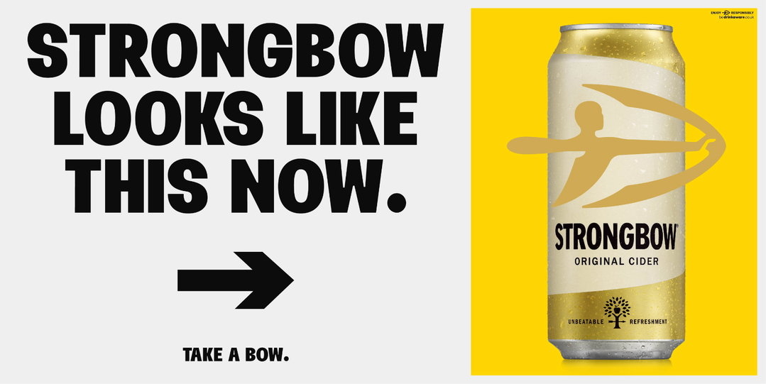
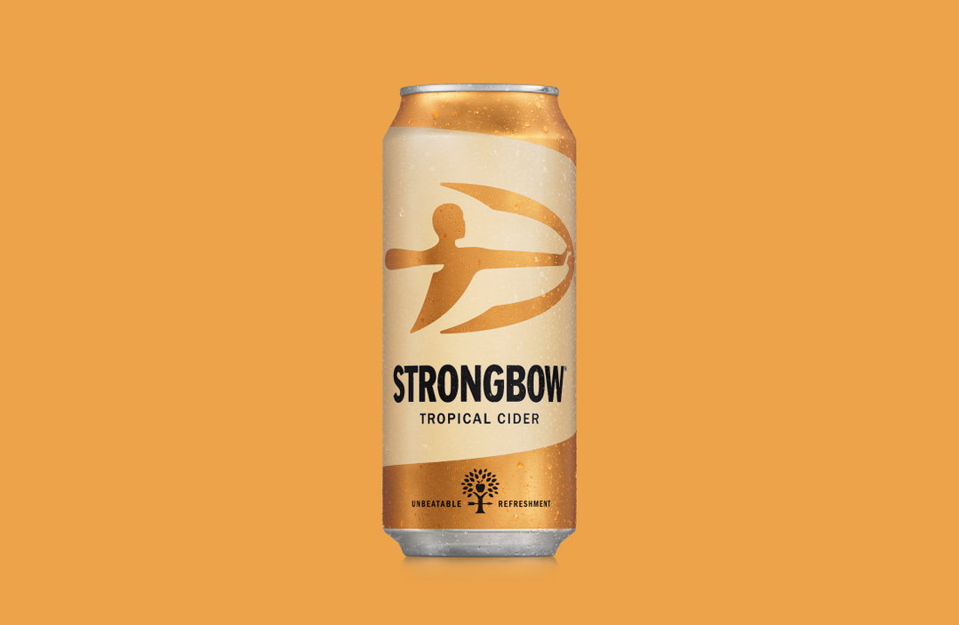
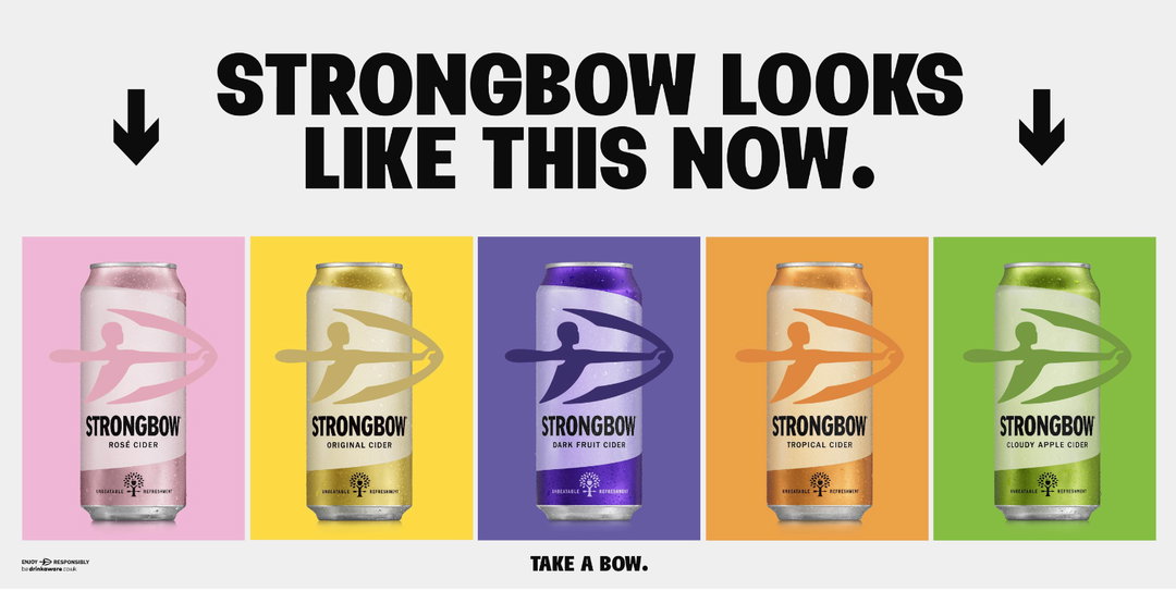
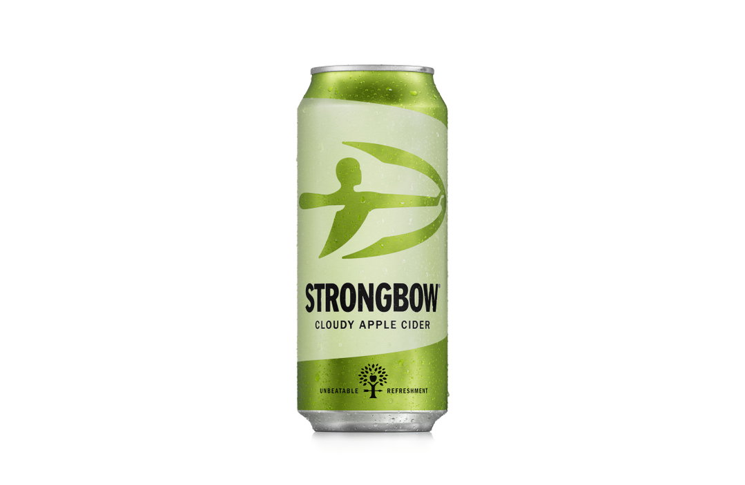
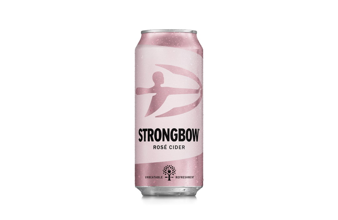
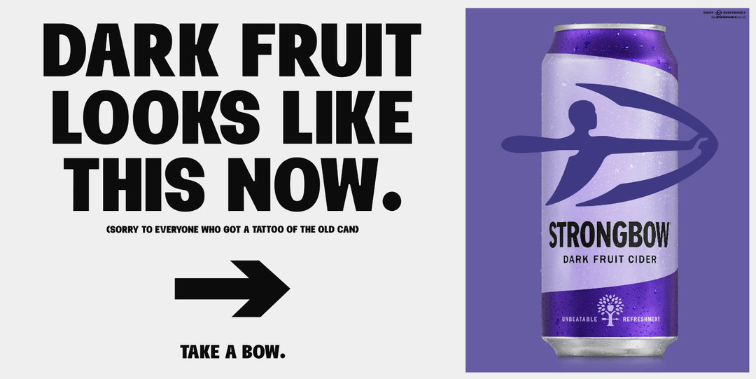
Strongbow has announced the first change to its black and gold can design since the cider was created in 1960. The brand’s “biggest and boldest redesign ever”, according to a release, has been completed with the design agency Otherway. It sees Strongbow strip back its packaging, trading graphic accents and patterned details across packaging in favour of bright colour blocking.
The makeover is pegged to the summer release of a new flavour (Strongbow Tropical, for any Dark Fruit fans out there) but the new design will appear across all lines, including Strongbow Original. The archer logo has been retained at the centre of packaging and typography remains consistent; the major change comes from a vibrant new palette that ranges from light pink to a grassy green.
“It’s not every day that a cider so cult that people have it tattooed on their bodies entirely changes the way it looks,” Rachel Holms, Heineken UK cider marketing director, states. “This is a huge milestone in 63 years of Strongbow, and the start of a new chapter for us. And it’s only just the beginning. Setting the pace for what’s to come, we’re excited to show people what else we have in store for our summer of cider.”
It’s not the first time a beverage brand has leaned closer to minimalism this year. Last month, 7Up flattened the illustrated citrus icons that have appeared on its packaging for over seven years, opting for abstract shapes instead. Though the Strongbow rebrand reflects a trend beyond simplicity. Colourful, approachable cans are trending within the independent drink space. With the line between beer beverages and cute milk brands growing ever slimmer, Strongbow’s “sunnier” direction makes sense for a brand marketing towards changing tastes, as much as it does for summer drink.
GalleryOtherway: Strongbow (Copyright © Heineken UK, 2023)
Hero Header
Otherway: Strongbow (Copyright © Heineken UK, 2023)
Share Article
Further Info
About the Author
—
Liz (she/they) is the senior editor at Insights, a research-driven department within It’s Nice That. They previously ran the news section of the website. Get in contact with them for potential Insights collaborations or to discuss Insights’ public-facing reports.