Long live the king: Studio Herrström’s identity for Elvis pulls on his typographic history
Drawing on his extensive archive of outfits and imagery, the brand lets the music do the talking.
Share
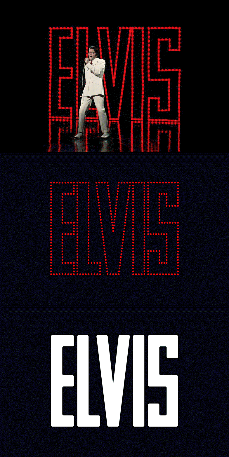
In the wake of Baz Luhrmann’s 2022 film Elvis, starring Austin Butler, Sony Music Entertainment sought a re-energised identity for the king of rock and roll, following an influx of new fans and the resurgence of long-time listeners. Turning to Studio Herrström – who’d come off the back of branding Whitney Houston a year before – the Viennese creative studio embraced the eccentricity of Elvis, from his pelvic-centric dancing and costumes to his discography and acting credits.
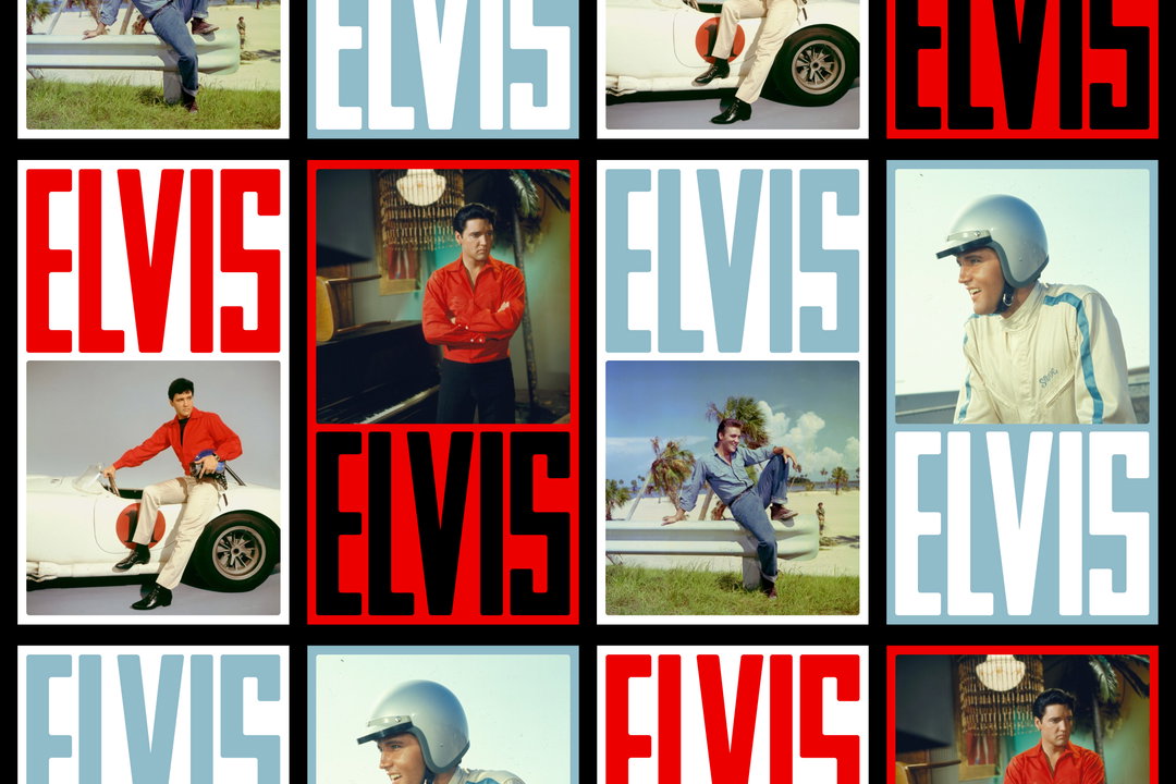
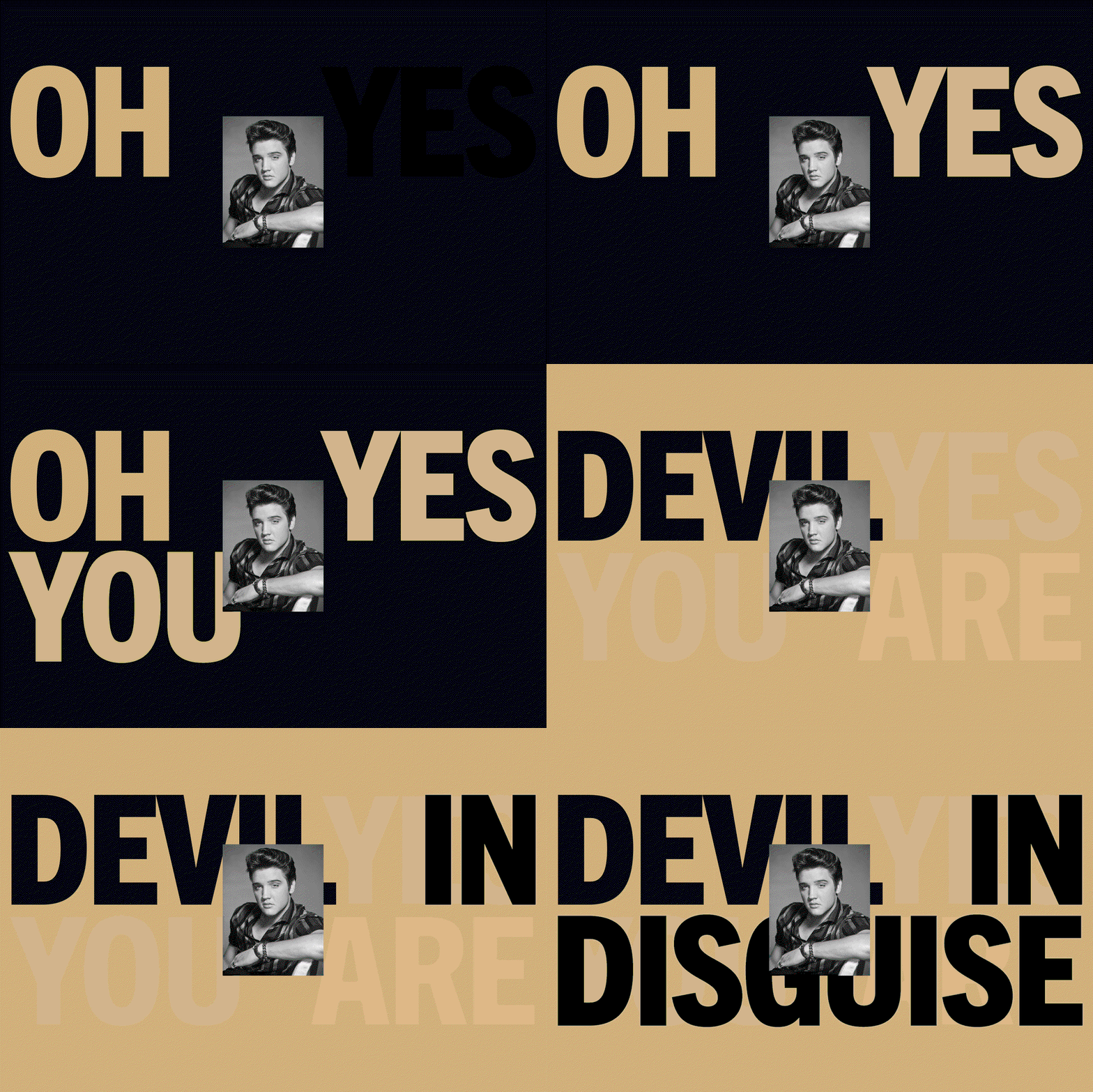
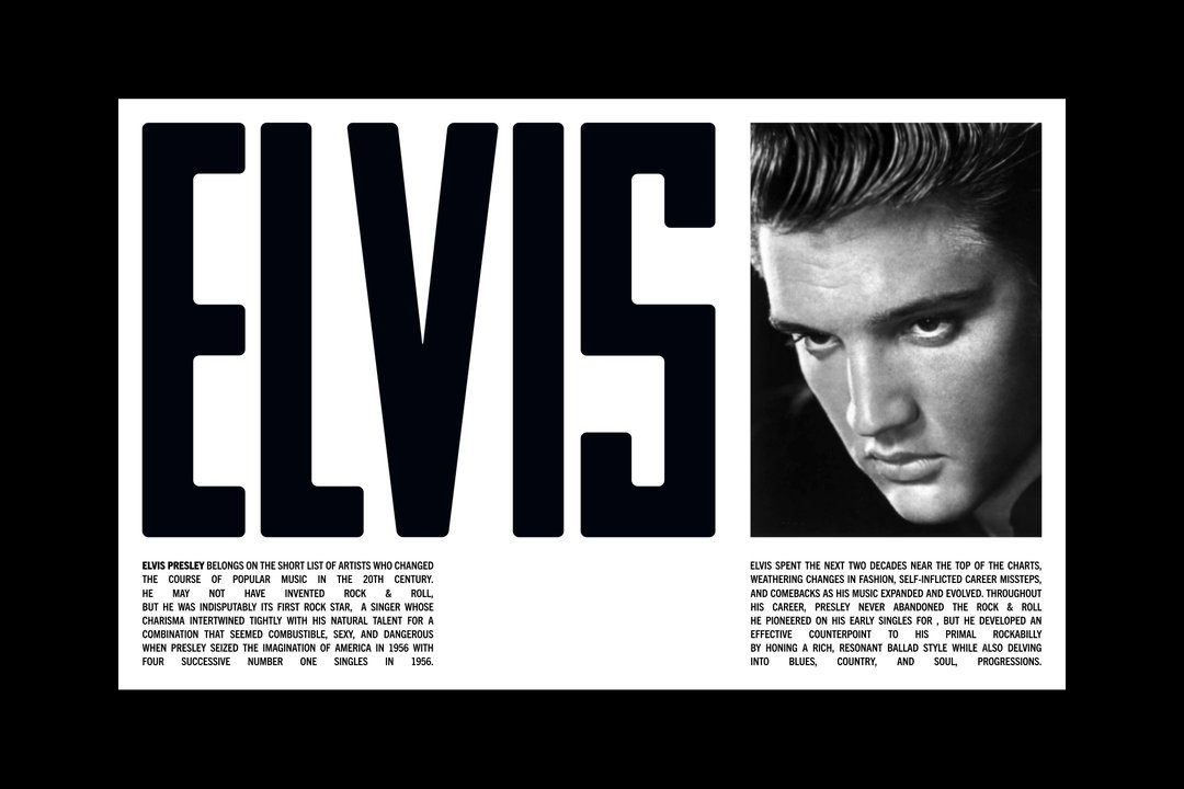
Truly coming to life in motion throughout the website’s interactive and kinetic storytelling (working with animation studio Cantera), the brand is led by a bespoke wordmark crafted in forms derived from the stage typography of his 1968 ‘Comeback Special’. The result is a resolute, heroic tone that guides the audience through the brand space, adapting to different contexts, parameters and products through its expanded lockup set.
GalleryStudio Herrström: Elvis (Copyright © Sony Music Entertainment, 2023)
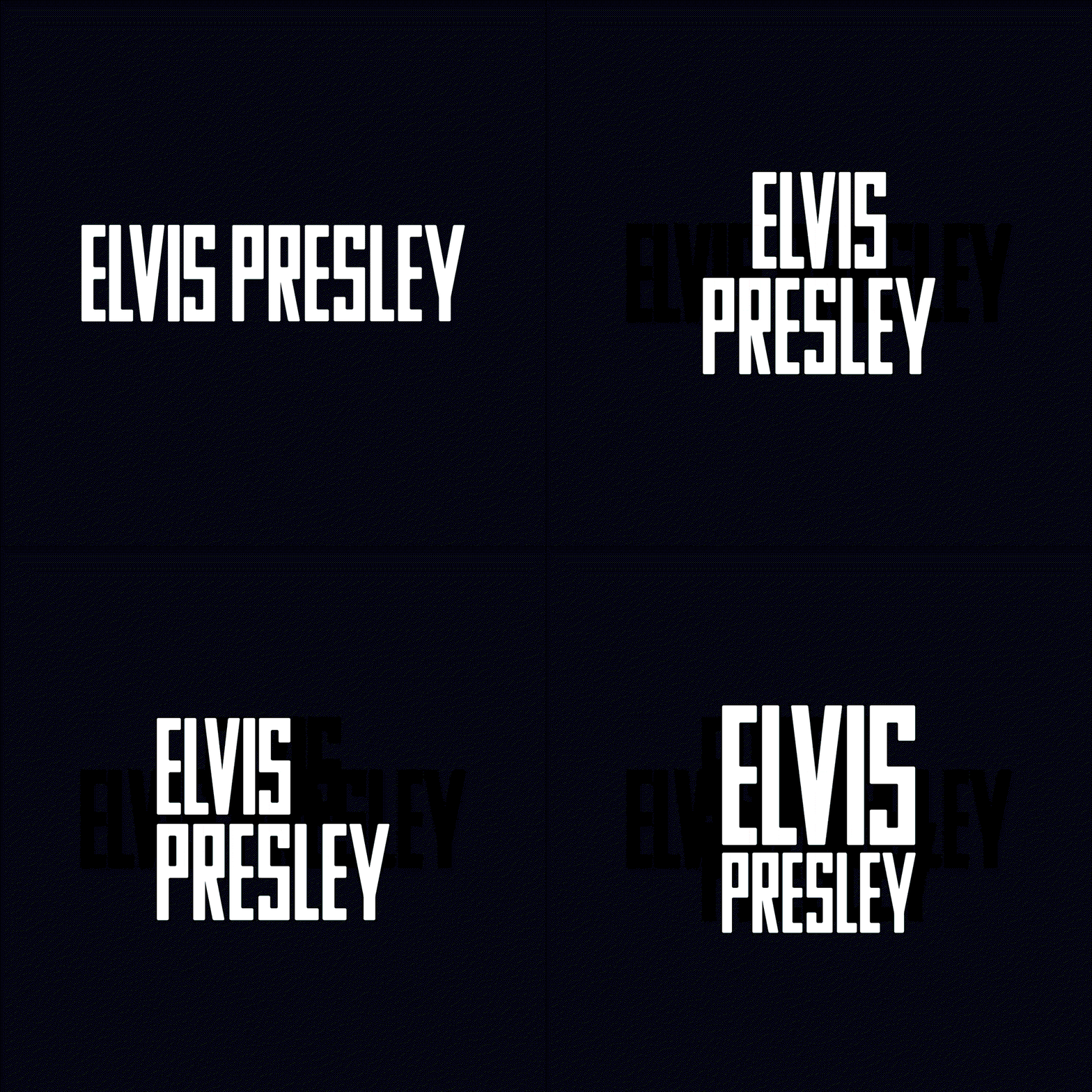

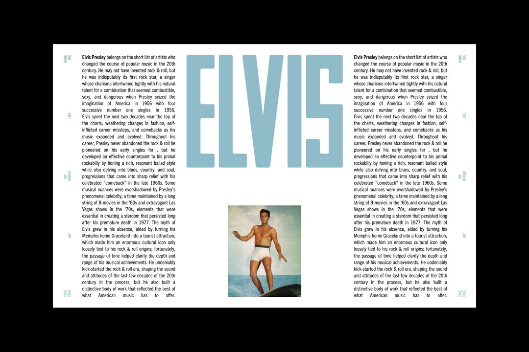
The historical typography references didn’t stop there, with Studio Herrström developing a custom headline typeface to complement its wordmark, drawing on ticket, trading card and tour poster type found in Elvis’ archive, as well as referencing the retro-style design within the typeface’s applications. Whilst likewise ensuring digital optimisation to cope with contemporary demands, the legacy-defined identity utilises and honours the artist’s historical creativity, pulling in iconic imagery and outfits to not only be championed but influence the identity around it – with colour palettes coming directly from archive photography. As such, the brand creates itself a space to adapt continually, as did Elvis, without being heavy-handed, allowing ‘the King’ and his electric visual identity to speak for themselves.
GalleryStudio Herrström: Elvis (Copyright © Sony Music Entertainment, 2023)
Hero Header
Studio Herrström: Elvis (Copyright © Sony Music Entertainment, 2023)
Share Article
Further Info
About the Author
—
Hailing from the West Midlands, and having originally joined It’s Nice That as an editorial assistant in March 2020, Harry is a freelance writer and designer – running his own independent practice, as well as being one-half of the Studio Ground Floor.