Mental health charity Calm finds a new brand identity to aid their fight against UK suicides
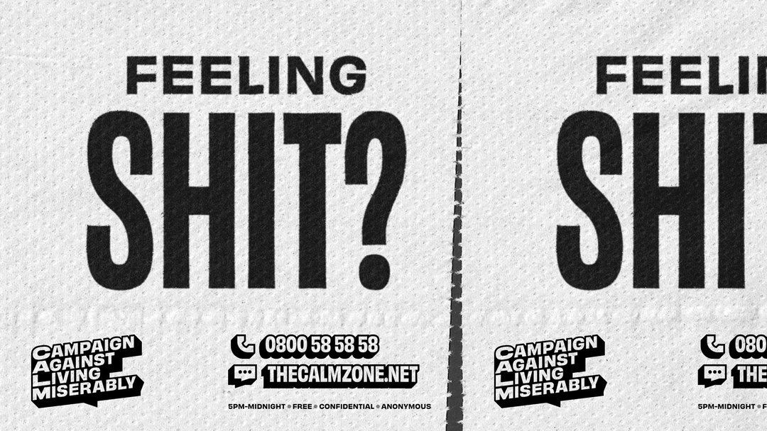
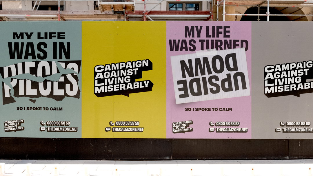
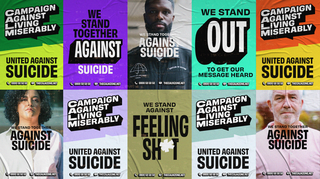
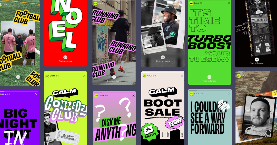
Studio Output has given the charity a rebrand that aims to be “there for everyone” with a strong and fixed typeface, a bold and bright colour palette, and eye-catching graphics.
Despite major dialogue changes in recent years surrounding mental health and its crises, 6000 people in the UK still take their own lives every year according to the latest full UK figures. So the work of charity Calm remains as vital as ever.
Output wanted to help create a brand that cuts through the noise of the busy mental health conversation. The charity, whose acronym stands for Campaign Against Living Miserably, exists to prevent suicides and it hopes the brand refresh reaches more people and unites the UK against suicide. The design agency thus equipped Calm with a brand identity that visualises a recognition of the “urgency of the situation and the need for change” whilst keeping sight of the need to speak to real people about issues of mental health and suicide.
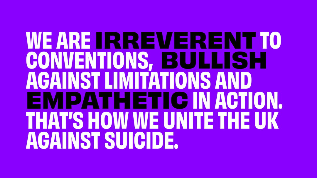
Calm hopes that through campaigns such as Project 84 and its recent Invisible Opponent ad, it can show change is possible and suicide is preventable. The organisation’s self-defined character traits are: irreverent to conventions, bullish against limitations and empathetic in action. Calm hopes its voice, through the new brand, works alongside cultural references that will realistically and genuinely resonate with people who often struggle to seek support. The charity hopes that the brand identity will therefore “continuously remind people that change is in the small things that create huge waves,” as CEO Simon Gunning mentions.
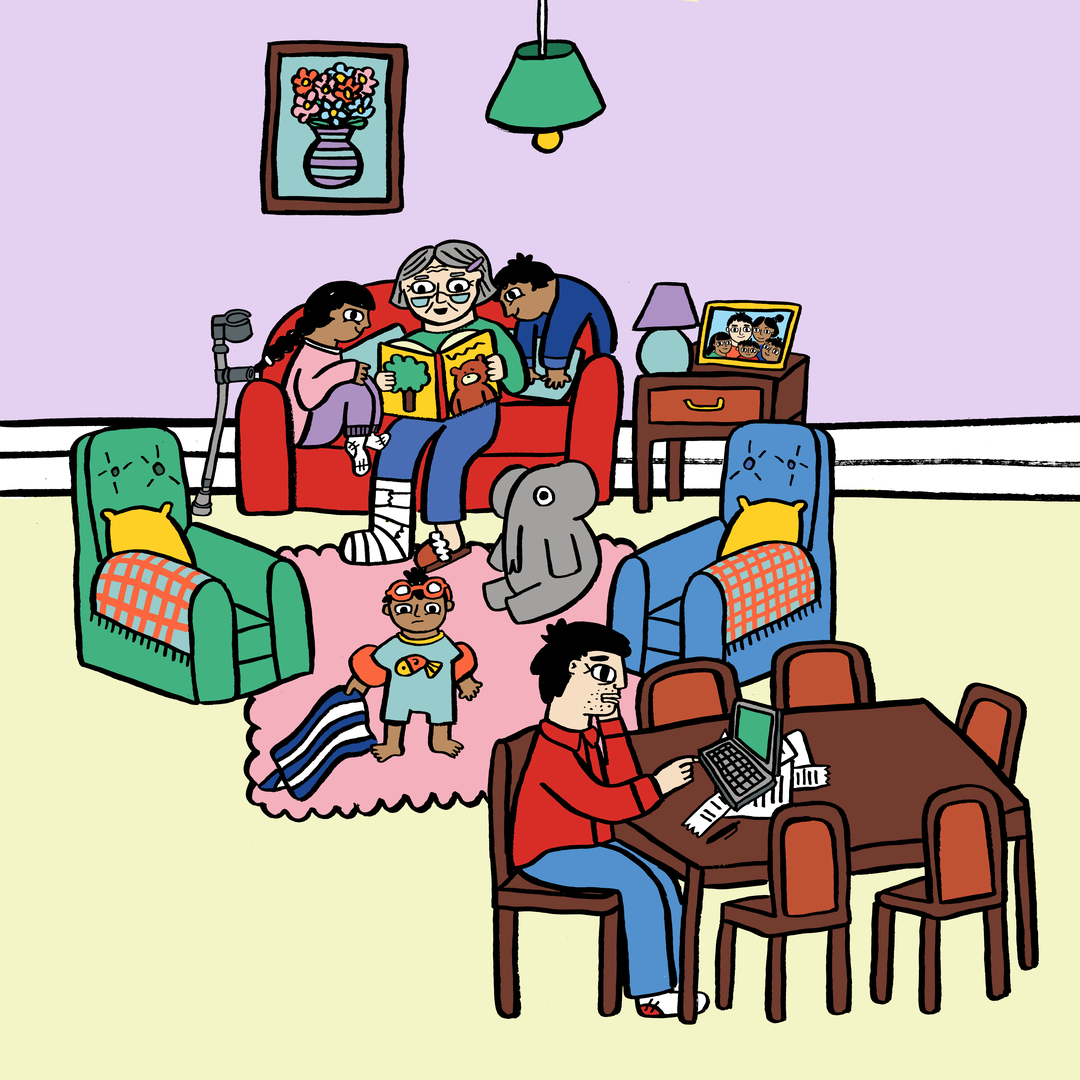
To do this – to truly reach the everyday person in an authentic voice – Output’s visual identity and the verbal identity by Reed Words aim to work together across Calm’s various touch points. A vibrant yet soft colour palette and use of real people throughout imagery, along with various styles of illustration, all seek to create a brand that is made for real people. Calm claims that it hopes to never appear clinical or stand-offish because, as Gunning claims, because it is a charity built upon “being there for everyone.”
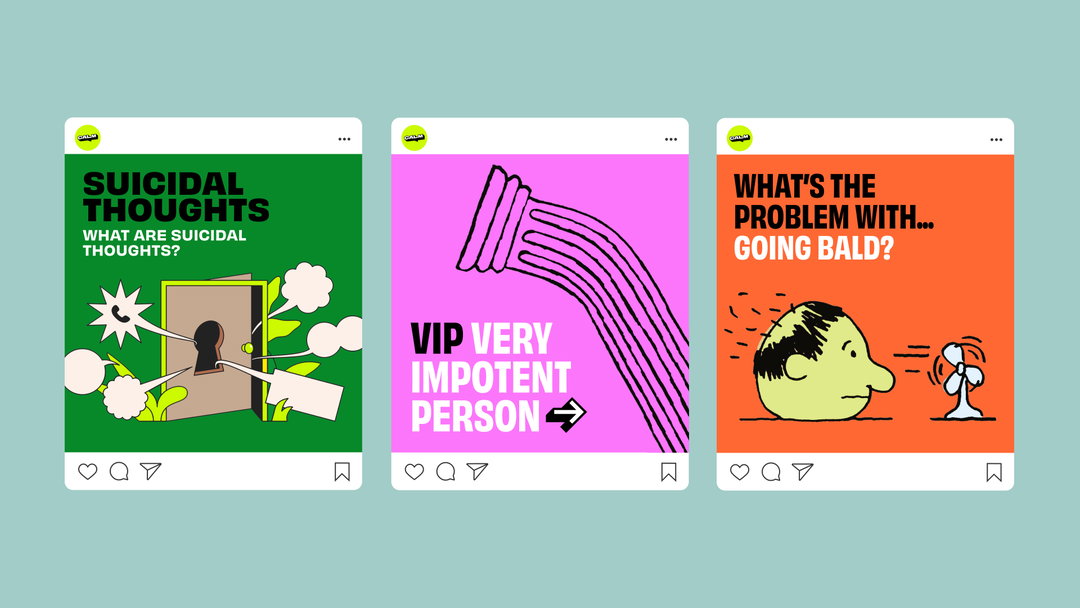
Studio Output and Reed Words: Calm rebrand (Copyright © Calm, 2021)
Writer at Reed Words Gemma Wilson adds that the team needed to retain the authenticity of Calm’s voice and “show how it can expand to fit the whole organisation, with all the different moments they meet their audiences in. It’s an unusual challenge,” she continues, “but one with so much potential for strengthening the brand even further. We worked with internal teams to show how their bold, punchy, and much-loved voice can work everywhere – even the toughest topics.”
Johanna Drewe, Output’s creative director, says that Calm’s challenge to them was “unique. The brand has to do so many different things – from support to activism,” but it always needs to always feel authentically like the organisation. So the design studio was also conscious that the rebrand “should feel like a natural evolution. The next iteration of a much-loved brand, rather than something completely new.”
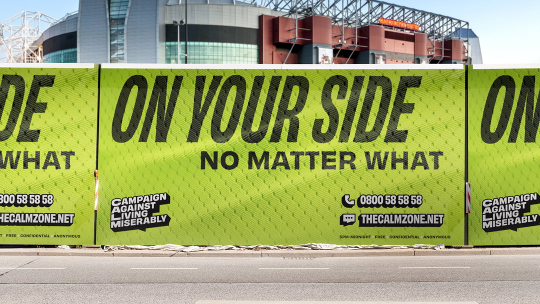
Drewe says that to do that, the designers revisited the speech bubble logo and “used the extruded text style to define the graphic language beyond it – the helpline number, website URL and framing devices.” The creative director claims that we don’t even need to see the logo to know the brand is Calm. “That structure gives freedom for the brand to flex to lots of different touchpoints – from bringing people together to fight for change, to helping someone in crisis – all in the same brand.”
To maintain a universal and wide reach, the charity’s “new look and feel” along with its “refreshed messaging leans into the power” of Calm’s name, Gunning explains. “That’s why our refreshed logo champions the full name and leads with our ethos but also brings people into the close knit community of Calm,” he continues, “by placing the abbreviation at the heart of the mark. By all working together against living miserably we are united against suicide.”
GalleryStudio Output and Reed Words: Calm rebrand (Copyright © Calm, 2021)
Hero Header
Studio Output and Reed Words: Calm rebrand (Copyright © Calm, 2021)
Share Article
Further Info
If you’re struggling, you can talk to CALM on 0800 58 58 58 (UK) or through their webchat. To find out more about CALM and their services, visit thecalmzone.net
About the Author
—
Dalia is a freelance writer, producer and editor based in London. She’s currently the digital editor of Azeema, and the editor-in-chief of The Road to Nowhere Magazine. Previously, she was news writer at It’s Nice That, after graduating in English Literature from The University of Edinburgh.