Superunion rebrands detective company with visual identity that mirrors its services
Courtesy of Superunion
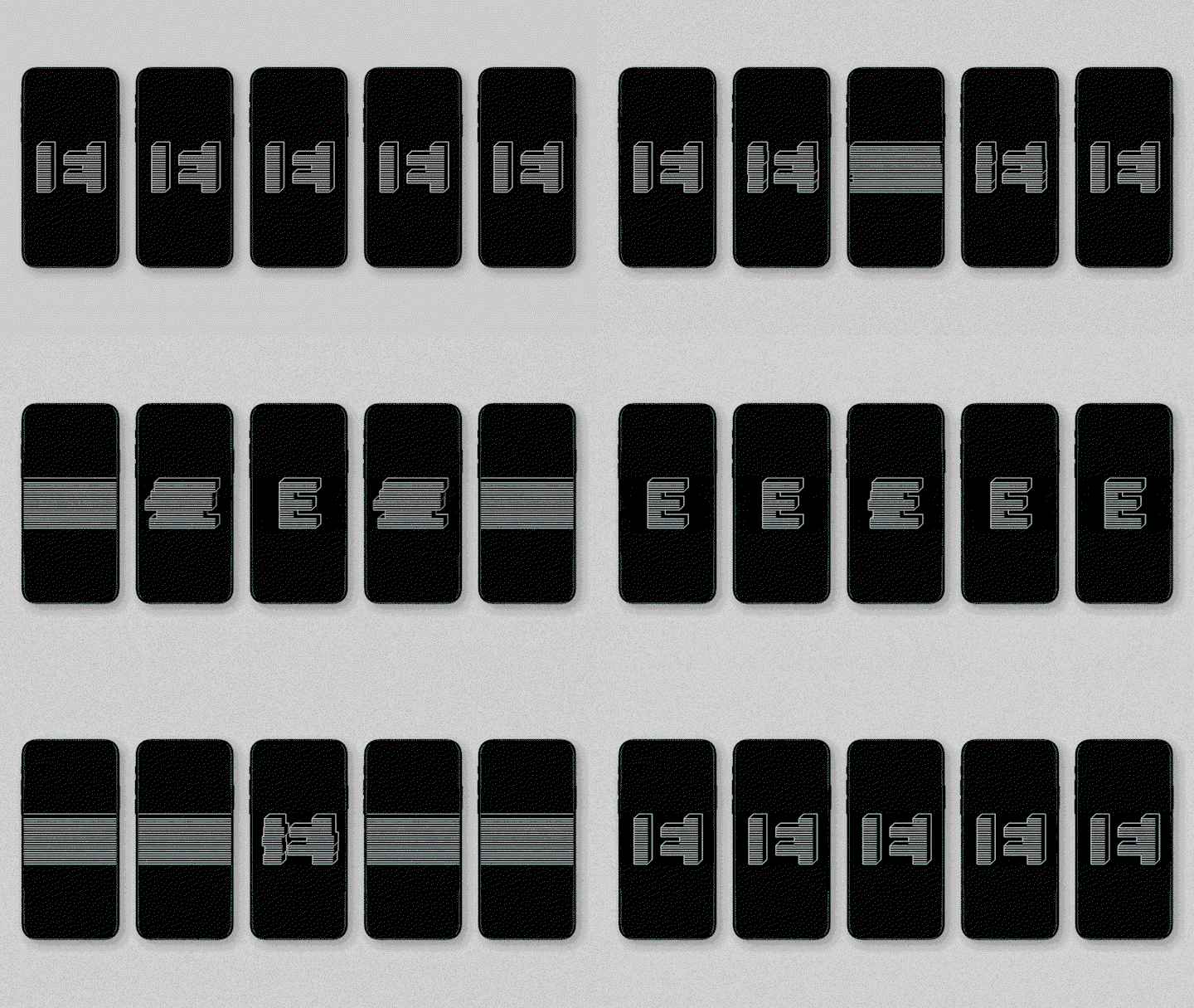
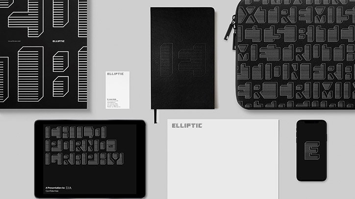
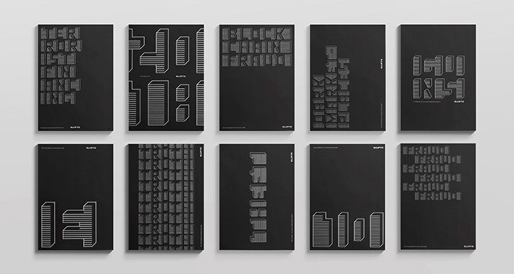
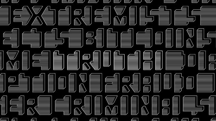
Superunion has redesigned detective company Elliptic’s visual identity to mirror its services. Elliptic investigates online crime, such as terrorism, child pornography and arms trafficking, by deciphering the difficult and complicated cryptocurrencies that conceal these illicit activities. Superunion’s updated visual language mirrors the complicated processes used by Elliptic to track criminal activity.
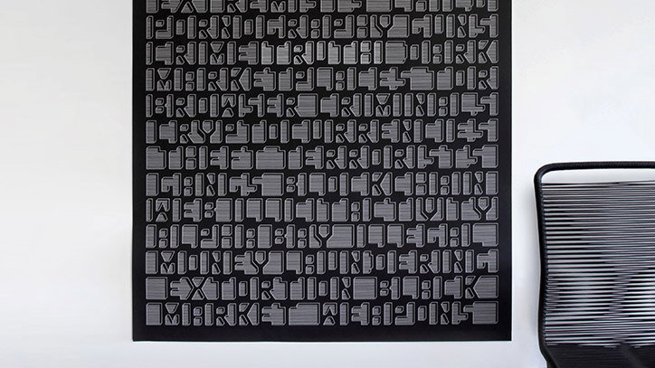
The result is a thickset, three-dimensional monochrome typeface that has been made deliberately difficult to read. Inspired by the rough, digital look of blockchain, a public online account that documents the transition made in cryptocurrency, Superunion has crafted an authentic visual representation of the work Elliptic does, making it easier to understand.
An example of Superunion’s astute representation of Elliptic as truth-hunters is a poster that includes the words “fraud”, “extortion and “terrorists” hidden in the disorienting backdrop. The word “truth” is fittingly written in the middle of the poster, made distinguishable by its lighter tone of grey.
“The legibility is deliberately challenging to echo the difficult task Elliptic undertakes and its simple black and white colour palette reflects the seriousness of the issue and the importance of the legal cases that rely on Elliptic’s intelligence,” Superunion writes on its website. For the agency’s logo, Superunion crafted an inverted version of the typeface, presenting Elliptic’s “E” in a positive light.
Courtesy of Superunion
Courtesy of Superunion
Courtesy of Superunion
Courtesy of Superunion
Courtesy of Superunion
Share Article
Further Info
About the Author
—
Daphne has worked for us for a few years now as a freelance writer. She covers everything from photography and graphic design to the ways in which artists are using AI.