Launch Recite Me assistive technology

The Liminal Space creates branding for egg-freezing product range, Timeless
—
Date
23 February 2016
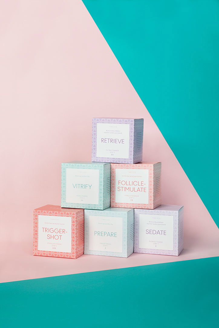
Seven small square boxes are stacked in a pyramid against a split pink and teal background. The boxes feature pastel colours and geometric patterns, with labels reading “Retrieve”, “Vitrify”, “Follicle-Stimulate”, “Trigger-Shot”, “Prepare” and “Sedate”.
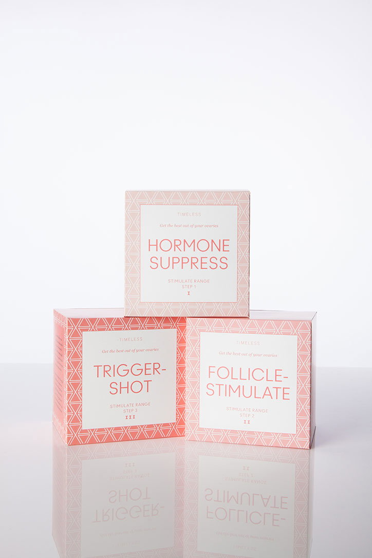
Three pink boxes for a medical range called “Timeless” are stacked against a white background. The boxes are labelled “Hormone Suppress”, “Follicle-Stimulate” and “Trigger-Shot”.

Design agency The Liminal Space has created the branding for Timeless, a fictitious egg freezing brand. The project, which involved designing branding, packaging and creating a short film, aims to encourage conversations around egg freezing and fertility, and educate people about the societal, as well as biological, issues surrounding such procedures.

The Liminal Space formed a creative team comprising graphic designer Laura Gordon, 3D designer David MacDiarmid, illustrator Jonny Glover and perfume maker Sarah McCartney of 4160 Tuesdays to create the Timeless brand.

This will be showcased in a pop-up shop in Old Street station, east London, where visitors will be able to see “products” including 3-Step Solution for egg freezing, the Eau so Pressured perfume line and a range of age defying serums that inform about fertility decline. The space will also house talks about gender politics and reproductive medicine and screenings of a short film.

Sarah Douglas, The Liminal Space director, says: “Timeless is a response to the growing cultural interest in egg freezing, how rapidly it is developing and how little is known about it by the general public. With Timeless we are bringing this debate to people in a creative and engaging way.”

The Liminal Space worked with the Wellcome Trust and The London School of Economics and Political Science on the project, which will be in place from 29 February – 5 March.
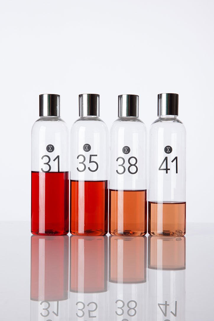
Four clear glass bottles with silver caps stand in a row against a white background. Each contains a liquid in a different shade of amber, ranging from deep red to pale gold. The bottles are labelled with the numbers “31”, “35”, “38” and “41”.
Above
Left

Laura Gordon and David MacDiarmid: Timeless
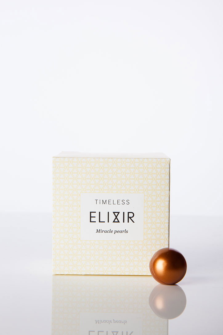
A small, square cream box with a pale yellow geometric pattern. A white label on the front reads “TIMELESS ELIXIR Miracle pearls”. A single, metallic bronze sphere sits on the reflective white surface beside the box.
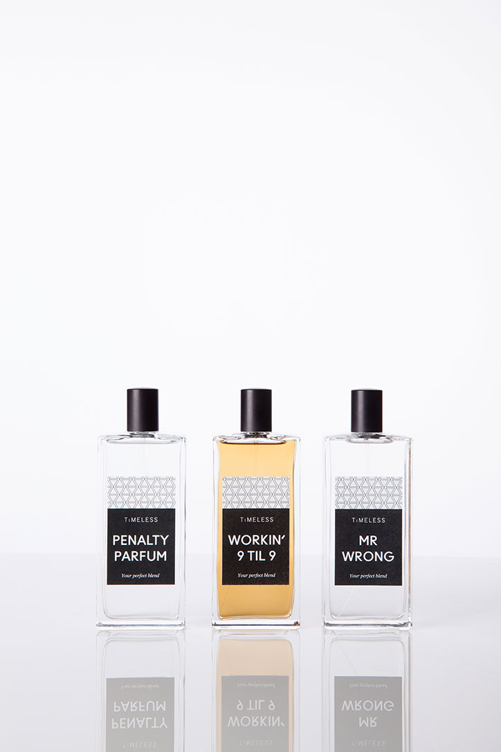
Three rectangular glass perfume bottles stand in a row against a plain white background. Each black label features the brand “Timeless” above titles that read “Penalty Parfum”, “Workin’ 9 Til 9” and “Mr Wrong”.
Above
Left

Laura Gordon and David MacDiarmid: Timeless
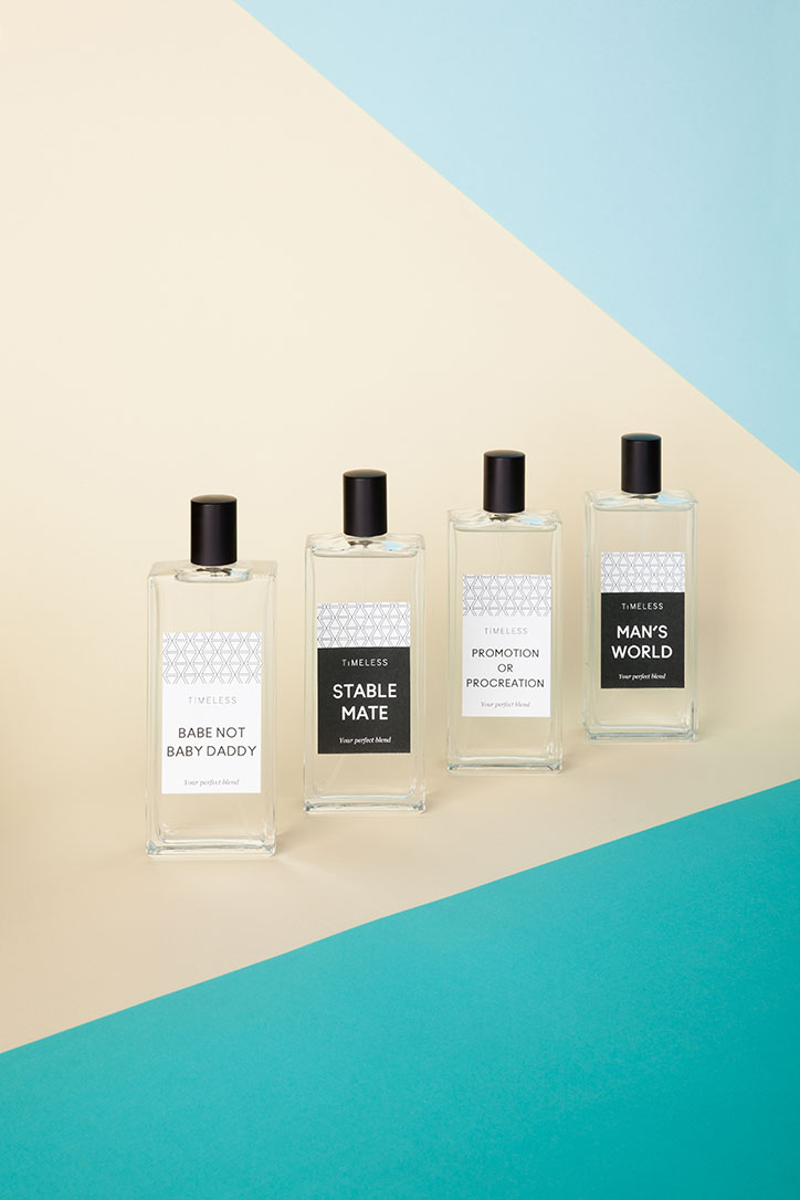
Four clear glass perfume bottles with black caps stand in a row against a tri-colour background. Each bottle features a label with the brand “Timeless” and phrases including “Babe Not Baby Daddy”, “Stable Mate”, “Promotion or Procreation” and “Man’s World”.
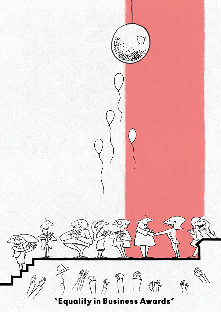
An illustration of a line of people waiting to shake hands with a figure on a red platform. A single prize hangs high above them, while several empty balloons float upwards. Text at the bottom reads “Equality in Business Awards”.
Above
Left

Jonny Glover: Illustrated postcard

Right

Jonny Glover: Illustrated postcard

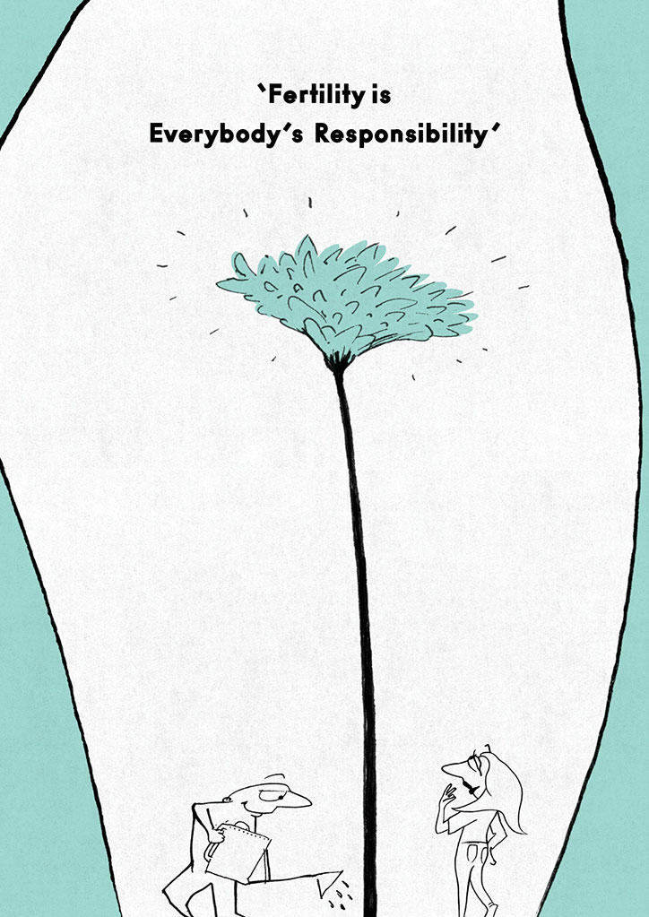
An illustration of two figures standing at the base of a tall, thin plant with a pale blue flower. Above them, bold text reads “Fertility is Everybody’s Responsibility”.
Above

Jonny Glover: Illustrated postcard

Share Article

About the Author

Emily Gosling

—

Emily joined It’s Nice That as Online Editor in the summer of 2014 after four years at Design Week. She is particularly interested in graphic design, branding and music. After working It's Nice That as both Online Editor and Deputy Editor, Emily left the company in 2016.

It's Nice That Newsletters

Fancy a bit of It's Nice That in your inbox? Sign up to our newsletters and we'll keep you in the loop with everything good going on in the creative world.