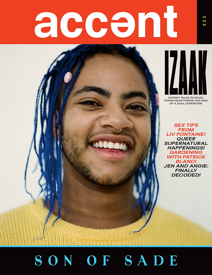
Accent Magazine on mocking, mimicking and surpassing the mainstream
Since its launch as an online photography journal in 2013, the look, feel and approach of Accent Magazine has been constantly evolving. In its fourth print issue, which launched last month, Accent editors Lydia Garnett and Lucy Nurnberg, and art director Luke Tudor Griffiths, are doing their own spin on the celebrity gossip magazine, drawing inspiration from the likes of dentist-waiting-room-giants Hello! and OK!
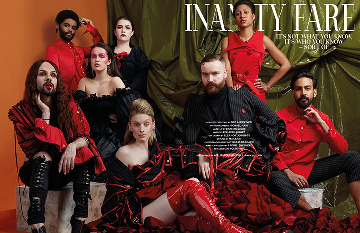
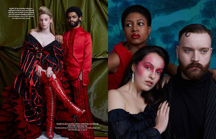
Of the new issue, Lydia says: “In true OK! and Hello! magazine style, we made sure to have some stunning, aspirational shoots with Accent characters. We went to Paris to shoot botanist Patric Blanc and his partner Pascal of Bollywood in their incredible green home; we shot a Vanity Fair inspired series with up-and-coming nobodies talking about their tenuous celebrity links. There’s plenty of bold, expressive portraiture in the magazine and it’s full of big smiles and close-ups.”
While Accent was founded as a space for sharing stories that were often being overlooked by mainstream magazines, its editors aren’t afraid to draw inspiration from the very thing they’re often eschewing. Issue four plays on more than OK! or Hello! magazine’s bold approach to photography and storytelling, the whole format and design aesthetic has notes of the mainstream worked into its innovative approach. “We took inspiration from the way these magazines present their subjects and the language they use,” says Lydia. “It’s important for us that Accent feels accessible, and in an effort to move away from the aesthetic of lifestyle magazines, we often look more to mainstream titles – with the glossy covers and standard format – because we want everyone to feel like they can pick up a copy.”
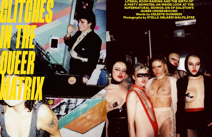
Accent Magazine Issue Four
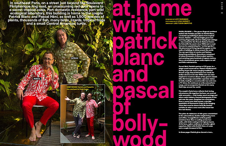
Accent Magazine Issue Four
The magazine seems to be informed by considerations of accessibility and openness at every step, from the founding principles of the design thinking – to not have any limiting rules with the design or identity “as we want to make sure that we can be open and responsive to new ideas and stories”, as Lydia says – to the editorial approach. “Features are designed to directly reflect the content, so the design will be inspired by someone’s personality or surroundings,” says Lydia. “We’ve always championed diversity and queer culture, publishing stories about the world’s most unconventional individuals. In issue four, we’ve got extra features, layers and more content. We spent time working to improve the cover and create something that felt open, honest and engaging. It feels denser, funnier and full of its own energy.”
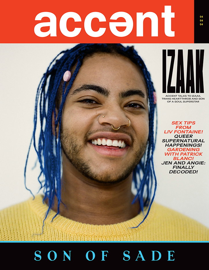
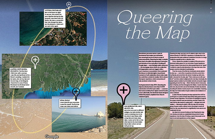
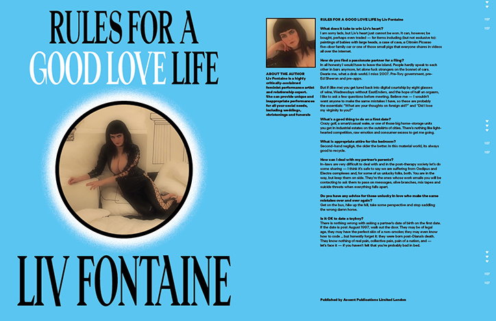
The cover features Izaak, “trans heartthrob” and son of soul superstar Sade; as well as an interview with tattoo artist and illustrator Soto Gang, which raises awareness of sexual abuse within the tattoo industry; and a piece on Queering the Map, which will extend into a workshop with its founder, Lucas, at Somerset House. Summarising the issue, Lydia says: “We dish out plenty of life advice. Rather than self-help guides that can make you feel worse, our advice helps you live a little. You can learn how to get the most out of therapy, how to quit your nine-to-five, and advice on how to start a successful girl band from Geri Halliwell (in drag). We appointed our most fabulous friends to write Accent exclusives: Celeste Guinness is our queer nightlife correspondent and Liv Fontaine gives the best advice on sex and dating. We also have our first no-nonsense agony aunt Brenda, who really tells it like it is.”
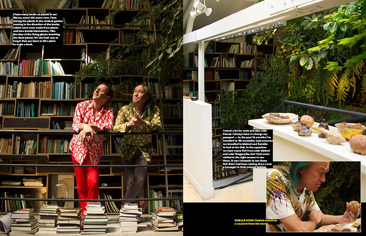
Accent Magazine Issue Four
Accent Magazine Issue Four
Accent Magazine Issue Four
Accent Magazine Issue Four
Accent Magazine Issue Four
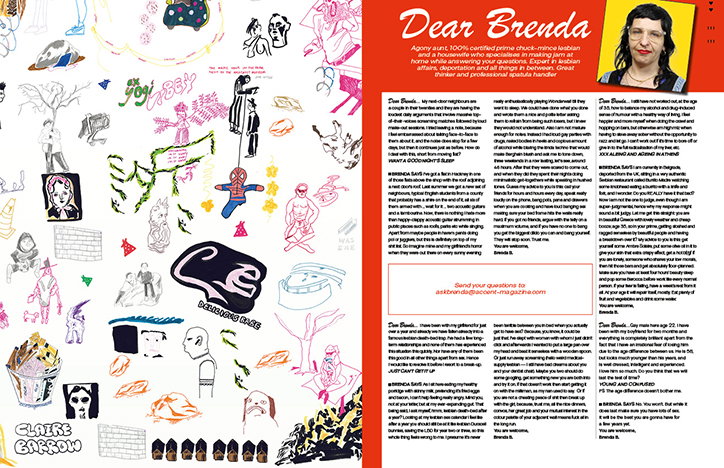
Accent Magazine Issue Four
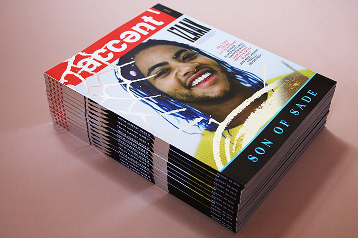
Accent Magazine Issue Four
Share Article
Further Info
About the Author
—
Billie studied illustration at Camberwell College of Art before completing an MA in Visual Communication at the Royal College of Art. She joined It’s Nice That as a Freelance Editorial Assistant back in January 2015 and continues to work with us on a freelance basis.