Launch Recite Me assistive technology
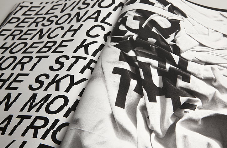
An open book shows a contrast between flat and distorted typography. The left page features bold, black sans-serif text including the words “TELEVISION”, “PERSONAL” and “FRENCH”. The right page shows similar black lettering warped across the folds of a white fabric.

Artist’s book from Paris studio Akatre is a paragon of post-grunge design

—
Date
11 August 2015

There is little more mysterious or unassuming than a book with plain black cover. You never know what you’re going to find inside. A 924-page book designed by multidisciplinary Paris studio Akatre is a wonderful example of inspiring curiosity through restraint. Founded by Valentin Abad, Julien Divert and Sébastien Riveron in 2007, Akatre turns out some beautiful graphic design, and it is its expressive typography that stands out the most, after all it was this that partly drew us to its work with Anglo-Japanese magazine Mother. Mostly monochrome without being minimal, 924P goes even further to show Akatre’s anti-modernist type to be the star player in the studio’s varied output.
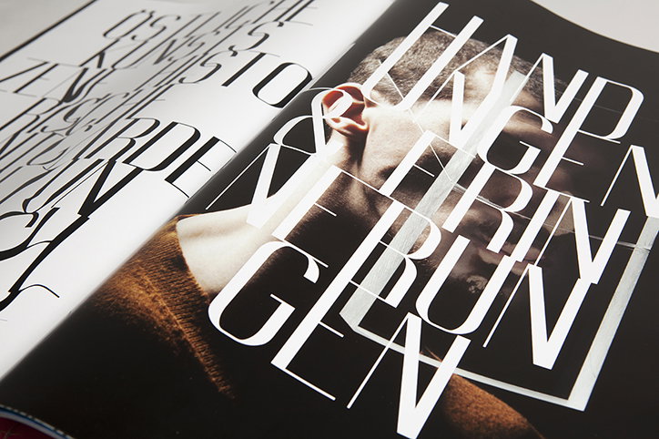
A close-up of an open magazine featuring a portrait of a person partially obscured by bold, white typography. The overlapping letters create a geometric grid across the page, with legible fragments including “HAND”, “TRINKEN” and “RUNGEN”.
Above

Akatre: 924P

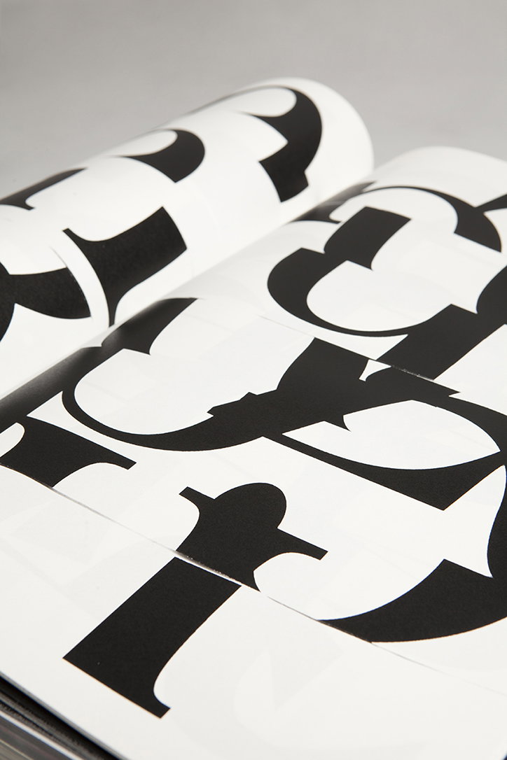
A close-up of an open book featuring bold, black typographic forms on white pages. The oversized letters are cropped and distorted, creating an abstract pattern of curves and sharp edges.
Above
Left

Akatre: 924P

Right

Akatre: 924P

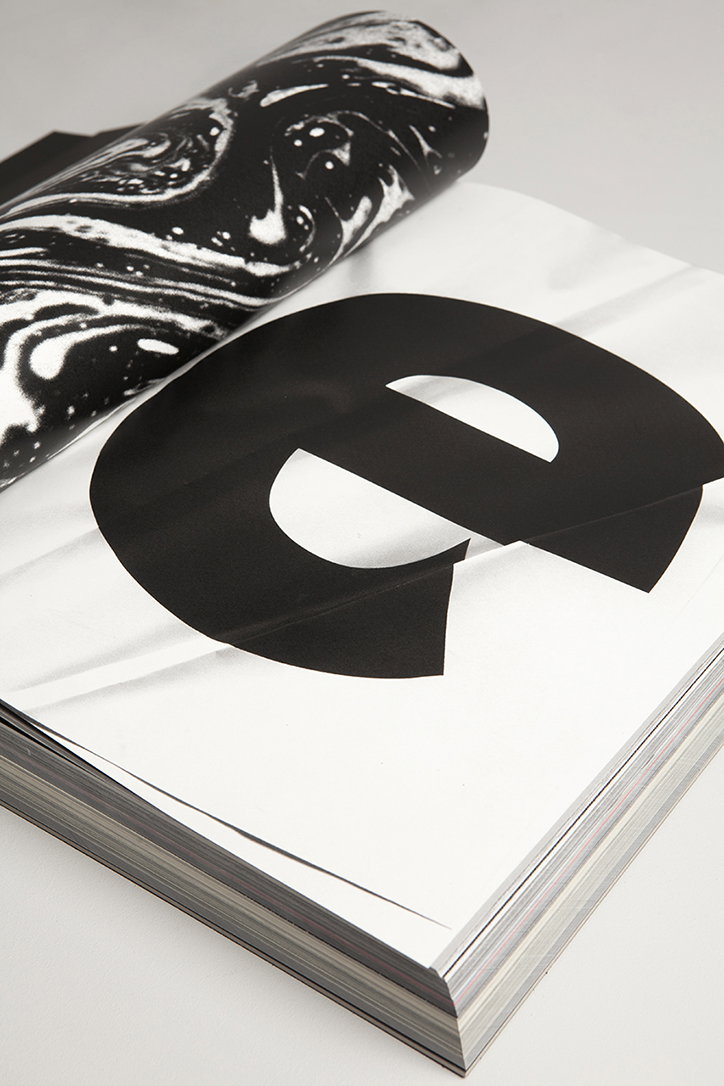
A large, black lowercase “e” is printed across the open page of a thick book. A piece of black and white marbled paper curls over the top of the page.
Above

Akatre: 924P

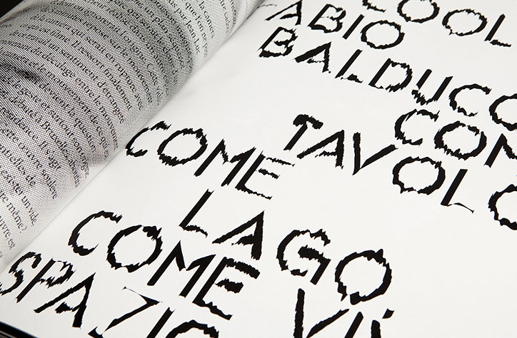
A close-up of an open book showing a page of dense text opposite a page of bold, jagged typography. The distorted black lettering on the white page includes the words “Fabio Balducco”, “Tavolo” and “Lago”.
Above
Akatre: 924P
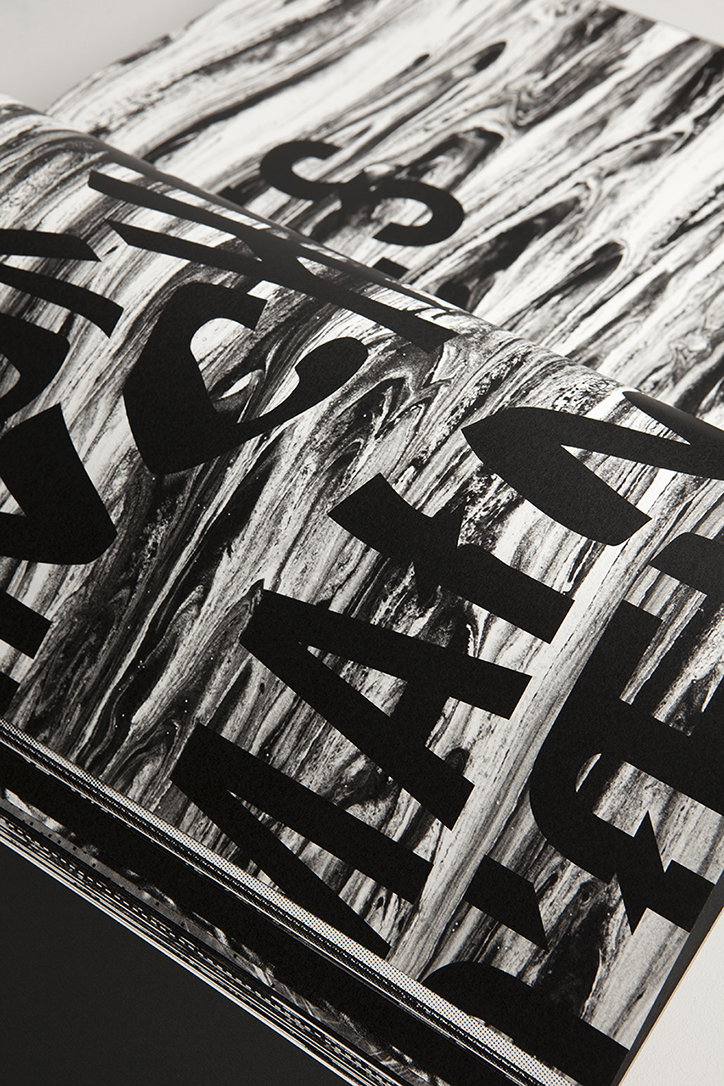
A close-up of an open book featuring bold, black typography laid over a swirling, marbled pattern in grey and white. The letters are cropped and distorted by the curve of the page.
Above
Left

Akatre: 924P

Right

Akatre: 924P

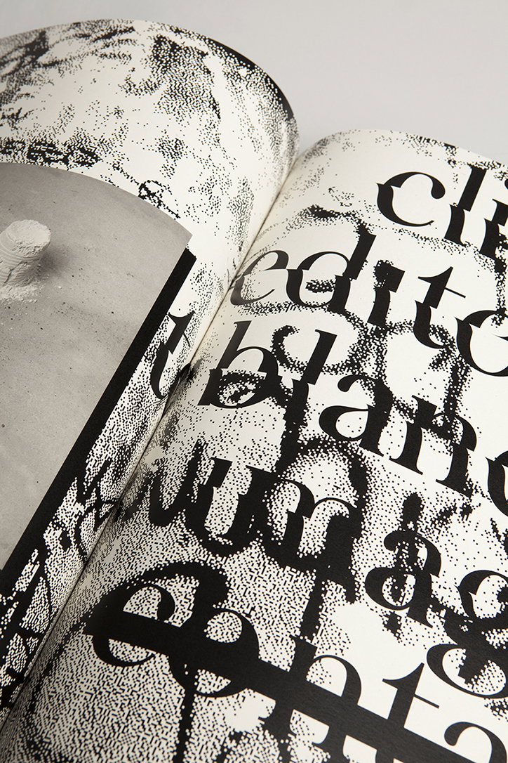
An open magazine featuring a black and white layout. Bold, distorted serif typography is layered over a grainy, stippled texture.
Above

Akatre: 924P

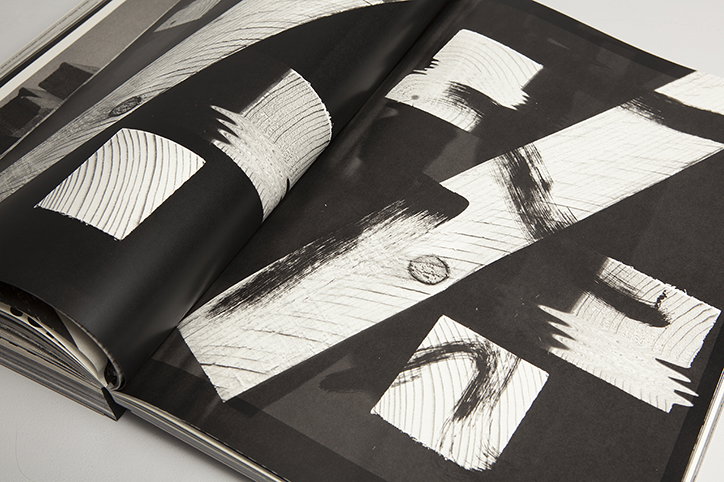
An open book displays high-contrast black and white prints of wood grain textures. The abstract, white organic shapes are scattered across dark pages.
Above

Akatre: 924P

Share Article

Further Info

About the Author

Alexander Hawkins

—

It's Nice That Newsletters

Fancy a bit of It's Nice That in your inbox? Sign up to our newsletters and we'll keep you in the loop with everything good going on in the creative world.