Anagrama's identity for Mexican sweet and tea shop Bonnard is all sorts of excellent
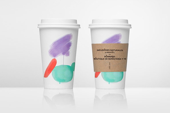
What’s your favourite French inspired tea and confectionary shop in Mexico? What none? Ok, well you should sort that out we reckon – as for us we’d plump for Bonnard simply because of their really eye-catching identity created by Anagrama. The splashes of colour are based on the work of postimpressionist Pierre Bonard and the simple, clean art direction and unfussy typography is all designed to create an air of Gallic cool. There’s also a nice touch in that the rounded cross detail in the typeface is based on the shape of macaroons, one of Bonnard’s specialities. Now look me in the eye and tell me you wouldn’t love to sashay into the office with one of these tea cups?
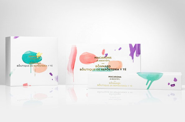
Anagrama: Bonnard (Product branding)
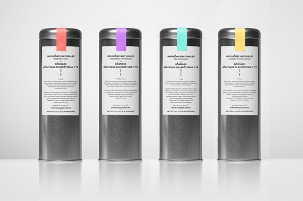
Anagrama: Bonnard (Metallic tea packaging)
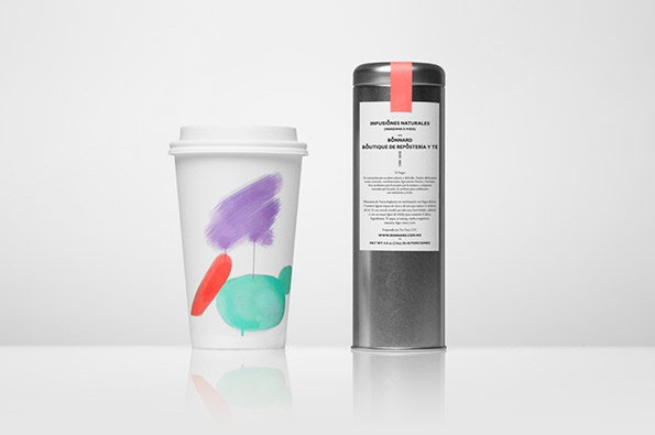
Anagrama: Bonnard (Tea cup and metallic tea packaging)
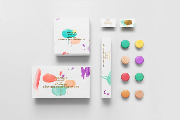
Anagrama: Bonnard (Macaroon packaging)
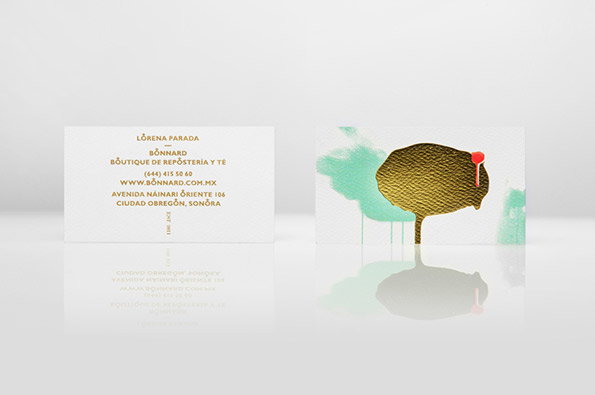
Anagrama: Bonnard (Business card)
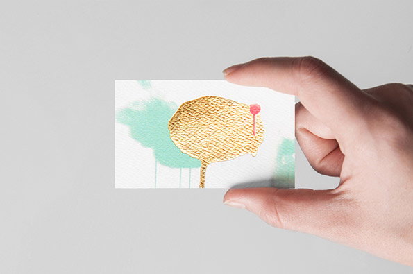
Anagrama: Bonnard (Business card)
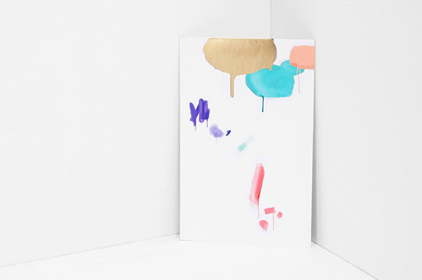
Anagrama: Bonnard (Brand leaflet)
Share Article
Further Info
About the Author
—
Rob Alderson is a freelance writer, editor and strategist. He was previously editor-in-chief of It’s Nice That and WePresent, and editor of Design Week. He publishes the newsletter Undo, which tries to make sense of how AI is changing design work, the design process and the design industry.