Launch Recite Me assistive technology
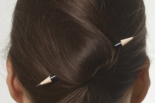
The back of a person's head with brown hair tied in a bun. Two sharpened pencils are used as hairpins to hold the style in place.

Graphic Design: Impressive sleek new redesign for Art Review magazine

—
Date
4 September 2013

With a heritage spanning more than 60 years and a roll call of contributors that includes Matisse and J.G. Ballard, a redesign of a title like Art Review cannot be undertaken lightly. The magazine’s design team have worked with John Morgan Studio to ensure that the new look and feel, which made its bow in the recent September issue, lived up to its illustrious pedigree.

There’s a new masthead, a simplified, pared-back page layout with an extra five mm of space to give everything a bit more room to breathe. There’s a switch to Lexicon for the typeface and text bubbles scattered throughout the publication aim to ensure it keeps a lightness of tone.

Overall it’s impressive stuff; personally I felt it was less headachy claustrophobic than some of its art world competitors. And I’m loving Fernanda Gomes’ cover photo as well and with plans for even more specially-commissioned covers over coming issues, I can’t wait to see what else they come up with.
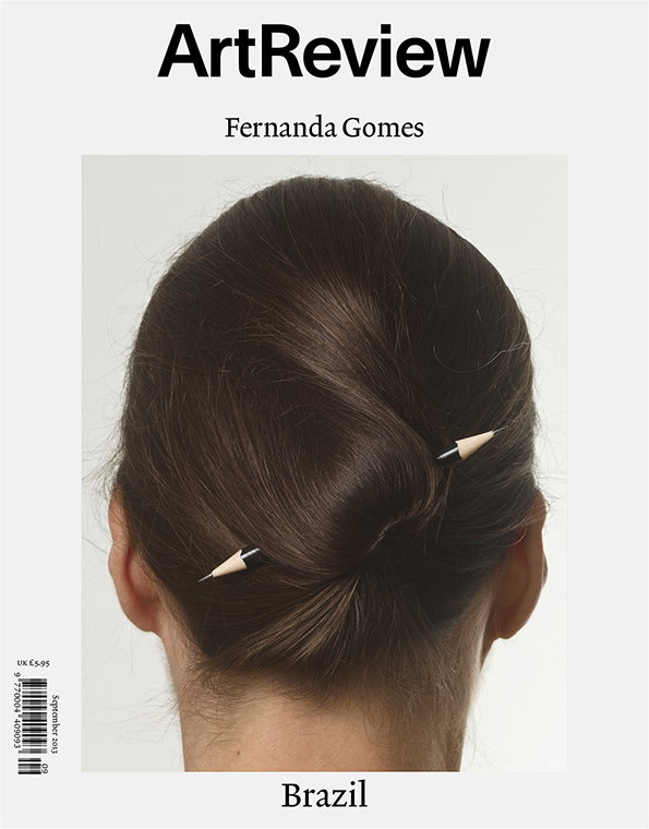
The cover of Art Review magazine features a person’s head from behind, their brown hair tied in a bun. Two pencils are pushed through the hair to hold the style in place. The text “Art Review”, “Fernanda Gomes” and “Brazil” appear on the white background.
Above

John Morgan Studio: Art Review September 2013 (Photo by Pat Kilgore)
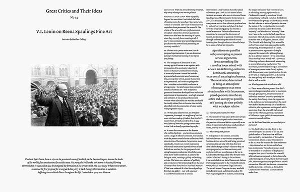
A black and white photograph of V.I. Lenin addressing a crowd, gesturing with one arm raised. The image is part of a printed page titled “Great Critics and Their Ideas” and “V.I. Lenin on Reena Spaulings Fine Art”.
Above

John Morgan Studio: Art Review September 2013
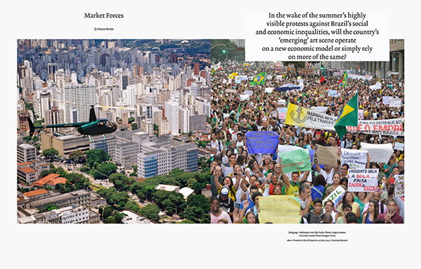
A double-page magazine spread titled “Market Forces”. The left page shows a helicopter flying over a dense cityscape of high-rise buildings and green parks. The right page features a crowded street protest with people holding various banners and flags.
Above

John Morgan Studio: Art Review September 2013
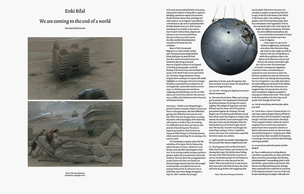
A double-page spread of an interview with Enki Bilal. The left page features a headline that reads “We are coming to the end of a world” above a vertical illustration of a person lying on their back in a desolate, grey landscape.
Above

John Morgan Studio: Art Review September 2013
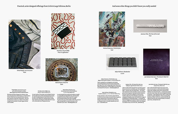
A double-page catalogue spread featuring various artist-designed products. The pages display a mix of photography and artwork, including a denim garment, a patterned textile, a painting, a chocolate bar and a book. Small blocks of descriptive text and prices accompany each item.
Above

John Morgan Studio: Art Review September 2013
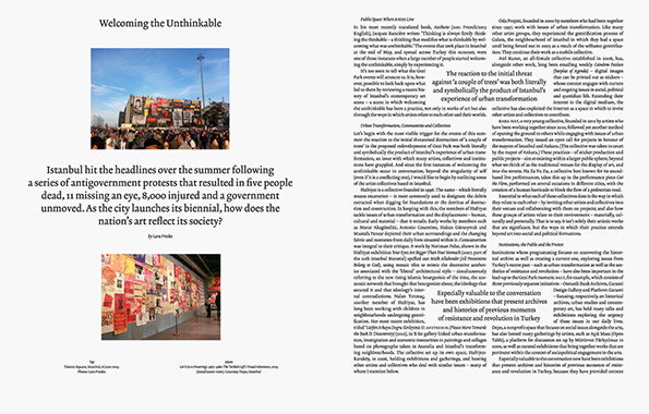
A layout of a magazine article titled “Welcoming the Unthinkable”. The page features a large photograph of a person standing in a brightly lit, red-walled gallery space filled with art.
Above

John Morgan Studio: Art Review September 2013
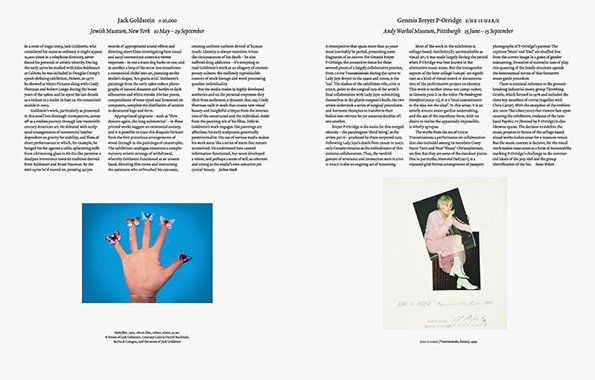
A two-page spread from a publication. The left page features a close-up of a hand with blue butterflies resting on the fingers, while the right page shows a person reclining in a chair. Both pages are framed by dense columns of editorial text.
Above

John Morgan Studio: Art Review September 2013

Share Article

About the Author

Rob Alderson

—

Rob Alderson is a freelance writer, editor and strategist. He was previously editor-in-chief of It’s Nice That and WePresent, and editor of Design Week. He publishes the newsletter Undo, which tries to make sense of how AI is changing design work, the design process and the design industry.
It's Nice That Newsletters

Fancy a bit of It's Nice That in your inbox? Sign up to our newsletters and we'll keep you in the loop with everything good going on in the creative world.