Launch Recite Me assistive technology
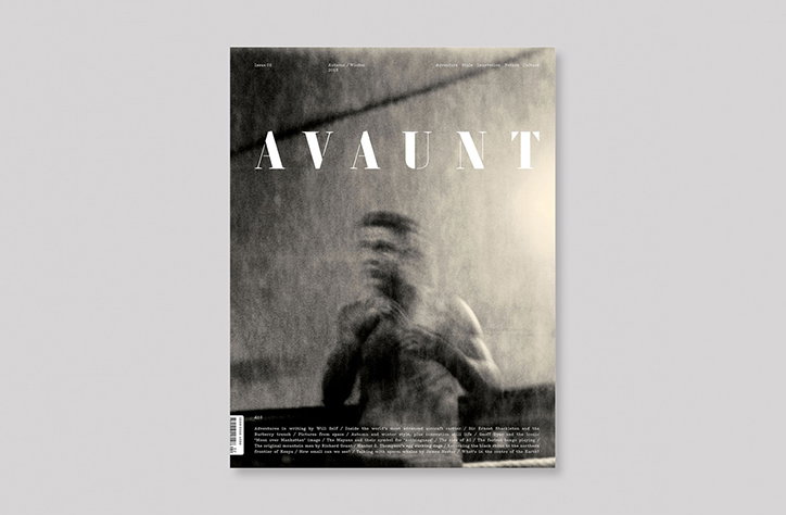
The cover of Avaunt magazine features a blurred, black and white photograph of a person. The title “AVAUNT” is printed in a bold, white serif typeface across the centre.

A look at the impeccable second issue of Dan Crowe and Matt Willey’s Avaunt

—
Date
25 September 2015

Earlier this year co-founders of Port, Matt Willey and Dan Crowe, teamed up with explorer Ben Saunders to launch a beautiful and intelligent adventure magazine. As eye-catching as it is readable, the second issue of Avaunt came out yesterday with identifiably Willey-esque flourishes abound.

The design is a joint effort shared by Matt, who heads up the magazine’s creative direction, and design director Alex Hunting, and brings together bold lettering, stencil and embellished serif type choices, and impeccable attention to detail. As is the way with Matt’s editorial design, an interest in the space around text and images is what creates dynamic page layouts.

Avaunt covers aren’t intended to illustrate stories from its pages, and following on from Giles Revell’s nine photographs of acrobat Charlie Wheeler for the inaugural issue, London-based photographer Jack Davison was virtually given carte blanche for the cover of issue two, asked only interpret the word adventure. For this he took to The Fitzroy Lodge boxing club in south London and created an energetic portrait that verges on abstract.

As its name suggests, Avaunt continues to embody adventure in its broadest sense and charges forth with issue two, marrying nuanced design with engaging content.

The author of this piece contributes to Avaunt.
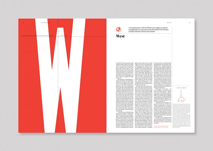
A double-page magazine spread featuring a large, bold red “W” that spans across both pages. The right page contains a title reading “West” and several columns of justified body text.
Above

Avaunt Issue Two

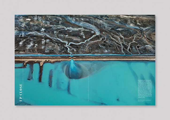
An open magazine spread featuring an aerial photograph of a landscape. A dark, textured terrain with winding white riverbeds is separated by a straight road from a bright turquoise body of water. Vertical text on the left reads “UP CLOSE”. A block of small body copy is positioned in the bottom right corner.
Above

Avaunt Issue Two

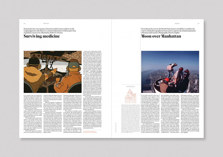
An open magazine spread featuring two articles. The left page, titled “Surviving medicine”, shows an illustration of a person in heavy winter gear and goggles. The right page, titled “Moon over Manhattan”, features a photograph of a person climbing a high structure overlooking a city skyline.
Above

Avaunt Issue Two

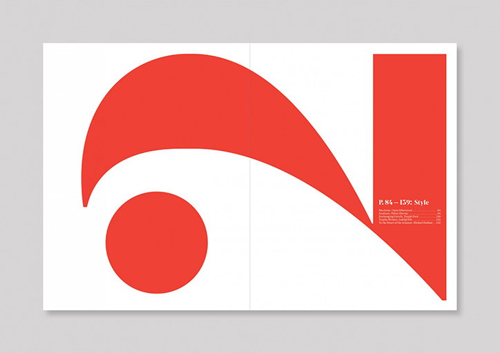
A double-page spread featuring a large, abstract red shape that curves across the white pages. Text on the right reads “P. 84–139: Style”, followed by a list of articles and authors.
Above

Avaunt Issue Two

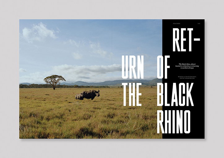
A double-page magazine spread featuring a black rhino and its calf in a grassy plain. Bold white typography reads “Return of the Black Rhino”, with a short introductory paragraph and credits.
Above

Avaunt Issue Two

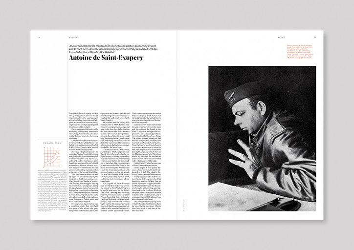
An open magazine spread featuring a black and white portrait of Antoine de Saint-Exupéry. The opposite page contains a biographical article with the headline “Antoine de Saint-Exupéry”.
Above

Avaunt Issue Two

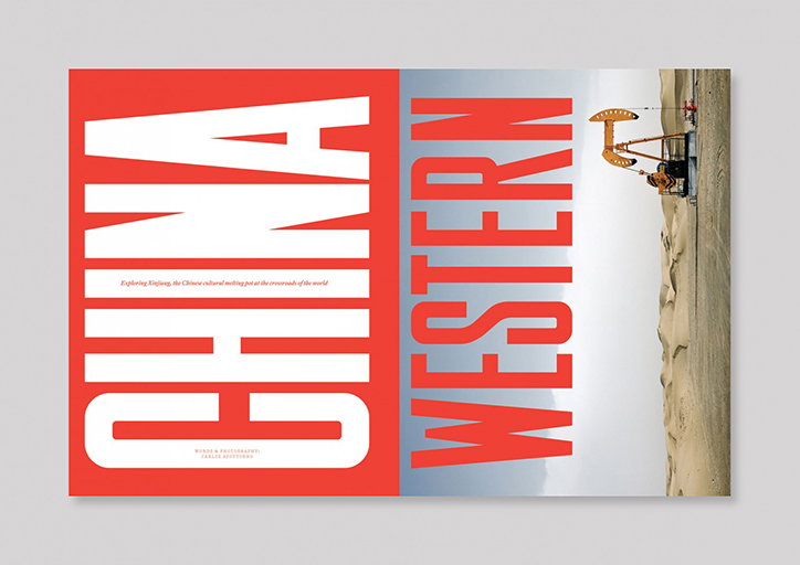
A magazine spread with a bold red and white layout. The left page features the word “CHINA” in large white type, while the right page shows “WESTERN” in red over a photo of an oil pump in a desert.
Above

Avaunt Issue Two

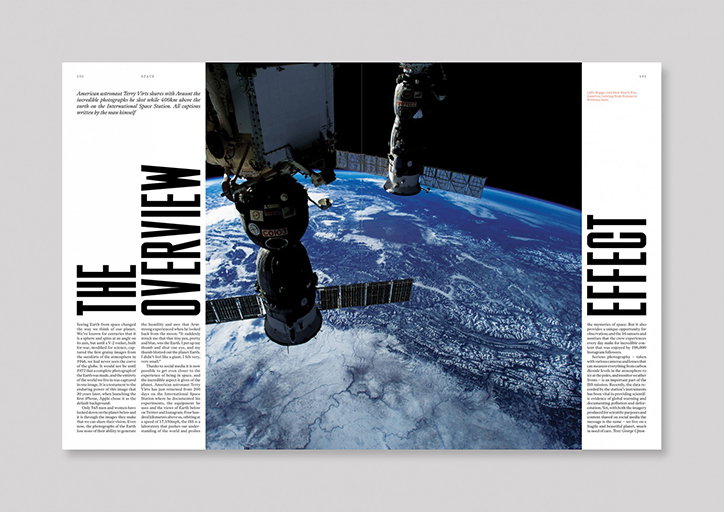
A double-page magazine spread featuring a photograph of the International Space Station orbiting Earth. Bold, vertical typography reads “THE OVERVIEW EFFECT” across the layout, accompanied by columns of introductory text.
Above

Avaunt Issue Two

Share Article

About the Author

Alexander Hawkins

—

It's Nice That Newsletters

Fancy a bit of It's Nice That in your inbox? Sign up to our newsletters and we'll keep you in the loop with everything good going on in the creative world.