Launch Recite Me assistive technology
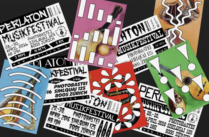
A collection of posters and flyers for the “Perlaton Musikfestival” in Zurich. The designs feature bold typography, abstract shapes, and images of stringed instruments against bright red, green, and pink backgrounds.

Badesaison - the Swiss design studio that can handle everything from Dada to music

—
Date
26 August 2016

Earlier this year graphic design studio Badesaison created an advertising campaign for “Perlaton”, an annual music festival held in Zurich. The studio’s approach to design is ideal for the event – unbiased in genre or taste – and in many ways the studio shares values that represent the festival as a whole. For this campaign the studio reference a number of typefaces that could be related to any genre of music, a gothic style balanced against graffiti typography. Their ability of combining and contrasting elements doesn’t stop there. Black and white layouts are mixed with highly saturated still life photography which sit comfortably on the page they’ve designed for it.

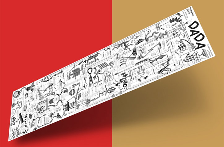
Back in May the studio created the official program for Festspiele Zurich 2016 dedicated to the anniversary of Dadaism. “This machine we created is a collage from a very old tool catalogue, we found in a thrift shop” the duo explain, “Our inspiration was the french dadaist Francis Picabia and his imaginitive blue prints. It works a flow chart, that guides the reader to a certain event of his interest.”

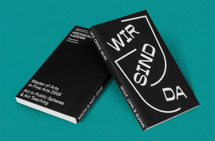
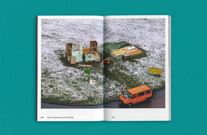
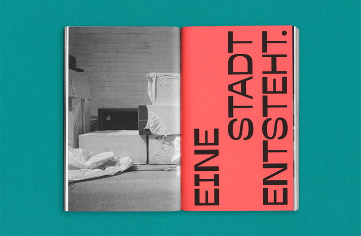
More recently Badesaison designed Wir Sind Da a publication for the masters degree of fine arts for the University of Arts Lucerne. For the brief they shot a “photographic portrait of the city” where the exhibition took place. “The individual characteristics of the City, with its huge factories and construction sites is reflected in our design as well as in the artworks of the students,” say the designers.
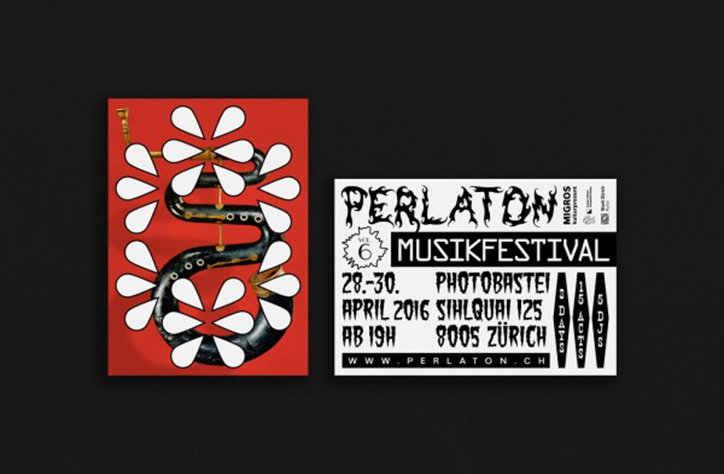
Two posters against a black background. One is red with a black, winding shape surrounded by white floral patterns. The other is white and black, reading “Perlaton Musikfestival” with the dates “28.–30. April 2016” and the location “Zürich”.
Above

Badesaison: Perlaton

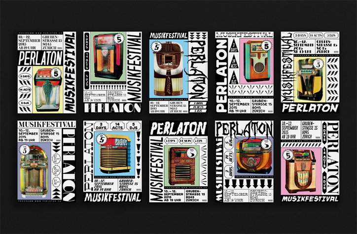
A series of 12 graphic posters for a music festival, arranged in two rows of six. Each poster features a different vintage radio and the words “Perlaton” and “Musikfestival”.
Above

Badesaison: Perlaton

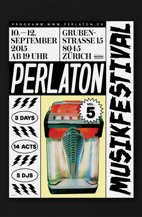
A black and white typographic poster for the “Perlaton Musikfestival”. It features a central illustration of a vintage jukebox and a starburst badge reading “Vol. 5”. The poster lists the dates “10.–12. September 2015” and the location “Grubenstrasse 15, 8045 Zürich”. Additional text notes “3 days”, “14 acts” and “5 djs”.
Above
Left

Badesaison: Perlaton

Right

Badesaison: Perlaton

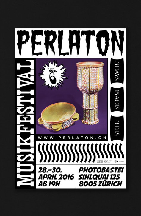
A black and white poster for the “Perlaton Musikfestival” featuring a purple central panel. Inside the panel, two gold-coloured drums are shown alongside a starburst containing the text “Vol. 6”. The poster lists the dates “28.–30. April 2016” and the venue “Photobastei” in Zurich. A side banner notes the event lasts “3 days” with “15 acts” and “3 DJs”.
Above

Badesaison: Perlaton

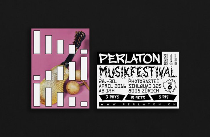
Two posters for a music festival against a dark grey background. One is pink with a fragmented image of a guitar and white rectangular blocks. The other is black and white, featuring bold typography that reads “Perlaton Musikfestival” and lists the dates “28.–30. April 2016” in Zurich.
Above

Badesaison: Perlaton

A long, narrow illustration featuring a dense collection of abstract black line drawings and diagrams on a white background. The word “DADA” appears in bold, blocky letters at the top right.
Above

Badesaison: Festspiele Zurich

Two black books with white text are angled against a teal background. One cover reads “Master of Arts in Fine Arts 2016” and “Art in Public Spheres & Art Teaching”, while the other features the bold phrase “WIR SIND DA”.
Above

Badesaison: Wir Sind Da

An open book shows a photograph of a construction site in a snowy field. An orange van is parked beside a small wooden structure and a yellow sign that reads “SUPER LOTTO”.
Above

Badesaison: Wir Sind Da

An open book shows a black and white photograph of draped, blocky shapes on the left. The right page is bright red with bold, black vertical text that reads “EINE STADT ENTSTEHT.”
Above

Badesaison: Wir Sind Da

Share Article

Further Info

About the Author

Lucy Bourton

—

Lucy (she/her) was part of the It’s Nice That team from 2016–2025, first joining as a staff writer after graduating from Chelsea College of Art with a degree in Graphic Design Communication, eventually becoming a senior editor on our editorial team, and most recently at Insights, a research-driven department with It’s Nice That.


It's Nice That Newsletters

Fancy a bit of It's Nice That in your inbox? Sign up to our newsletters and we'll keep you in the loop with everything good going on in the creative world.