Launch Recite Me assistive technology
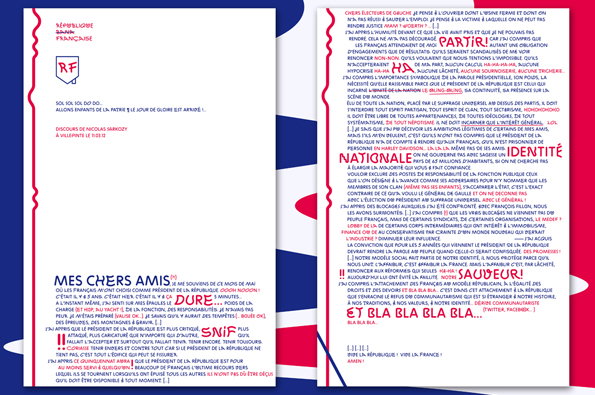
A collage of three white pages featuring dense French text and red markings. The central page begins with the heading “MES CHERS AMIS” and includes handwritten red annotations such as “DURE” and “SNIF”.

A look at Benoit Bodhuin's benbenworld and latest font ZIGZAG

—
Date
10 April 2012

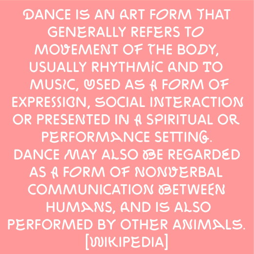
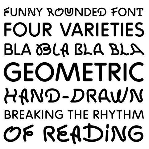
benbenworld is Benoît Bodhuin, a graphic designer and “créateur de caractères” (of the typographic persuasion). His latest update is ZIGZAG, a fun font that aims to break the rhythm of reading by using a rotation of four varieties of each letter in the alphabet, all of which retain the same rounded, loose letter forms.

Much of what Benoît does is equal parts play to colour, succinctly designed so that it stays far from anything gimmicky or trite, experimentally – yet professionally – applied to a range of traditional design media. His portfolio to date proves him to be a progressive designer, so one to keep an eye on for sure.
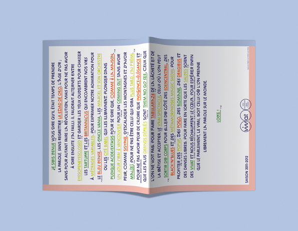
An open brochure featuring a page of dense French text. The words are printed in black, with various phrases highlighted in bright green, orange, blue and red.
Above

Benoit Bodhuin, ZIGZAG

White text on a pink background provides a definition of dance. The text reads “Dance is an art form that generally refers to movement of the body,” and attributes the quote to “[Wikipedia]”.
Above

Benoit Bodhuin, ZIGZAG

A typographic specimen showing a rounded, hand-drawn font in black on a white background. The text reads “FUNNY ROUNDED FONT”, “FOUR VARIETIES”, “BLA BLA BLA BLA”, “GEOMETRIC”, “HAND-DRAWN” and “BREAKING THE RHYTHM OF READING”.
Above

Benoit Bodhuin, ZIGZAG

Share Article

About the Author

Bryony Quinn

—

Bryony was It’s Nice That’s first ever intern and worked her way up to assistant online editor before moving on to pursue other interests in the summer of 2012.


It's Nice That Newsletters

Fancy a bit of It's Nice That in your inbox? Sign up to our newsletters and we'll keep you in the loop with everything good going on in the creative world.