Brick magazine enlists Hort, Mirko Borsche and more for a special tribute to Phife Dawg
Last year, we here at It’s Nice That raved about the launch of new hip-hop periodical, Brick, noting in particular its strong logotype, clean design and great content. The second issue of the magazine, launched today, includes a vibrant tribute to the lyrical prowess of Phife Dawg, one of the founding members of A Tribe Called Quest who died in March this year.
14 tritone graphic posters in black, white and salmon have designed by an impressive list of artists and designers including Hort, Mirko Borsche and Catalogue. Brick Design Director, Ric Bell, further encouraged a breadth of response, “the only restrictions we placed on the brief was the limited colour palette as a way of tying everybody’s contributions together, but apart from that, the artists were free to interpret their lines as they saw fit.”
Each of these illustrated epitaphs respond to a personal selection of Phife’s most quotable work, highlighting the emotional irreverence of his songs and place in hip-hop culture. As Hayley Louisa Brown, editor in chief and founder of Brick, explained: “we really wanted to reflect their unconventional musicality in the way we put this together.”
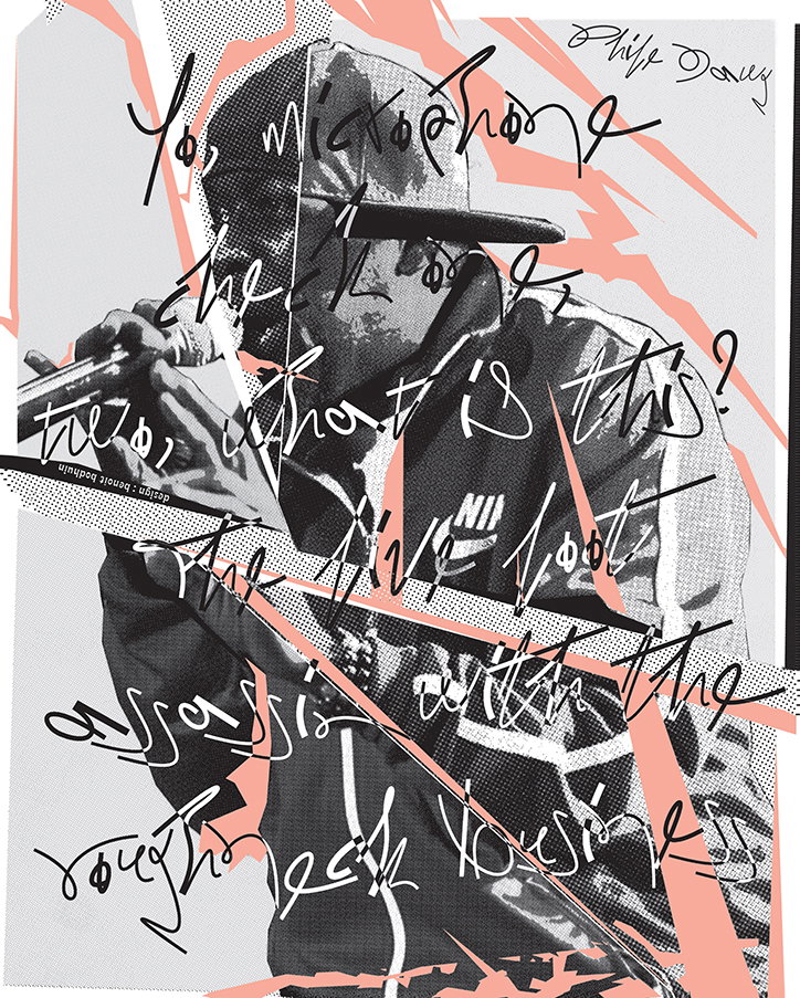
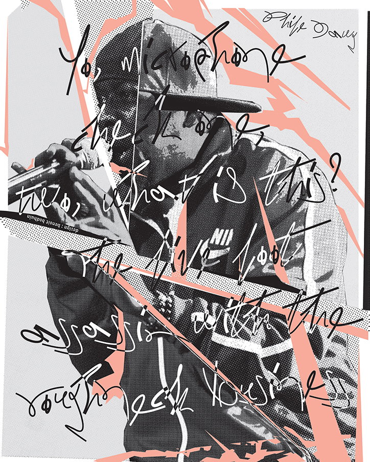
Elsewhere in the feature, BCMH has contributed a minimalist flow chart with arrows directing through the rapped list of double acts who “mashed up the party,” while Benoît Bodhuin submitted a collaged portrait of Phife Dawg in action overlayed with an erratic typeface. While, Nonporous depicts an emblematic “Phife 5” football shirt design as a reverent effigy of the man and his image.
The contributions are rounded out by strong offerings from the likes of Till Wiedeck, Corbin Mahieu, Anastasia Tasou, Bam Sailey, Baron Von Fany, Tim Head, Kasper Florio, and Adam Tickle.
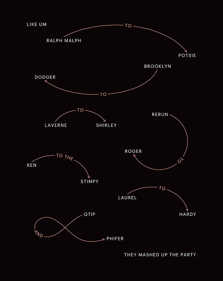
Brick: Issue #2, BCMH
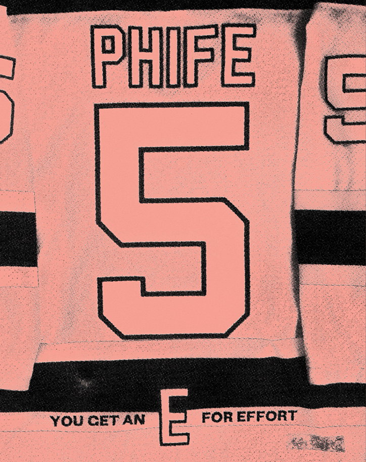
Brick: Issue #2, Nonporous
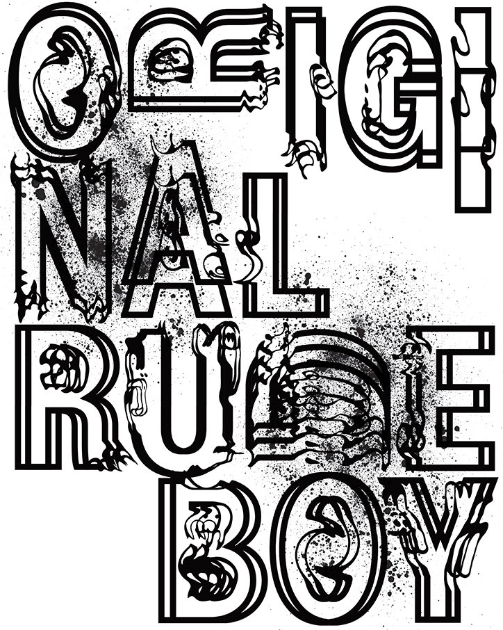
Brick: Issue #2, HORT
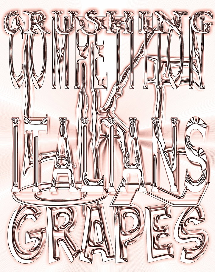
Brick: Issue #2, Mirko Borsche
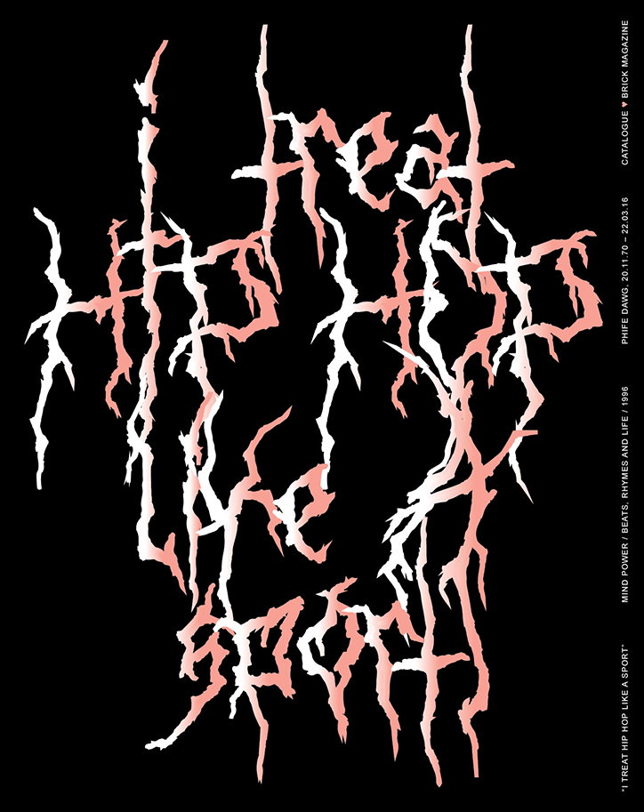
Brick: Issue #2, Catalogue
Share Article
Further Info
About the Author
—
Jamie joined It’s Nice That back in May 2016 as an editorial assistant. And, after a seven-year sojourn away planning advertising campaigns for the likes of The LEGO Group and Converse, he came back to look after New Business & Partnerships here at It’s Nice That until September 2024.