Caterina Bianchini releases new publication filled with hand drawn type
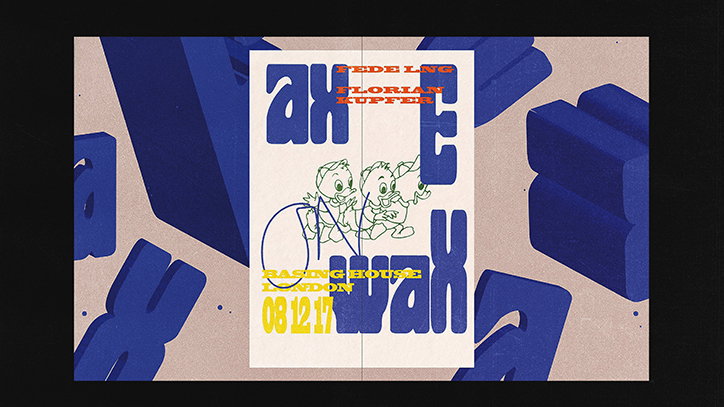
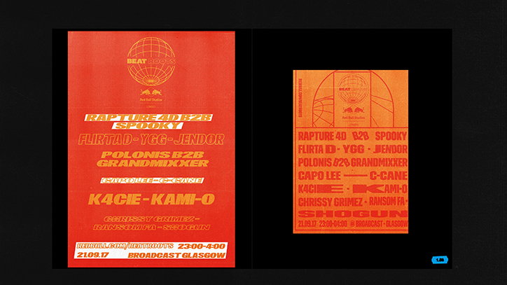
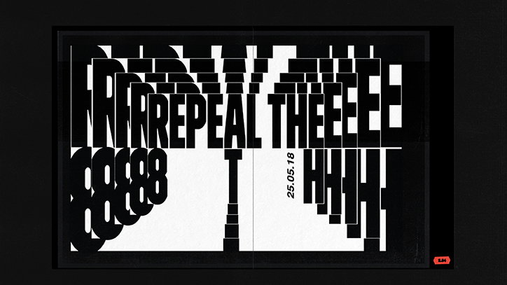
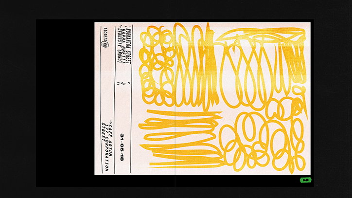
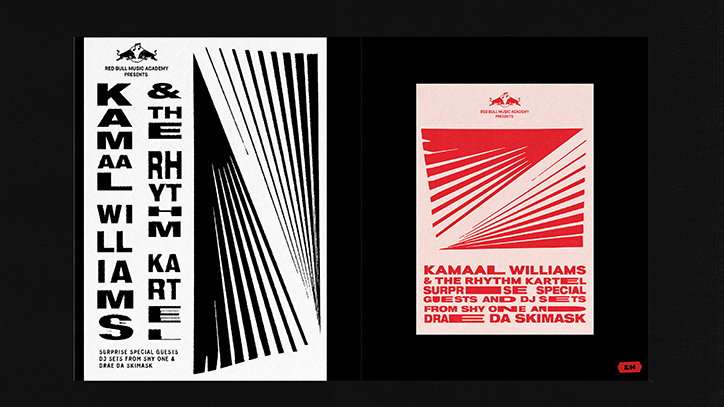
In today’s digital age, hand drawn type is less visible amidst the convenience of digital type that certifies uniformity. However, for the London-based designer Caterina Bianchini, hand drawn type is a key aspect of adding a touch of personality to her bold design aesthetic. Running an independent design studio of the founding designer’s name, Caterina has just released a visual catalogue titled See You at the Dance which compiles posters and EP covers that she has designed throughout 2018.
Speaking to It’s Nice That, Caterina discusses her signature use of hand drawn type: “I have always liked my designs to feel personal, and a way of creating that connection with the viewer is through hand drawn typography.” Through handcrafting individual letterforms, Caterina has found a way of creating new typography “that might not exist yet”. Additionally, hand drawn elements inject a sense of life and movement into the typography which can sometimes seem static, bordering on sterile. The designer says, “Ultimately, [hand drawn type] gives me more control as a designer to create something that is closer to my vision” – a highly personal vision that incorporates the DIY punk culture aesthetic with minimal, grid-based graphic design.
Caterina Bianchini: See You at the Dance
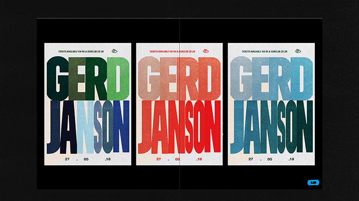
With high-calibre clients from the likes of Crack magazine, Red Bull and Boiler Room, Caterina’s personal highlights of See You at the Dance, includes work for the famous Glaswegian club, Sub Club. A personal client for the Scottish designer, Caterina describes the venue as “the Scottish Haçienda” which “defined the music scene in Scotland and continues to do so.” For this “dream client”, Caterina centred the posters on typography, playfully subverting the rules of typography by condensing certain letters with zero kerning in between each letter.
To further enhance the “hand made element” in the work, the designer creates her own textures. These textures “can be anything from scanning in a piece of paper and using the tactile flecks seen in the textural overlap; to using a Xerox scan texture over the letters.” Intrigued by the relationship between physical and digital work, she sometimes uses scanned prints of a digital printout as the final artwork as another way to incorporate texture into the design.
Her type design starts by sourcing “interesting concepts from art, art history and even essays”. After drawing up mood boards and collecting various ideas, she then sketches out the type to be scanned and digitalised. Alternatively, she finds an existing font that is admired and works into it to feel “unique and considered”. Despite the fact that See You at the Dance documents only a year’s worth of work, the publication is impressively large. The catalogue truly celebrates the design process, showcasing “the used and unused concepts” for artwork, evoking a “real scrapbook feel.” Released at a limited edition the book is currently
available and has already been archived in the Scottish heritage collections.
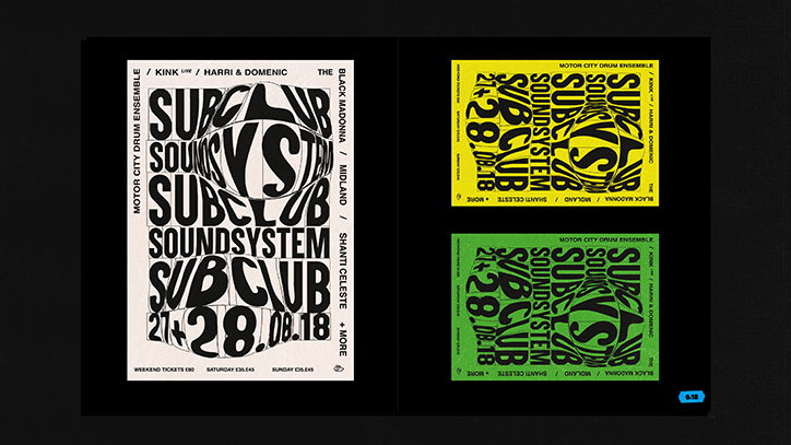
Caterina Bianchini: See You at the Dance
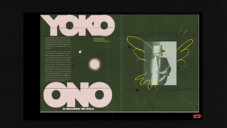
Caterina Bianchini: See You at the Dance
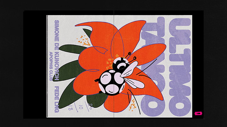
Caterina Bianchini: See You at the Dance
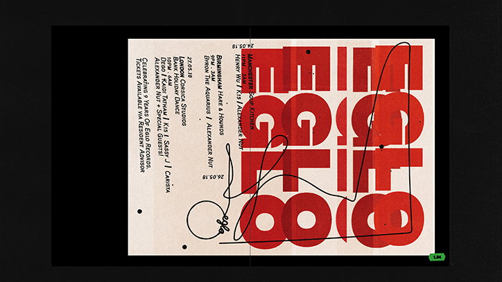
Caterina Bianchini: See You at the Dance
Caterina Bianchini: See You at the Dance
Caterina Bianchini: See You at the Dance
Caterina Bianchini: See You at the Dance
Caterina Bianchini: See You at the Dance
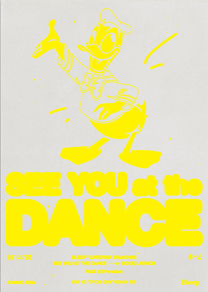
Caterina Bianchini: See You at the Dance
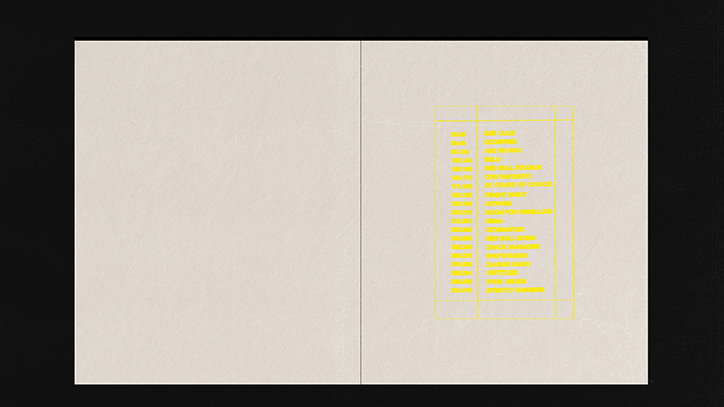
Caterina Bianchini: See You at the Dance
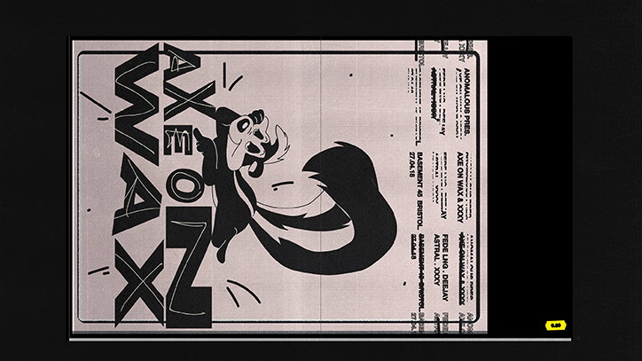
Caterina Bianchini: See You at the Dance
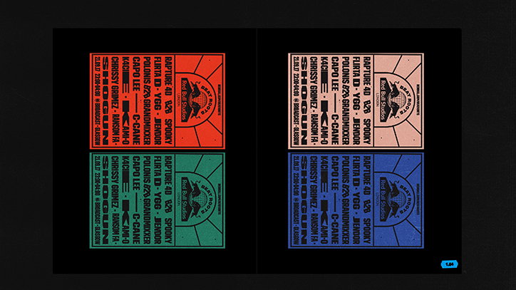
Caterina Bianchini: See You at the Dance
Share Article
Further Info
About the Author
—
Jynann joined It’s Nice That as an editorial assistant in August 2018 after graduating from The Glasgow School of Art’s Communication Design degree. In March 2019 she became a staff writer and in June 2021, she was made associate editor. She went freelance in 2022.