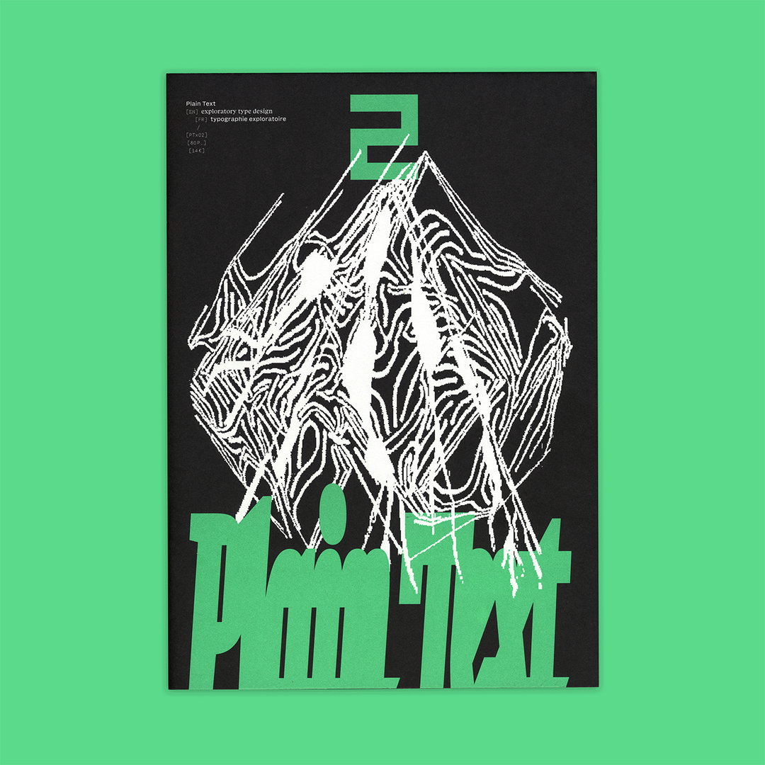
Plain Text is the experimental typography publication for seasoned designers and curious beginners
From the French foundry Plain Form, this publication is making way for judgment-free experimentation.
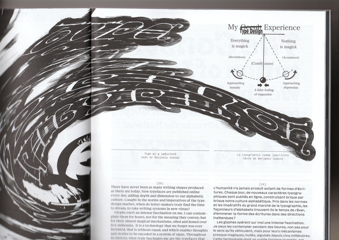
“We defend a poetic vision of type design,” says Lucas Descroix, founder of Plain Form, the boundary-pushing type foundry behind Plain Text, type design publication full of contributions from recognised practitioners as well as curious beginners. “We aim for Plain Text to be a space where letters are free from utilitarian expectations.” As an independent magazine without a distributor, they aim to make an inclusive space for designers to share doubts, successes and failures through bizarre typographies and alternative shapeforms. “Often, the market encourages self-censorship, inventive projects get clipped because they might confuse potential customers,” says Lucas. Through collecting and studying type faces that are non-traditional, Plain Text opens up new avenues for stories to be told through design.
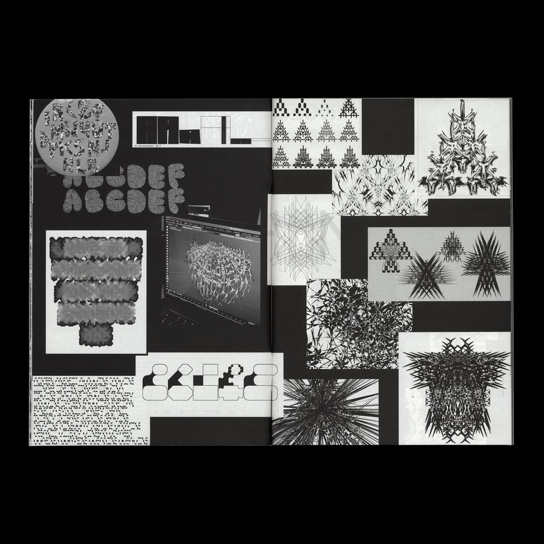
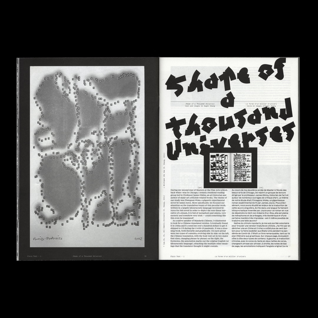
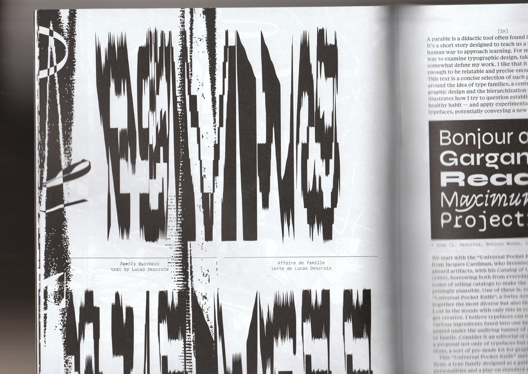
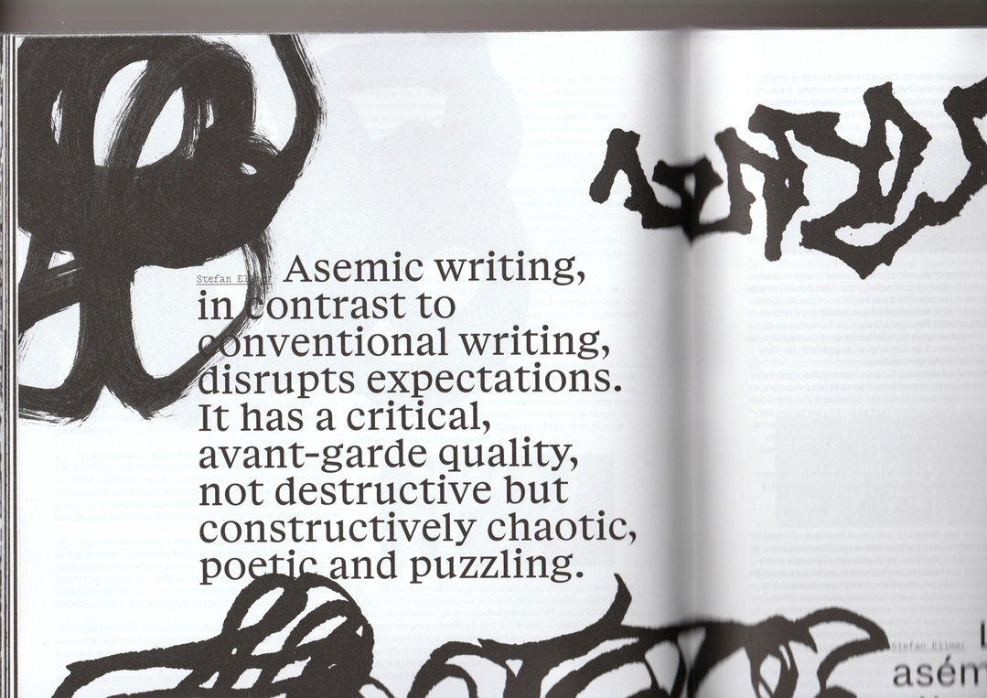
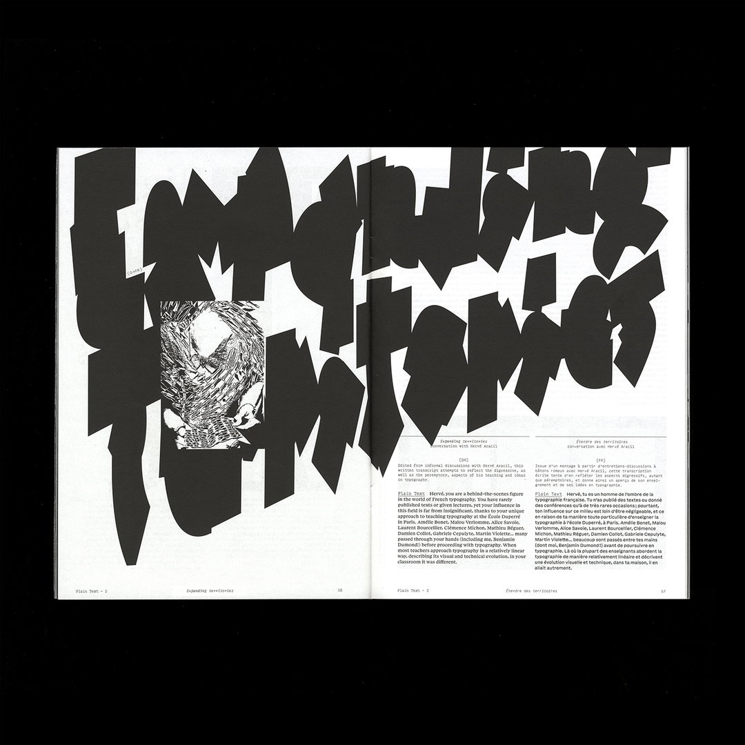
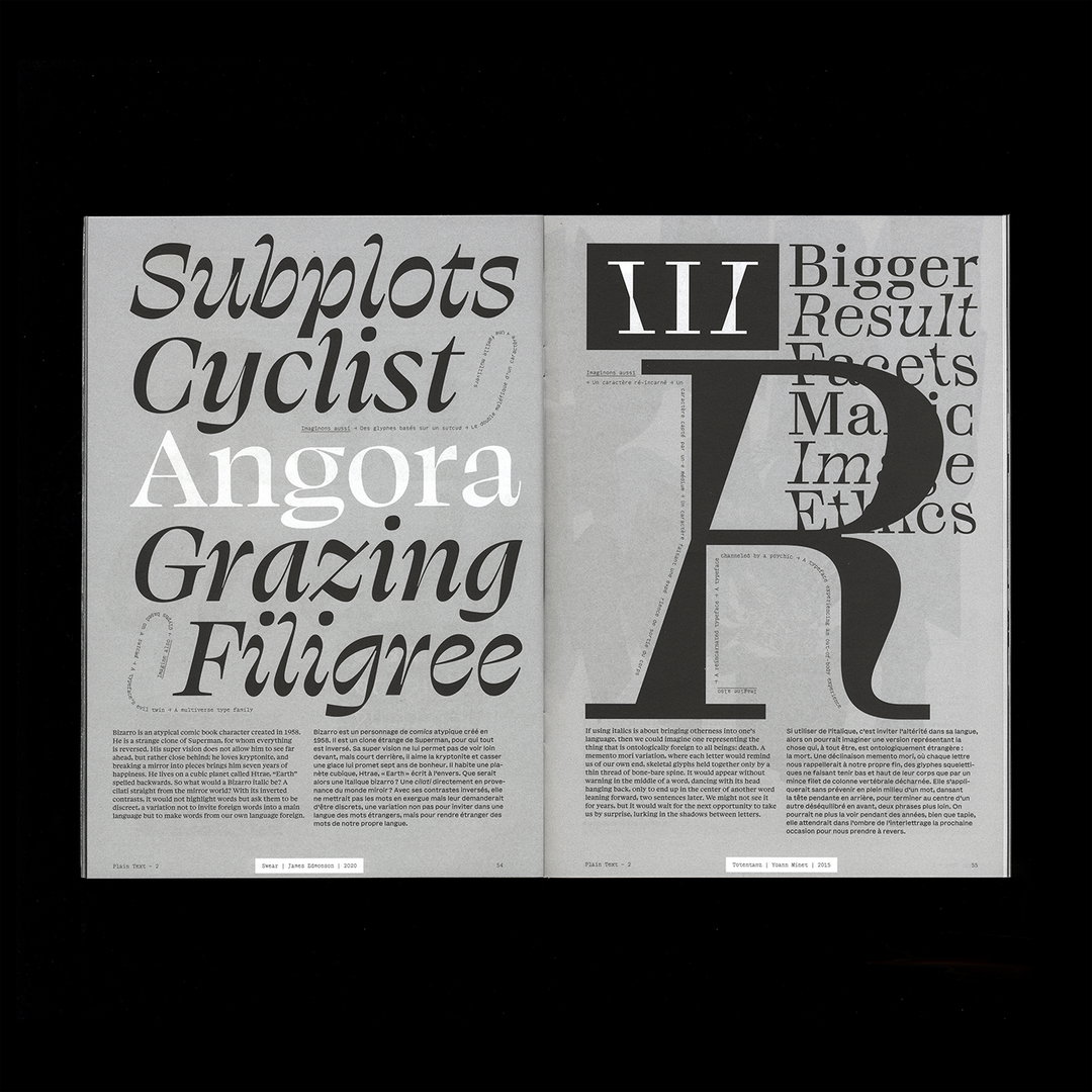
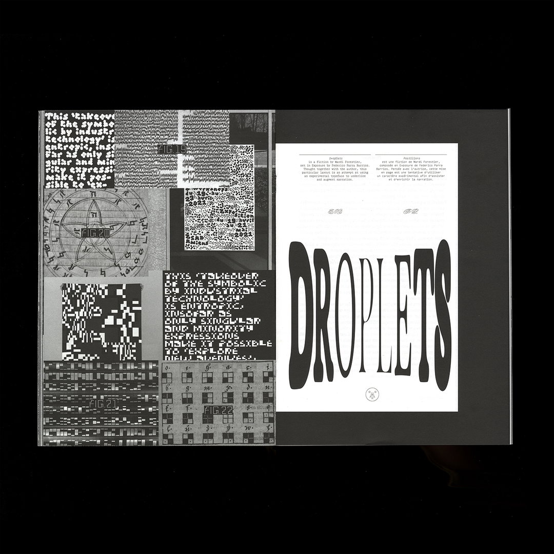
Featuring essays, interviews, portfolios, re-publications, fiction and visual works, Plain Text doesn’t just attempt to please experts in their field but students too, by offering valuable insights to language and communication. Plain Text’s first issue features calligraphic cursives and bold fonts blown to bits with distortive elements, turning otherwise ordinary typeface into barrages of spikes and assaults of waveform. Quite literally, the typographic norms that have laid the bed for typeface design is decimated and glued back together. “Typography works because of norms—but those norms are neither natural nor fixed,” says Lucas. “Alternative approaches to type design allow us to question what a system of letters does, what it’s allowed to do, and what kinds of relationships we can invent between form and meaning.”
(Copyright © Plain Form, 2025)
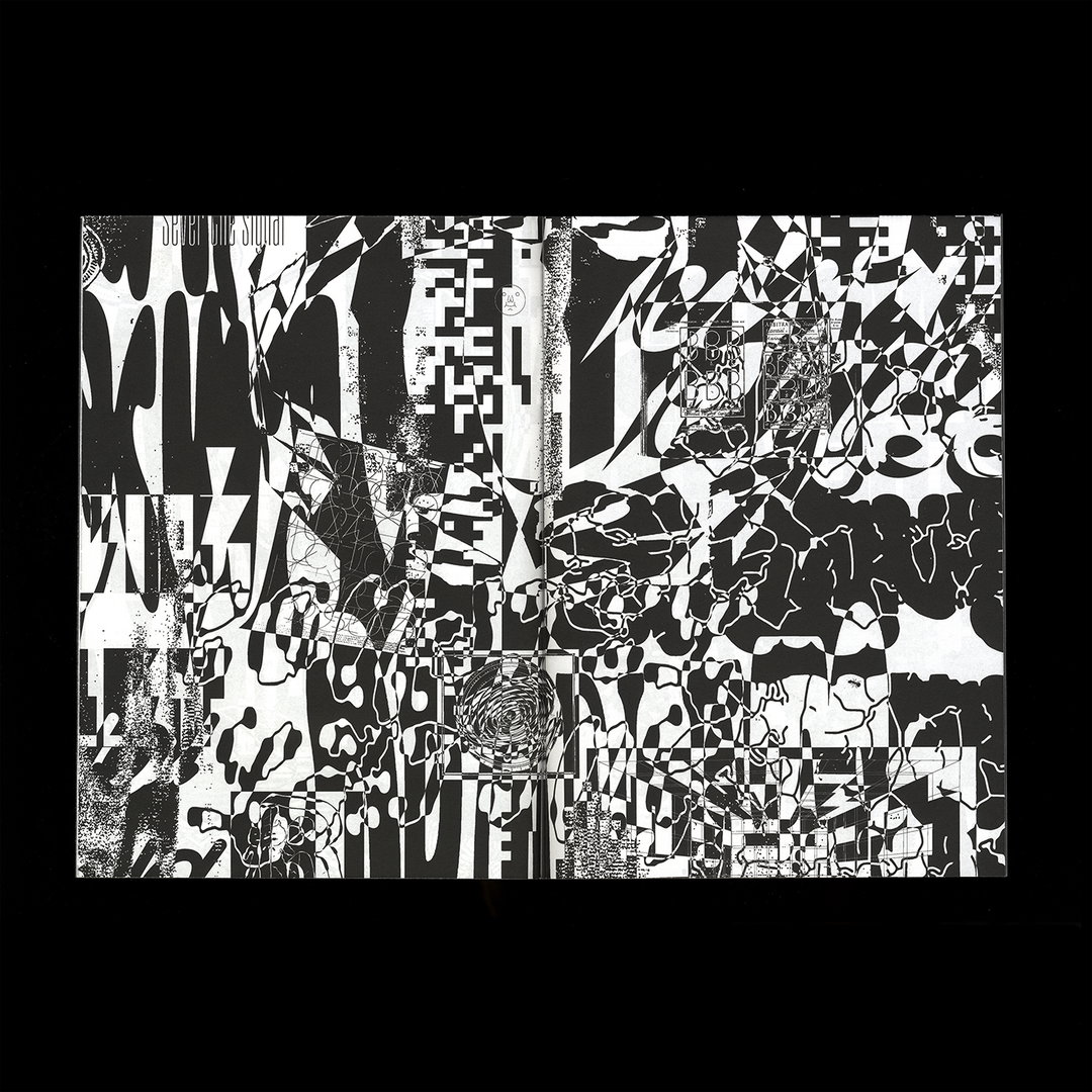
Printed in stark monochrome, each and every checkered page features angular explosions, garbled cursive and ribbons of jet black typography no doubt inspired by punk zine gnarliness. Within all of this, Plain Text’s poetic vision is realised through the blatant disregard for utilitarian values, opening up a moshpit of unique typography to dance across the page. “Plain Text is a platform for typographic thinking that doesn’t need to conform to standard formats, pretty much like our type foundry Plain Form already was,” says Lucas, “And because we operate through direct relationships with readers, our survival depends on the real interest our work generates. That’s what keeps us grounded and honest.”
Each zine is created from conversations, approaching writers, artists, and designers who are “already looking at typography sideways”. Instead of showcasing strong, isolated works, Plain Form aims to create a corpus of works that together explore and redraw the shifting boundaries of experimental typography. The physicality of Plain Text anchors the work in time, lending literal weight to gesture, and form to thought. “While the digital realm opens up new horizons—moving typography, parametric tools—we see the printed page as equally fertile ground for invention. There are still infinite ways to stage typography in print,” says Lucas. Publishing isn’t outdated, it’s an ongoing experiment, and Plain Form are charting its course with side steps and sharp turns.
Plain Form Issue 2 is available to buy now.
Gallery(Copyright © Plain Form, 2025)
Hero Header
(Copyright © Plain Form, 2025)
Share Article
Further Info
About the Author
—
Paul M (He/Him) is a Junior Writer at It’s Nice That since May 2025. He has a strong interest in graphic design, digital kitsch, multimedia painting, collage, nostalgia, analogue technology and all matters of strange stuff. pcm@itsnicethat.com
To submit your work to be featured on the site, see our Submissions Guide.