- Words
- Jenny Brewer
- —
- Date
- 2 November 2026
- Tags
“Designing a good poster is a dark art” – highlights from this year’s INTL poster competition
We chat to INTL festival co-founder James Gilchrist about how poster design has changed over the past decade and what to expect at this year’s show.
Share
Share
In some ways, anyone can design a poster, and a poster can be anything, so what makes a great one? And what is its purpose in today’s visual and cultural landscape? A good place to ponder these grand questions is the INTL poster exhibition, formerly known as Graphic Design Festival Scotland, a major event in the calendars of all self-respecting UK-based designers. Now part of a highly reputable design festival which encompasses a conference, workshops, live projects and an awards ceremony in a medieval castle, no less, the poster competition and exhibition remains at the core, and is where founders James Gilchrist and Beth Wilson have learned some of the secrets to those big questions about poster design. Here, they pick out three visual trends they’ve spotted amidst this year’s selection, and discuss how the medium has evolved in recent years.
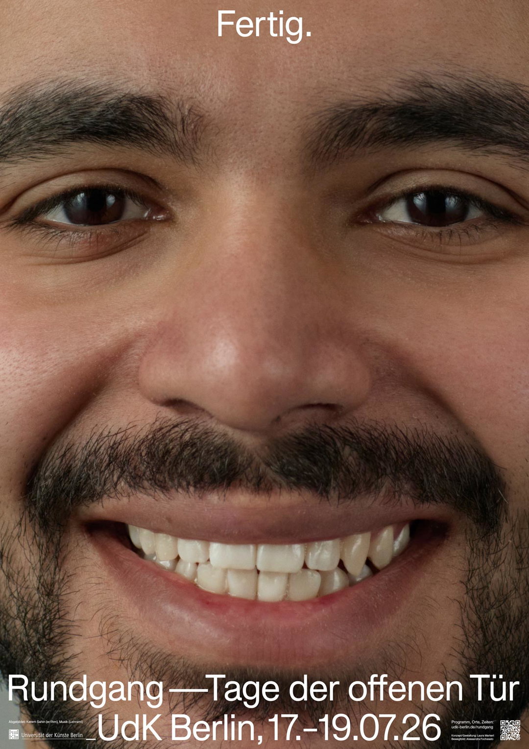
1 of 4
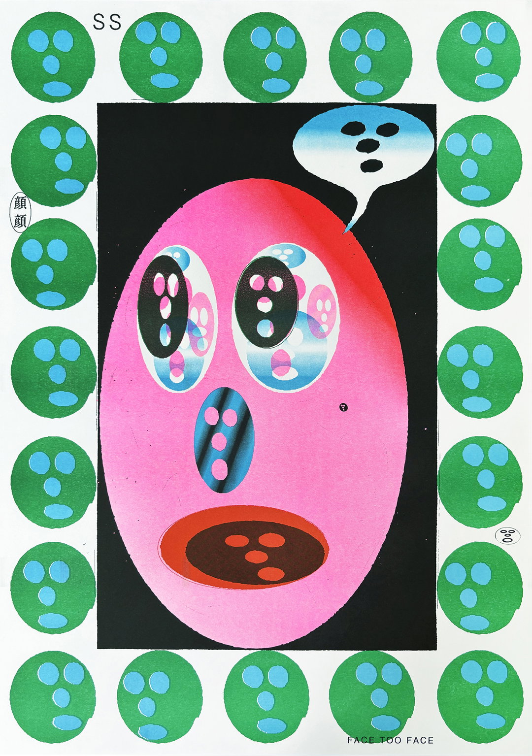
Shun Sasaki, Hand Saw Press: FACE TOO FACE, 2025 (Japan)
1 of 4
Shun Sasaki, Hand Saw Press: FACE TOO FACE, 2025 (Japan)
It’s Nice That:
You’ve been doing the poster competition a long time now… how has the medium changed in that time in your opinion? What is the purpose of the poster these days?
James Gilchrist:
We launched the International Poster Competition in 2014 as fresh-faced students on a mission to highlight the artistic and cultural value of posters. There is something timeless, powerful yet humble about the format.
The medium has changed as a result of the context surrounding posters, however the fundamental purpose of posters has not changed for hundreds of years, which I think contributes to the case for their value. A poster’s challenge was and remains to publicise, promote, persuade, provoke, perform – and sometimes protest.
A poster can serve such a broad spectrum of purposes, to an infinite range of individuals, and that’s what makes them interesting. A poster could be a large-format advertisement for a global brand, a signpost to an intimate local event, it could offer a framework for a manifesto, it could become a functional chart or calendar, a poster could be educational (think of those animal posters at school), it could be a talisman or tribal flag providing a sense of identity or belonging, it could be a formal instruction in a public space, it could be an interactive invitation for a community group, it could be made by hand, by machine, large, small, on paper, on fabric, on screen, in the sky. No matter the format or audience, a poster’s challenge remains to influence thought and/or catalyse behaviour through the power of visual form.
In terms of change, with the support of web links within the artwork, QR codes or captions online, there is less pressure on posters to communicate directly or ‘efficiently’. As a result designers can take on a more free and artistic approach, knowing that key information will be attached outwith the boundaries of their work.
The relentless attention economy and the increasing amount of visual information we have to process daily also means that standing out is more challenging than ever. As a result, originality and designers’ ability to create unique and memorable work is more crucial than ever before.
There is a lot of fear and scepticism around graphic design at the moment, however perhaps the homogenisation of graphic design through accessible tools and AI might actually work in favour of those who are pushing the envelope and pursuing thoughtful and captivating work which feels human and has soul.
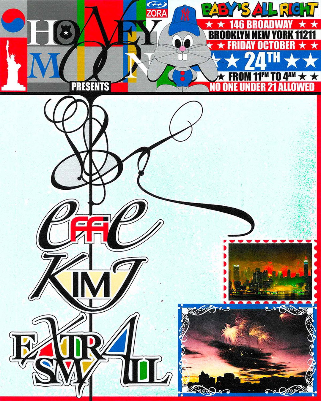
Edouard Nazé: HONEYMOON – 24.10.2025, 2025 (France)
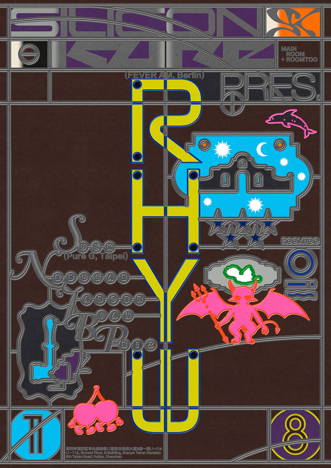
Haojun Pan: Silicon Kure pres. Rhyw, 2025 (China)
“No matter the format or audience, a poster’s challenge remains to influence thought and/or catalyse behaviour through the power of visual form.”
James Gilchrist
INT:
Why do you think poster design remains such a fun, expressive creative outlet for graphic designers?
JG:
Posters are the ultimate challenge. It’s easy to design a poster but it’s almost impossible to design a great poster. Because the guardrails are off, anything goes, posters are the ultimate creative arena. It’s a bit like ten-pin bowling. Sometimes you get a strike, but you don’t know how, when you try and repeat the formula, you get a gutter ball. Designing a good poster is a dark art.
There are so many considerations and possibilities; the process of creating a poster brings all of the core principles of visual communication into one format. You can’t hide anything in a poster. If something hasn’t been considered, it will be immediately obvious. It’s something everyone understands too. Everyone knows what a poster is, and everyone has an opinion!
I think posters straddle a sweet spot of transience, accessibility, immediacy and timelessness which make the format very beautiful. Unlike an identity system, a piece of signage, an e-commerce website or most of the other outputs we endeavour to create to make a living, posters usually have less pressure. Typically, they only have to perform for a short period of time. Printed on paper or not at all – making them fairly cheap to produce, replicate and share.
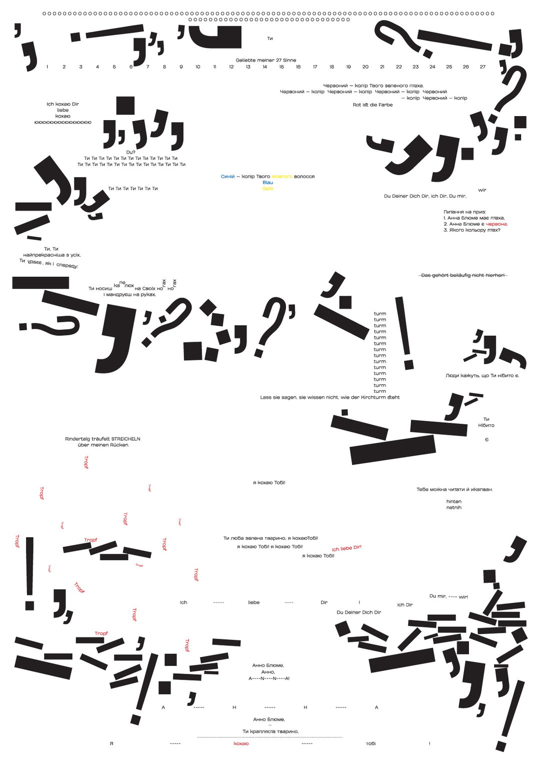
1 of 5
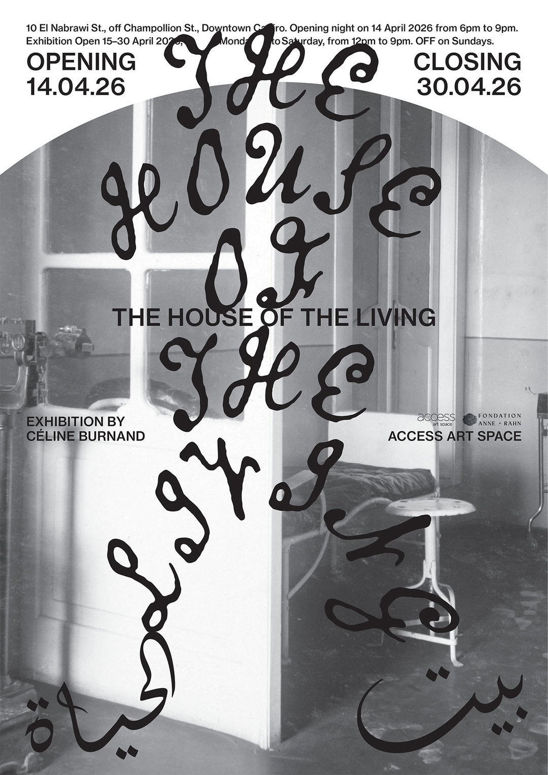
Rana Wassef: The House Of The Living, 2026 (Egypt)
1 of 5
Rana Wassef: The House Of The Living, 2026 (Egypt)
Posters also exist in public space physically and online, which makes them social performers. As a result, they are inherently political (as with all graphic design), but posters more-so, down to this public-facing aspect. A global brand can design a poster and a five-year-old child can design a poster. This creates an interesting juxtaposition when reviewing posters as a ‘medium’. The range of what can be considered a poster is unfathomably wide, and that’s exciting.
I also see posters as indicators of culture and society. If we consider what is being advertised, how it is being advertised, why it is being advertised, who are the intended audiences, how was the poster created, how was it shared, who created it and under what conditions. These questions only scratch the surface but these answers allow us to build an understanding of social, cultural and societal conditions.
When you visit a city, the collective impression of the posters offers a very unique perspective on the commercial and cultural climate of the city.
“It’s easy to design a poster but it’s almost impossible to design a great poster.”
James Gilchrist
INT:
What can you tell us about the range of people who’ve submitted this year and how that’s affected the sea of work you’ve received?
JG:
The competition received 2,670 submissions from 78 countries in 2026. Within that group, you can see posters created by people of all ages and at all stages of their creative journey and you can find value in each piece of work at each level. This makes curation difficult and delicate.
The majority of the work entered is created by people and groups who are designers by trade; professionally, in education or as hobbyists. Within that field, there is such a wide spectrum of individuals and perspectives. This is something we try to highlight in the poster book by interviewing various practitioners involved. It’s especially interesting to hear about the differences in attitude, values and industry between different countries.
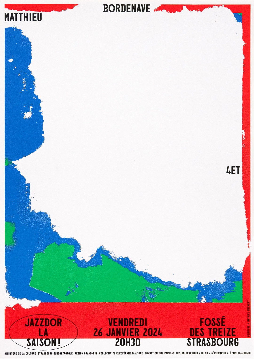
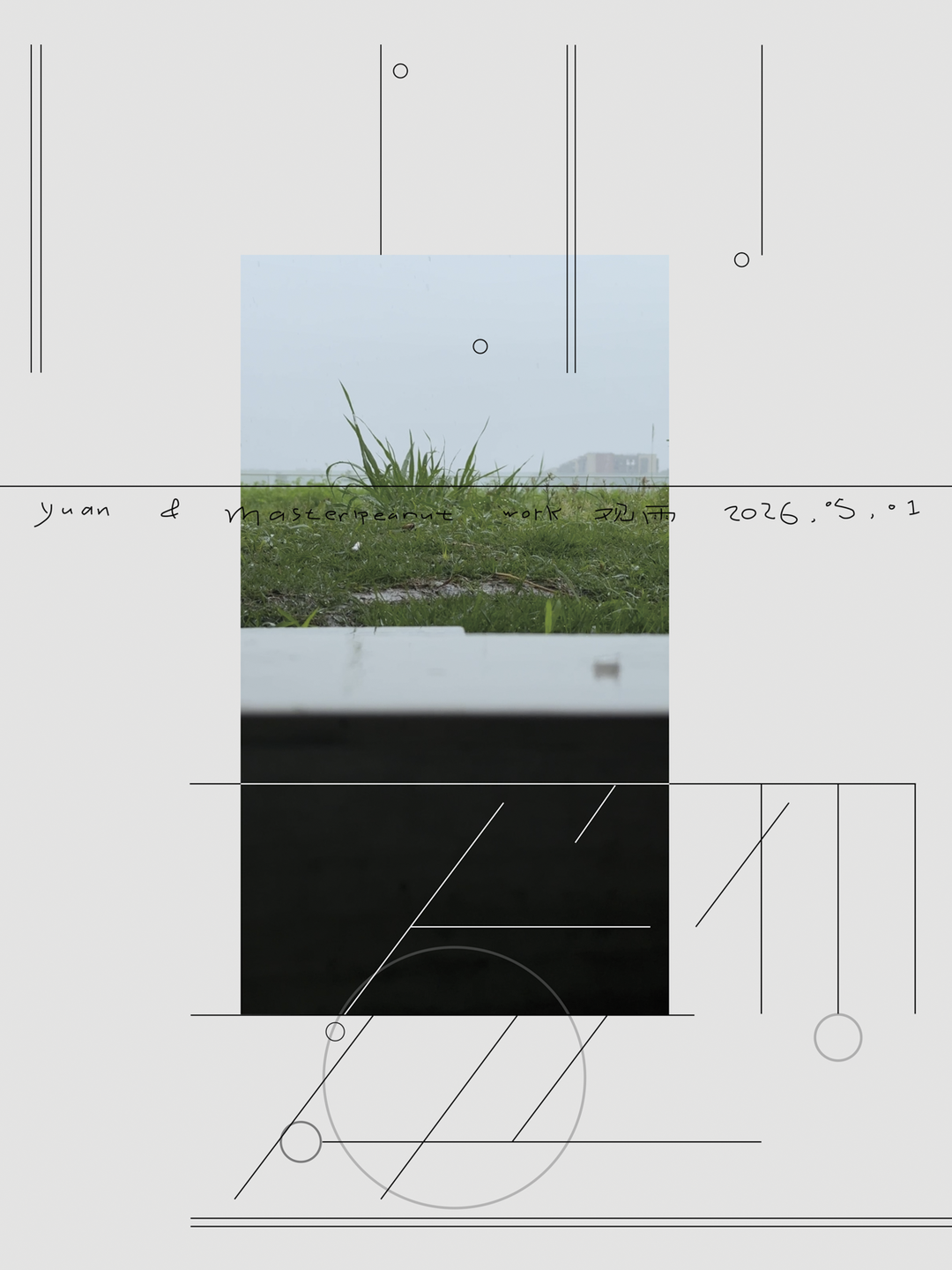
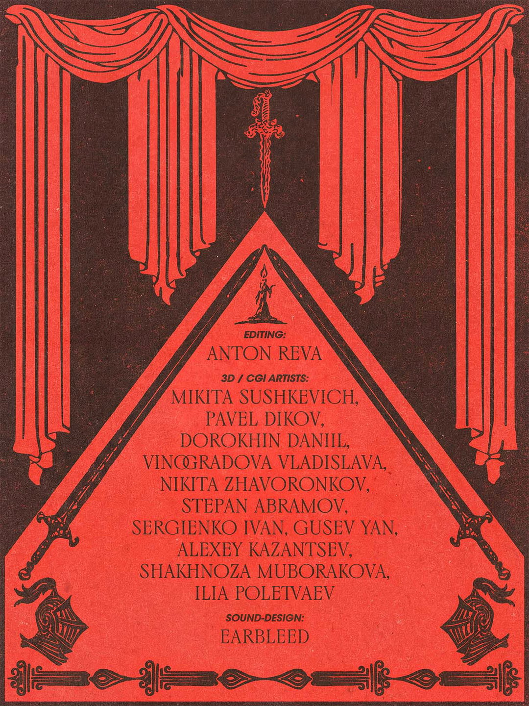
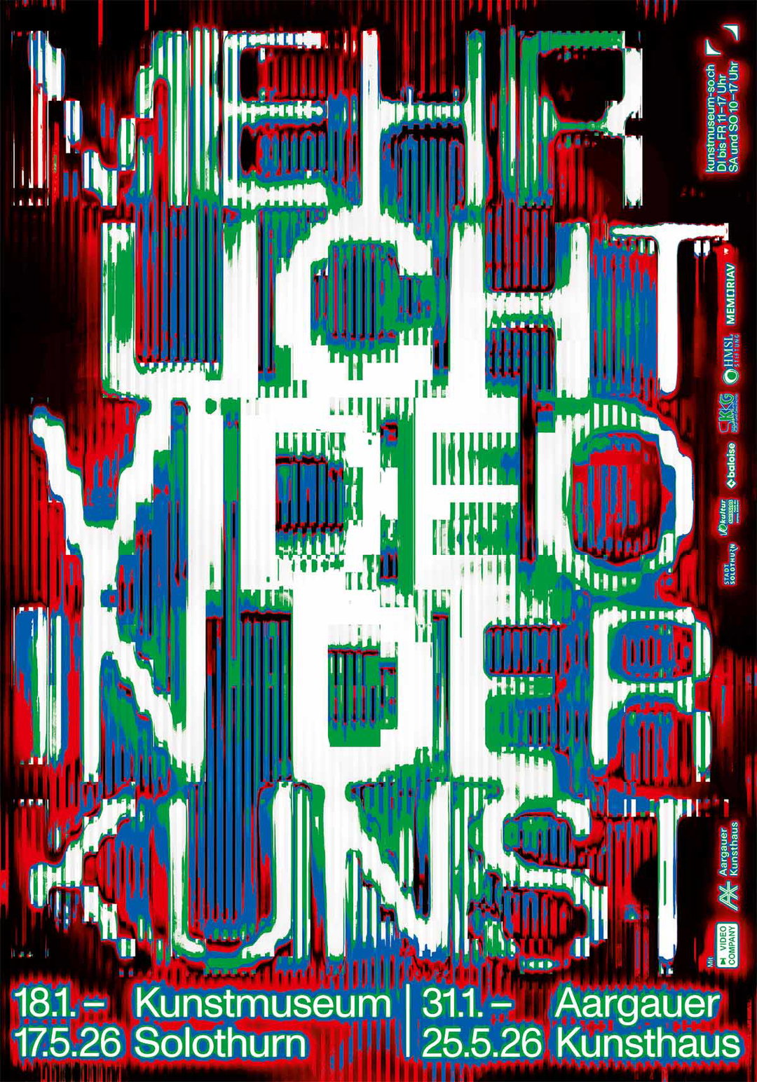
1 of 4
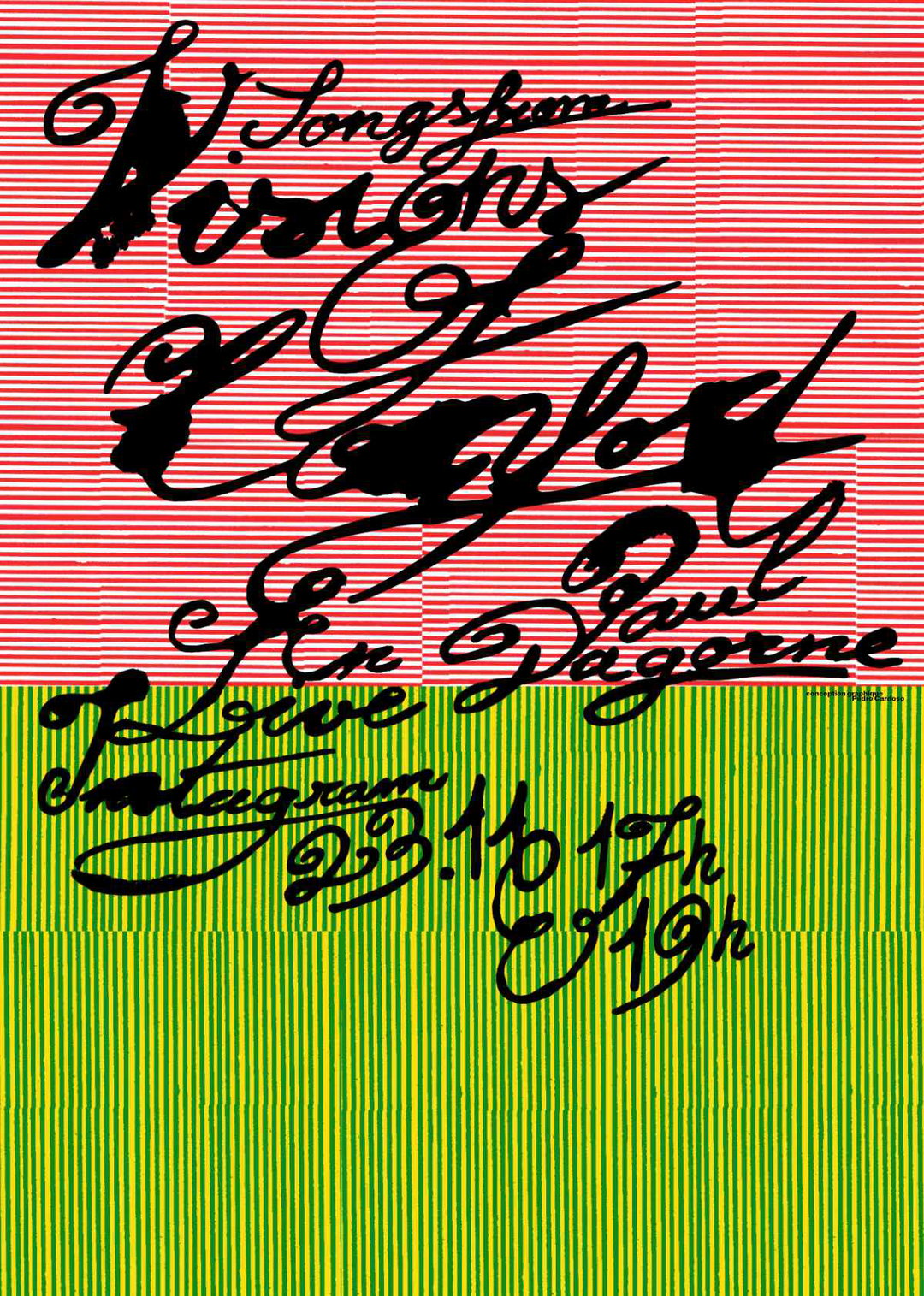
Helmo: Jazzdor La Saison!, 2023–2024 (France)
1 of 4
Helmo: Jazzdor La Saison!, 2023–2024 (France)
INT:
What are the key visual trends you can see across the group?
JG:
There are many but I will highlight three.
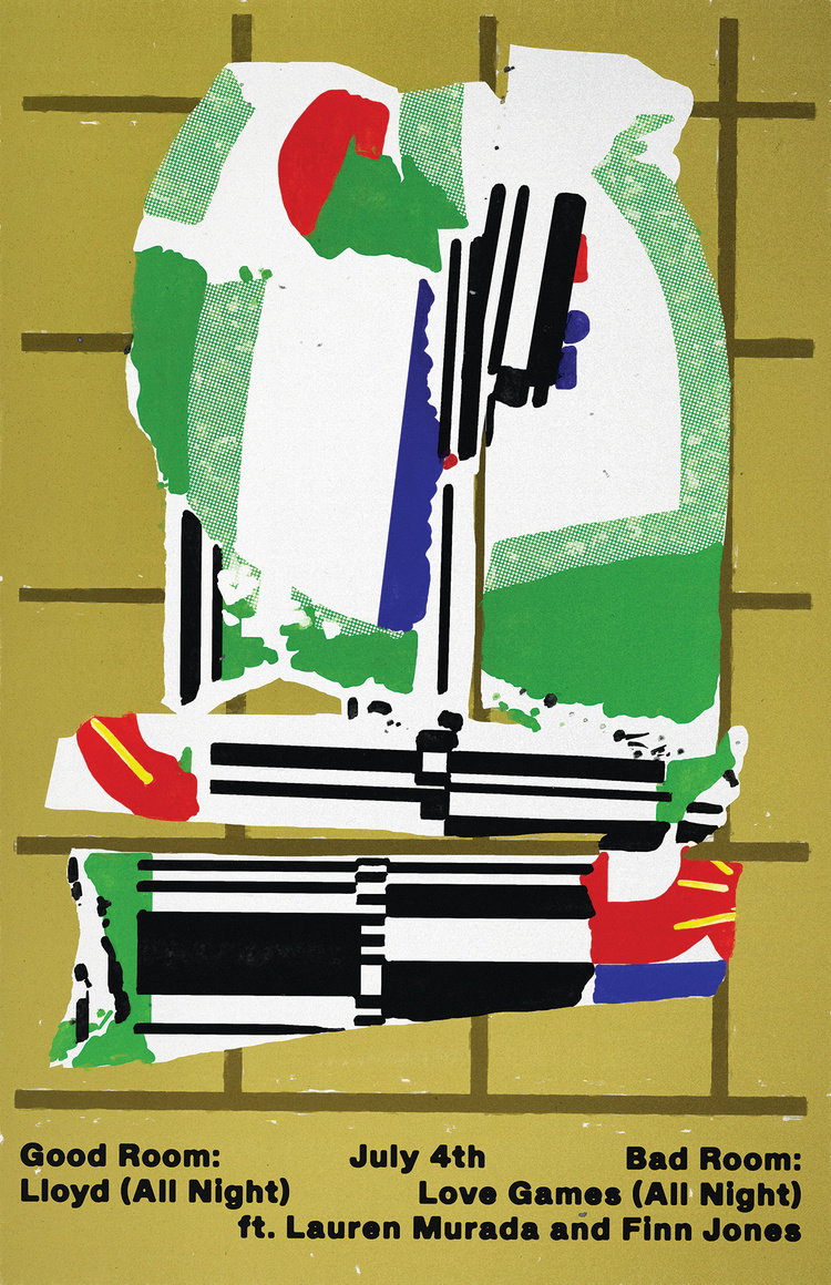
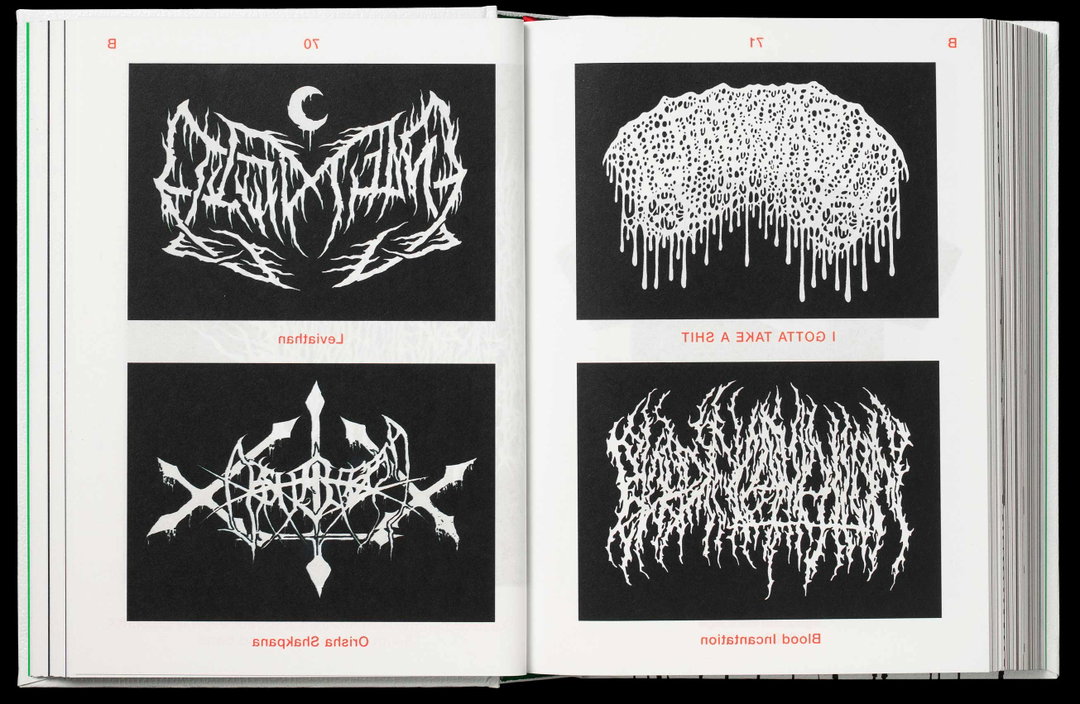
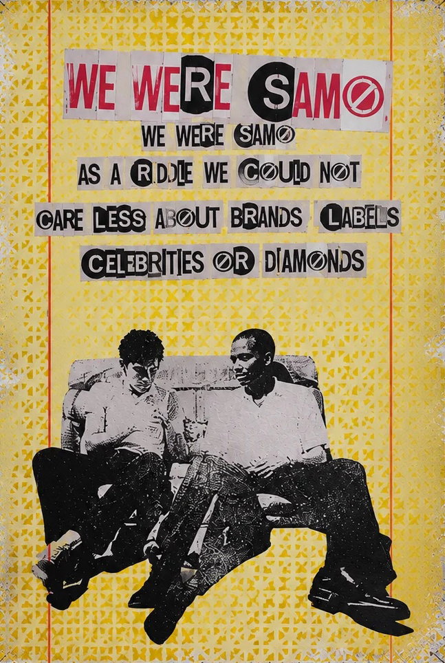
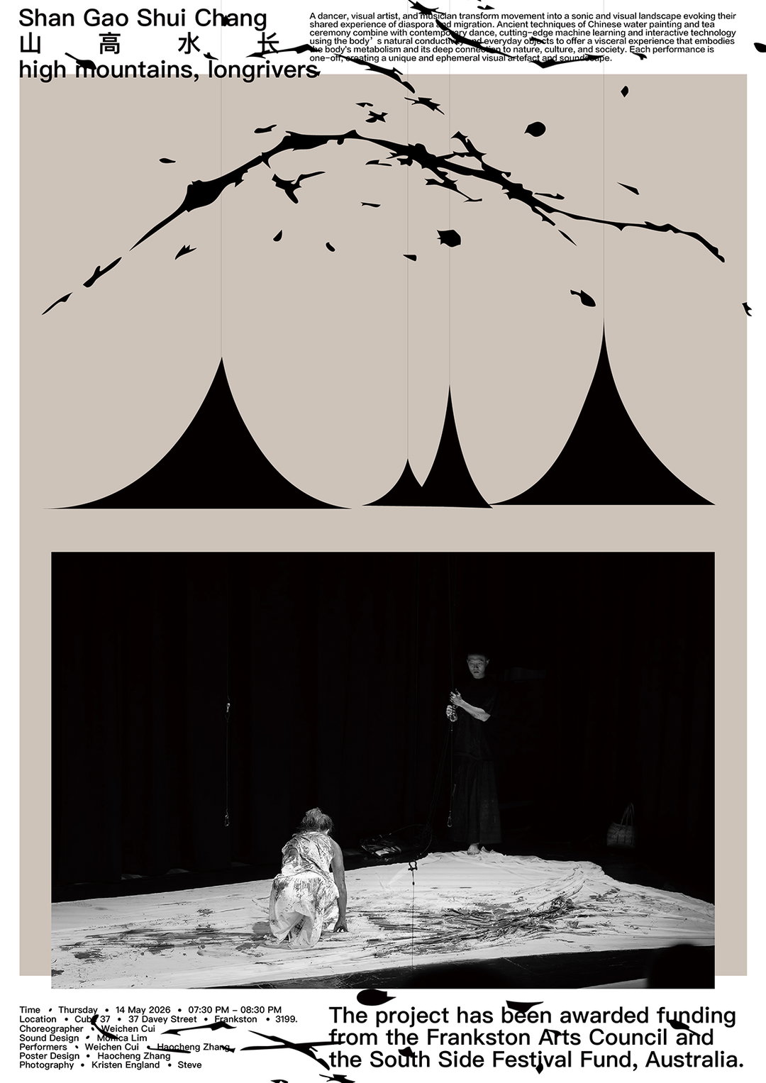
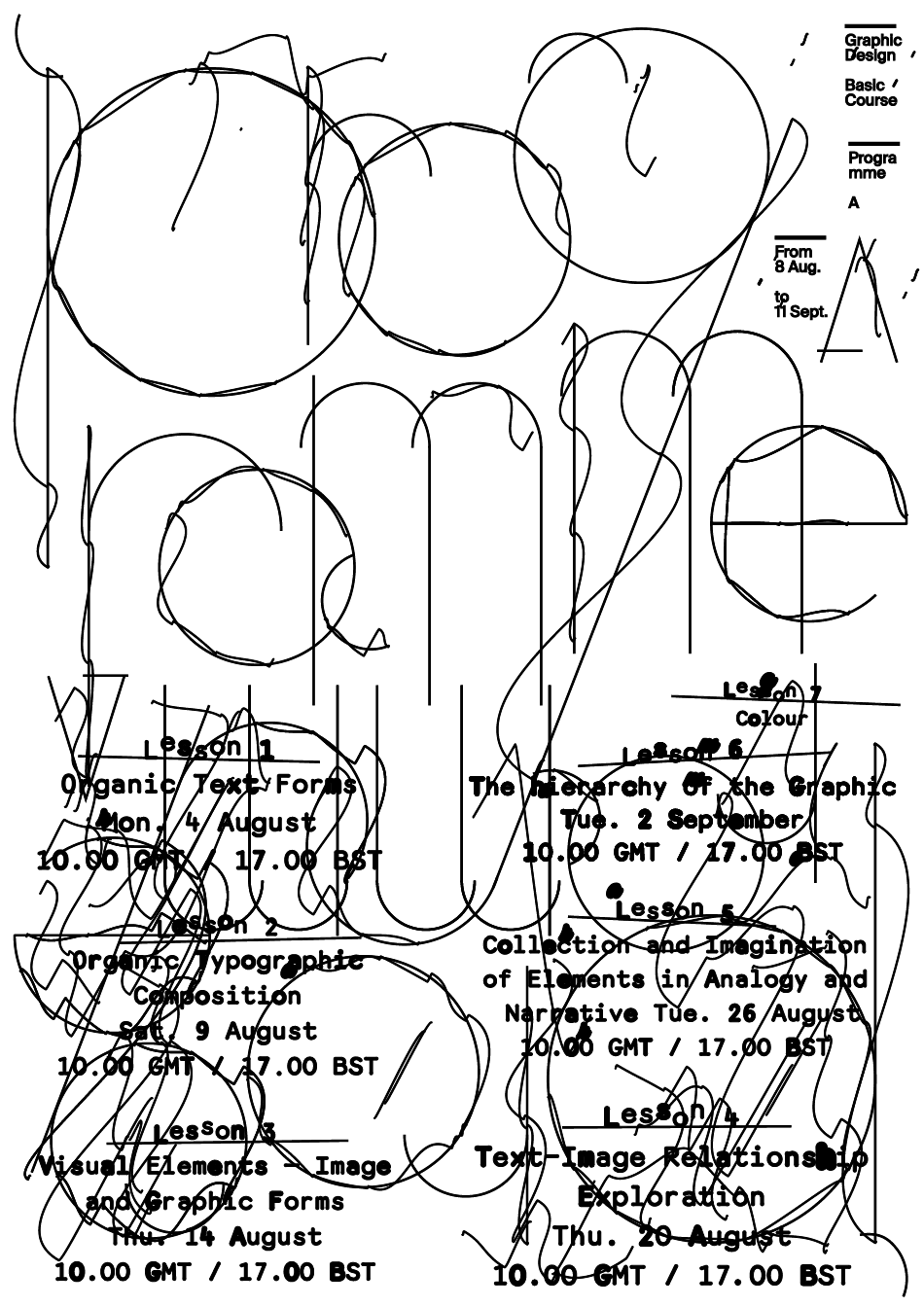
The poster as ‘surface’ is becoming more common. In some cases it involves the intense layering of visual material, to the point that the image becomes a surface texture. Like a textile in the case of Nao Lee (South Korea); or layering effects over type and illustrations to the point where the poster feels like an entire collage of living screens inside of the belly of a huge creature in the case of Kid Rose (Japan); or in a calmer sense like the floating depths of the sea or sky in Youyou Luo’s (China) poster Perhaps we have never seen the same blue. Or in a more layered sense in Manon Bruet’s Festival Parallèle 16, 2026 (France). This convention of the poster becoming a textural artwork is now fully established. These textures are often visceral and organic – perhaps as a response to our deepening connection with the gloss black screen of our phones and computers.
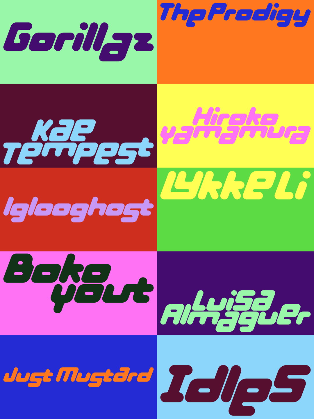
Another theme we are seeing is collaged typography that brings together multiple different fonts, at various scales, colours and angles, combined with flat, soft, muted graphics and simplistic brutalist composition – reminiscent of the visual worlds of 90s editorials, music media or video games. With the recent surge in nostalgia and fascination with CDs, Walkmans, early games consoles, clothing and hairstyles from the 90s, it’s no surprise that this extends to graphic design. For the younger generation who did not grow up during the 90s, engaging with these unfamiliar technologies might offer a connection to a simpler time which they were not able to be a part of. For the generations who did live through the 90s (like myself), perhaps there’s a warmth and familiarity to enjoying it again. Either way, 90s-core is alive and kicking. Or maybe the kids would say we’re ‘90s maxxing’.
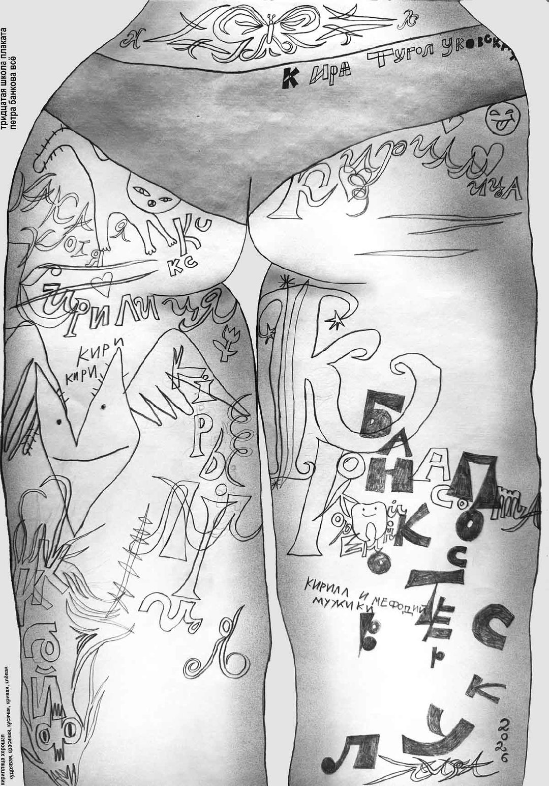
The third (which we’ll speak about more in an upcoming article) is work which is consciously created to look and feel ‘unprofessional’. Threads of vernacular design run through a new contemporary naivety. This work lacks visual consistency, structure or refinement and appears to abandon established commercial graphic design ‘rules’. This has been done many times, if we look back at David Carson, Neville Brody, TDR and the waves of imitators that came with them – rebellion is not new but I think this rebellion has a new flavour and perspective. This is more playful, softer, childish, naive and distinctly ‘unprofessional’. Think sticker packs, teenage collage, analogue techniques, tactility, cuteness – there’s an intimacy which the previous design rebellions lacked. A defining characteristic is a lack of seriousness. Has seriousness become cringe?
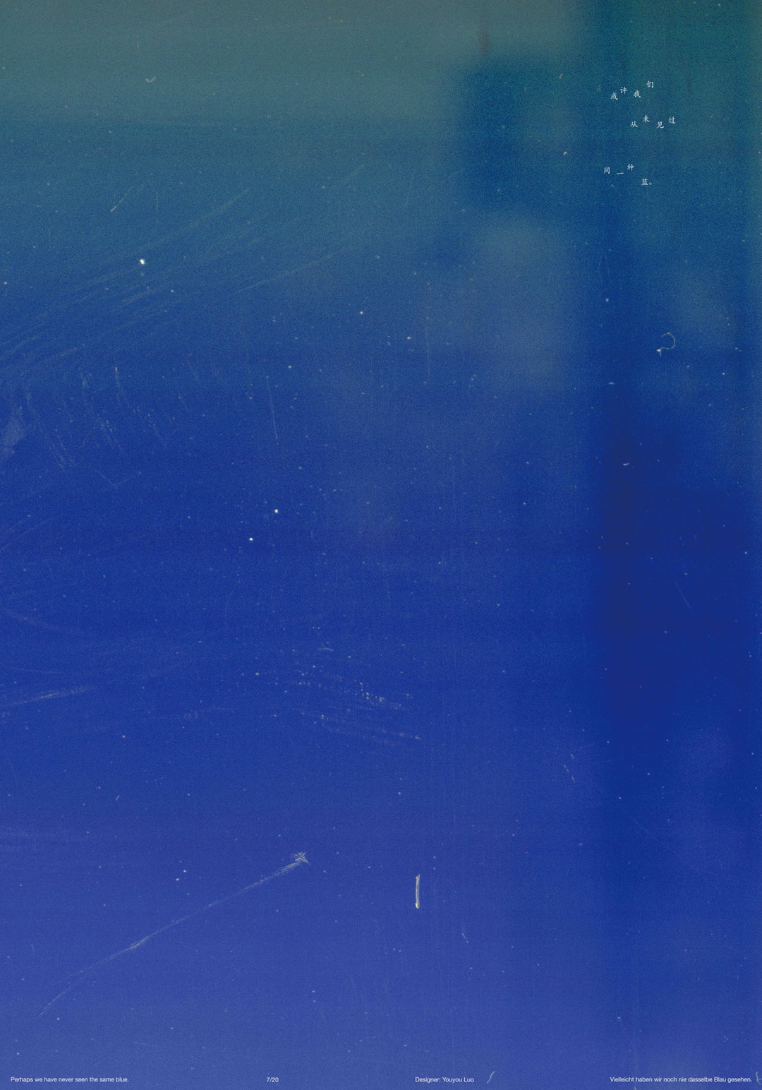
Youyou Luo: Perhaps we have never seen the same blue., 2026 (China)
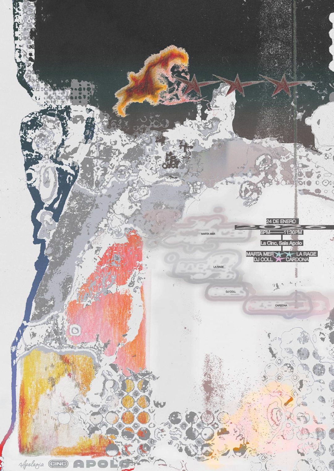
Dypere: Stars aligning, 2026 (Germany)
“Rebellion is not new but I think this rebellion has a new flavour and perspective.”
James Gilchrist
INT:
Lastly, what should people come to the INTL Poster exhibition for, and what else can they enjoy while there?
JG:
The International Poster Exhibition is a review of contemporary poster design, featuring 190 posters designed by more than 200 designers and creatives. The exhibition offers a visual tsunami of inspiration. You can discover hundreds of posters from your favourite designers and your new favourite designers.
It’s the perfect platform to consider the artistic, cultural and societal value of posters. Small DIY formats through to huge multi-layered industrial bus-stop formats. Enjoy the tactility, colour, texture and smells which you can only experience in-person. Meet the designers featured, enjoy connecting with kindred spirits and be in a room full of fellow geeky designers.
The International Poster Exhibition is just one small piece of a much larger festival programme, International Assembly. International Assembly offers a space for learning, evolving and connection through a carefully curated festival: Inspiring conferences, innovative workshops, a panel discussion, live projects connecting students with industry, an all-new Secret Stage featuring undisclosed speakers, the International Creative Awards ceremony hosted in a medieval castle and the official opening of the International Poster Exhibition.
International Assembly runs 12-22 November in Glasgow at Glasgow Royal Concert Hall and The Pyramid at Anderston.
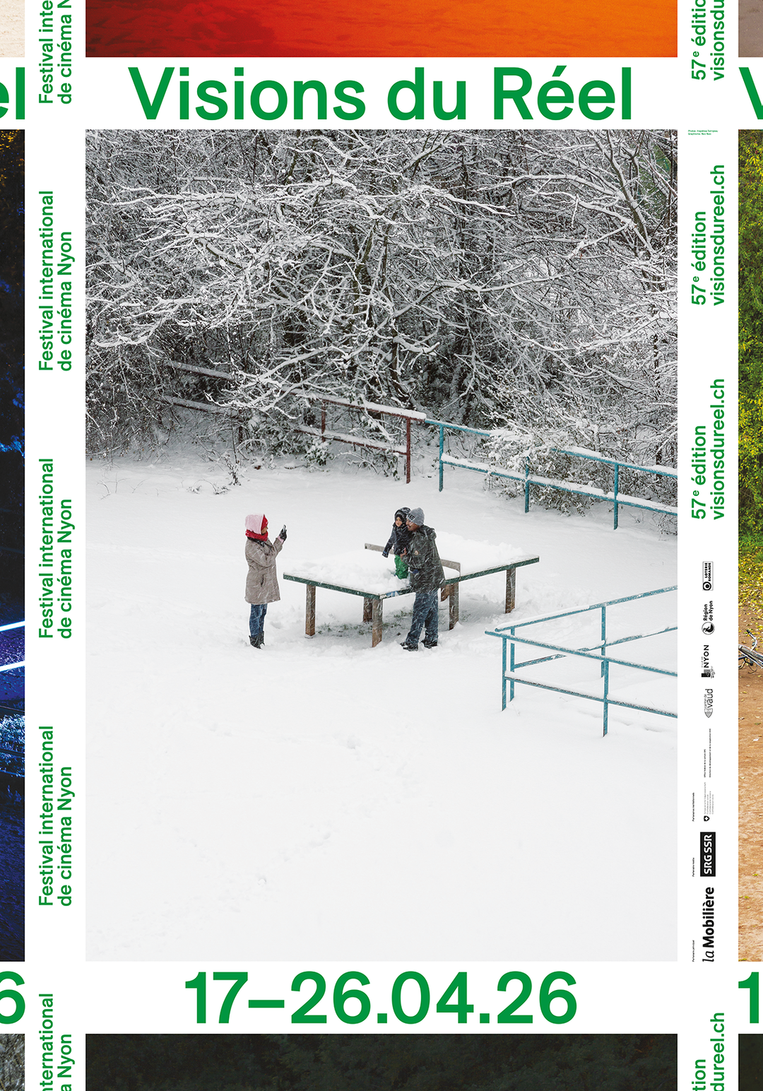
Neo Neo (Xavier Erni, Thuy-An Hoang, Estelle Piguet), Hayahisa Tomiyasu: Visions du Réel, 2026 (Switzerland)
Hero Header
Left: Manon Bruet, Julia Andréone, Festival Parallèle: Festival Parallèle 15, 2025 (France)
Middle: Ivo Blackwood, Manu-Sophie Linder, Anja Aurand, Velko Kalchev: Gerrit Rietveld Academie / Sandberg Instituut Open Day, 2026 (Netherlands)
Right: Viktor Briestensky: Ooohhh, 2025 (Germany)
Share Article
About the Author
—
Jenny oversees editorial output across It’s Nice That. Get in touch with writing pitches for features or opinion pieces, big creative story tips, or questions about all things editorial. jb@itsnicethat.com
To submit your work to be featured on the site, please see our Submissions Guide.