From wax seals to postal stamps, Aplomb perfume’s packaging has the intimacy of a handwritten letter
The luxury scandi fragrance brand strikes a perfect balance between confidence and simplicity – it draws on all the visual codes of personal correspondence with taste.
When Scandinavian perfume brand Aplomb reached out to Studio Lotta Nieminen, the brand had a name and an idea: each of its fragrances would be inspired by a person. Lotta and her team set out to find a way that the identity for Aplomb could embody that. “We looked at concepts such as archiving systems, mirrors, and the idea of each perfume as a letter written to someone – that last one resonated strongly with the founder, and the visual world grew from there,” Lotta tells us.
The intimate and tactile world of letter writing and stationery gave the New York-based design studio an array of visual material to draw from for a brand identity, but the key balance for the designer was how to keep things feeling high-end against a brief of Finnish luxury fragrances: “references from letter writing can easily skew crafty or too grounded,” she says. “I’m often most drawn to that kind of duality when building brand worlds, in this case the warmth of the handmade against the restraint of luxury.”
(Studio) Lotta Nieminen: Aplomb (Copyright © (Studio) Lotta Nieminen, 2026)
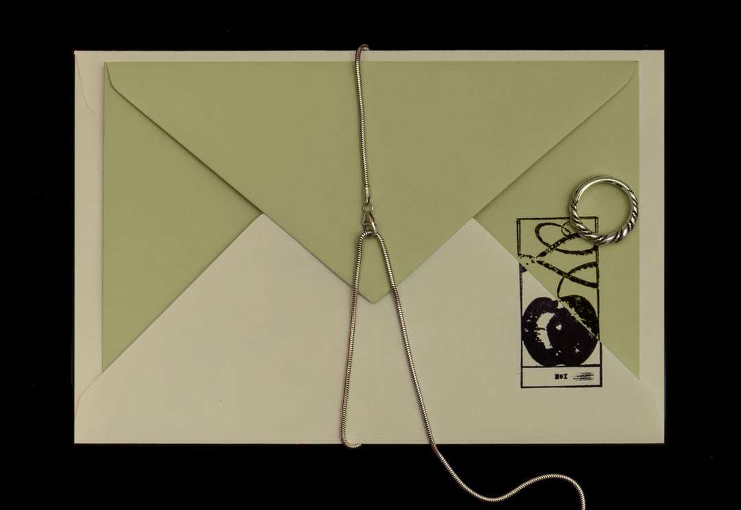
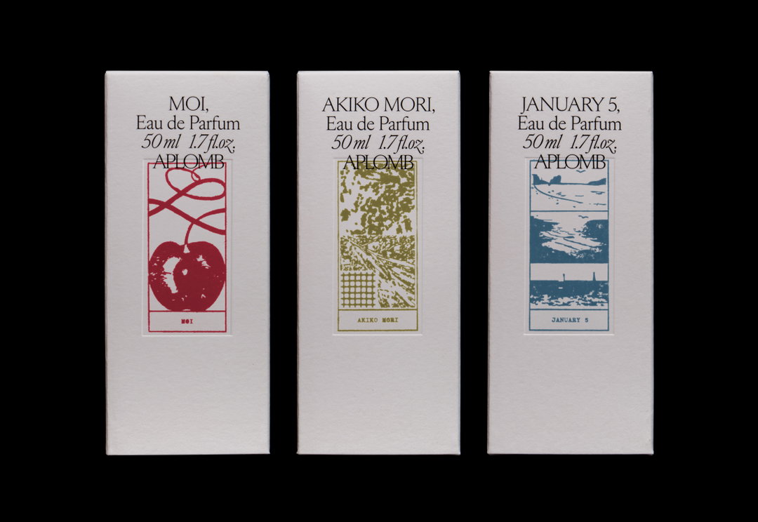
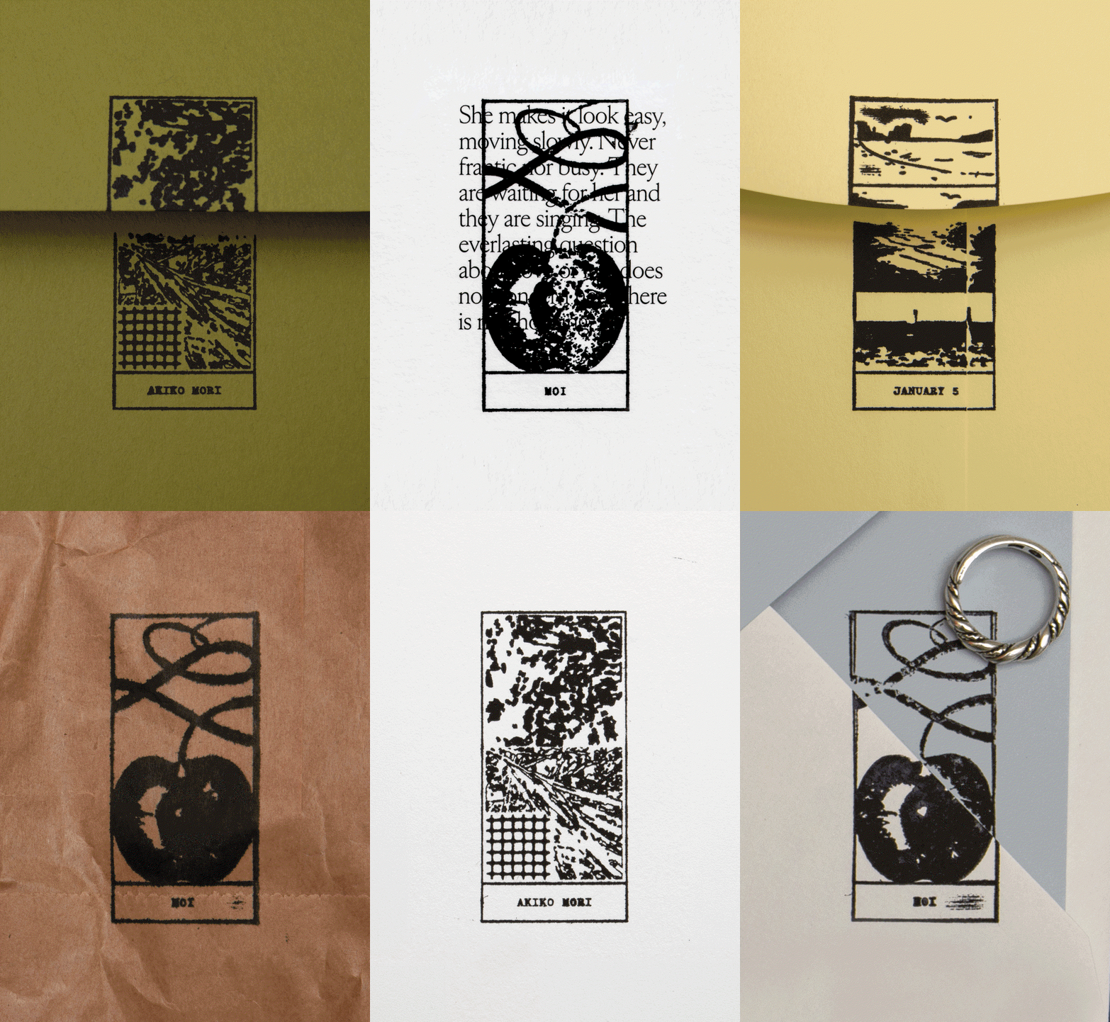
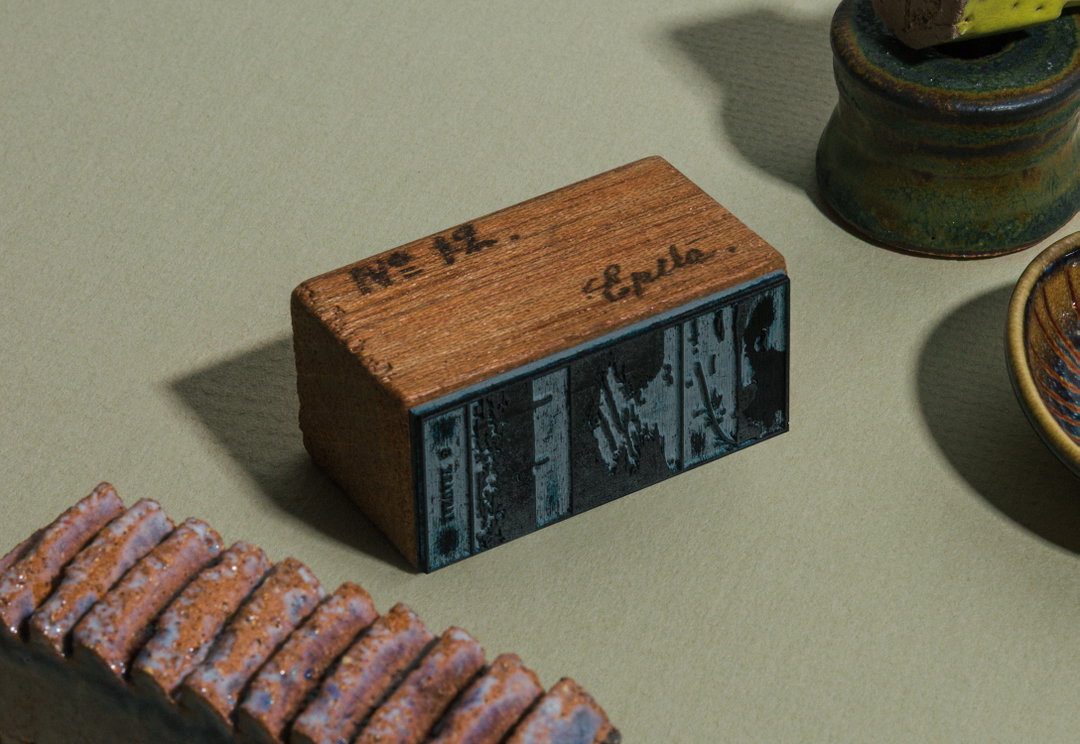
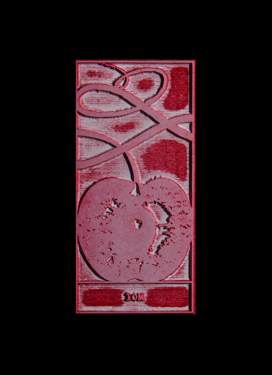
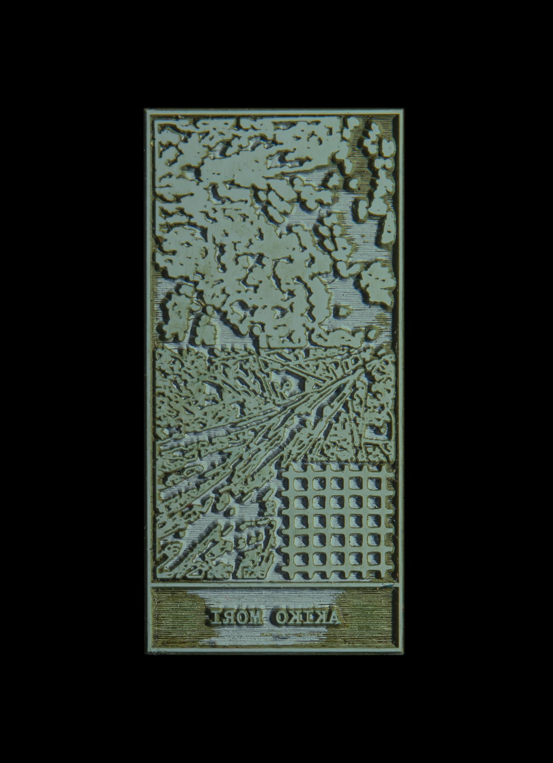
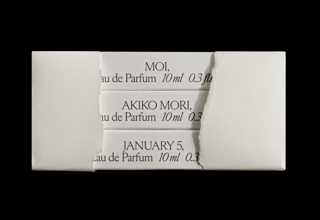
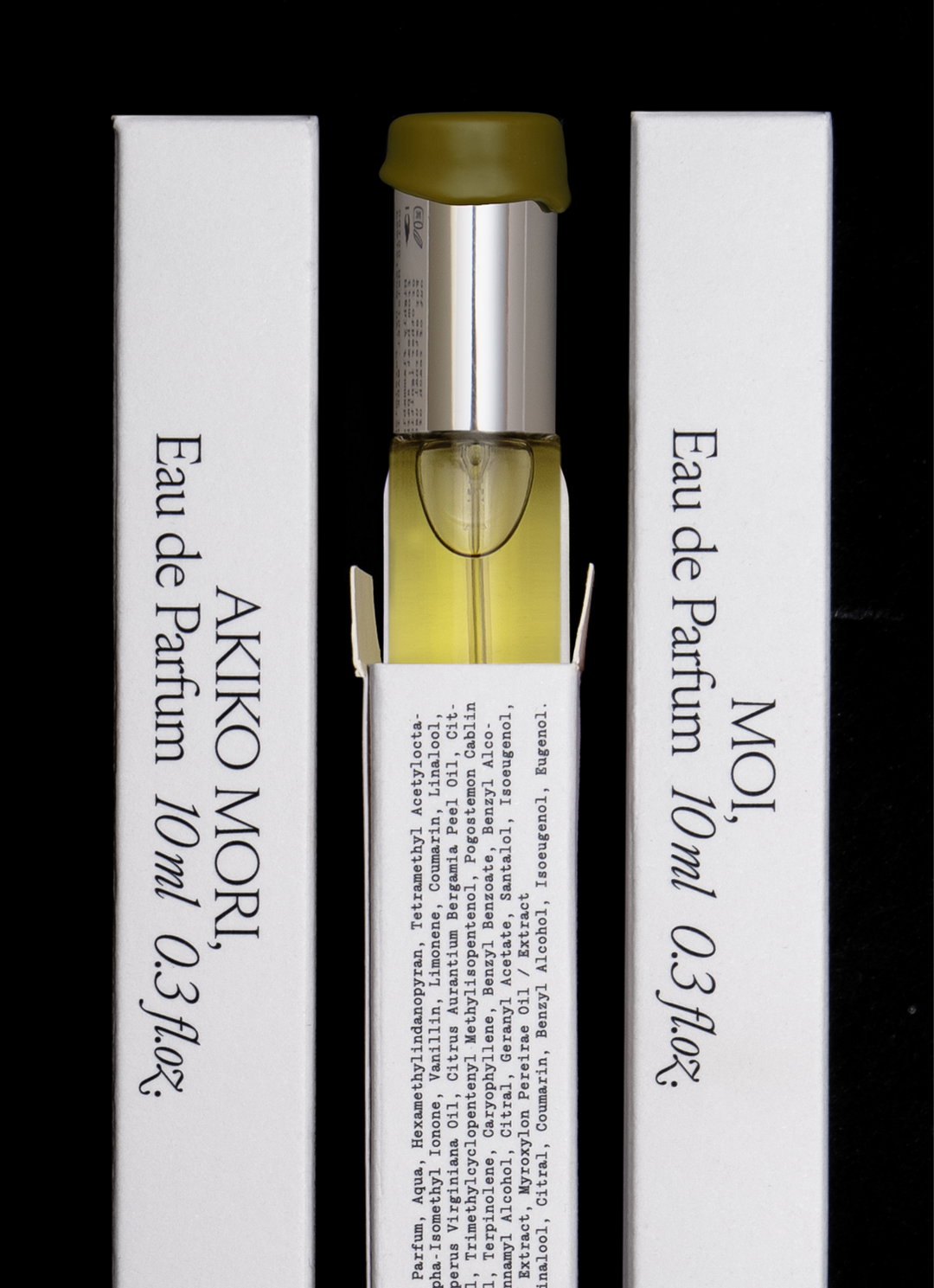
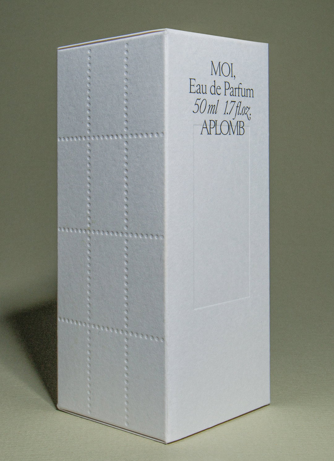
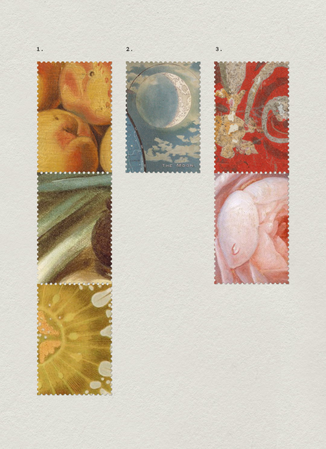
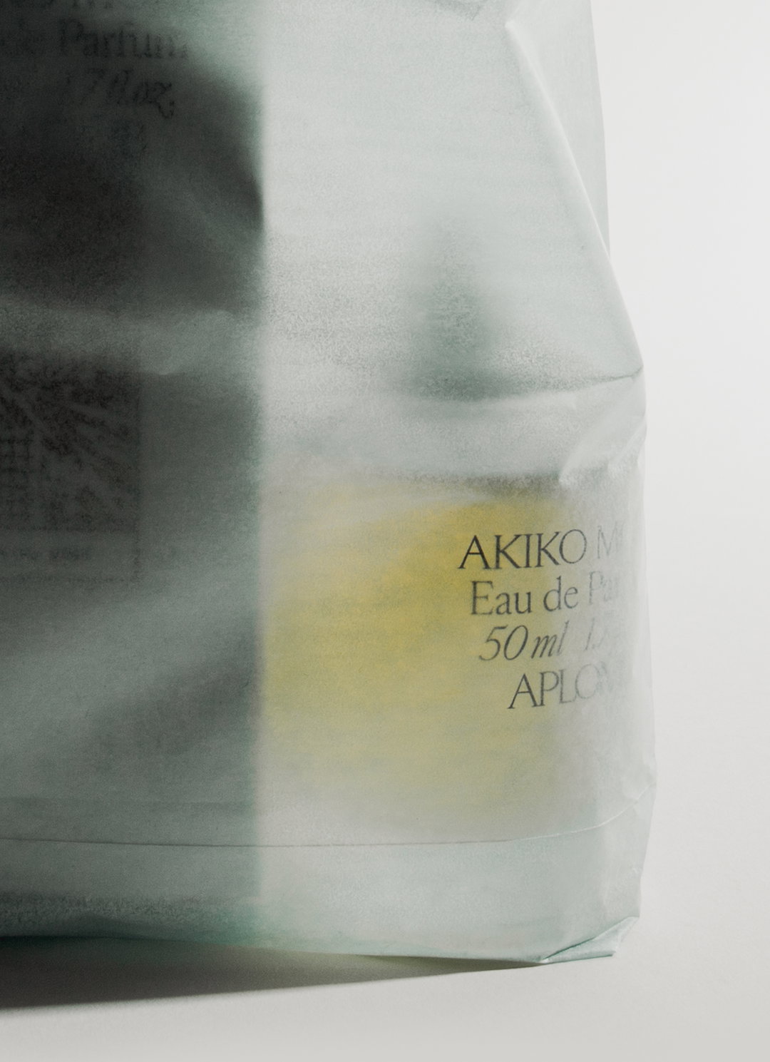
Opting for something that felt elevated, the studio shaped the perfumes packaging with an illustrated stamp cut for each fragrance. Founder of Aplomb, Ina Niiniketo “had very thorough mood boards”, Lotta shares, that mapped out each of the people that inspired the brand’s perfumes, “which were a starting point for developing the scents and a springboard for these illustrations,” she says. For the stamps to feel less crafty and more considered, the designer decided to set each one within a debossed frame. “Drawing from sheets of postage stamps, one side also has a debossed perforated motif,” Lotta says. “These details add personality and depth to an otherwise minimalist approach.” Lotta also wanted sealing wax to be a part of the brand’s visual world but using it as a seal on the packaging “felt too obvious, and therefore not high-end enough, so we introduced it somewhere more surprising: the caps of the bottles themselves”, she says.
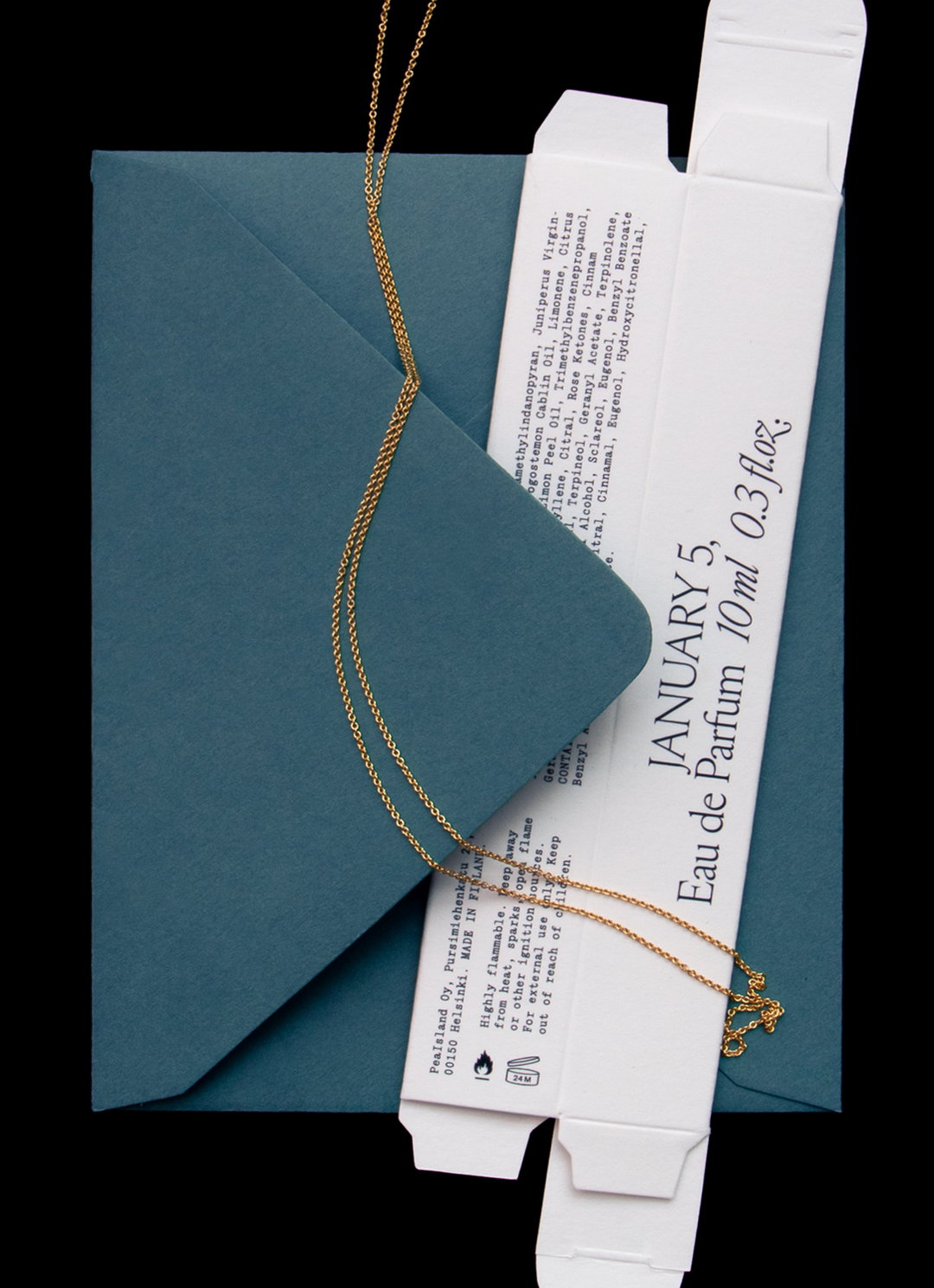
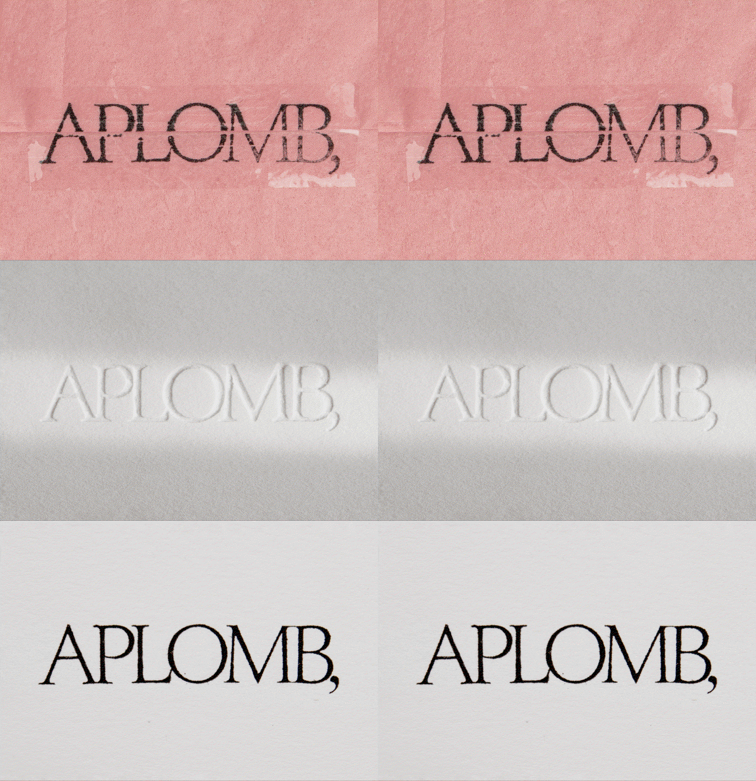
Typography also became a tool to communicate luxury, and Lotta decided the best way to bring it in was with a more quiet, minimal presence. “The word ‘Aplomb’ means self-assurance, so the type had to find confidence in simplicity. The typographic world is built on Edict, a modern serif defined by the interplay of sharp serifs and soft, teardrop terminals. Designed by Schick Toikka, its warmth and rhythm evoke the fluidity of handwriting.”
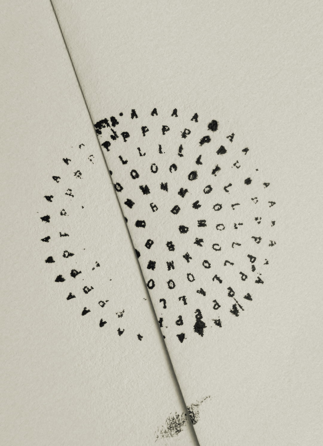
Punctuated with a healthy amount of white space, the studio paired this nod to handwritten scripts and personal correspondence with a monospaced typewriter typeface by 205TF called Yorik, which became the springboard for a secondary mark to sit alongside Aplomb’s simple serif Logo that “draws from circular postmarks,” says Lotta. “Its gently scattered form also echoes the airy pattern of a perfume spray,” the designer ends.
Gallery(Studio) Lotta Nieminen: Aplomb (Copyright © (Studio) Lotta Nieminen, 2026)
Hero Header
(Studio) Lotta Nieminen: Aplomb (Copyright © (Studio) Lotta Nieminen, 2026)
Share Article
About the Author
—
Ellis Tree (she/her) is a staff writer at It’s Nice That. She joined as a junior writer in April 2024 after graduating from Kingston School of Art with a degree in Graphic Design. Across her research, writing and visual work she has a particular interest in printmaking, self-publishing and expanded approaches to photography. ert@itsnicethat.com
To submit your work to be featured on the site, see our Submissions Guide.