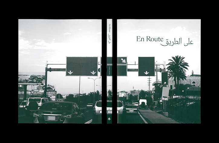
Chantal Jahchan explores the Arabic type design landscape and concepts of modernity in En Route
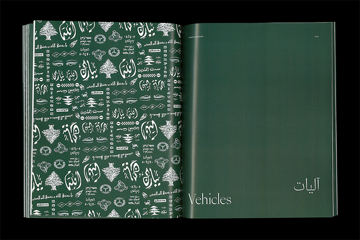
“I was born in Rabieh, Lebanon and came to the US when I was five years old,” New York-based graphic designer Chantal Jahchan tells It’s Nice That. “Ever since then, I have been interested in the ways that language can be both a barrier and a tool for communication.” In a project that fully embodies this experience, Chantal explores what “modernity” might mean for Lebanon, specifically through a typographic and linguist lens in her publication En Route.
Chantal’s love of words has always been evident, although it didn’t fully present itself until she enrolled at Washington University – where she is due to graduate later this month – and discovered the communication design programme. “Looking back at the paintings I did in high school, it’s pretty evident that I was innately fascinated by the power of words – both for their visual and communicative qualities. I had always loved books, problem-solving, and organising information, but it wasn’t until college that I realised how they could come together,” she recalls.
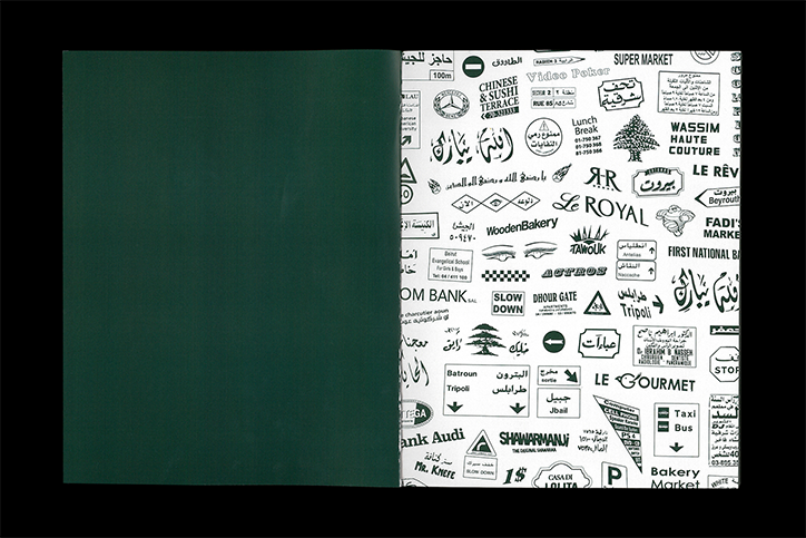
Chantal Jahchan: En Route
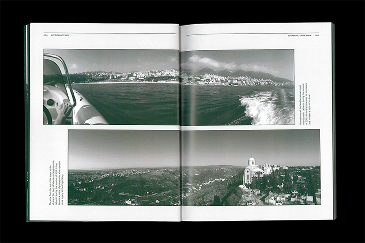
It was on her most recent trip to visit her grandparents in Lebanon – a holiday her family takes every summer – that her view of the country shifted; a result of her recent design education. “What made this visit different for me, was the fact that I had spent the past year and a half diving into books and lectures and interviews about the Arabic type design landscape,” Chantal explains.
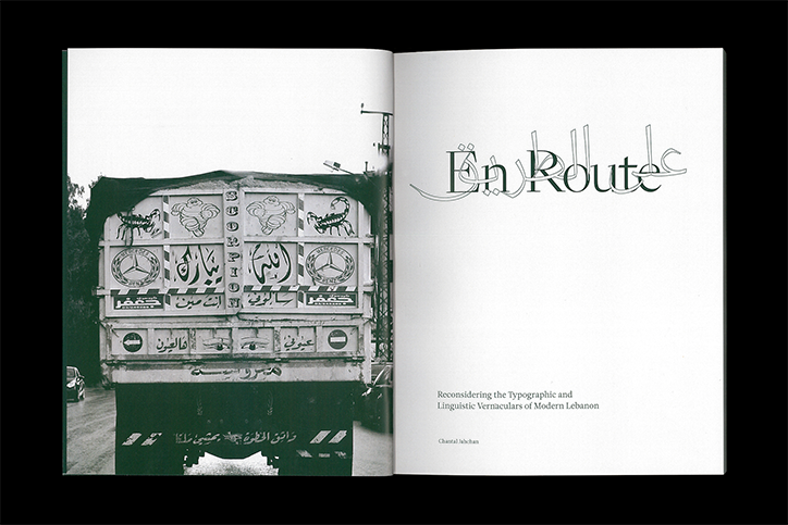
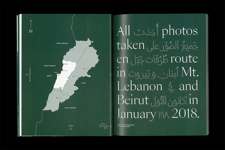
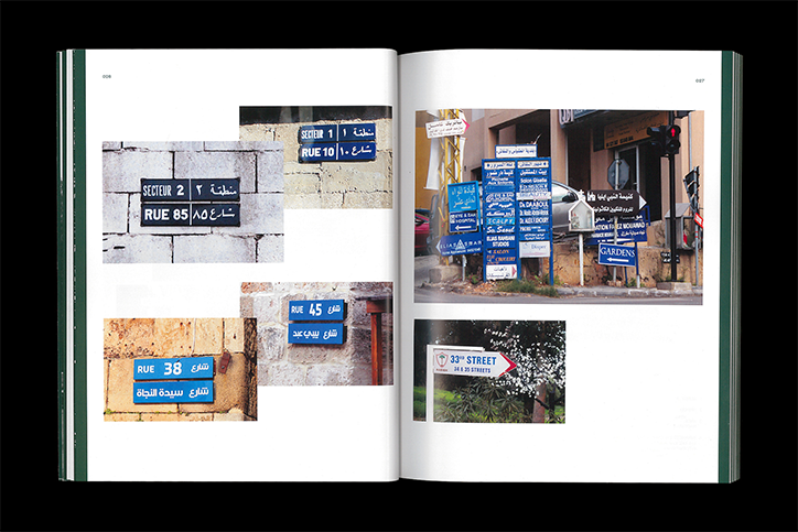
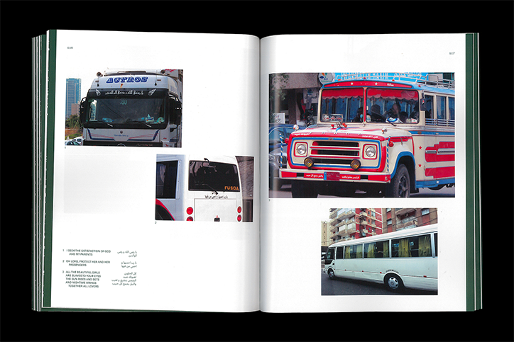
Once in Lebanon, Chantal found herself “mesmerised by the roadside signage and storefronts, lit up with words in English, French, and Arabic.” Add to it the fact that she is fluent in English, nearly fluent in French, and “verbally competent but illiterate on paper in Arabic, and I’m sure you can understand why I often stare out the car window in silent awe,” she continues. With an appreciation of grids, cleanliness and objectivity instilled in her by her Western design education, Chantal began photographing the country’s typography en mass, all through the window of her grandfather’s car.
Chantal Jahchan: En Route
Chantal Jahchan: En Route
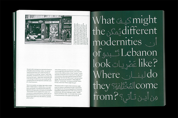
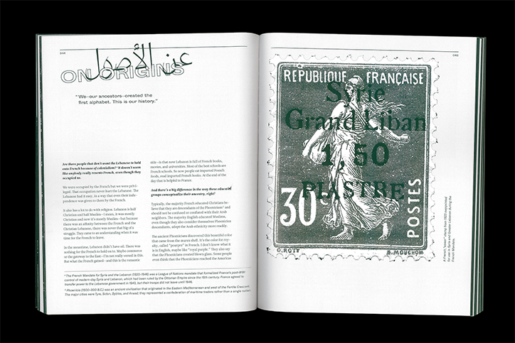
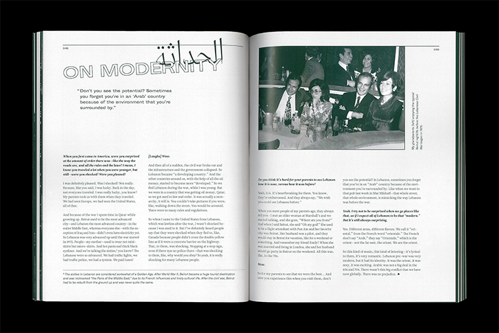
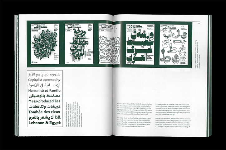
En Route is a compilation of these photographs alongside a series of transcribed interviews with Lebanese professionals giving valuable insights on the state of “modern” Lebanon. “I spoke to Lara Captan and Wael Morcos, two Arabic type designers with contrasting approaches about the past, present, and future of the Arabic script. I spoke to my mum, Lara Bousleiman, about growing up in the Lebanese civil war and how the country’s political and linguistic landscape changed during that time. And lastly, I spoke to British-Lebanese photographer Natalie Naccache about using the camera to challenge preconceived notions about the Middle East in modern day society,” Chantal explains of the book’s content.
Although she originally set out to challenge the West to see – or not see – Lebanon in a certain way, through her design and research process Chantal realised En Route was about something else: how Lebanon sees itself. Instead of drawing conclusions on this subject, the publication poses questions. “Because digital type technology has only recently caught up with the complexity of the Arabic script, there are many unanswered questions about how we should move forward,” Chantal adds. En Route presents modernity as a subject that means something different to everyone depending on personal experiences, religious beliefs and historical knowledge. In terms of typography, Chantal explains “modernity was similarly hard to pin down—for some, it meant being informed about the roots of the Arabic script before moving forward, and for others, it meant pushing the envelope through experimentation and collaboration.”
Chantal Jahchan: En Route
Chantal Jahchan: En Route
Chantal Jahchan: En Route
Chantal Jahchan: En Route
Chantal Jahchan: En Route
Chantal Jahchan: En Route
Chantal Jahchan: En Route
Chantal Jahchan: En Route
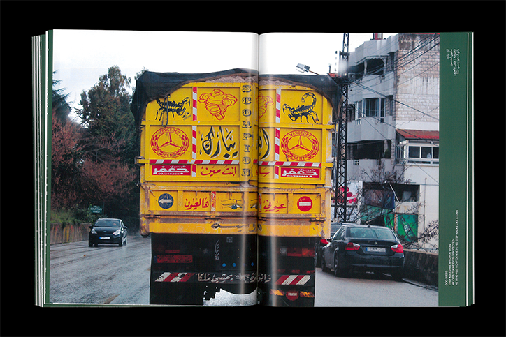
Chantal Jahchan: En Route
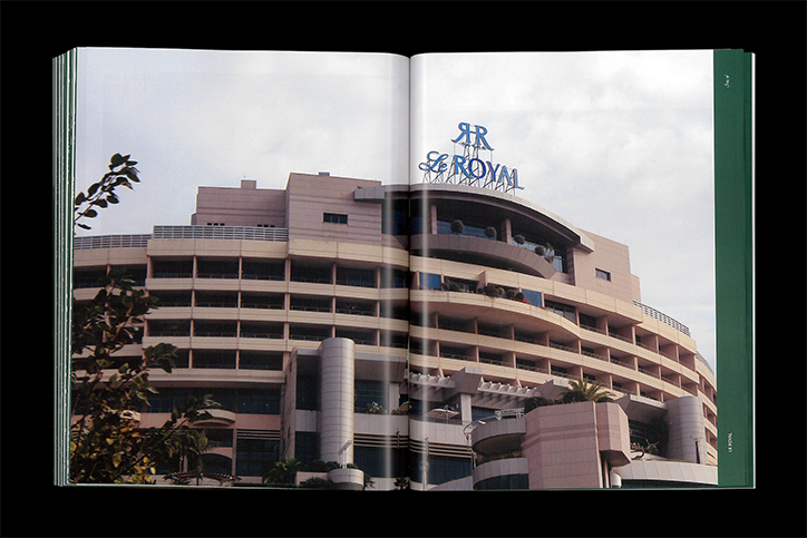
Chantal Jahchan: En Route
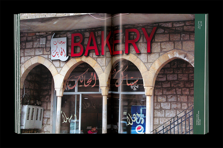
Chantal Jahchan: En Route
Share Article
Further Info
About the Author
—
Ruby is Senior Creative at It's Nice That, overseeing our visual output across platforms and projects. Before that, she was associate editor on the editorial team, after joining in September 2017 following graduation from Central Saint Martins.