“I take on freelance projects that I love”: Chloe Scheffe on designing for joy and experimentation
The Brooklyn-based graphic designer talks us through her varied portfolio, with work for The New York Times, Here Magazine, plus record labels and books.
What first drew Chloe Scheffe towards the medium of graphic design was that she enjoyed the problem solving. Working better with parameters than without, the Seattle-raised and Brooklyn-based designer grew up with an interest in the arts, but was inadvertently put off while attending an arts-based public high school. “I hated it at first,” she tells It’s Nice That of when she was first introduced to the medium, “since it’s all about reduction (at least at first) and the work I was doing – mostly graphite and charcoal drawings – was detailed and true to life.”
In 2015 however, Chloe graduated from a BFA in design from Rhode Island School of Design and began her career with internships at Pentagram with Michael Bierut and Metahaven, before working full-time at The New York Times Magazine. “The amazing team there, led then and now by Gail Bichler, taught me everything I know about the fundamentals of magazine design,” she says. Her next steps involves working freelance with Peter Mendulsund and Oliver Munday, before taking on briefs on her own as an editorial illustrator until mid-2018 – where she’d joined the team at Here Magazine, leading the two-person art department ever since.
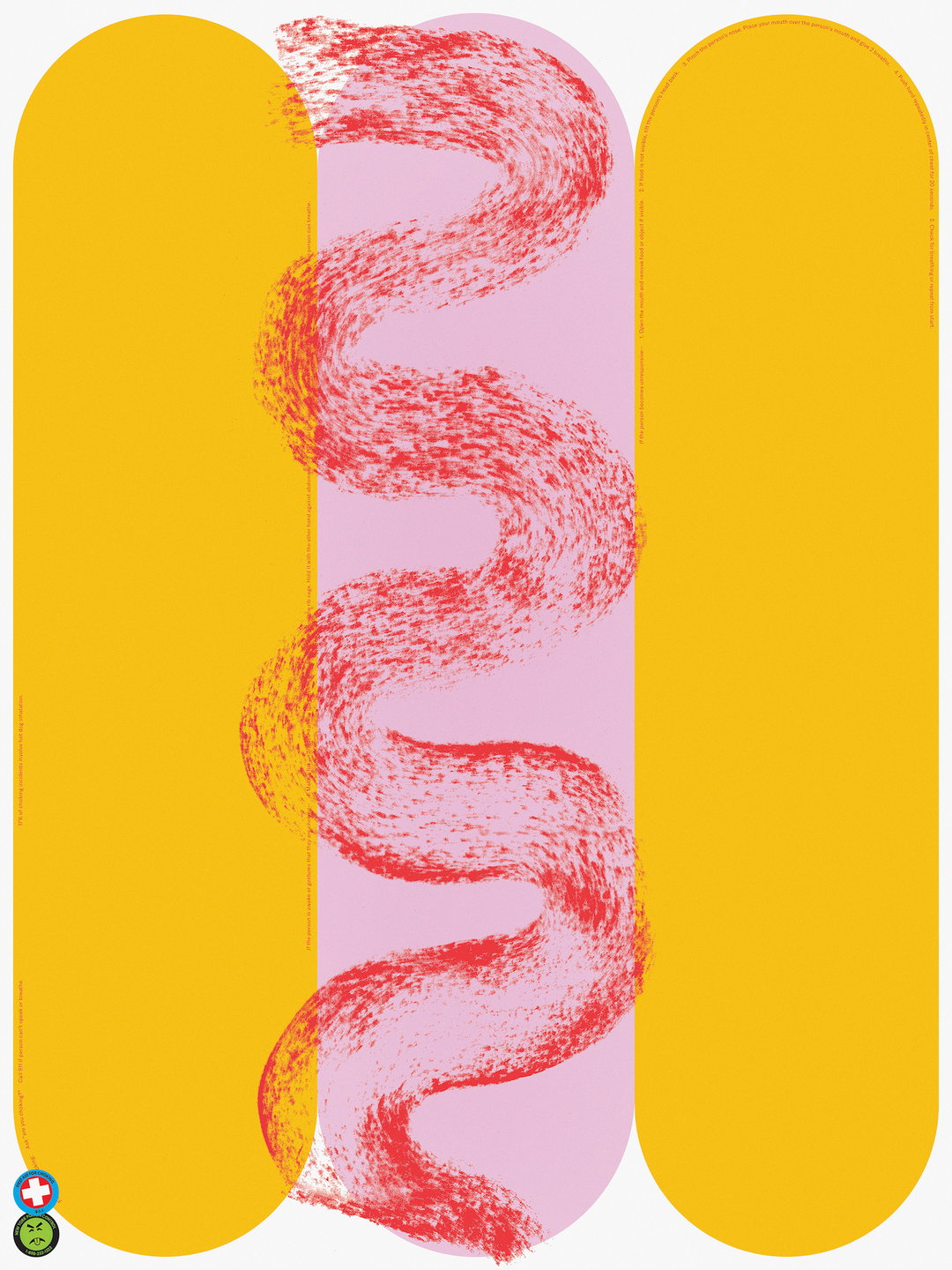
With her art director role at the quarterly travel magazine Here, Chloe’s day-to-day varies greatly. With each issue fitting “neatly” into three one-month phases, she tells us how the first is focused on research, story pitches, reporting and the promotion of the past issue. The second makes time for illustration and photography commissions, art direction, prop fabrication and styling. “Any travel I do also falls during the first two months (although, of course, our team has not travelled at all during the pandemic),” she says. The third then sees the team work on the design, press and proofing – Chloe’s favourite phase for the fact that it’s when the design really takes off. “Actually making things on paper – in the case of the magazine, usually display type – is essential to my creative process,” she adds. “It’s much easier for me to be agile and explore ideas without reservation when I work by hand, rather than on screen; I feel like I have permission to be sloppier, weirder and more playful.”
GalleryChloe Scheffe: Baauer
Chloe makes sure to fill her less-design-focused days with freelance projects on the side – making sure to fit them in at night or on the weekends. “I take on freelance projects for love, as cliché as it may sound,” she says, noting how she regulates her freelance work with care so that she can spend a good amount of time on the projects she’s really excited about. Although, Chloe isn’t much a fan of the “side-hustle culture”, particularly for the fact that it glorifies overworking and burnout. “My free time is the space where I get to experiment with design, intentionally engaging with it in ways that I simply can’t in my day job.” Instead, she seeks out the work that allows her to test her skill set – especially on book covers and the “firsts”, like things she’s never made or clients she’s not worked with before.
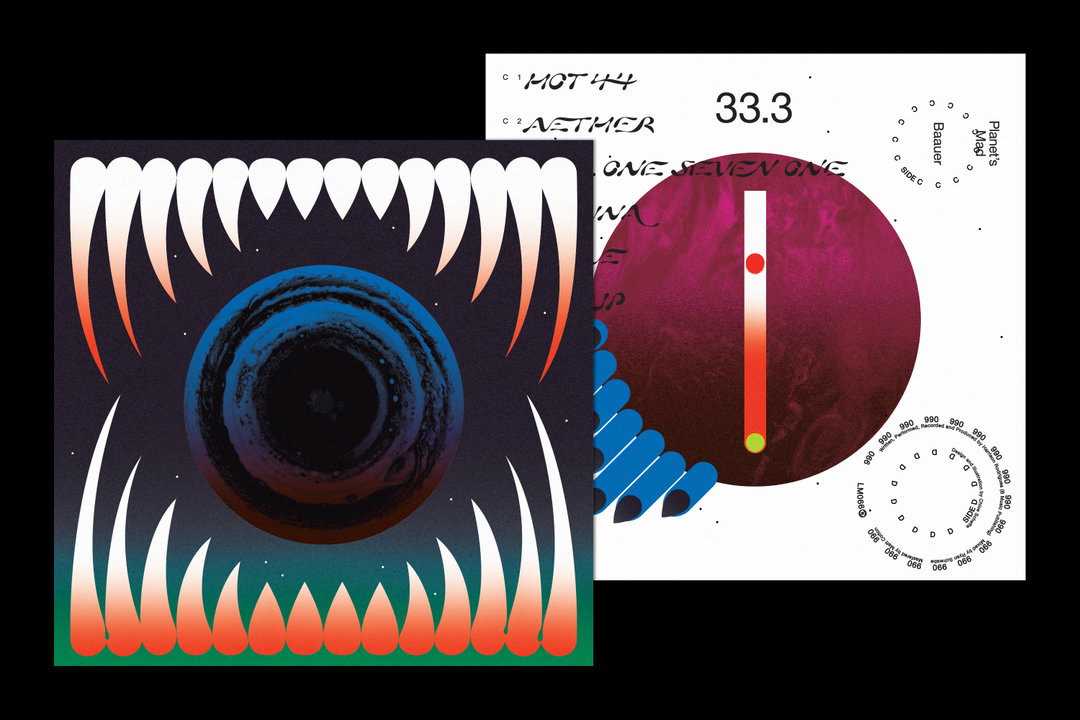
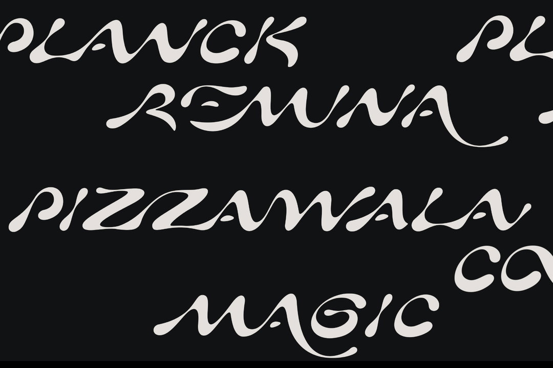
At the end of May, Chloe wrapped up a project for Baauer’s sophomore album, Planet’s Mad, for the UK indie label LuckyMe. “When I was brought onto the project, the overarching visual concept was already well established, drawn from the narrative Baauer had invented for the music itself,” she explains. “It was up to me to implement a specific graphic language.” From the get-go she made headway on a brief that involved “flatness”, a welcomed contrast to the “rendered, RPG feel” that you often see in music videos. As such, she landed on a 70s minimalist illustrative style and merged in a twist of textures and colours, “intended to evoke the energy of dance music.” She adds: “The monolithic monsters/aliens have this pulpy quality, while the typesetting – a mix of a custom display face and Helvetica Neue – is quite serious and formal. I got to go pretty wild with production; the vinyl sleeve is double-sided and features a lava-lamp core on one side and an exploding Matryoshka planet on the other.”
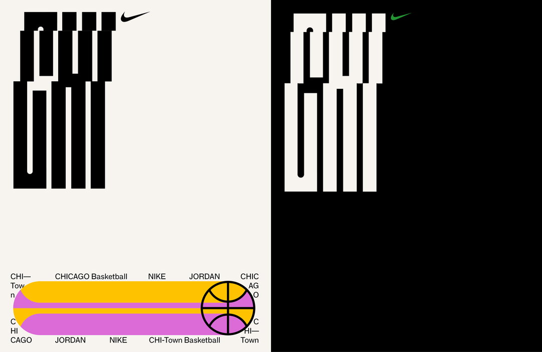
With the upcoming issue of Here launching at the end of this month, Chloe is full of buzz about the fact that it’s their first-ever illustrated cover. A special edition indeed, the issue is partly in response to the coverage of the pandemic in the creative industry, “and partially to speculations on life and travel afterwards.” As for her freelance ventures, she admits that it’s ever-changing but has a roster of projects in the making; she’s particularly looking forward to working on a couple of records for indie labels Network and BBE, the next issue of LAAB, as well as covers for Verso Books, the identity for Tribeca Drive-In and the Tribeca Film Festival’s summer event series, alongside a capsule collection of apparel for Nike. Watch this space!
GalleryChloe Scheffe
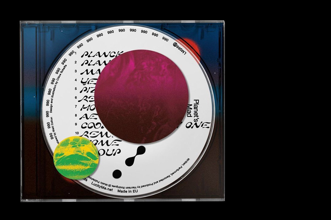
Baauer CD
Baauer Vinyl
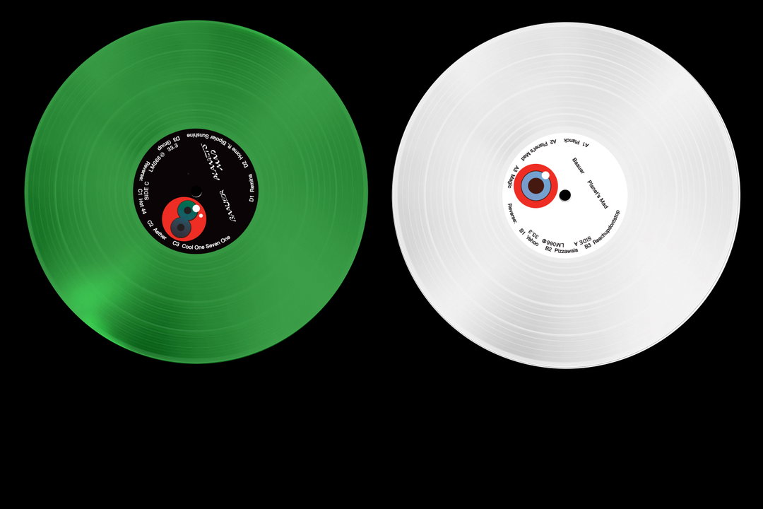
Baauer Vinyl
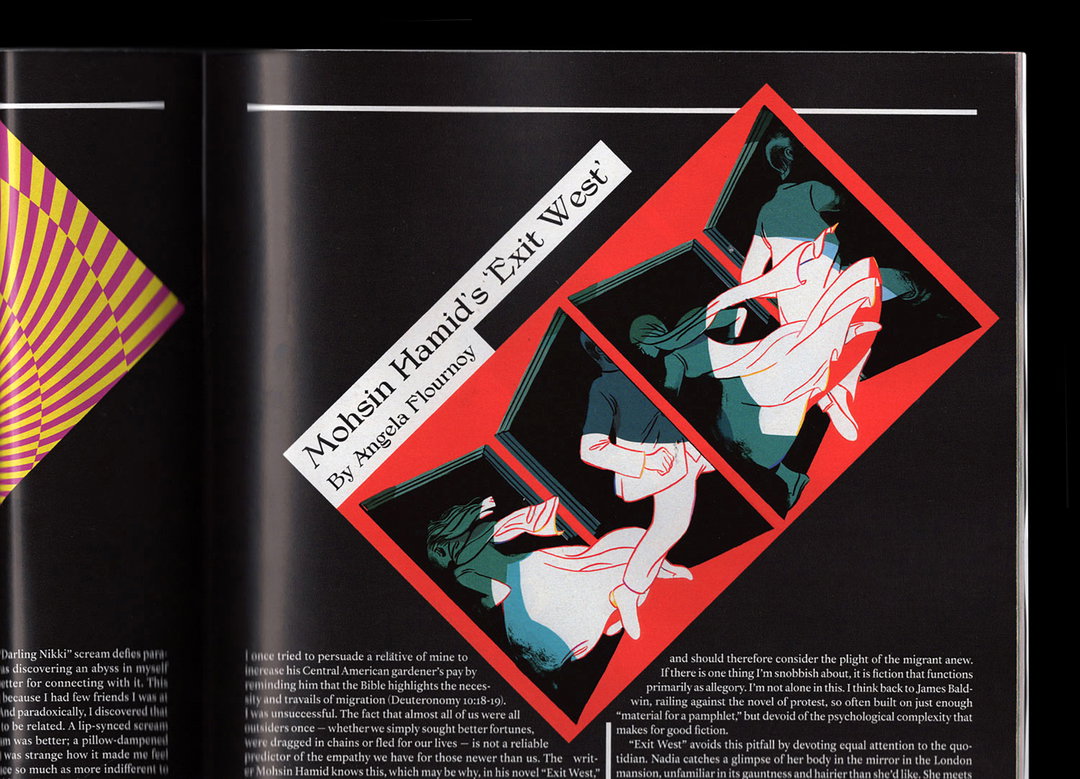
Exit West, NYT
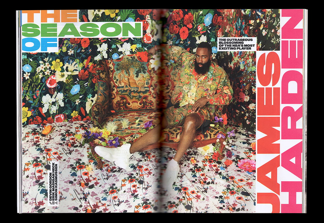
Harden
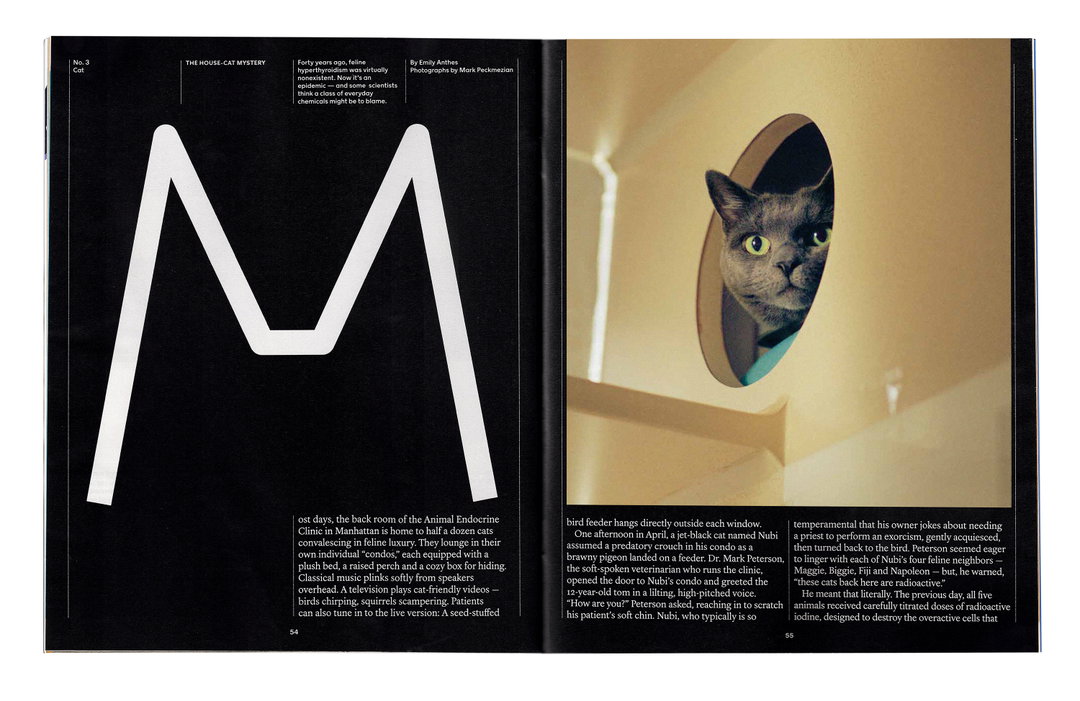
Health Issue, NYT
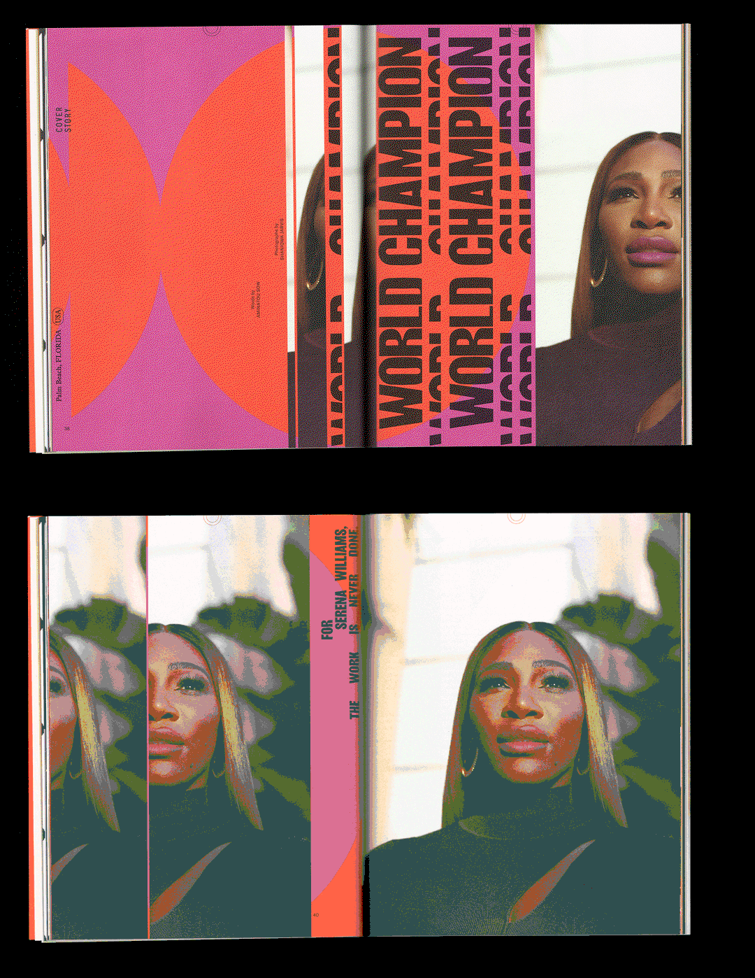
Here, Issue 11: Serena
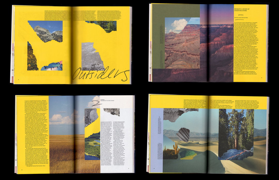
Here, Issue 6: Outsiders
Here, Issue 8: Dublin
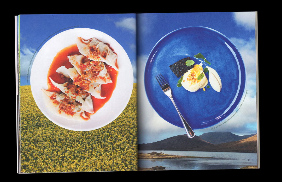
Here, Issue 8: Dublin
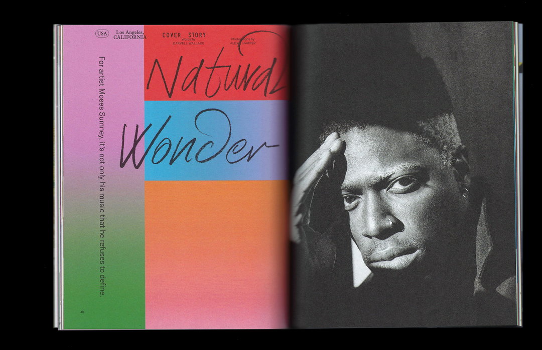
Here, Issue 12: Moses
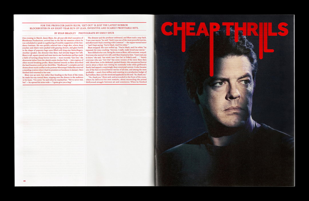
Blum, NYT
Education, NYT
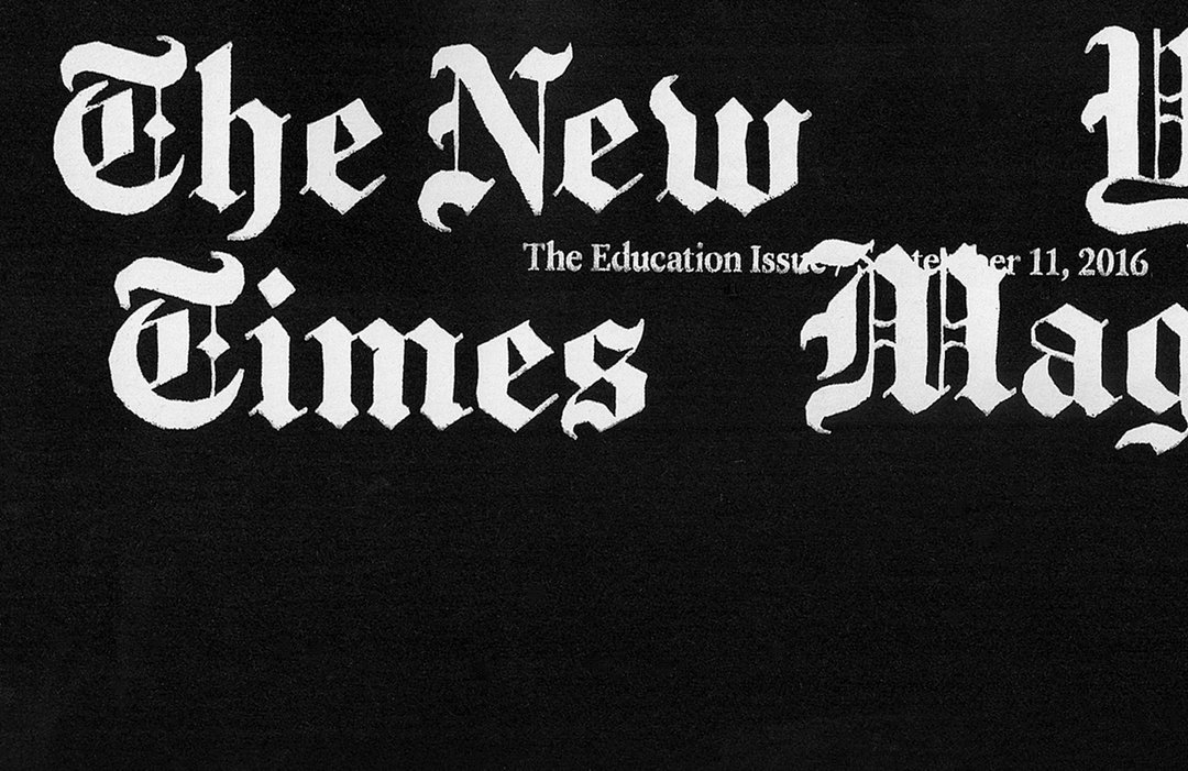
Education, NYT
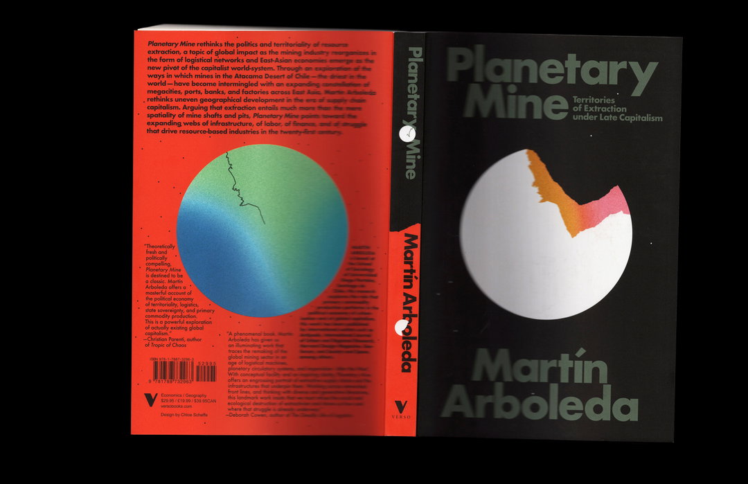
Planetary Mine
Share Article
About the Author
—
Ayla is a London-based freelance writer, editor and consultant specialising in art, photography, design and culture. After joining It’s Nice That in 2017 as editorial assistant, she was interim online editor in 2022/2023 and continues to work with us on a freelance basis. She has written for i-D, Dazed, AnOther, WePresent, Port, Elephant and more, and she is also the managing editor of design magazine Anima.