Launch Recite Me assistive technology
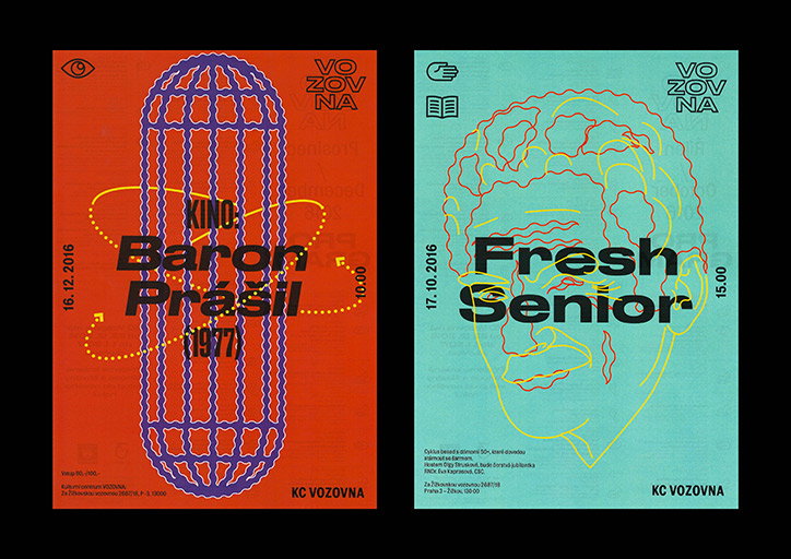
Two posters side by side against a black background. The first is red with a purple hatched oval and reads “KINO: Baron Prášil (1977)”. The second is mint green with a yellow line drawing of a face and reads “Fresh Senior”.

Designer Cindy Kutikova on translating her ideas into a visual language

—
Date
26 July 2017

Graphic designer Cindy Kutikova approaches every project as a “challenge to discover something new”. Based in Prague and currently studying at The Academy of Art, Architecture and Design (UMPRUM), Cindy has the opportunity to explore her interests in history and contemporary design through various projects including brand identities, poster design and websites.

“Because I’m still a student, the core of my work is school projects, which can be fully implemented and realised. I like these projects because when you work within the school environment, you can work more freely, take risks and experiment. I don’t have any restrictions from a client,” explains Cindy.

Typography is a key part of every project but it often comes after the designer has fleshed out the concept. “It’s not like that all the time though. Sometimes I have a clear vision of what type I’m going to be using from the start. It all depends on the theme and context,” she explains. Cindy has been working with fellow designer Jiri Mocek on “several visual styles” which see the pair create posters and festival identities that are bright, bold and experimental.

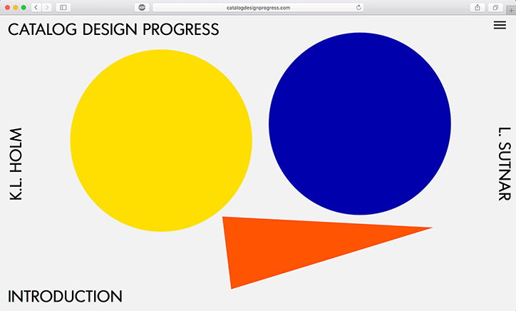
Another recent project Cindy is still working on is the digitisation of a book by Czech graphic designer Ladislav Sutnur from the 1950s. “The output is an interactive webpage, which isn’t complete yet. I see potential in this project because books which have come out in limited prints or are very rare can be made available to the project with this idea,” says Cindy.

As her work develops, Cindy is keen to keep the principles of design at the heart of what she does. “I’m trying to transform the core of the assignment into a visual language,” the designer explains. “I care about a clear and coherent transfer of the thought and idea. I’m trying to point out and shed light on the very essence of things.”
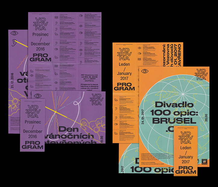
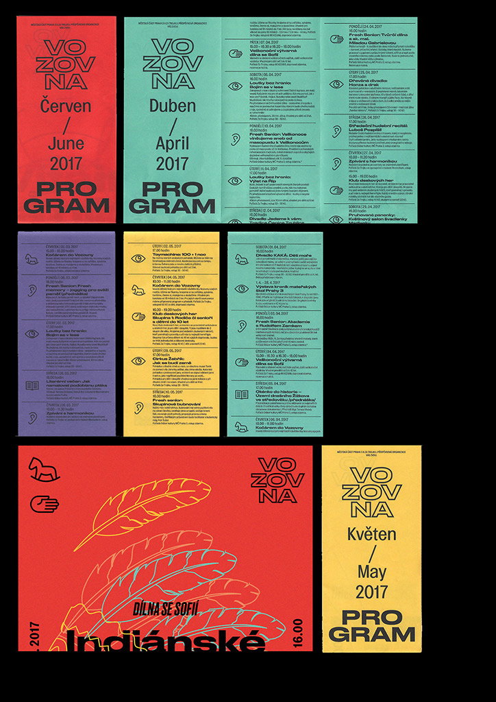
A collection of purple and orange event programmes for Vozovna. The layouts feature bold typography, grid-based text, and abstract line drawings.
Above

Cindy Kutikova and Jiri Mocek

A series of graphic posters and programme leaflets for “Vozovna” from 2017. The designs use bold blocks of red, green, purple and yellow with clean, sans-serif typography.
Above

Cindy Kutikova and Jiri Mocek

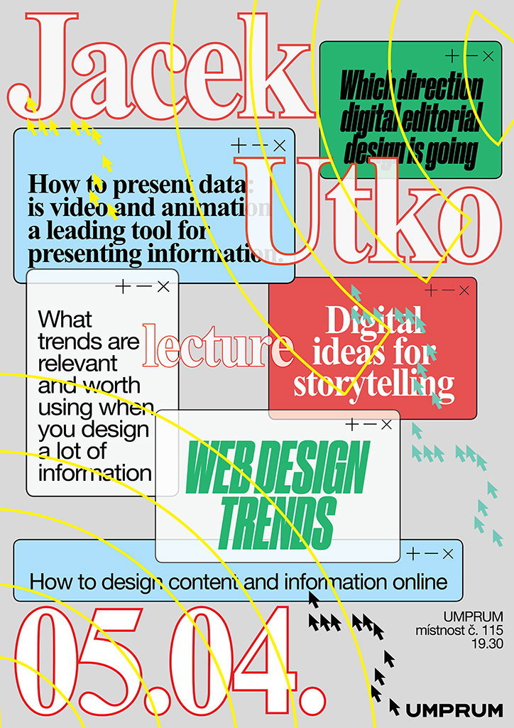
A graphic poster for a lecture by “Jacek Utko” on “Web Design Trends”. The layout features a collage of colourful text boxes and bold red outlines of the speaker’s name. The boxes contain questions about digital editorial design, data presentation and storytelling. The date “05.04.” is displayed in large red numbers at the bottom, alongside the location “Umprum místnost č. 115” and the time “19.30”.
Above

Cindy Kutikova

A website landing page featuring a large yellow circle, a blue circle and an orange triangle on a light grey background. Text reads “Catalog Design Progress” at the top, “Introduction” at the bottom, and the names “K.L. Holm” and “L. Sutnar” on either side.
Above

Cindy Kutikova

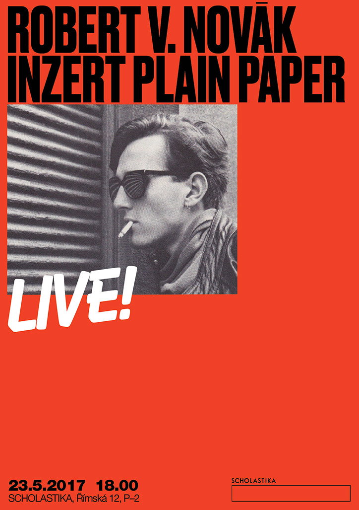
A red poster featuring a black and white photograph of a person wearing sunglasses with a cigarette in their mouth. Bold black text at the top reads “ROBERT V. NOVÁK INZERT PLAIN PAPER”, with the word “LIVE!” in white below the image. Small text at the bottom lists the date “23.5.2017”, the time “18.00”, and the venue “SCHOLASTIKA, Rímská 12, P–2”.
Above

Cindy Kutikova

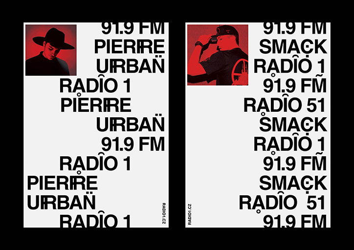
Two posters with a white background and bold black typography. Each features a small photo of a person at the top left and repeating text including “91.9 FM”, “Rádio 1” and “Urban”.
Above

Cindy Kutikova

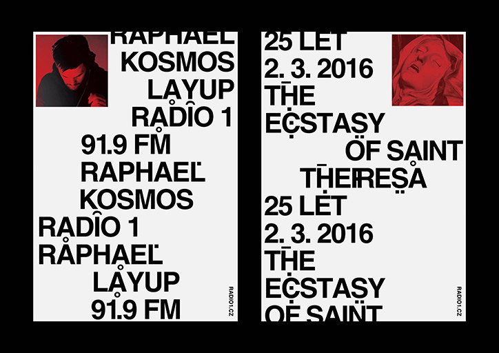
Two typographic posters on a black background. The first features a red-tinted photo of a person with headphones and text including “Raphael”, “Kosmos”, “Layup” and “Radio 1 91.9 FM”. The second shows a red-tinted image of a face and text reading “25 let 2. 3. 2016 The Ecstasy of Saint Theresa”.
Above

Cindy Kutikova

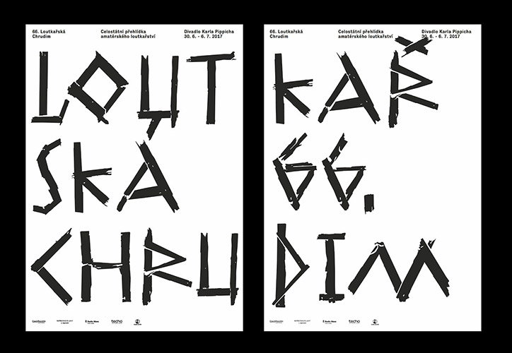
Two posters with bold, fragmented black typography on a white background. The distorted letters read “Loutkářská 66. Chrudim”, with smaller text at the top providing event details and dates.
Above

Cindy Kutikova

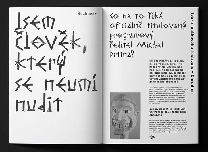
An open magazine spread featuring bold, hand-drawn black typography on white pages. The left page contains a large quote in Czech, while the right page includes a headline, columns of text and a surreal illustration of a smiling face.
Above

Cindy Kutikova

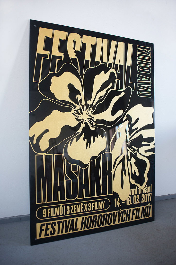
A black and gold poster featuring a stylised floral illustration. Bold text reads “Festival Masakr” and “Festival hororových filmů”, with the date “14.–16.02.2017” and the venue “Kino Avu”.
Above

Cindy Kutikova

Share Article

About the Author

Rebecca Fulleylove

—

Rebecca Fulleylove is a freelance writer and editor specialising in art, design and culture. She is also senior writer at Creative Review, having previously worked at Elephant, Google Arts & Culture, and It’s Nice That.


It's Nice That Newsletters

Fancy a bit of It's Nice That in your inbox? Sign up to our newsletters and we'll keep you in the loop with everything good going on in the creative world.