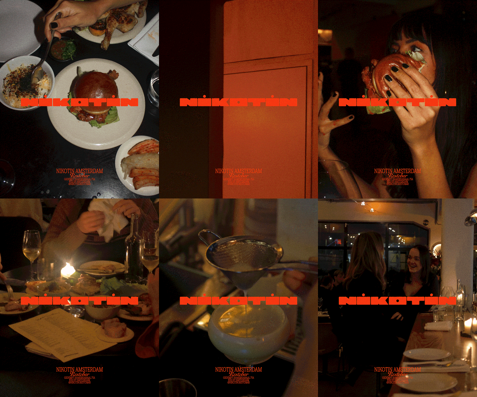
A tobacco factory turned restaurant, Nikotin’s logo takes the shape of a cigarette
A lesson in making something instantly cool and recognisable, Davy Denduyver’s design system uses typography as a clever nod to the restaurants past.
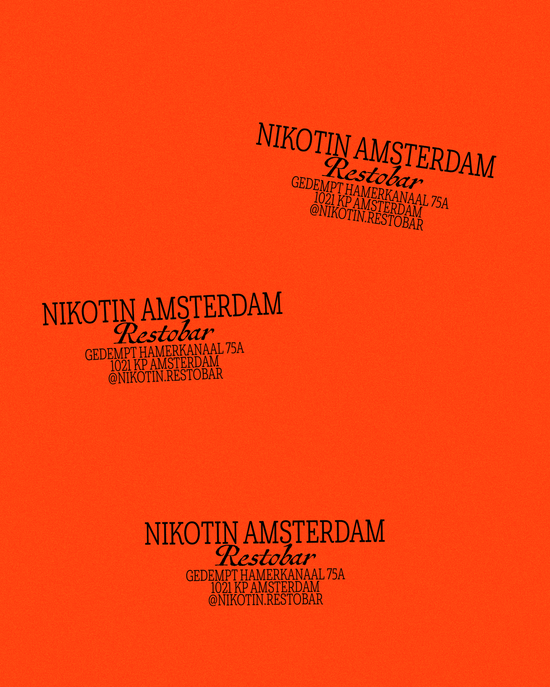
Bruges-based designer Davy Denduyver has built up quite the reputation for stylish and sleek restaurant identities and his latest visual system for Amsterdam’s newly opened bar and restaurant Nikotin, cofounded by nightlife institute Nachbar and Michelin-starred chef Tim Van Der Molen is no different. A last minute project “with a near impossible deadline”, Davy tells us, the restaurant’s branding was a creative puzzle that actually came together in a close collaboration with its interior designer in the run up to its opening: “Yoeri and I clicked from the start,” Davy says. “He wanted something rough with a little bit of a space age touch at the same time. Two things I love. They were already working with bright orange for the interior, so I tried to avoid that palette at first, but quickly realised it was the way to go”
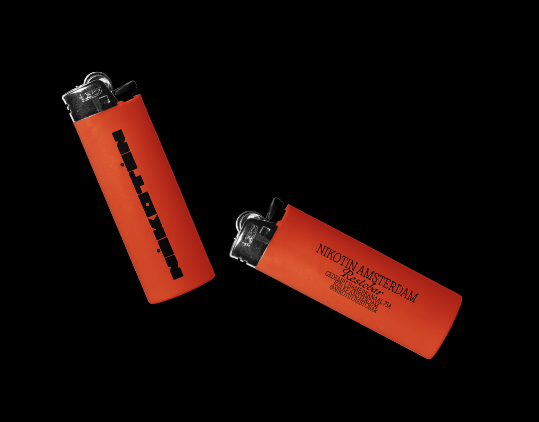
With this minimal but contrasting colour combination and the fact that the restaurant’s location used to be an old tobacco factory, Davy had a springboard to make something “that screams fun,” the designer says. Keen to implement the places tobacco influence from the outset, Davy wanted to strike a balance between something that gave a nod to the restaurant’s past while still arriving in a package that felt subtle and tasteful. “I had a lot of early iterations that were much more literal, inspired by iconic cigarette logos, but these didn’t feel right,” he says.
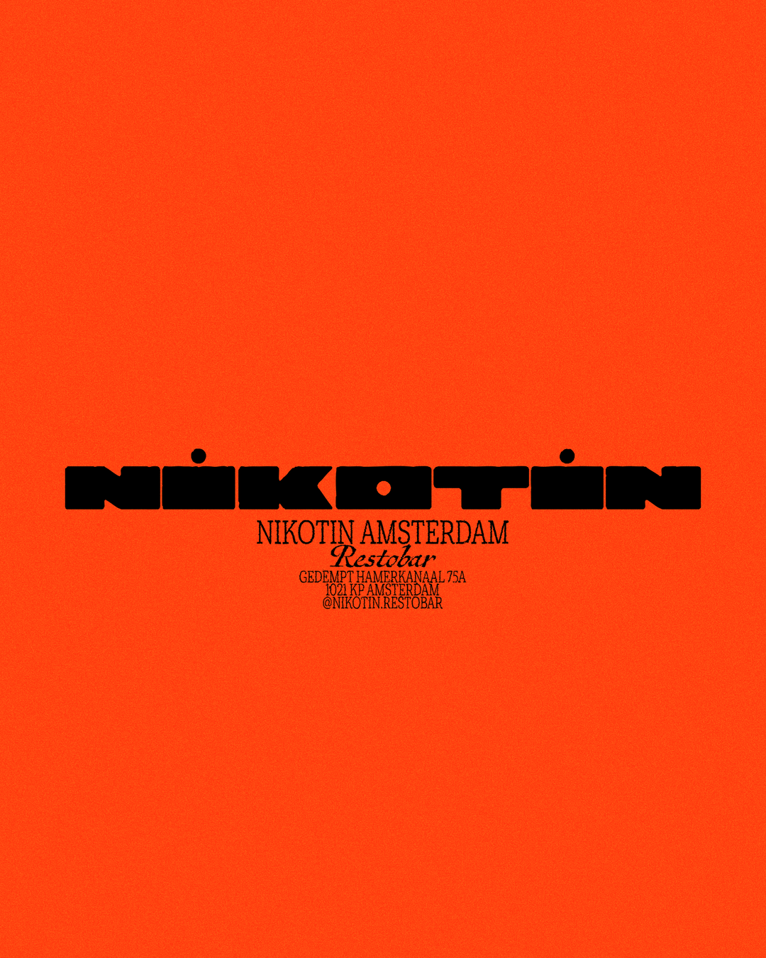
Davy Denduyver: Nikotin (Copyright © Davy Denduyver, 2026)
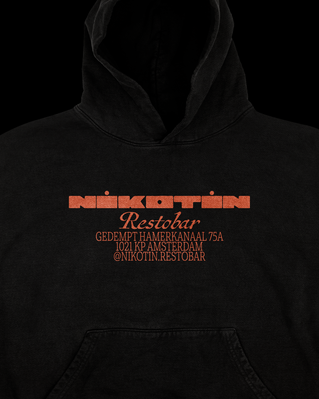
Stripping things right back to a simple horizontal form, Davy landed on an extended custom logo type that took the subtle shape of a cigarette. With its letterforms deliberately wide and rounded, the bold brand mark is also a nod to the kind of space age visuals that the restaurant owners were keen to have in the interiors and beyond from the beginning. “The cigarette influence isn’t the most conventional route for a restaurant to go down,” Davy says, “but I’m really glad we did. When a location has that type of story, it’d be weird not to work around it.”
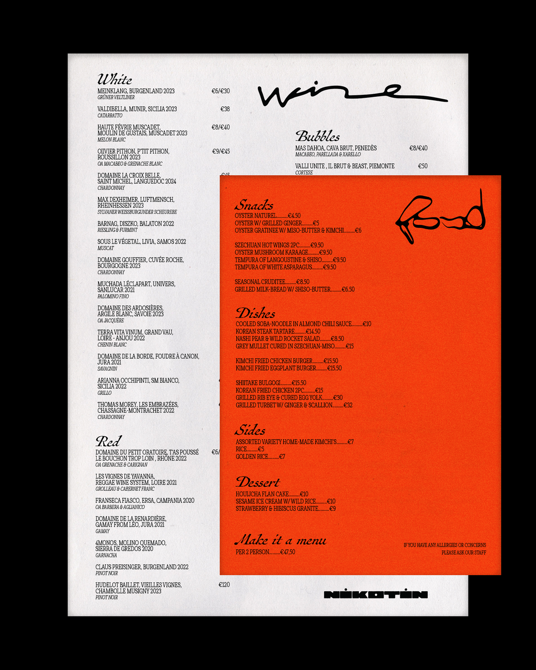
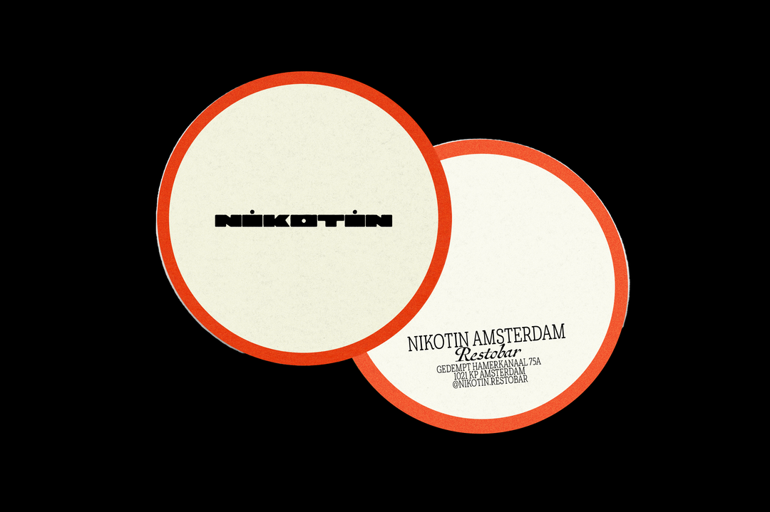
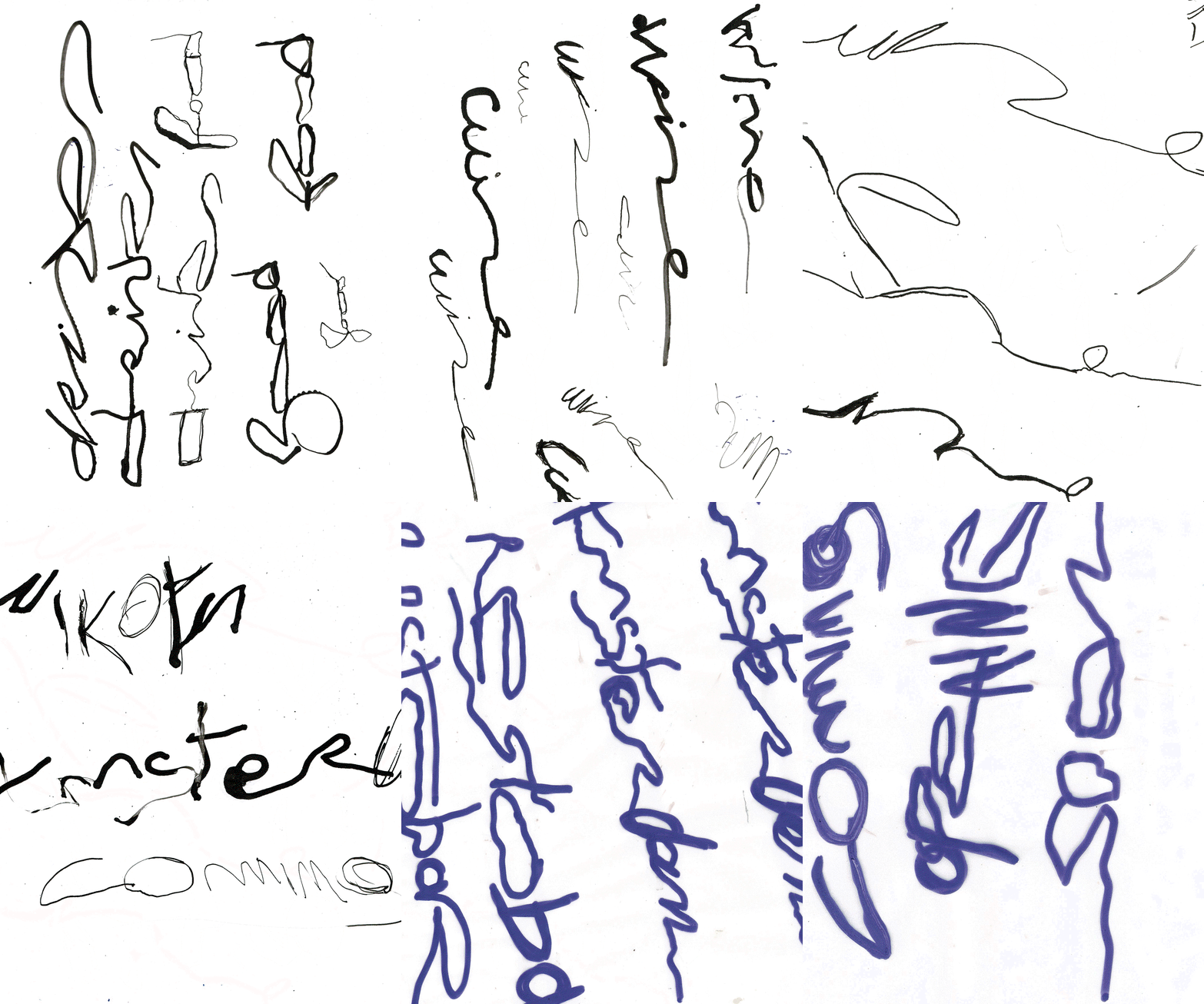
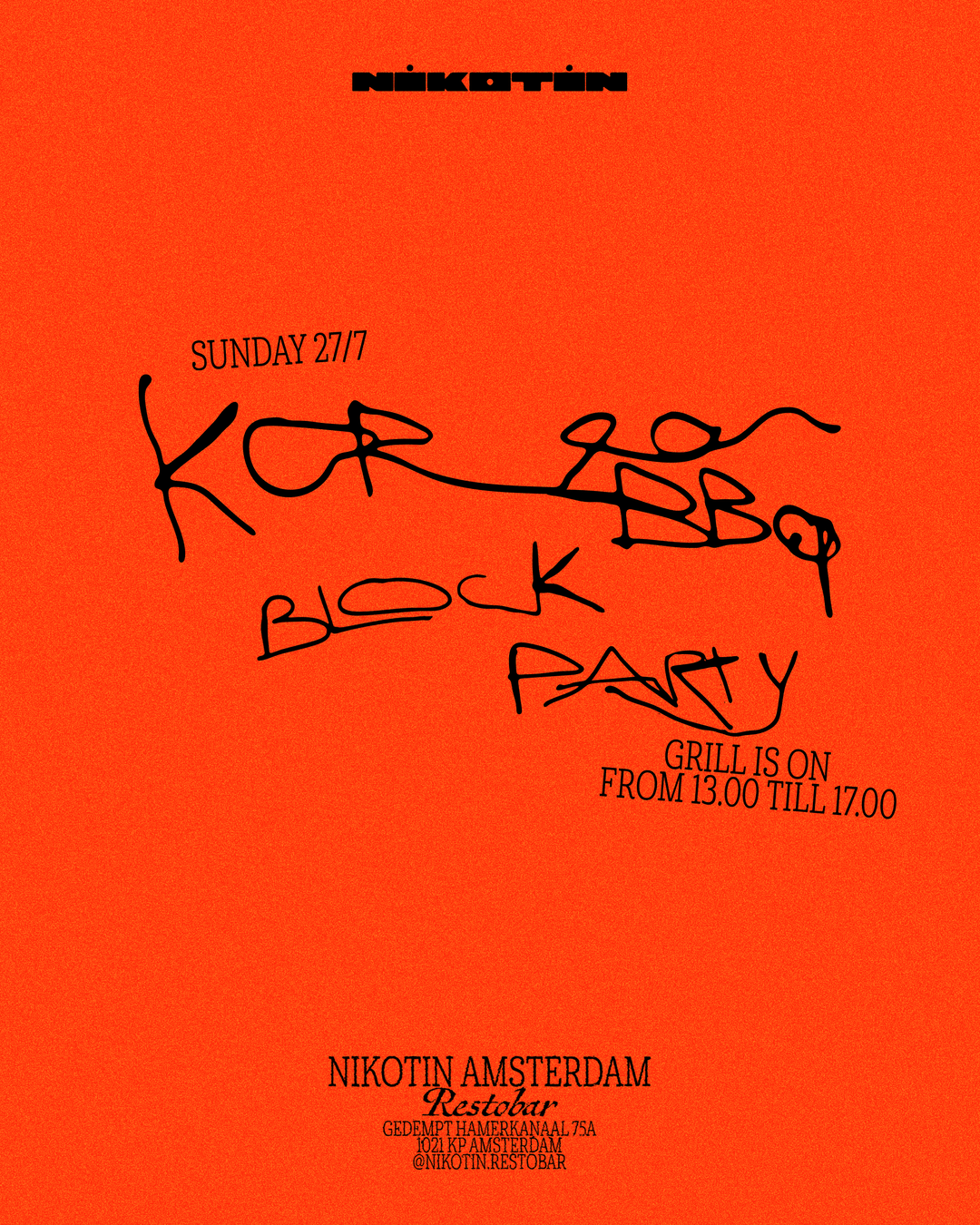
What surrounds this custom logo mark is a visual world that Davy built for Nikotin out of a far less controlled form of typography: handwriting. Created with a napkin sketch feel, this hand drawn type that covers menus and cards was something Davy drew countless interactions of using India Ink. It’s a looser approach that brings a rougher, unpolished feel to the identity, to reflect the restaurant’s grill based cooking. The analogue look and feel was also something that Davy didn’t want to miss out on: “Dining out is probably one of the least digital things we do now. And I think the visuals surrounding it should reflect that,” the designer ends. “Working with a technique like this means I give away the control, I am by no means a lettering or calligraphy artist, I just had fun and let go and that adds an element of surprise, and a certain uniqueness.”
GalleryDavy Denduyver: Nikotin (Copyright © Davy Denduyver, 2026)
Hero Header
Davy Denduyver: Nikotin (Copyright © Davy Denduyver, 2026)
Share Article
Further Info
About the Author
—
Ellis Tree (she/her) is a staff writer at It’s Nice That. She joined as a junior writer in April 2024 after graduating from Kingston School of Art with a degree in Graphic Design. Across her research, writing and visual work she has a particular interest in printmaking, self-publishing and expanded approaches to photography. ert@itsnicethat.com
To submit your work to be featured on the site, see our Submissions Guide.