Elizabeth Goodspeed on the branding challenge behind Mayor Zohran’s new municipal grocery stores
Everyone wants to know who will win New York City’s grocery store RFP – the more interesting question is what public identities should actually do.
Share
In late May, the New York City Economic Development Corporation released a Request for Proposals (colloquially known as an RFP) for a branding and design consultant to develop the identity for NYC Groceries, a new network of five city-supported grocery stores – one per borough – scheduled to open in the city over the next two and a half years. The initiative, part of Mayor Zohran Mamdani’s broader affordability agenda, aims to lower grocery prices, minimise food deserts, and demonstrate “a new role for public sector leadership in food affordability”. The selected collaborator will be responsible for developing the stores’ entire public-facing retail system. This includes naming (NYC Groceries is a placeholder), brand strategy, logo, visual identity, signage, wayfinding, employee uniforms, merchandising, and environmental graphics, as well as collaboration with architects and engineers as each location is designed and built.
Discourse about what design studios would apply, and who would be selected, began immediately. Would the project go to an established heavyweight – Pentagram came up in almost every conversation I had about the RFP – or would the Mayor’s office choose an indie darling, a dark-horse wunderkind, a civic design veteran, a youthful underdog, or something else entirely? The online information session for the project, held on 11 June, offered some clues as to who might be dipping their toes in the water: the PDF sent to attendees following the call listed emails for 637 registrants representing 481 organisations. These ranged from small New York-based boutique shops to major international branding firms. While registering for the session doesn’t necessarily mean a studio ultimately submitted a proposal, the email domains included many familiar names: &Walsh, Athletics, Alright Studio, Base Design, Gander, Gensler, Grand Army, Gretel, Koto, Local Projects, Mother, Mythology, Open, Parts & Labor, Pearlfisher, Pentagram, Polonsky & Friends, Studio Rodrigo, Sylvain, Thought Matter, Uncommon Creative Studio, Wieden+Kennedy, and many, many, many more.
“When you’re an op-ed columnist – essentially a professional yenta – asking about a project that the whole city is applying for, nobody really wants to tell you anything.”
Elizabeth Goodspeed
Over the last few weeks, I chatted with more than a dozen studios or designers that submitted proposals. Almost everyone declined to speak on the record. Perhaps for good reason: the RFP includes a clause stating that “Recipients of this RFP shall make no news or press release pertaining to this RFP or anything contained or referenced herein without prior written approval from NYCEDC.” Then again, perhaps it was naïve of me to expect otherwise, legalese or otherwise. When you’re an op-ed columnist – essentially a professional yenta – asking about a project that the whole city is applying for, nobody really wants to tell you anything. One studio founder suggested that discussion among design studios in New York was similarly tight-lipped. Specifically, he compared it to an Art Directors Club poster designed by Bob Gill for the organisation’s 65th Annual Exhibition in 1985; it shows two be-suited men warmly shaking hands, each concealing a weapon behind his back. Basically, everyone was excited about the opportunity, but everyone knew everyone else was too.
Given his meteoric rise and unusual status as a political tastemaker (as The New York Times recently put it, “Zohran Mamdani Knows He Has Political Capital. And He Intends to Spend It”), it’s no surprise that so many people are eager for a piece of the Mr Cardamom pie. Just as Mamdani has become a kingmaker for politicians, he’s done the same for designers; Forge, the studio behind his original campaign identity (currently the lone case study on its website) got coast-wide coverage for its work in publications from The New York Times to The Hollywood Reporter. Since taking office, the administration has continued commissioning ambitious graphic design work, from Arsh Raziuddin's identity for NYC’s World Cup campaign to the newly redesigned Key to the City with custom typography by Frere-Jones Type. If this much attention followed a mayoral campaign, a temporary civic initiative, and a Knicks win (no matter how historic!), imagine the visibility attached to designing a visual identity that might become as familiar to New Yorkers as the MTA or Key Foods.
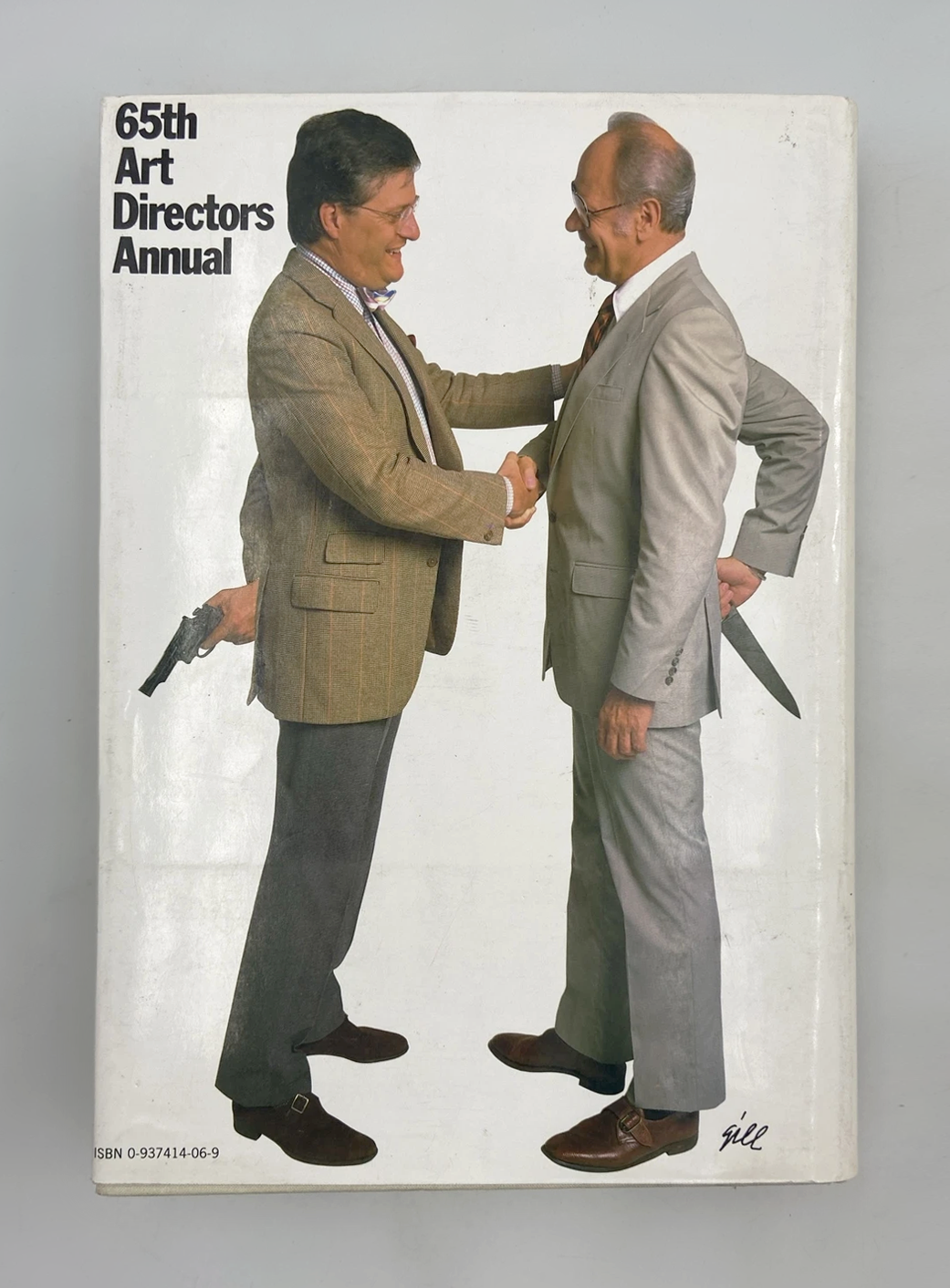
Art Directors Club call for entries, 1985
Arsh Raziuddin & New York City Hall: World Cup Campaign (Copyright © Arsh Raziuddin & New York City Hall, 2026)
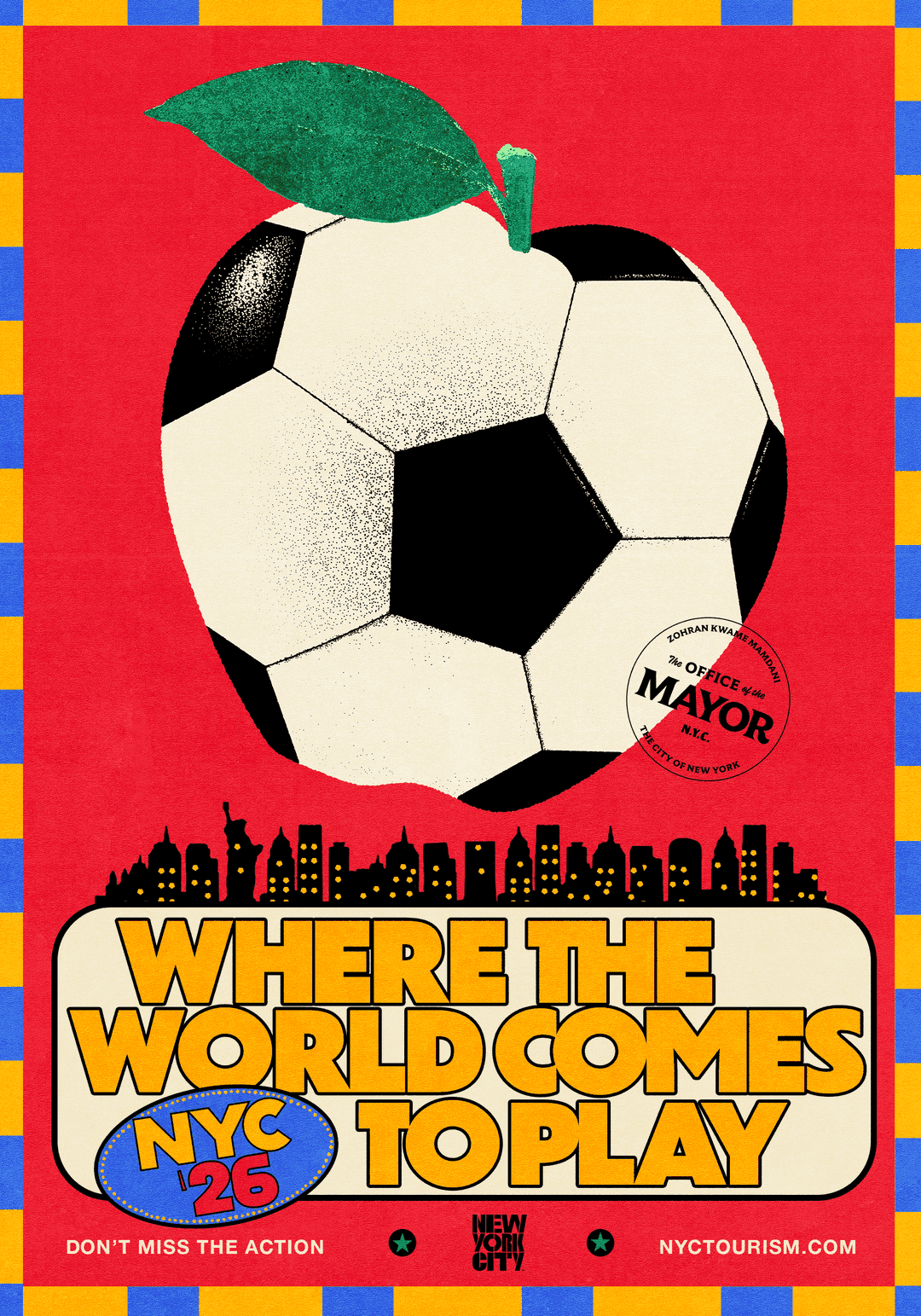
Arsh Raziuddin & New York City Hall: World Cup Campaign (Copyright © Arsh Raziuddin & New York City Hall, 2026)
Perhaps even more importantly, the project offers an unusually rare combination of prestige and ideological alignment. Most of the time, the highest-profile branding commissions come from multinational corporations; this brings visibility, but often comes with inevitable ethical compromise. The world knows you did Amazon, but, uh, the world knows you did Amazon. NYC Groceries squares the circle: all the clout, none of the baggage. The project, improbably, manages to be both indie and mass, ethical and lucrative.
Of course, not every box is checked. NYC Groceries carries a maximum value of $1 million over roughly three and a half years, running from mid-2026 to the end of 2029. This isn’t paltry by any means, especially for the public sector, but it’s still a modest fee by most studios’ standards, particularly once you consider all that the budget has to cover. By comparison, I’ve heard rumours that Warner Bros.’ 2023 logo cost $2 million (or, as I prefer to think of it, $1 million a letter). To be clear: this isn’t an argument that the City should have spent more. A million dollars is a lot of money in almost any context, and public agencies have genuine budget constraints (any more and the New York Post would probably run a front page with ZOHRAN’S $2M LOGO in 120-point type). I only mean to say that given the fee, and the symbolic capital attached to the project, studios with deep enough pockets are probably happy to treat the commission as a loss leader rather than a profit centre. More than one designer I spoke with said they assume that if firms like Collins or Ogilvy throw their hats in the ring, they’ll simply offer to do the work for cheap-to-free – creating what one might call, in local parlance, an offer Mamdani “can’t refuse”. Smaller studios, meanwhile, can’t always afford to subsidise work.
“NYC Groceries squares the circle: all the clout, none of the baggage. The project, improbably, manages to be both indie and mass, ethical and lucrative.”
Elizabeth Goodspeed
While the RFP is technically open to anyone, another significant evaluation criterion favours firms already embedded in New York City’s procurement ecosystem. The City requires that at least 30 per cent of the NYC Groceries contract value go to certified Minority- and Women-Owned Business Enterprises, or M/WBEs. Only M/WBEs accredited through the New York City Department of Small Business Services count towards the participation requirement; certification from another state does not, nor does pending certification. In practice, that means studios without existing certification are already at a disadvantage. This is a meaningful distinction in an industry where diversity is increasingly – finally! – a hiring consideration, but government certification almost never is. This requirement has had downstream effects on how teams have approached the RFP. I spotted one studio recruiting collaborators for its RFP team based on M/WBE certification, rather than simply seeking women- or minority-owned collaborators. Other teams mentioned using the City’s M/WBE directory to find partners, though several admitted the pool felt surprisingly thin. The numbers bear this out: searching “graphic design” in the City’s directory returned just 256 certified businesses, compared with more than 2,400 under “construction”.
What most studios seem to be left grasping for is what Mamdani is looking for, and how they can become it. So far, the Mayor has built much of his political identity around accessibility, coalition-building, and scepticism towards elite institutions. That creates an interesting tension with graphic design, a profession that often traffics in prestige; golden pencils, celebrity design influencers, and insider networks abound. If you’re responding to a project whose political identity is explicitly populist, do you lean into your elite design credentials, or downplay them? Some applicants described carefully considering how much prior civic experience to foreground, for fear that invoking prominent collaborators or connections would read as insiderism or an attempt to curry favour. Another team made the opposite calculation, mentioning an existing relationship with Mamdani’s office in its submission as evidence that it already understood the administration and how to work within it. Applicants weren’t just trying to convince the City they were talented; they were trying to convince the City they understood what kind of talent this administration valued.
“Ultimately, the question the RFP is posing to studios is this: what should civic branding be? It’s admittedly a bit of an oxymoron.”
Elizabeth Goodspeed
Despite all this uncertainty, the administration has offered a few clues to what they might be looking for. When read closely, the RFP – and the accompanying 83-page Q&A document answering 697 questions submitted by prospective applicants – begins to sketch out the specific kind of practice and approach. Over and over in the doc, designers ask the NYCEDC for aesthetic guidance. Should the brand feel “empowering, neighbourly, proud, something else?” Were there existing brands the NYCEDC admired? Was the City looking for something “bold, vibrant, wholesome; minimal, simple, earthy; cool, edgy, street”? The City’s response was remarkably consistent, and deliberately vague: “NYCEDC encourages the selected Branding and Design Consultant to recommend brand concepts that are informed by strategic insights.” In other words: we’re not going to tell you what this should look like, because we want you to tell us. Implicitly, the RFP is selecting less for a particular visual sensibility than for a way of working. The ideal collaborator isn’t a visual auteur with a logo already in mind, but a researcher, strategist, collaborator, and systems thinker – less Smile in the Mind than The Death and Life of Great American Cities. It makes sense, then, that respondents were repeatedly instructed not to submit speculative design concepts, but to demonstrate the quality of their thinking through past work instead. After all, how could they arrive at the right answer before they’d asked the right questions?
Ultimately, the question the RFP is posing to studios is this: what should civic branding be? It’s admittedly a bit of an oxymoron. After all, as a discipline, branding was largely developed in the service of commerce. Consumer brands typically deploy visual identities to cultivate personality, aspiration, loyalty, even envy. The visual identity of a civic institution aims to do something entirely different: to cultivate trust and recognition. Much less important, if present at all, is competing for market share in the way commercial brands do; the Department of Sanitation doesn’t have to convince most people to choose its garbage collection over a competitor’s any more than the MTA needs to persuade New Yorkers to ride one subway instead of another.
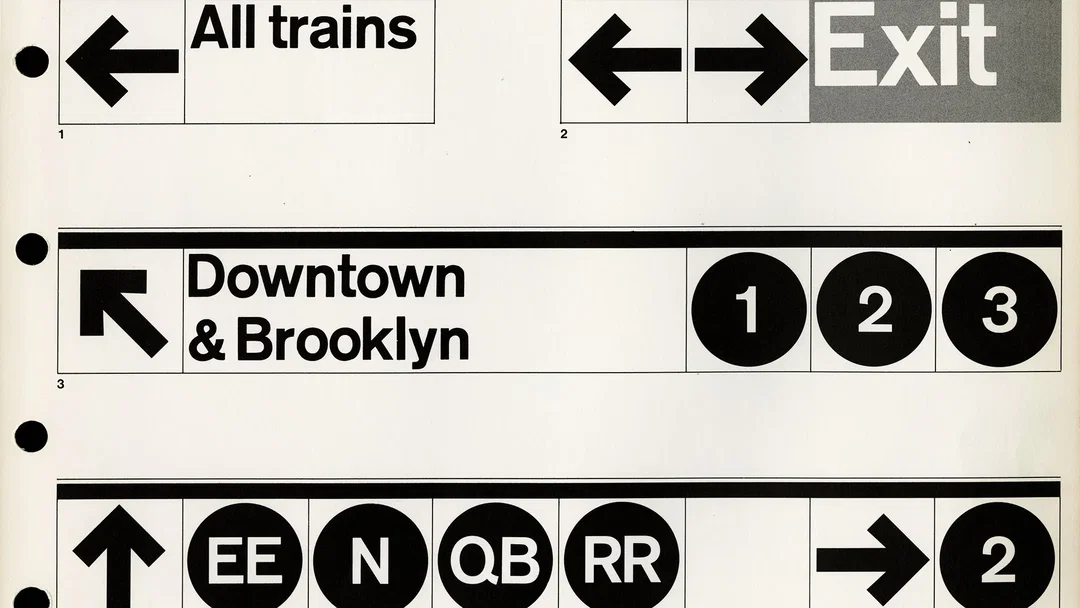
Massimo Vignelli and Bob Noorda / Unimark International: 1970 New York City Transit Authority Graphics Standards Manual
NYC Groceries is unusual because it occupies two worlds simultaneously: a public institution operating inside a competitive retail marketplace. There are existing public institutions, like the USPS or public universities, that also operate in competitive environments while advancing a public mission. But even they aren’t asking customers to compare cereal boxes on a shelf or storefronts in Hunts Point. In 2028, someone deciding where to buy milk will be able to choose Trader Joe’s, Key Foods, Wegmans, Fairway, Aldi – or NYC Groceries (with a 30 per cent discount). In that sense, the closest commercial analogue may be a supermarket’s private label: a brand, usually cheaper than the alternatives, owned by an institution rather than a manufacturer. To wit, one of the most fascinating parts of the brief – to this designer, at least – is the RFP-listed task of creating NYC Groceries’ own line of packaged goods. Effectively, the winning team will be designing New York City’s own generic grocery brand, much like the iconic yellow No Name packaging designed by Don Watt for Canadian supermarkets or Collins’ work for Target’s Up&up house brand. The crucial difference, of course, is that the institution behind the products isn’t Target, Costco, or Loblaw, but the City of New York. What NYC Groceries needs to do is convince New Yorkers to place some of the trust and loyalty they’ve long invested in private brands in a public one instead.
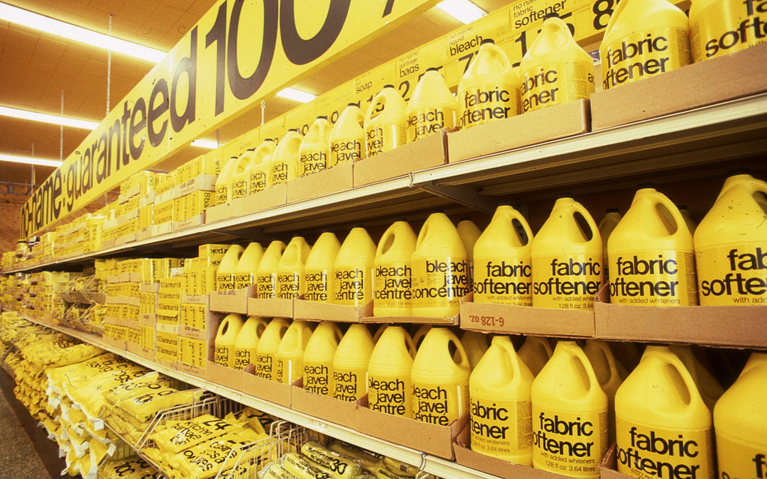
Don Watt: No Name branding (Copyright © Loblaw Companies)
Collins: Up&up branding (Copyright © Target)
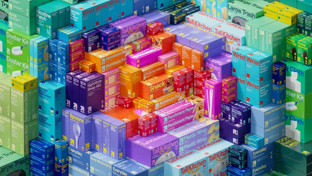
Collins: Up&up branding (Copyright © Target)
“Branding can only capture the spiritual soul of a place if it bears the handprints of people, not the fingerprints of the ‘system’.”
Kelli Anderson
Exactly what that trust should look like is far less obvious. David Barnett, co-founder of Noble Signs and the New York Sign Museum, sees the project as an opportunity to return to an older New York tradition of direct, legible communication. In his recent Nicer Tuesday talk, he argued that this kind of clarity has become increasingly rare in contemporary visual identities. “Walk down Broadway in SoHo today and you may have a hard time figuring out what most stores sell without any prior knowledge... You don’t know what this is? Maybe you should keep walking.” Older storefronts, by contrast, put their offerings front and centre: Deli. Restaurant. Coffee Shop. Bakery. Meat Market. To David, good public design doesn’t withhold meaning. Another applicant to the RFP sees a similar opportunity for civic branding: “The visual cacophony of our everyday lives is only increasing, and the services we need to get by are filtered through a kaleidoscope of VC-funded, privately owned brands and products. It would be incredible for this project, and public graphic design in general, to counteract this dissonance by producing a clear, accessible, and welcoming visual environment for us all.”
All this clarity doesn’t mean municipal grocery stores can’t look good. Perversely, the coolest person in the room is often the most earnest one, simply because it’s obvious how uninterested they are in performing coolness. NYC Groceries could accomplish something similar by avoiding the usual playbook. As Kelli Anderson – whose past work includes the identity for New York fixture Russ & Daughters – put it: “The usual plan of attack – with its corporate standards manuals, top-down guidelines, and spiritually degrading suburban modular efficiencies – will never fly with New Yorkers.” That conviction was central to her proposal. In her cover letter to NYC Groceries, she wrote that “branding can only capture the spiritual soul of a place if it bears the handprints of people, not the fingerprints of the ‘system’.” The appeal of Mamdani's project, then, won’t come from chasing aspiration, but from expressing its purpose with enough clarity and authenticity that people come to love it for exactly what it is – the same way New Yorkers have come to love idiosyncratic retailers like Kalustyan’s, Canal Plastics, Di Palo’s, Economy Candy, Casey Rubber Stamps, or, yes, even Mamdani himself, who, despite all the adoration (and his obviously-cool wife), is, at heart, an unabashed cornball.
Only time will tell what the branding for NYC Groceries looks like, and who will design it. And to the many studios who privately worried they’d be competing against Pentagram, there’s some consolation: at a party a few days before the deadline, I heard someone mention the RFP to a higher-up at Pentagram. They hadn’t heard of it.
Share Article
Further Info
About the Author
—
Elizabeth Goodspeed is It’s Nice That’s US editor-at-large, as well as an independent designer, art director, educator and writer. Working between New York and Providence, she’s a devoted generalist, but specialises in idea-driven and historically inspired projects. She’s passionate about lesser-known design history, and regularly researches and writes about various archive and trend-oriented topics. She also publishes Casual Archivist, a design history focused newsletter.