The new issue of Colors is a beautiful guide to the end of the world
Sometimes it’s easy to get carried away with modern life, perched happily on the apogee of human innovation in a tech-savvy world of comfort and convenience. What that kind of flabby mindset needs is a reality check, and Colors magazine has just the thing. The latest issue in its ongoing survival series is a guide to the big-one – apocalypse and how best to get through one.
The cheerful write-off on the website points out: “Civilization could end in a hundred ways. Yet the relentless onslaught of disaster prophecies leaves you overwhelmed, exhausted and unsure who to believe.” Fair point, but luckily for those of us afflicted with this so-called “apocalypse fatigue” help is here with a one-stop guide to riding out the worst things in the world.
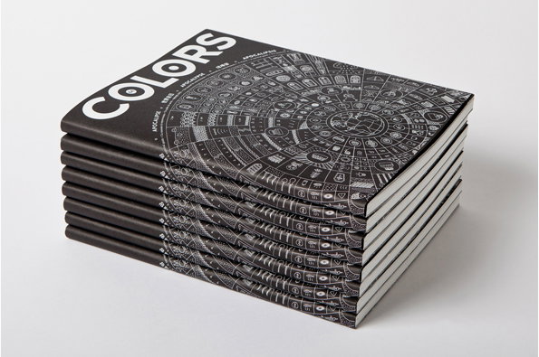
The drawback though is that if you do need something to burn during a nuclear attack or a flash flood, this magazine is just far too beautiful to sacrifice. A lovely intricately-illustrated monochrome poster-cum-cover leads into the crisp, clear content, with the designers making excellent use of some stunning photography. A seriously good-looking treatment of this uber-dramatic subject matter.
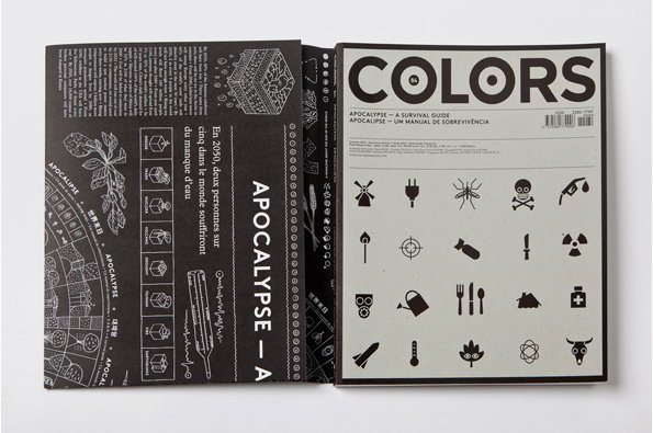
Colors 84: Apocalypse
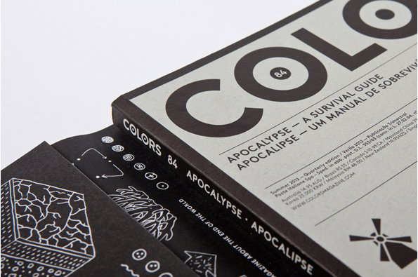
Colors 84: Apocalypse
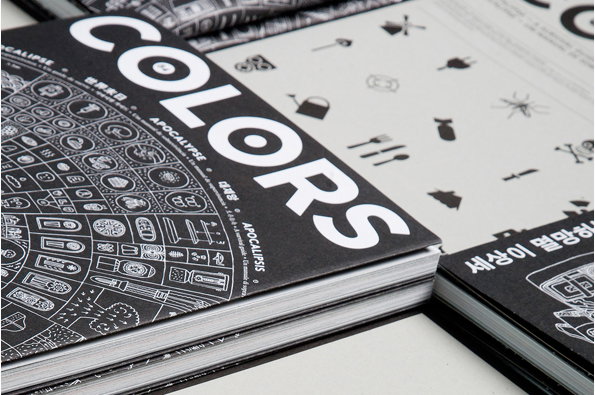
Colors 84: Apocalypse
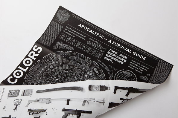
Colors 84: Apocalypse
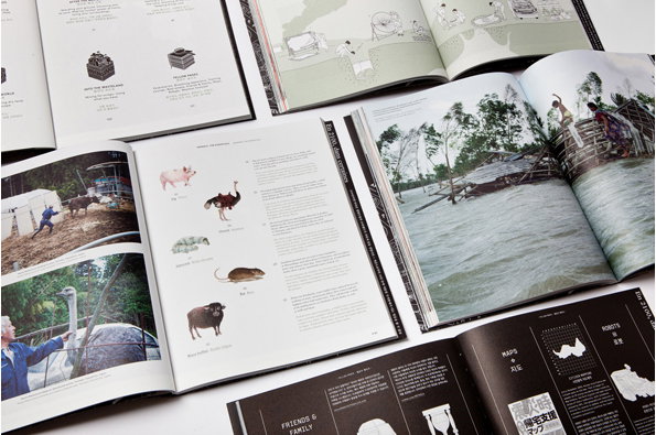
Colors 84: Apocalypse
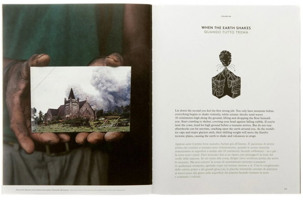
Colors 84: Apocalypse
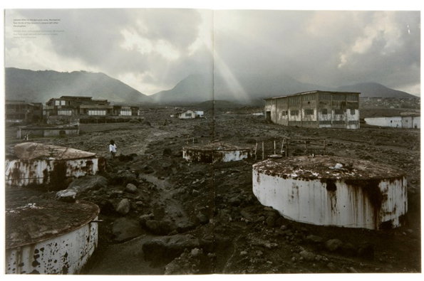
Colors 84: Apocalypse

Colors 84: Apocalypse
Share Article
Further Info
About the Author
—
Rob Alderson is a freelance writer, editor and strategist. He was previously editor-in-chief of It’s Nice That and WePresent, and editor of Design Week. He publishes the newsletter Undo, which tries to make sense of how AI is changing design work, the design process and the design industry.