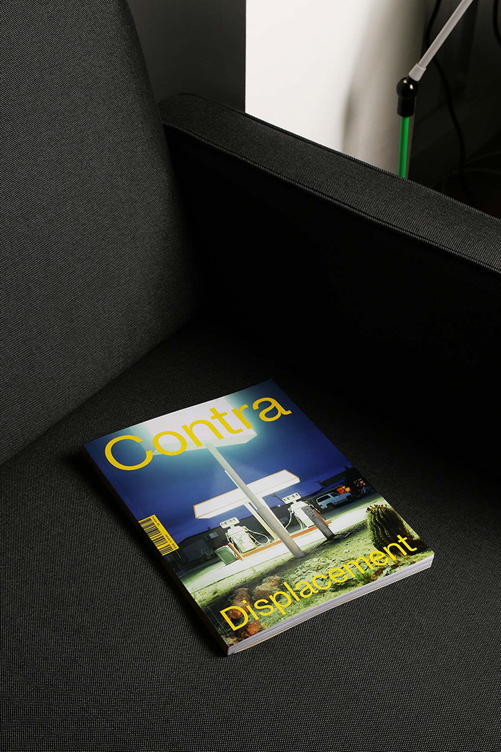
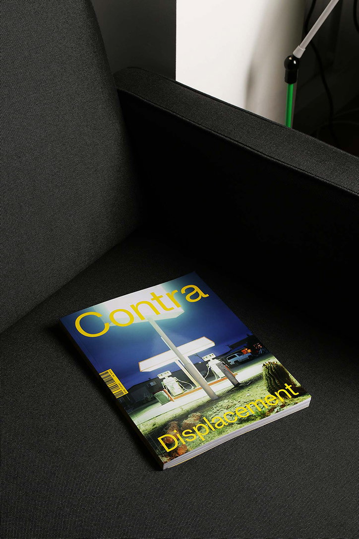
Contra Journal shines a light on visual responses to conflict and migration
“The word contra means ‘against or in opposition to’ and so is conflictual by definition,” explains George Brodie, co-founder of Contra Journal, a new publication exploring the interactions between visual culture and conflict. With strong social and political motivations, it informs on the subject in a new fashion, beyond traditional newspaper headlines or academic essays.
Contra was born out of a conversation between George and co-founder Ben Bohm-Duchen back in 2015. Having both studied and written about representations of conflict extensively as part of their university degrees, they felt compelled to create accessible material (outside the world of academia) that reflected how important and engaging the topic of conflict is.
Three years later and the pair has built up a team of six, all based in London and working across the fields of publishing, museums, cooking and filmmaking. With content pulled from various corners of the creative world, Contra is a publication dedicated to “shining a light on the artists and voices that are not often seen or heard when engaging with conflict,” in turn, creating something which considers an alternative narrative to that found in mainstream media.
In its first issue, Contra will thematically explore displacement. “Over the last few years, there has been a dramatic increase in images related to migration in the mainstream media as a result of what’s commonly termed as ‘the refugee crisis,” explains George, “it’s arguable that single images swayed policies and voters.” Despite being a topic which initiates debate and engagement, there are few opportunities to consider the visual elements related to displacement outside of traditional media. In its debut issue, Contra is, therefore, able to support the effort to re-engage the public whilst widening the narrative, as the press moves on to other headlines.
Featuring a clean, clear and minimal design, Contra explores the subject of displacement through a plethora of voices and sources. “We did this by considering traditional mediums such as photojournalism and fine art, but we also looked to visual practitioners in fields such as architecture and dance, which have heavily explored this topic but may not be as easily accessed in everyday encounters with media,” say Ben and George.
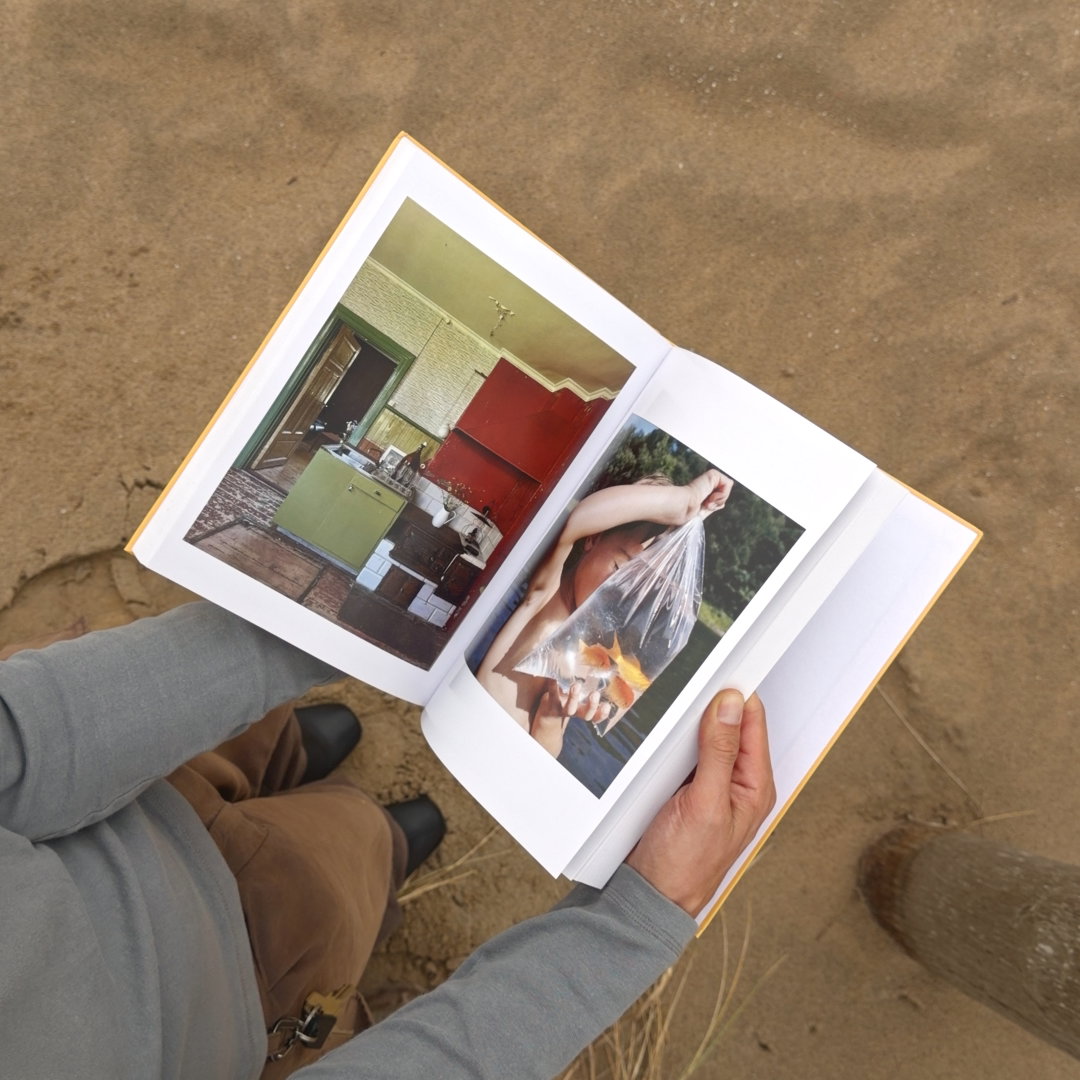
With an emphasis on the visual responses to current and past migration, the publication sports two covers – one shot by Seba Kurtis and the other by Harley Weir. A further selection of Harley’s photos can be found within the journal’s covers, providing an insight into the Calais Jungle through the homes of some of its residents. These visual responses manifest themselves beyond photography and imagery, however. In an interview with Akram Khan, Ben and George present a conversation on displacement, xenophobia and identity and how they have influenced the esteemed choreographer’s work.
Through the combination of captivating photo essays and insights into the thoughts of well-known creatives, Contra Journal utilises art and design to create a platform that communicates stories and champions unheard voices. Designed by Our Place, Contra launches this Friday, 19 January, at Rich Mix.
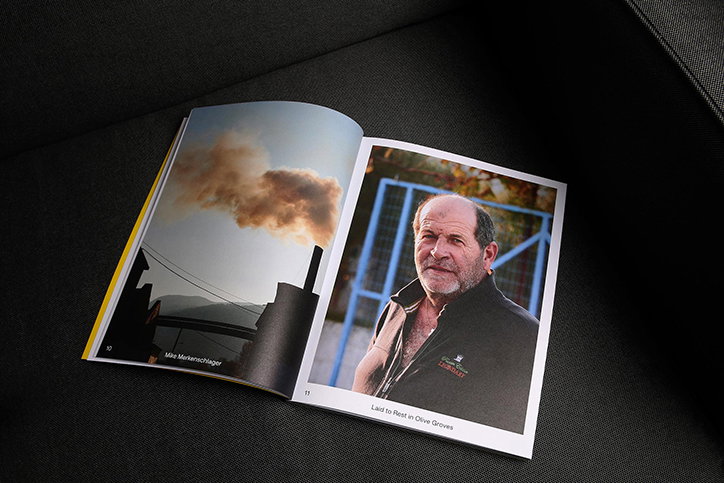
Contra Journal, Issue 01, designed by Our Place
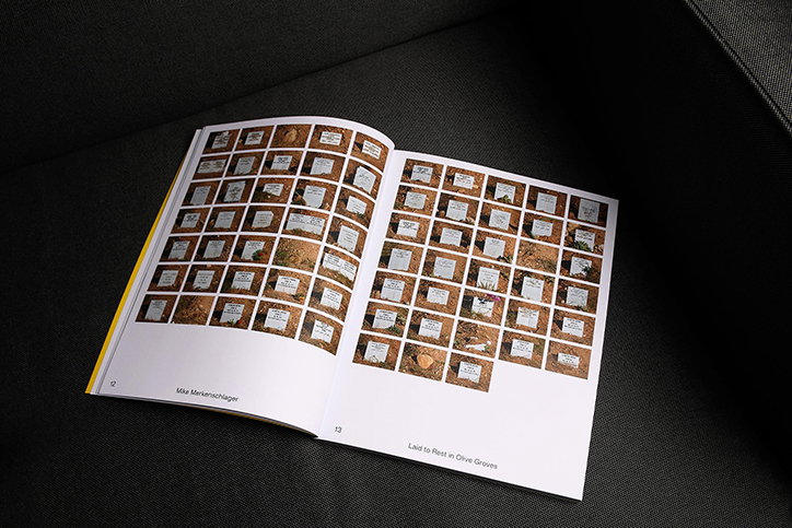
Contra Journal, Issue 01, designed by Our Place
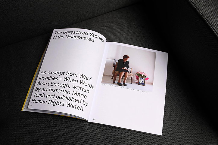
Contra Journal, Issue 01, designed by Our Place
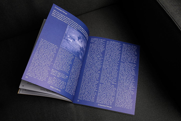
Contra Journal, Issue 01, designed by Our Place
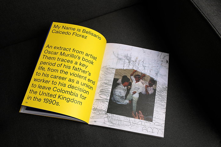
Contra Journal, Issue 01, designed by Our Place
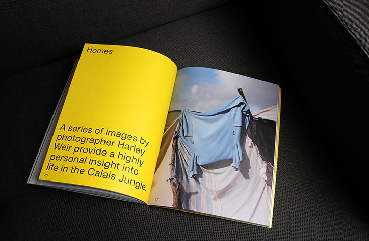
Contra Journal, Issue 01, designed by Our Place
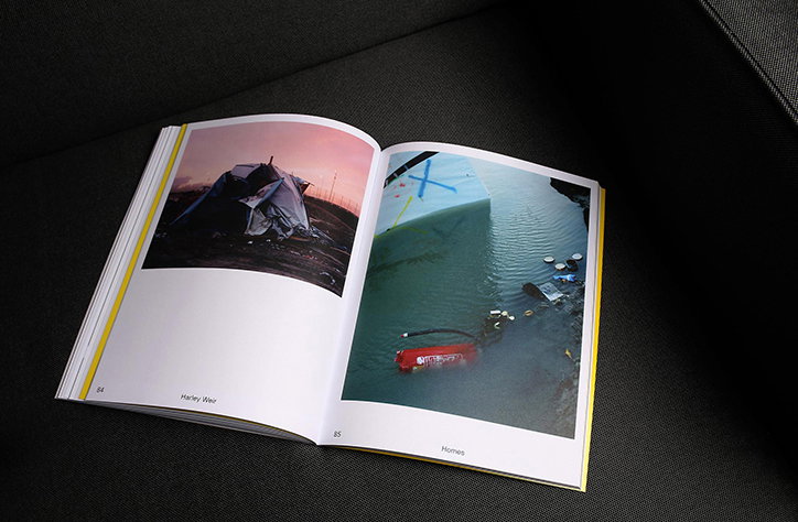
Contra Journal, Issue 01, designed by Our Place
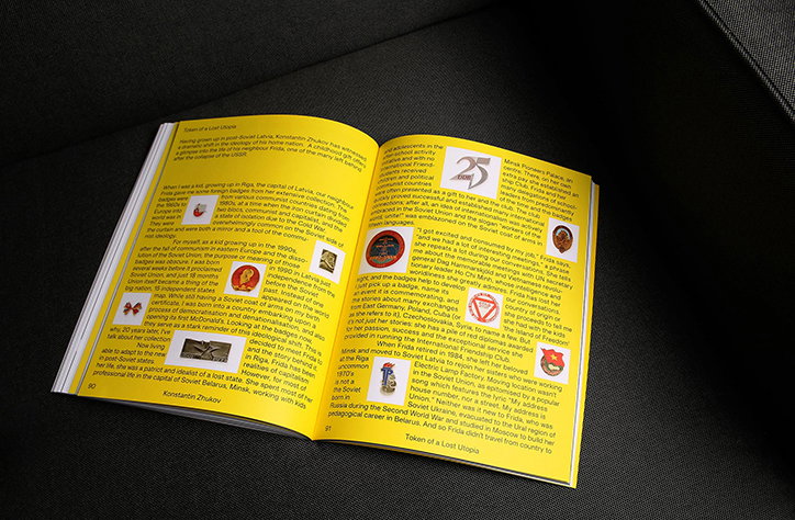
Contra Journal, Issue 01, designed by Our Place
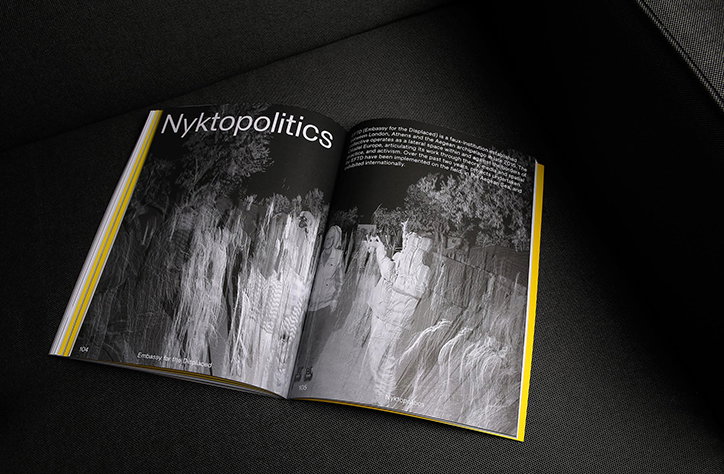
Contra Journal, Issue 01, designed by Our Place
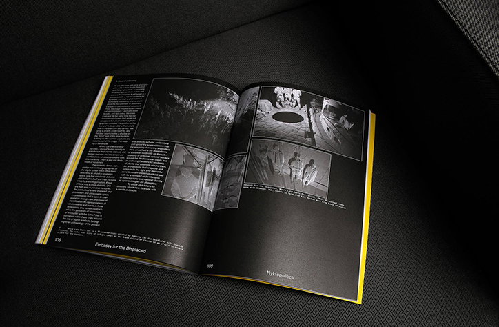
Contra Journal, Issue 01, designed by Our Place
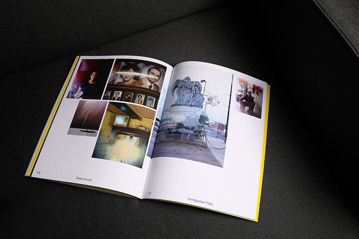
Contra Journal, Issue 01, designed by Our Place
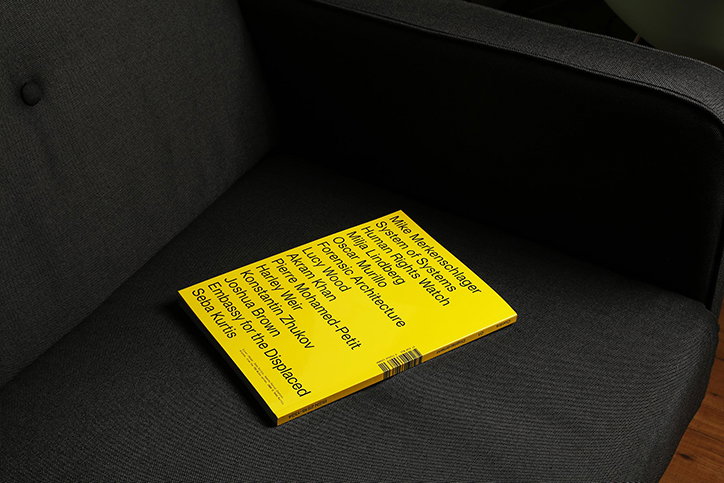
Contra Journal, Issue 01, designed by Our Place
Share Article
Further Info
About the Author
—
Ruby is Senior Creative at It's Nice That, overseeing our visual output across platforms and projects. Before that, she was associate editor on the editorial team, after joining in September 2017 following graduation from Central Saint Martins.