Launch Recite Me assistive technology
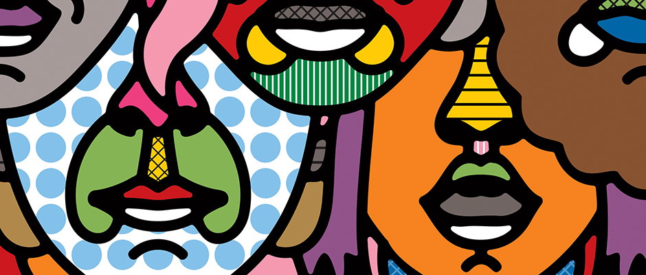
A colourful illustration of several stylised faces overlapping in a collage. The figures are rendered in bold primary colours and patterns, including blue polka dots and green stripes.

Great new work from Craig & Karl shows off the duo's magnificent talents and versatility

—
Date
30 November 2012

This year’s US presidential elections may have lacked the iconic Shepard Fairey-type visual that summed it up in a single image, but Craig and Karl’s Obama portrait for the cover of New York magazine was among the cream of this year’s crop. We were reminded of the pair’s brilliance via the news that they have teamed up with Agent Pekka, joining the likes of Rami Niemi, Santtu Mustonen and Jack Hughes on the Finnish agency’s impressive roster. So what better time to delve into their new work, which also includes some amazing poster illsutartions for the Bayerische Staatsoper (Bavarian State Opera) and wonderfully dry 1960s scenes that throb with a barely concealed sexual tension. Their use of colour remains peerless and their aesthetic vernacular is consistent without getting repetitive – and for our money their Obama is as strong as they come.
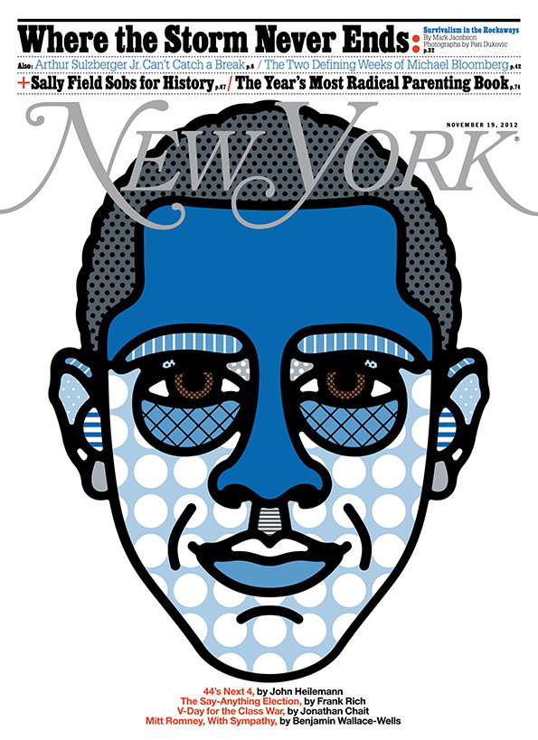
An illustration of Barack Obama’s face on a New York magazine cover. The portrait uses a bold blue and white colour palette with halftone dot patterns and graphic lines. The masthead reads “New York” above the image. A headline at the top reads “Where the Storm Never Ends”, with further article titles listed below.
Above

Craig & Karl: Obama Portrait for New York magazine

An illustration of two people standing on a pink terrace under a bright yellow sun. One person wears a blue suit, while the other has long blonde hair and looks away towards a single palm tree.
Above

Craig & Karl: Resort

An illustration of a person seen from behind, looking through a window at another person. The figure inside wears a red and white striped bikini and is partially obscured by blue horizontal blinds. Tropical plants and bright pink cacti frame the scene under a blue and white striped awning.
Above

Craig & Karl: Resort

An illustration from a top-down perspective shows a person in a blue polka-dot bikini lying on a red and white striped towel. They are positioned on a yellow tiled poolside next to a colourful striped towel. In the turquoise pool, another person floats upside down next to a yellow and white lifebuoy.
Above

Craig & Karl: Resort

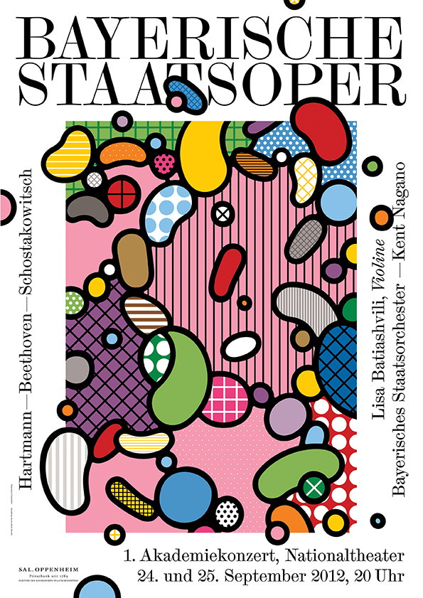
A colourful poster for the “Bayerische Staatsoper” featuring an abstract composition of organic, pebble-like shapes. The shapes are filled with various patterns, including dots, stripes and grids, set against a pink and purple background. Text at the bottom reads “1. Akademiekonzert, Nationaltheater” and lists the dates “24. und 25. September 2012, 20 Uhr”. Vertical text on the sides lists composers and performers, including “Beethoven” and “Lisa Batiashvili, Violine”.
Above

Craig & Karl: Bayerische Staatsoper (Design by Mirko Borsche)
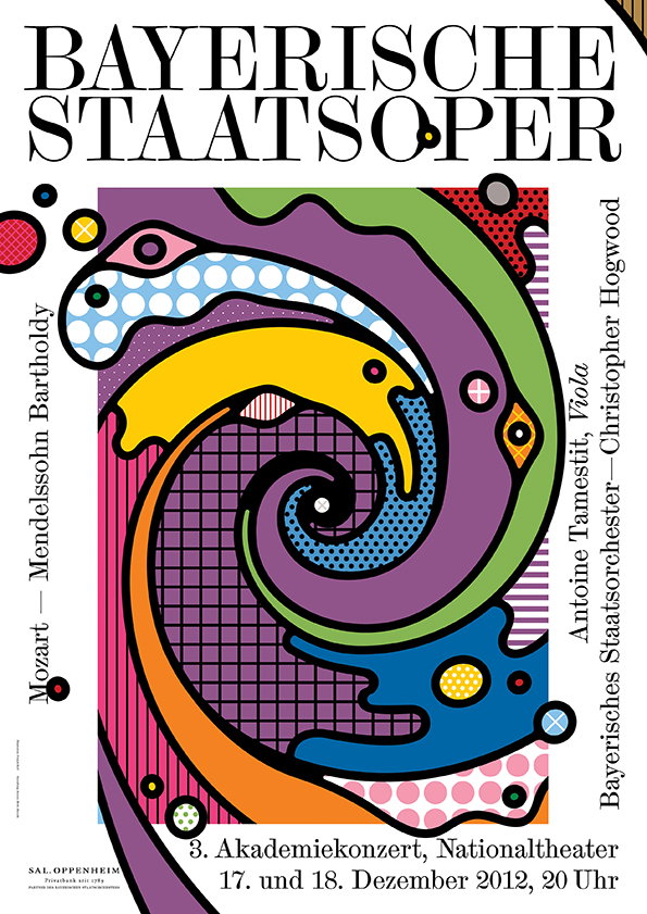
A colourful poster for the “Bayerische Staatsoper” featuring a bold, psychedelic illustration of a swirling vortex. The abstract shapes use a palette of purple, yellow, green and blue with patterns of dots and grids. Text around the border lists composers and performers, including “Mozart”, “Mendelssohn Bartholdy” and “Christopher Hogwood”. At the bottom, text reads “3. Akademiekonzert, Nationaltheater” and lists the dates “17. und 18. Dezember 2012, 20 Uhr”.
Above

Craig & Karl: Bayerische Staatsoper (Design by Mirko Borsche)
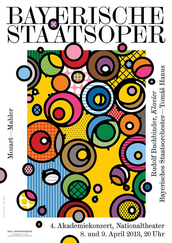
A colourful poster for the “Bayerische Staatsoper” featuring a dense arrangement of overlapping circles and geometric patterns. The abstract design uses a bold palette of yellow, red, blue and green. Text on the sides and bottom lists the composers “Mozart – Mahler”, the performers and the date “8. und 9. April 2013”.
Above

Craig & Karl: Bayerische Staatsoper (Design by Mirko Borsche)
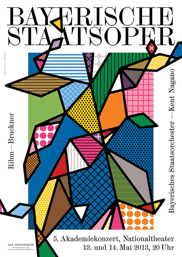
A bold typographic poster for the “Bayerische Staatsoper” featuring a vibrant, geometric abstract illustration. The artwork is composed of interlocking shapes in primary colours, filled with patterns like dots, stripes and grids. Text at the bottom reads “5. Akademiekonzert, Nationaltheater” and lists the dates “13. und 14. Mai 2013, 20 Uhr”.
Above

Craig & Karl: Bayerische Staatsoper (Design by Mirko Borsche)
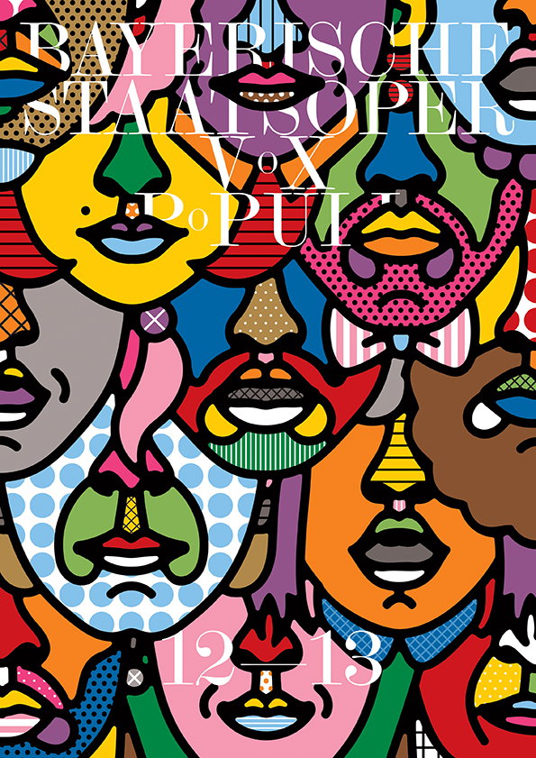
A colourful illustration of overlapping, stylised faces in a pop art style. White text across the top reads “Bayerische Staatsoper” and “Vox Populi”, with “12–13” at the bottom.
Above

Craig & Karl: Bayerische Staatsoper (Design by Mirko Borsche)
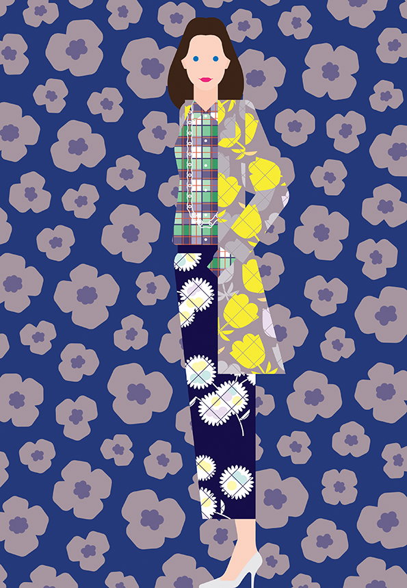
An illustration of a person standing against a blue background patterned with purple flowers. They wear a mix of clashing prints, including a checked shirt, floral trousers and a yellow patterned coat.
Above

Craig & Karl: Dries Van Noten

Share Article

About the Author

Rob Alderson

—

Rob Alderson is a freelance writer, editor and strategist. He was previously editor-in-chief of It’s Nice That and WePresent, and editor of Design Week. He publishes the newsletter Undo, which tries to make sense of how AI is changing design work, the design process and the design industry.
It's Nice That Newsletters

Fancy a bit of It's Nice That in your inbox? Sign up to our newsletters and we'll keep you in the loop with everything good going on in the creative world.