




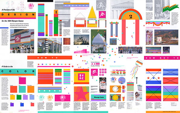
Graphic Design: Plan to celebrate Deborah Sussman's 84 Olympic work at new show
A report out this week warns that London is in danger of not making the most of its post Olympic legacy, which all helps make that summer of smiles and success seem like a surreal dream. Leaving aside the sporting impact, it’s probably too early to say what the cultural or design effects will be of that very distinctive visual vernacular that surrounded the Games. For other cities though that assessment is very possible, in particular one with nearly 30 years’ hindsight as is the case with Los Angeles.
Deborah Sussmann is the designer who came up with the look and feel for the 1984 Olympics, and her bold, bright and colourful environmental design, it is said, “created an image of Los Angeles in both its modern and its post-modern forms.”
Now a Kickstarter campaign is underway to try and mount an exhibition paying tribute to her work and to her amazing talents, honed as part of the Eames studio and in collaboration with figures like Frank Gehry. There’s only a few days left to make the show at California’s Woodbury University a reality; it would be a crying shame if such a great graphic treat didn’t materialise.
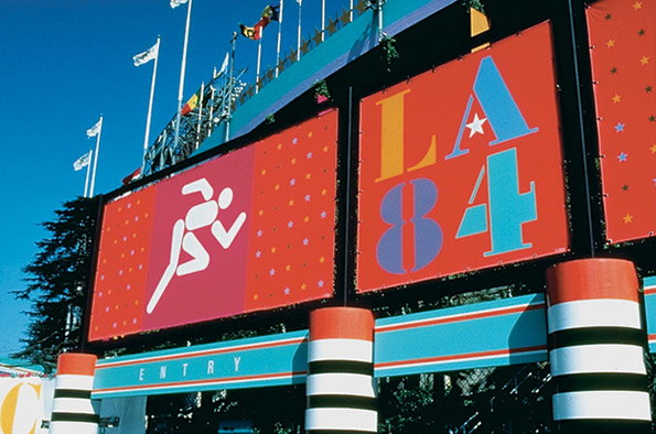
Deborah Sussman: 1984 Olympics signage
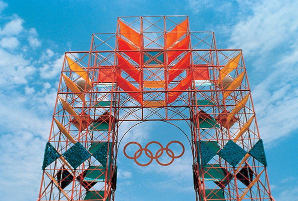
Deborah Sussman: 1984 Olympics scaffolding
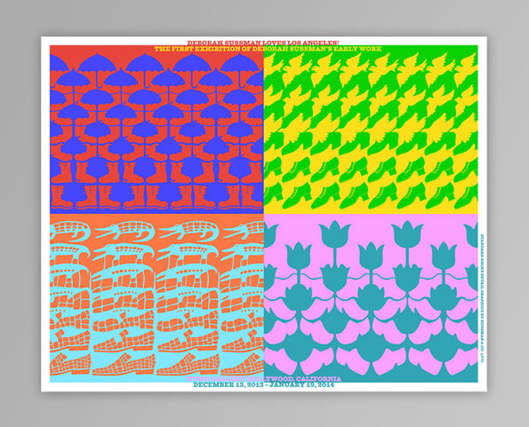
Thomas Kracauer: Deborah Sussman Loves Los Angeles poster
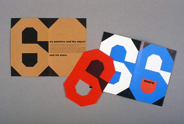
Deborah Sussman: Six Painters and The Object Exhibition design
Share Article
Further Info
About the Author
—
Rob Alderson is a freelance writer, editor and strategist. He was previously editor-in-chief of It’s Nice That and WePresent, and editor of Design Week. He publishes the newsletter Undo, which tries to make sense of how AI is changing design work, the design process and the design industry.


