DR.ME release the latest issue of Fin? filled with killed projects and ideas that never made it
We can only imagine the downtrodden feeling that comes with losing a pitch or some of your favourite work being cut out of a brief by a client. Feeling excited about a concept and seeing it shift is just a part of creative working, and more often than not it works out for the best. But to tackle this feeling DR.ME, the Manchester-based creative studio who consistently create projects with heart, take hold of the pieces and ideas they’re fond and publish them in their own zine, Fin?
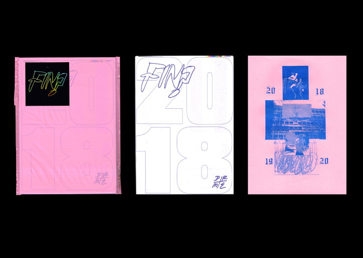
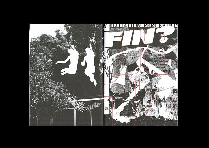
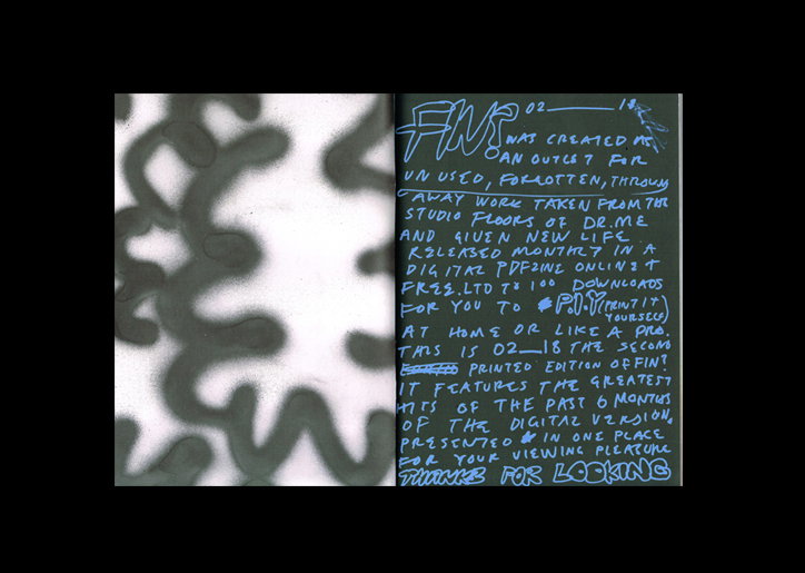
Regularly published digitally as a PDF zine edition on the last Friday of every month, Fin? collates “unfinished, unrealised, killed client and personal work alongside forgotten work found in drawers or hard drives,” DR.ME tells It’s Nice That. This digital version is free for fans of the studio, but limited to 100 downloads, “with the idea being that people can P.I.Y (print it yourself),” he says. Each of these monthly editions includes around 20-40 pieces of DR.ME work, amassing a bank of 100 bits and bobs over a few months. Once the bank is full, the studio design a print edition twice a year, “a selection of the greatest hits” of around 35 pieces. “Simply, it’s an experiment and an outlet for the studio so that we avoid becoming too precious over an idea, pushing us to constantly make new work rather than regurgitate and re-contextualise old work,” the studio explains.
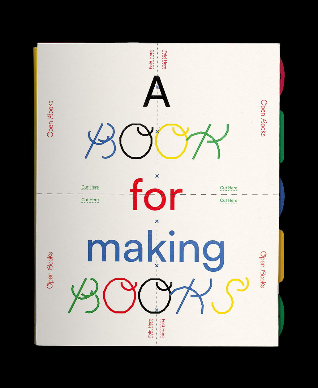
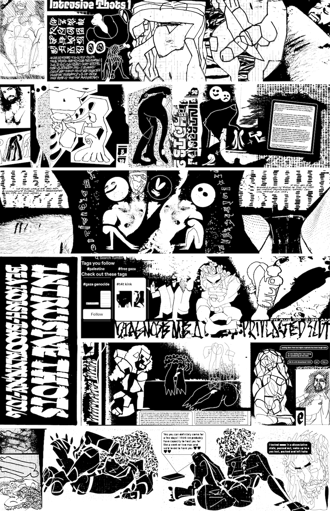
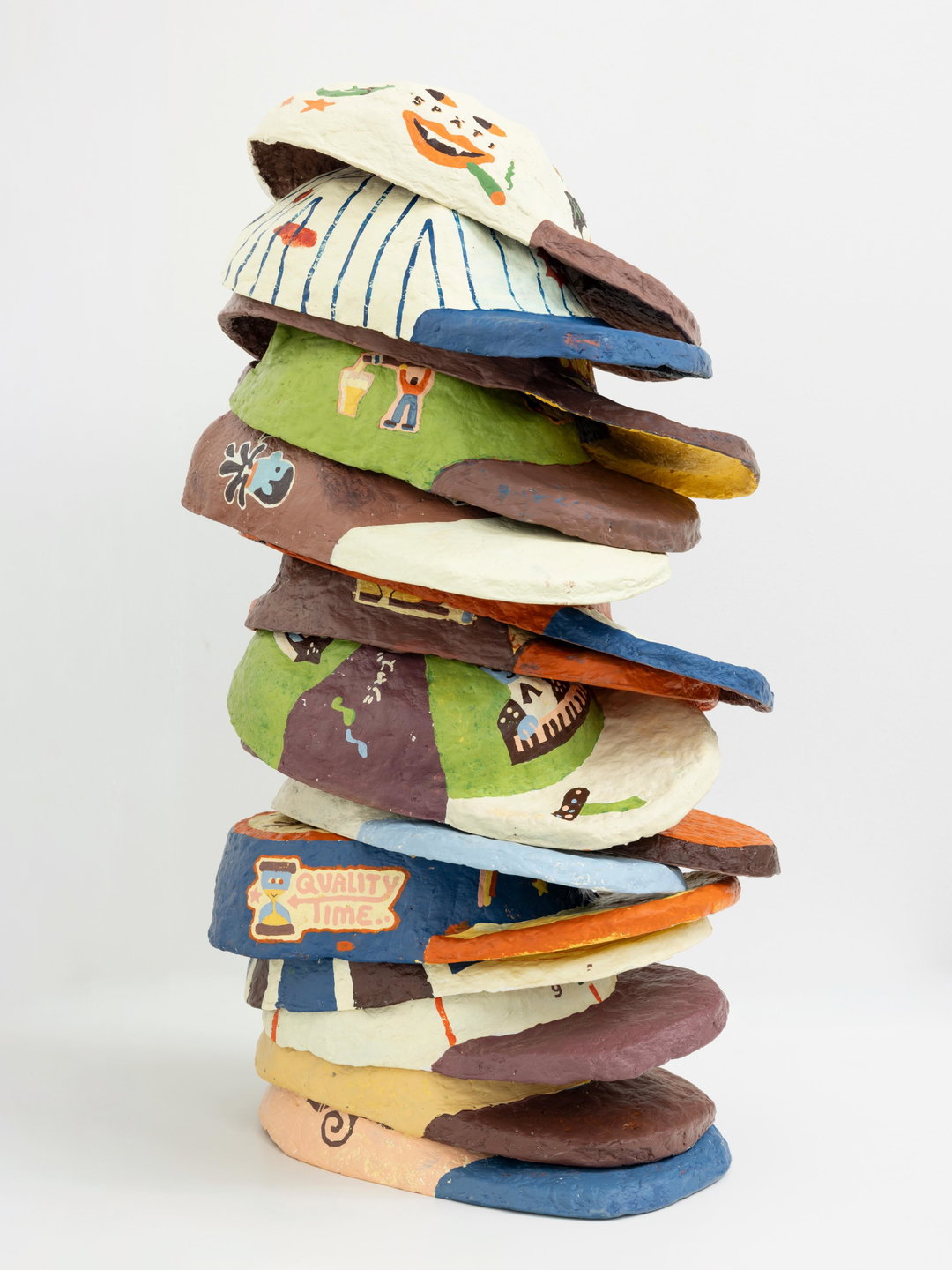
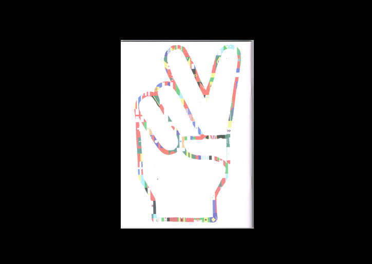
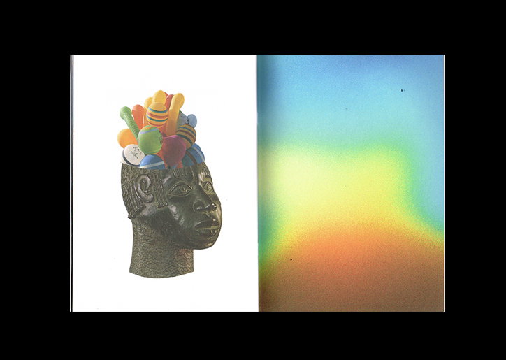
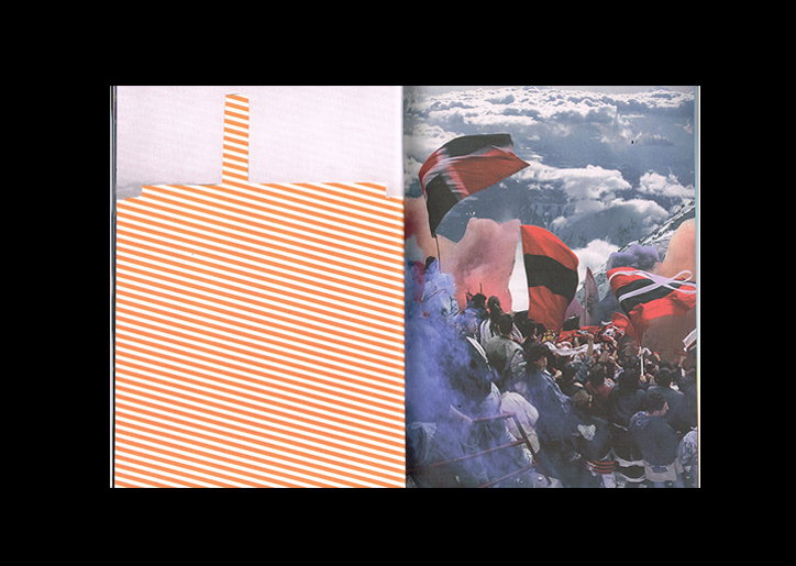
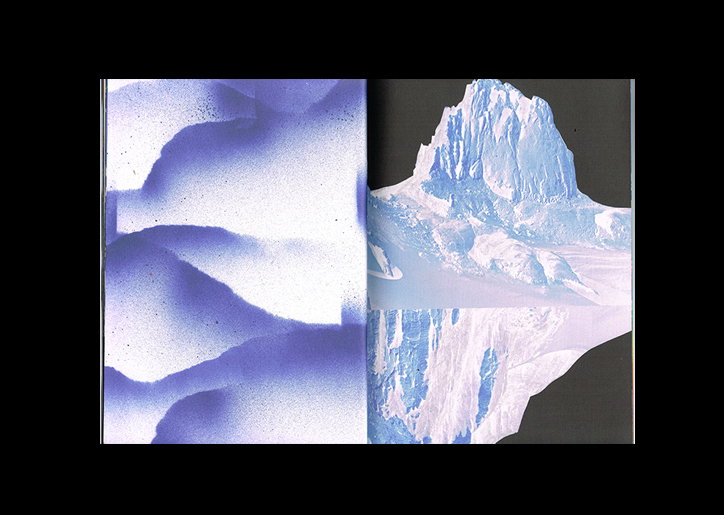
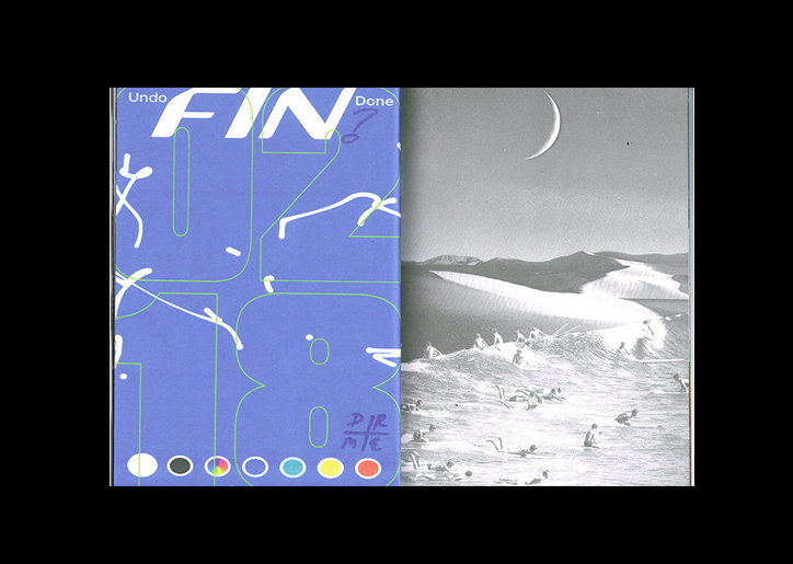
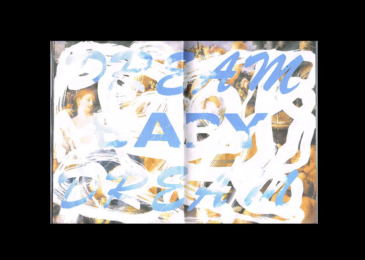
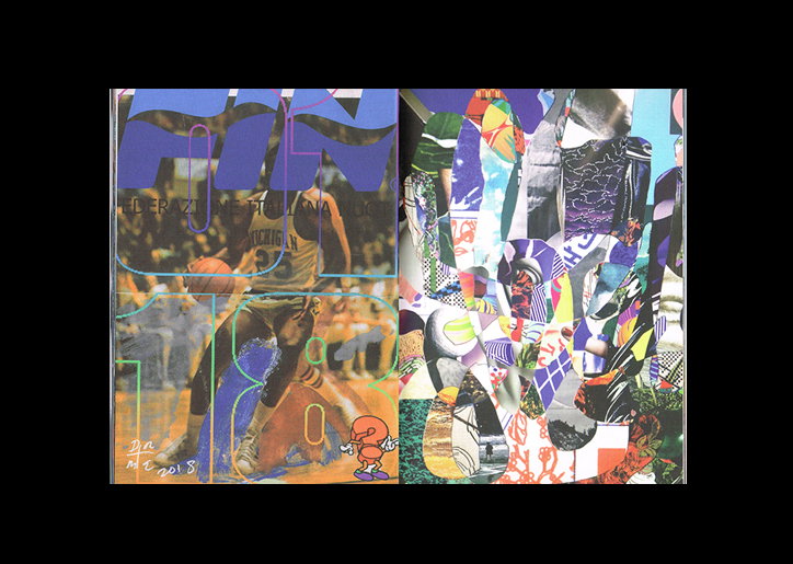
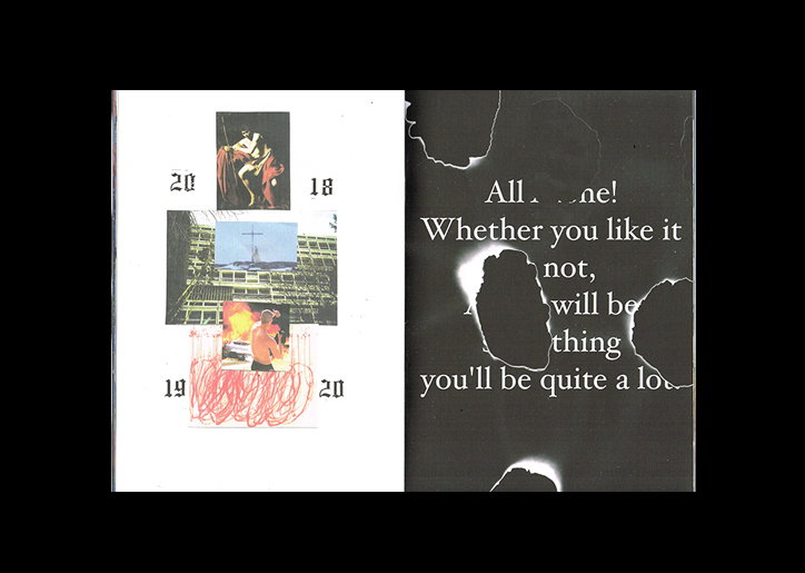
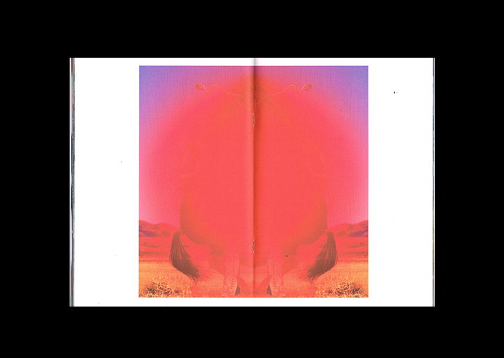
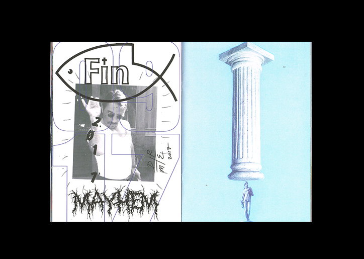
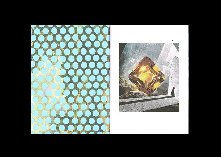
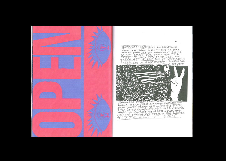
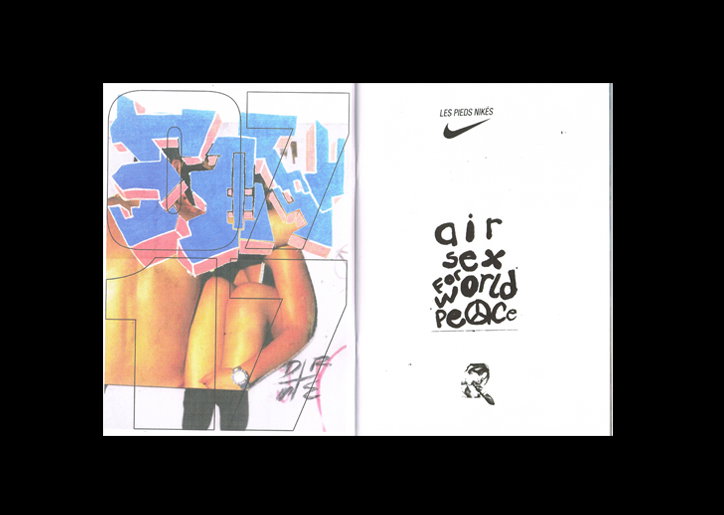
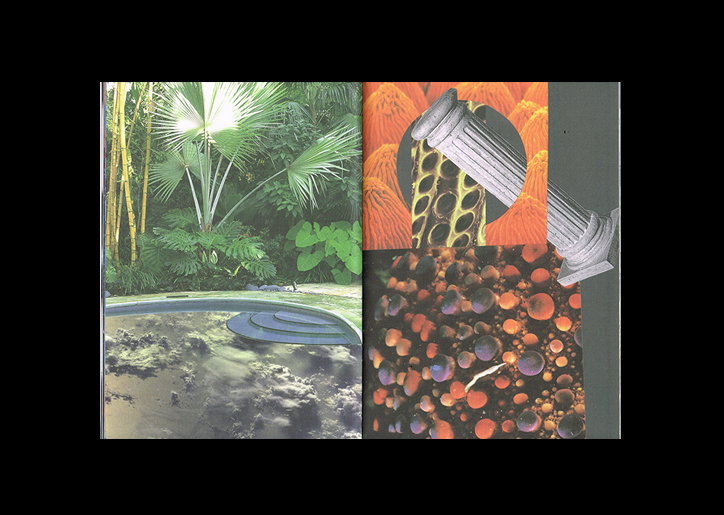
The latest printed edition of Fin? features a bunch of brilliant snippets from the projects DR.ME have worked on recently. A wide variety of graphic design, it features “outcomes that fell on the cutting room floor for people like Mick Jagger to Young Thug, The Tate to Hivern Discs,” DR.ME points out. “Commercial works aside, we really want to continue to publish Fin? as we find it hugely beneficial as a studio to have this outlet in order for us to constantly create new work and for us to share and give insight into the inner workings of the studio.”
Personality is the first thing you notice about Fin? whether scrolling through a PDF version or flicking through the printed zine. Considering DR.ME dip in and out of working on so many different disciplines, “it’s a real show of our studio in microcosm, from collage to painting to photography and illustration,” the studio continues. “It allows us to show some personal work which otherwise might seem strange or random on its own, taking in curation and publishing on the way. It also gives a bit of an insight into the heavy outlay of work we create when working on a project and we hope gives a deeper insight into the inner working of DR.ME as a collaborative studio, although most of the work is either one (Ryan) or the other (Mark) which is also a fun game to play.”
Asking the studio which bits from the most recent edition of Fin? are personal favourites, more often than not its work that was cut from a client brief that is still playing on the mind of DR.ME. “We had a lot of fun working on the single campaign for Mick Jagger and actually prefer the killed work from this project as opposed to the final artwork which was used, so that’s included in there.” Another is a few rejected pieces from recently working on an exclusive print with The Tate, hinting at how many staples of the creative industry the studio have worked with this year. “Because they’re such household names it was exciting on a very basic level, but also because these huge cultural characters came to us and asked us to make work in our visual language and allowed us complete freedom to do what the fuck we wanted, which we did! The fact that we can garner this level of trust from such influential institutions is humbling.” Other bits include an on-going project the studio is doing with Crack magazine, killed t-shirt ideas for Hivern Discs and a rejected book cover from its collaged focused book Cut That Out.
On asking DR.ME if it has any plans to expand on the work included in FIN? the studio explains that there isn’t. “Once it’s in Fin? the life of that piece is over, time to think of something new. You could say Fin? is the graveyard of DR.ME, but at the same time, it gives the work a new lease of life and still exists for people to enjoy. And it smells great.”
DR.ME: FIN?
DR.ME: FIN?
DR.ME: FIN?
DR.ME: FIN?
DR.ME: FIN?
DR.ME: FIN?
DR.ME: FIN?
DR.ME: FIN?
DR.ME: FIN?
DR.ME: FIN?
DR.ME: FIN?
DR.ME: FIN?
DR.ME: FIN?
DR.ME: FIN?
DR.ME: FIN?
DR.ME: FIN?
Share Article
Further Info
About the Author
—
Lucy (she/her) was part of the It’s Nice That team from 2016–2025, first joining as a staff writer after graduating from Chelsea College of Art with a degree in Graphic Design Communication, eventually becoming a senior editor on our editorial team, and most recently at Insights, a research-driven department with It’s Nice That.