Mainstudio's razor-sharp editorial design for art and architecture
From Jan van Toorn to Wim Crouwel, Amsterdam has been turning out cutting-edge graphic design talent for the better part of the last half-century. Carrying the torch along with design innovators like Experimental Jetset is Edwin van Gelder, the man behind one of the most impressive studios currently working out of the Dutch capital, Mainstudio. Favouring exactitude and a razor-sharp aesthetic of the kind he championed during his beautifully inventive redesign of architecture magazine Mark between 2008 and 2012, Edwin set the tone for his focus on editorial design for architecture and art publications. He has since designed an award-winning book for artist Thomas Raat, the identity for the IIT College of Architecture in Chicago and is currently working an architecture book for MoMA due out next year.
A graduate of Utrecht School of the Arts in the Netherlands, Edwin’s work with Mark magazine not only heralded the beginning of his studio, but his approach to the redesign cemented a dynamic grid and strong but simple type as the cornerstones of his winning design formula. “I’ve always enjoyed coming up with design solutions,” he says. “I see graphic design as a sort of puzzle. You have, or you set, a few key boundaries and then play within them. Graphic design is a thinking process, which gives you the possibility to connect your personal interests with your work.” This is why the content of Edwin’s editorial projects is always instrumental to the design.
Whilst in talks with Dutch publishing house Frame about designing a book back in 2008, Edwin was asked if he wanted to redesign the international architecture journal that under his direction went on to win a Gold Cube at the Art Directors Club in New York.
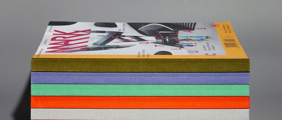
“The briefing was to give the magazine a more grown up character,” he says. “The first issues of Mark were very illustrative and the design distracted from the content. My approach to the redesign was to strip the magazine of all illustrative layers and focus on the content. I created a dynamic grid to give structure and chose a simple, but recognisable font: the Apercu from Colophon Foundry. I also kept the pages calm so the beautiful photography could speak for itself. Each issue had its own colour palette seen on the cover and within the chapter pages, the binding is a linen spine so that the magazine can lay open flat, and each cover is printed with UV ink so parts of the text could stand out and give the magazine its subtle tactility.”
The magazine that followed is crisp without being conservative and is an exemplar of the kind of brilliant and quietly daring editorial design we could definitely do with more of.
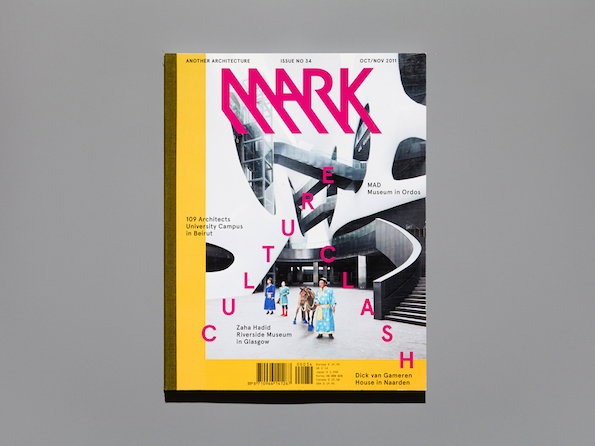
Mainstudio: Mark Magazine
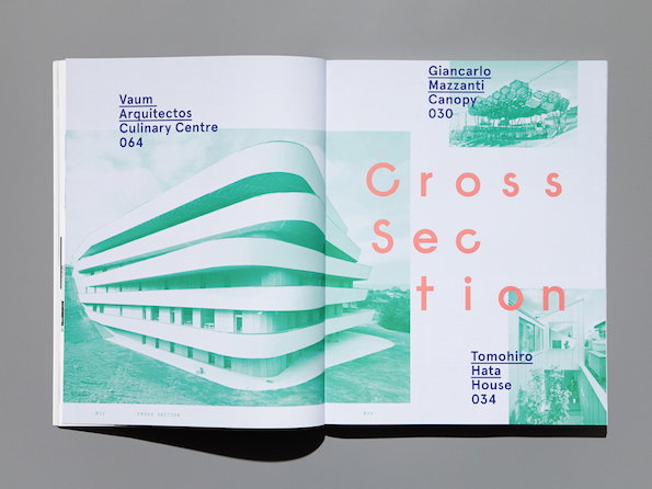
Mainstudio: Mark Magazine
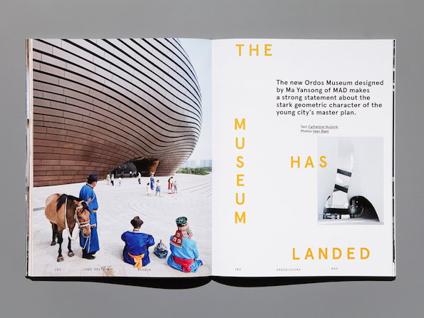
Mainstudio: Mark Magazine
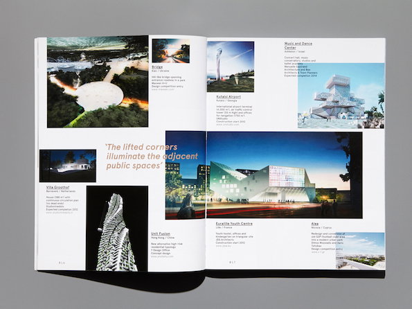
Mainstudio: Mark Magazine
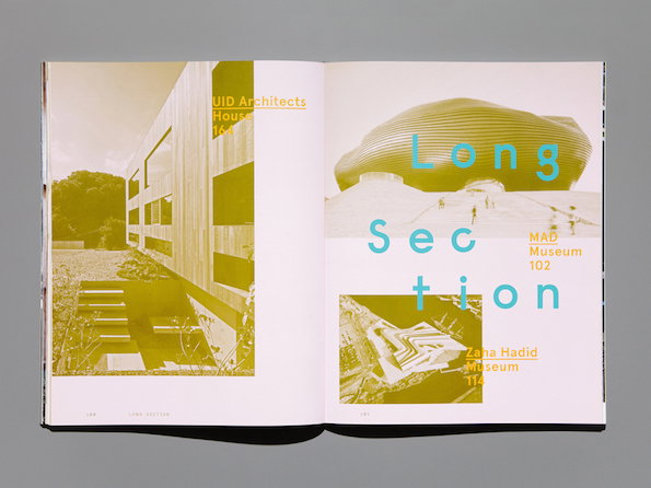
Mainstudio: Mark Magazine
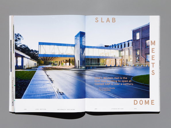
Mainstudio: Mark Magazine
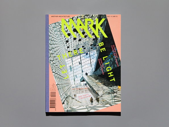
Mainstudio: Mark Magazine