Emiliano Ponzi's The Great New York Subway Map displays how graphic design can turn chaos to order
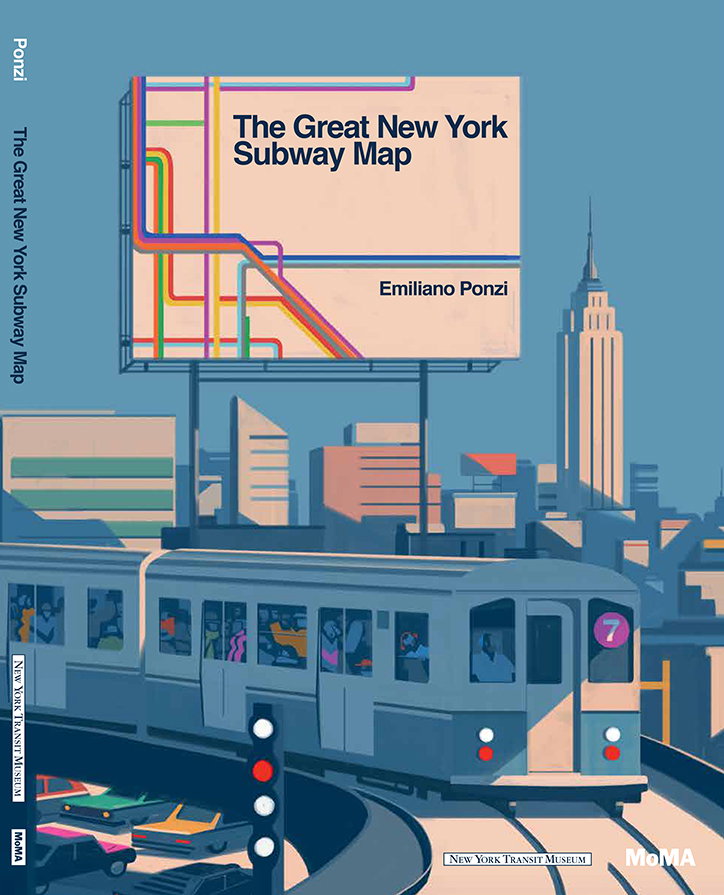
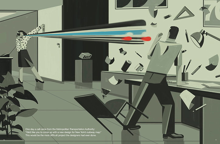
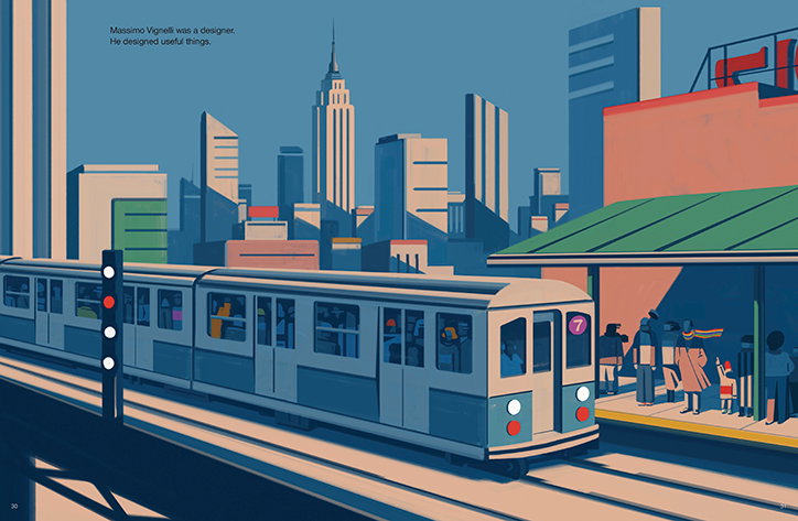
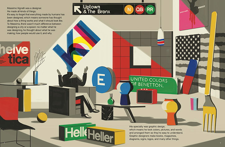
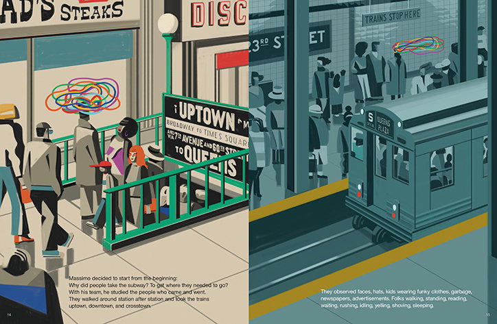
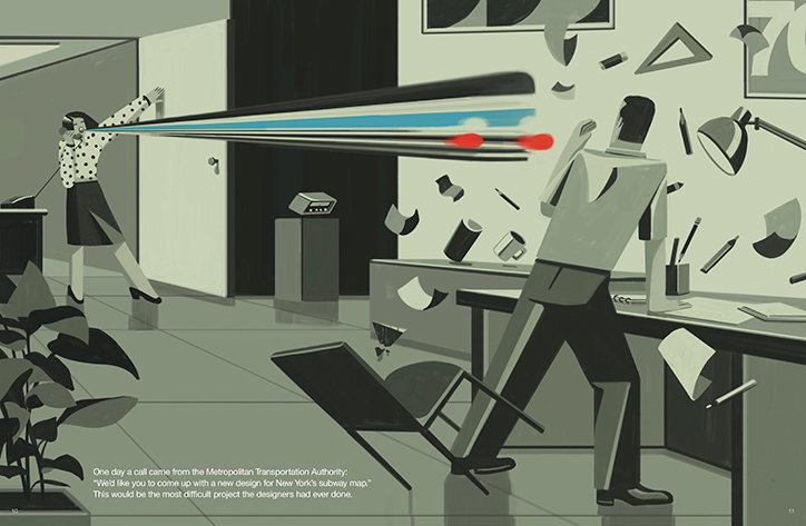
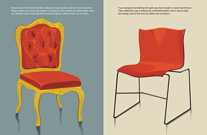
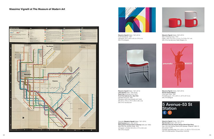
Emiliano Ponzi, in collaboration with the MoMA, has created a book introducing young readers to the work of iconic graphic designer Massimo Vignelli. Using illustrations of “trains, subway stations, and the NYC skyline”, Emiliano’s book tells the story of how Vignelli created an “easy-to-navigate subway map in 1972”. The Great New York Subway Map aims to show how graphic design can be used for “problem-solving” and turning “chaos to order”.
Below, we speak to Emiliano to hear more about this project.
Emiliano Ponzi: The Great New York Subway Map
It’s Nice That: How did the project start?
Emiliano Ponzi: I was in the MoMA to talk about another project, which didn’t go through. Being there was a good chance to collaborate with them and I didn’t want to leave the office empty-handed. We started to talk about creating something for their series on masters of creativity, explained to children. The connection between Massimo Vignelli and me came naturally: we are both from Milano with a strong bond to the city of New York.
INT: Could you talk us through the creative process?
EP: The hidden topic of the book was "from chaos to order”: how to synthesise the complexity of the real world into an act of visual communication. Vignelli needed to understand and digest the real subway system before turning it into a map, and the same for me with the whole book.
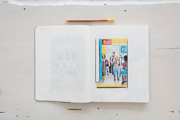
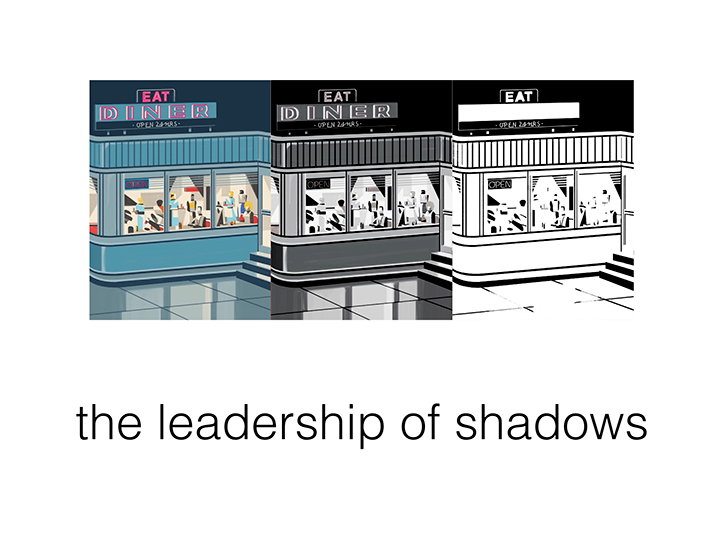
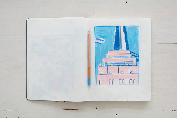
I began by producing a massive amount of sketches; the first creative step should always be a free stream of concepts. Every project is a chance to improve your skills as a professional; the Japanese people have a word for this: Shokunin. I gave myself two ground rules before starting: “the leadership of shadows” — every shape is designed by dark brush strokes of colour and “the diet of colour” — I used a chromatic dominant plus the NYC subway lines colours as accents.
It’s not just an intuitive process but also a rational one: I tested every intuition I had to see what was the best option. I redesigned every illustration copious times. In the process, I discovered that there were elements that could be adjusted. It’s just a matter of balancing ingredients — like a chef making soup, the quantities alter the taste.
Emiliano Ponzi: The Great New York Subway Map
INT: How has Massimo Vignelli inspired your work?
EP: What inspired me most was reading his book, The Vignelli Canon. I was taken by his ideas about a mindset that, without knowing, I always used. Concepts such as discipline (a set of self-imposed rules, parameters within which we operate), design as semantically correct (it needs to have a meaning, we design what people need, not what they want) and the syntactically consistent item (every detail must be consistent because perfection is in the details) etc. I was fascinated by his clarity of intention, his awareness of the world but, at the same time, his strong beliefs that could overcome the trends of the time.
INT: Do you often combine your writing with illustration?
EP: I’m fortunate because with illustration you don’t need text for it to be understood. Illustrations can be “read” without “subtitles”, this allows it to be universal, without geographical or cultural barriers. So I tried to make every image very intuitive. An example of this is the messy old map depicted as a maze, which then turns into a knot for Vignelli to untie.
Emiliano Ponzi: The Great New York Subway Map
INT: For you, what is the purpose and meaning of graphic design?
EP: It should have a purpose, a democratic one; it should help people learn and understand things in a straightforward way, without pushing back a level of aesthetic sophistication. I think for years the sentence “less is more” allowed many professionals to decrease their visual vocabulary, to a point where they shallowly represented the world. This quote doesn’t mean you should banalise everything, place two flat colours on paper stating “I follow minimalism”. It shouldn’t be an excuse to be lazy.
INT: How did you decide to create a book that appeals to both children and graphic designers?
EP: I needed to explain creative processes to children through the example of a significant figure in art, design etc., but it didn’t have to push the idea of a superhuman. We live in a world of people who we idolise for their products or just the way that they sell themselves — so it’s fundamental to show that it’s not just about talent, anything is possible using the method where focusing on the process is the key for achieving goals.
Emiliano Ponzi: The Great New York Subway Map
Emiliano Ponzi: The Great New York Subway Map
Emiliano Ponzi: The Great New York Subway Map
Emiliano Ponzi: The Great New York Subway Map
Emiliano Ponzi: The Great New York Subway Map
Emiliano Ponzi: The Great New York Subway Map
Emiliano Ponzi: The Great New York Subway Map