




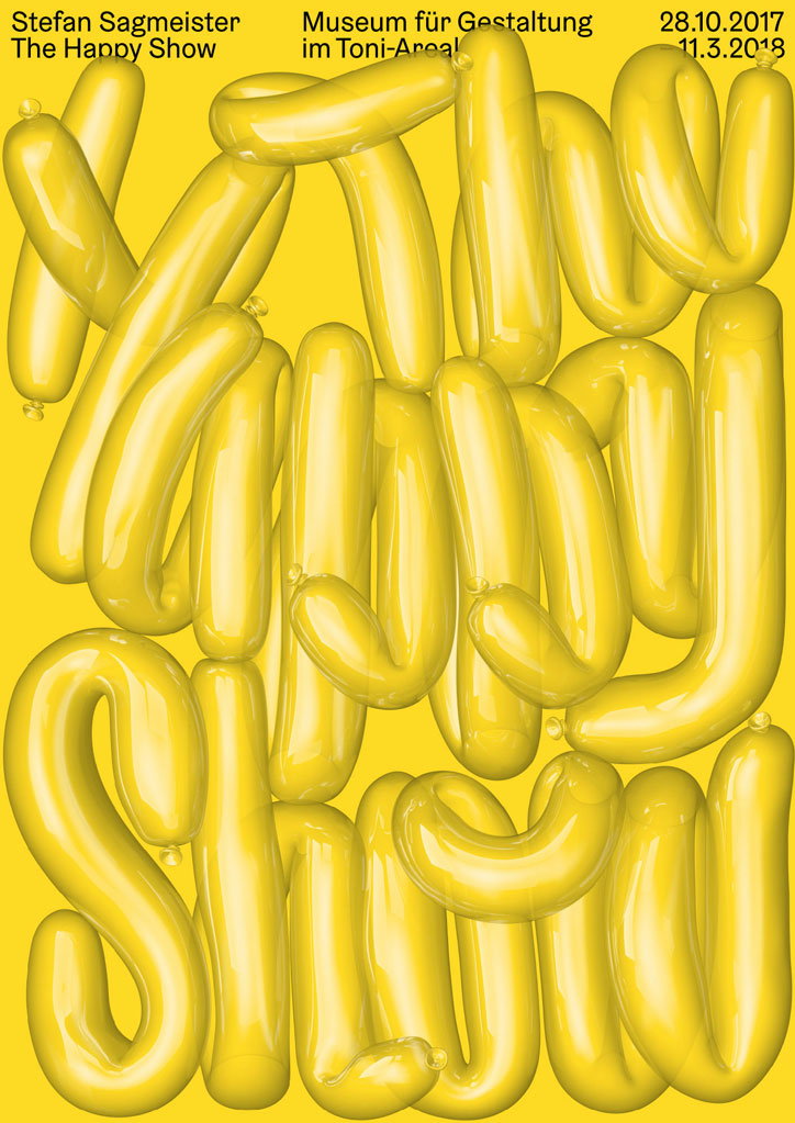
Erich Brechbühl’s posters are witty and inventive, with an element of surprise
We first covered the work of graphic designer Erich Brechbühl way back in 2012. Since then he’s been making moves in the poster design world, helping to create a solid design community in Lucerne – one that’s beginning to have an impact outside of Switzerland.
Erich grew up in Sempach, a small town near Lucerne and as teenager always wanted to be a film director. In 1990, at the age of just 13 he founded Mix Pictures with some friends and began to produce about one short film a year. After a couple of internships – one with a typographer and another with a graphic designer – he realised that he enjoyed the shorter process from ideation to realisation that graphic design could offer and so was “infected with the poster virus.”
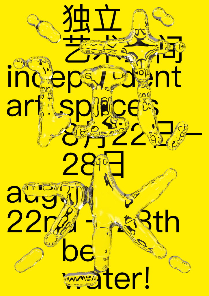
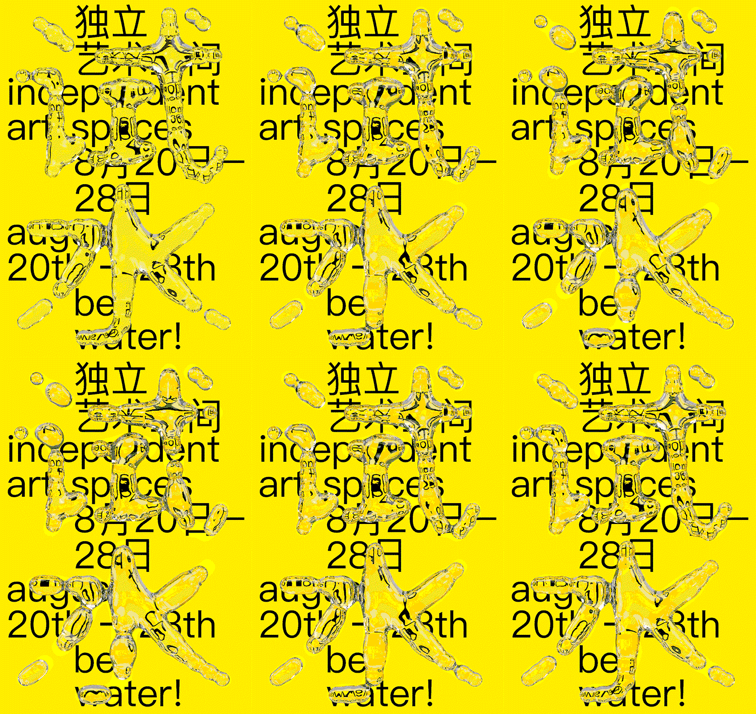
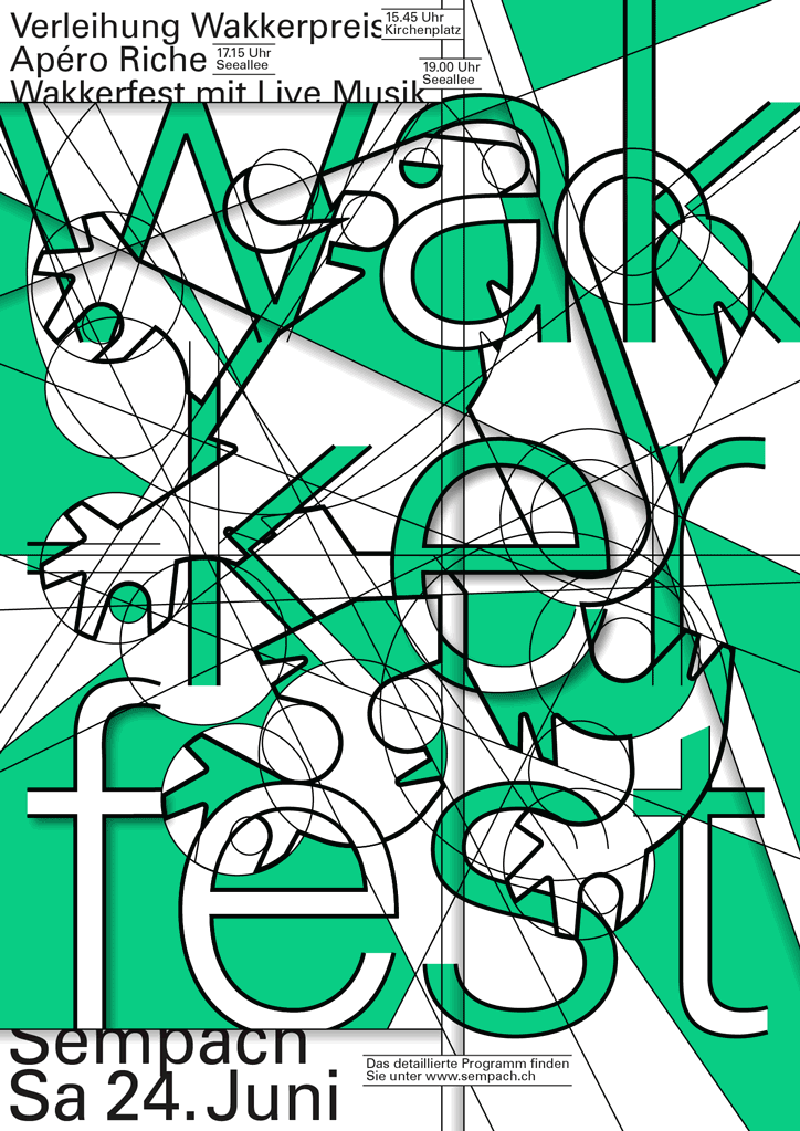
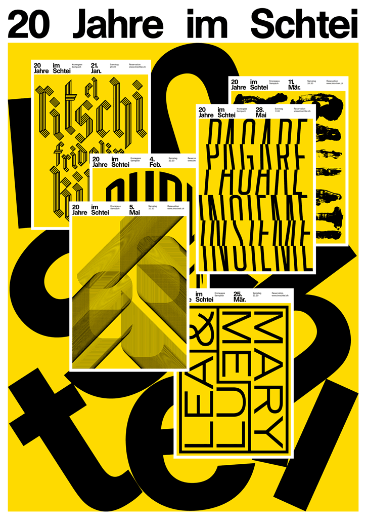
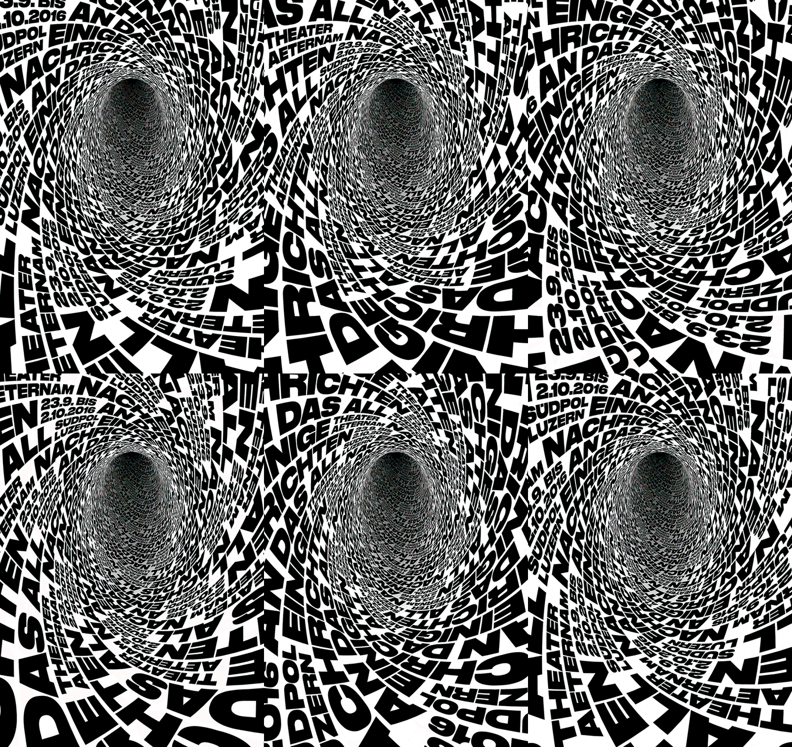
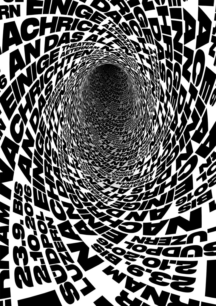
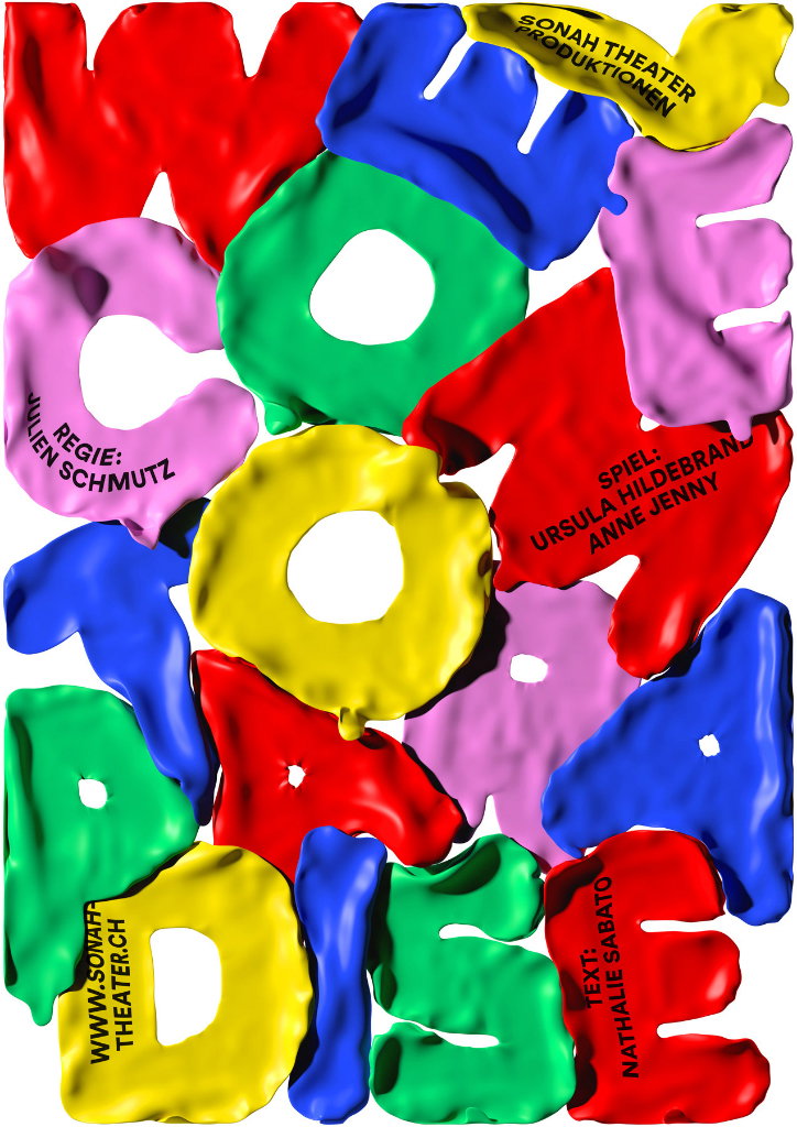
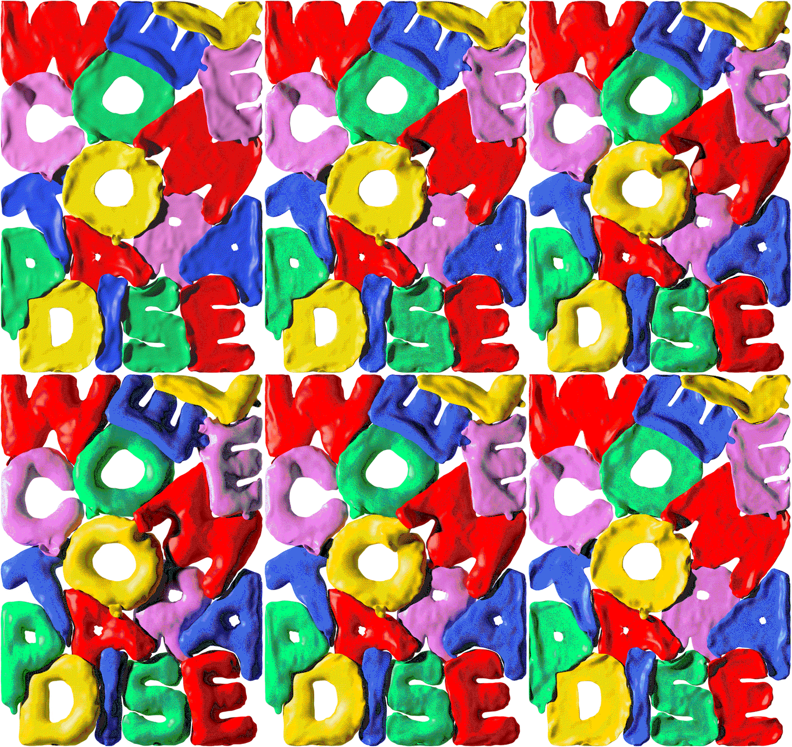
Erich’s posters have a distinctive style to them despite the difference in how they actually look. This is the result of a considered, particular approach. “The core thing is always the idea,” he explains. He starts by generating as many as possible, confronting the message that needs to be communicated until he hits on “the perfect idea”. Then the search changes to finding the perfect way of visualising the idea. This means Erich’s posters are witty and inventive, always incorporating a visual pun or an element of surprise. “I always work with the same attitude, but I try not to have a specific style. That’s also why I’m interested in a broad range of projects: the less I know about something, the more interested I am in the job.”
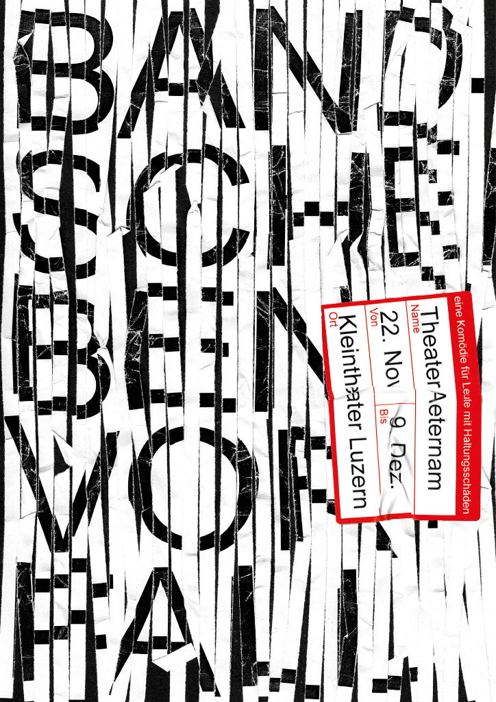
When we covered Erich’s work five years ago, he was largely producing static posters. Since then, his toolkit has expanded: “That was only the beginning for me, I was learning new programs like Cinema 4D and After Effects which afforded me the freedom to decide how the final result would look.” As a result, Erich’s work has expanded to include motion graphics. Although most of his posters are still shown in a traditional manor, moving posters provide “a nice supplement for social media.” The essence of the image or what it’s communicating largely stays the same but the movement attracts additional attention. Last year, Erich made his first steps into the world of augmented reality and even created his first 360 degree poster which “doesn’t make much sense, but it was fun!”
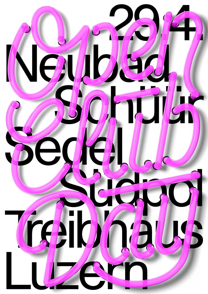
Upon finishing school in 2002, most of Erich’s peers left the city to go to Zurich or Berlin as Lucerne wasn’t a thriving in terms of design but Erich “saw it as a challenge.” Whilst working at a local youth club called Teribhaus, he realised that there was a lot of potential for designers to create posters for the events happening there. “So I founded a graphic design pool together the with organisers from Treibhaus,” he says. They were flooded with entries from students, keen to see their work implemented in the real world. The pool still exists today and is still popular.
Lucerne, as a city, is fairly small – around 80,000 inhabitants. As a result, there is a strong sense of community and of “everyone knowing everyone”. This is reflected in its design scene as well: “We realised that we are not competition but are accomplices. We decided to have bimonthly meetings in different people’s studios called Show & Tell where we would discuss, in a casual way, recent projects and problems in the world of design.” This concept has now even been adopted in Germany (Berlin, Stuttgart, Mannheim), Korea (Seoul) and Brazil (São Paolo, Jaragua do Sul).
The work being produced by this tight-nit community is gaining more and more recognition as over the past year or so, Erich’s work (alongside others) has been exhibited in Russia, Germany, New York, China, Egypt and a few weeks ago, Dubai. The success of these exhibitions inspired the group to create a book about Lucerne called Poster Town, which was released by German publishers Spector Books this September.
Erich Brechbühl
Erich Brechbühl
Erich Brechbühl
Erich Brechbühl
Erich Brechbühl
Erich Brechbühl
Erich Brechbühl
Erich Brechbühl
Erich Brechbühl
Erich Brechbühl
Erich Brechbühl
Erich Brechbühl
Share Article
Further Info
About the Author
—
Ruby is Senior Creative at It's Nice That, overseeing our visual output across platforms and projects. Before that, she was associate editor on the editorial team, after joining in September 2017 following graduation from Central Saint Martins.



