Erik Brandt releases his final Ficciones Typografika as a book documenting the project’s entirety
From 2013-2018, Erik Brandt exhibited the work of well-known and up and coming designers on a piece of cedar board attached, by himself, to the side of his garage in Minneapolis, Minnesota. The self-initiated exhibition space, titled Ficciones Typografika, began as an invite-only project before being opened to submissions and rapidly grew into a “who’s who” of experimental typographic practice within the global design community.
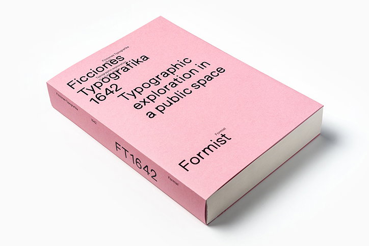
Now, with 1,641 exhibited posters under his belt, Erik has collaborated with Mark Gowing of Formist Editions to create a publication chronicling the beloved project, also acting as the final ficciones: Ficciones Typografika 1642.
The decision to make the publication, Erik tells us, “was the generosity and enthusiasm of the publisher, Mark”. Although Erik had wanted to make a book since the project’s inception, as it grew in size and momentum, “the idea became more and more daunting”. At 624 pages, Ficciones Typografika 1642 is a weighty book, altogether fitting for a project which played such a major role in the graphic landscape for half a decade.
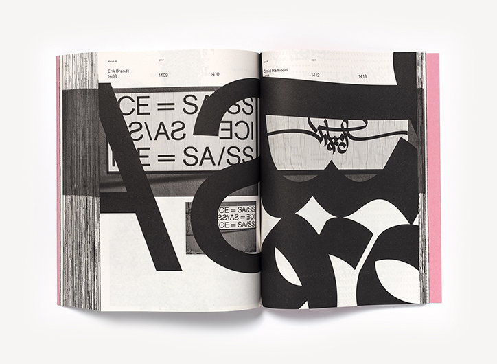
Erik Brandt and Mark Gowing: Ficciones Typografika, published by Formist Editions
When it came to creating the book, Mark took on the design of the publication: “It’s his generosity and vision that made this all possible,” Erik points out. “When we finally began over a year and a half ago, I packed a hard-drive of my documentation and sent it to him in Sydney, Australia, telling him he had complete freedom to create his own fiction," he continues. "This is why you engage with a graphic designer, they do things you could not – I could not have made this book. I was too close to the project, I would have treated the material to gingerly, still feeling it in my fingertips.”
In order to convey the enormity of Erik’s project, Mark opted to document the entire thing from start to finish, also including a 1:1 overprint of each individual digital file. In turn, this allows readers to experience what only Erik and passers-by ever experienced: the works at their full size. “I mean, even for me,” Erik adds, “holding this object is staggering, even having hung all of the posters myself I could not appreciate the sheer scale of the project. It’s just so beautiful and I’ll never be able to thank Mark enough.”
Reflecting on Ficciones Typografika now, Erik says he feels “pure gratitude” to all of the “contributors who embraced this project and contributed their love and care through their work”. And although the project came to a natural conclusion, he misses the excitement of “new submissions coming from all parts of the world, engaging with the contributors and sharing their own excitement when their own ficciones was finally realised”. In turn, Ficciones Typografika 1642 is a testament to the joy Erik felt throughout the project, communicating not only this but its important position in conveying a moment of graphic design history.
Ficciones Typografika 1642 is published by Formist Editions and is currently available to pre-order.
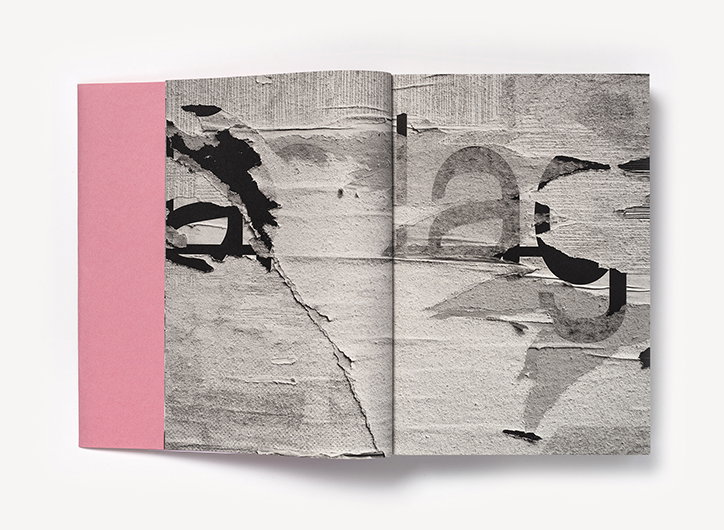
Erik Brandt and Mark Gowing: Ficciones Typografika, published by Formist Editions
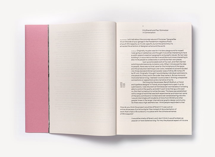
Erik Brandt and Mark Gowing: Ficciones Typografika, published by Formist Editions
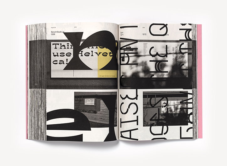
Erik Brandt and Mark Gowing: Ficciones Typografika, published by Formist Editions
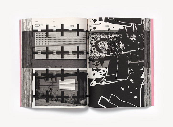
Erik Brandt and Mark Gowing: Ficciones Typografika, published by Formist Editions
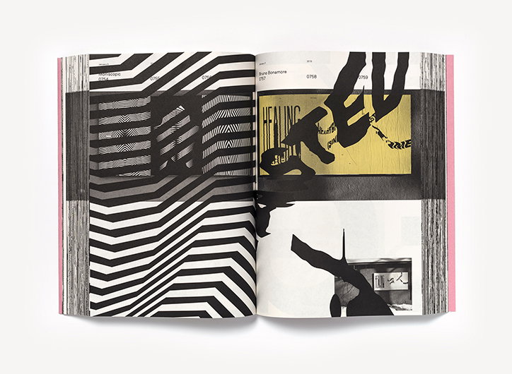
Erik Brandt and Mark Gowing: Ficciones Typografika, published by Formist Editions
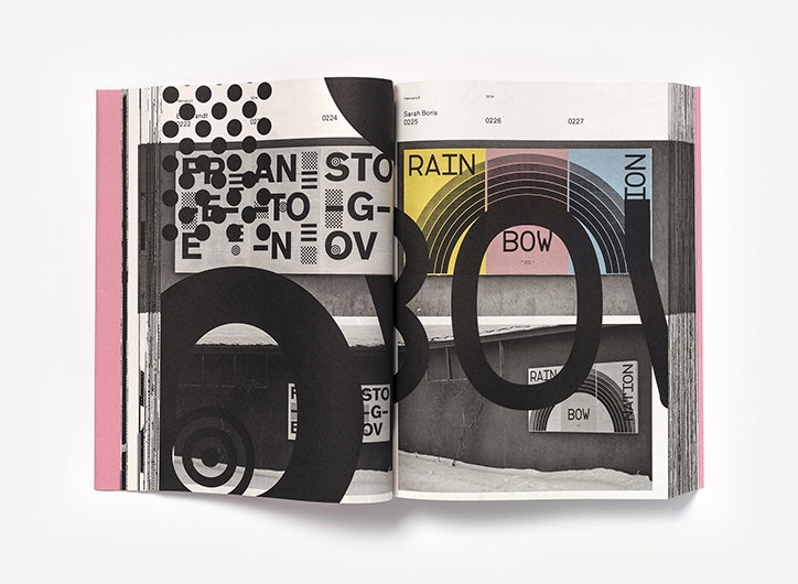
Erik Brandt and Mark Gowing: Ficciones Typografika, published by Formist Editions
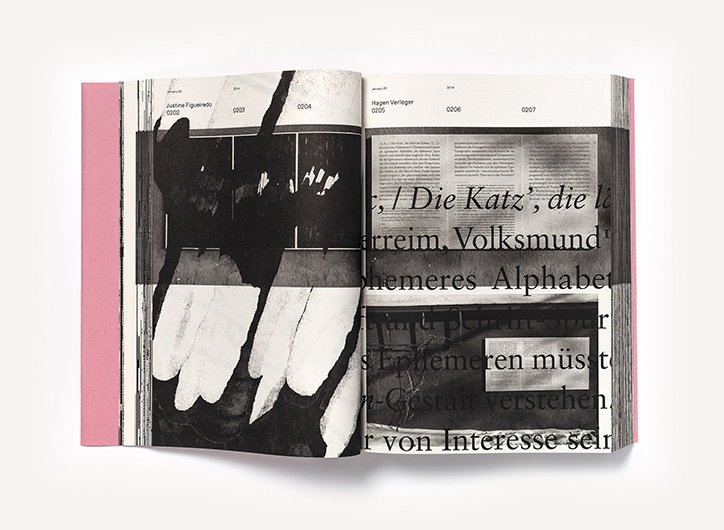
Erik Brandt and Mark Gowing: Ficciones Typografika, published by Formist Editions
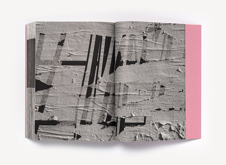
Erik Brandt and Mark Gowing: Ficciones Typografika, published by Formist Editions
Share Article
Further Info
About the Author
—
Ruby is Senior Creative at It's Nice That, overseeing our visual output across platforms and projects. Before that, she was associate editor on the editorial team, after joining in September 2017 following graduation from Central Saint Martins.