Graphic Design: Esquire's creative director on The Big Black Book
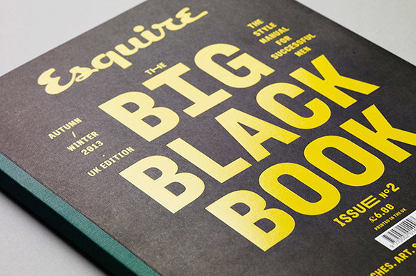
We’re always keen to see new publications and similarly we always take an interest in existing titles undergoing redesigns, but it’s rarer to see an established print brand producing a new product. But that’s exactly what Esquire did earlier this year when they launched The Big Black Book subtitled “The Style Manual For Successful Men.” With its big, bold typographic covers and slick stylish layouts it turned heads as soon as the inaugural issue landed in the studio. With the second one recently out, we decided it was the perfect time to catch up with Esquire creative director David McKendrick to find out more about the project.
What were the initial design inspirations? Is it exciting starting from scratch on a new title, or high pressure?
Design inspiration comes from a lot of different places really; I guess a traditional book design was a starting point, but with a clear point of difference. Commissioning Atelier Carvalho Bernau to produce a custom headline typeface would visually give The Big Black Book a unique look; we are going to have a custom headline for every issue.
It’s very exciting and a complete indulgence on my part. I really wanted it to also to be a very functional, clean but elegant design with a wee bit of oddness; allowing the pictures and words to do their own job. We have some of the best writers, photographers and illustrators in the world and didn’t want to mess too much with this.
It’s really exciting to start from scratch – it’s also high pressure juggling all the different products and commissioning all the content; that is the biggest challenge. Interestingly though, juggling all these different products has seen quite a dramatic change in my role at Esquire. It’s much less hands-on and I find myself overseeing more and commissioning more as opposed to designing pages.
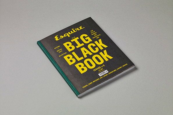
Esquire: The Big Black Book Autumn/Winter 2013
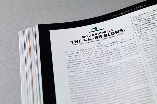
Esquire: The Big Black Book Autumn/Winter 2013
How would you characterise the design approach of the BBB?
It’s a clear and concise approach with fine attention to detail. We spend a huge amount of time crafting what, in the end, looks very very simple. Its a wee bit odd in its design too. When we send it to the printer, they called us up to say the typeface "has went all weird" which I kind of like.
What are the main design differences between this and the mag?
The Big Black Book is a different beast. The monthly is more poppy, lively, with a cheeky sense of humour and certainly more experimental. We have a huge amount of fun with this. The Big Black Book is a more grown-up, sophisticated beast so the design reflects this I think. So for example, we have a bunch of typefaces that we play with in the monthly, and with the BBB we only have two typefaces and a headline.
The Little Black Book insert is such a nice touch – how did that come about?
Honestly, as a starting point I wanted to have a section on different paper in there to give it a change in pace. And from there we chatted about having a kind of directory, an insiders’ guide, a well researched list of indispensable contacts. I think it works well to give the magazine a bit of pace and also it’s really useful, so everyone’s a winner.
For such a visually rich publication the covers are very stark, why is that?
I think if you see it on the newsstand you will understand why. I wanted it to be bold and stand out from the crowd of nice on the newsstand. Also it’s quite a bold move just to run type on your cover. No? I think so.
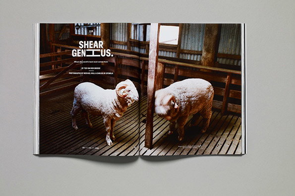
Esquire: The Big Black Book Autumn/Winter 2013
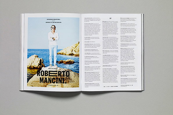
Esquire: The Big Black Book Autumn/Winter 2013
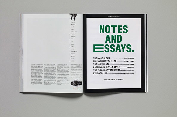
Esquire: The Big Black Book Autumn/Winter 2013
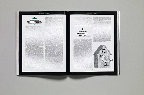
Esquire: The Big Black Book Autumn/Winter 2013
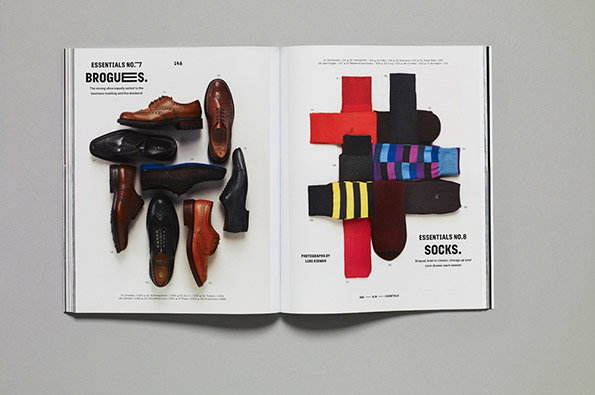
Esquire: The Big Black Book Autumn/Winter 2013
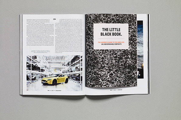
Esquire: The Big Black Book Autumn/Winter 2013
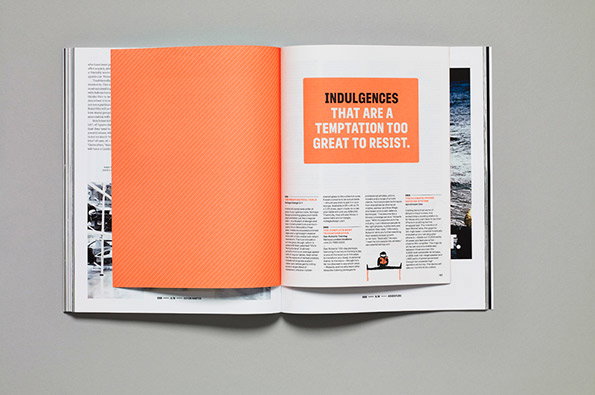
Esquire: The Big Black Book Autumn/Winter 2013
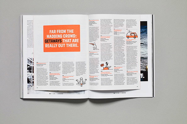
Esquire: The Big Black Book Autumn/Winter 2013
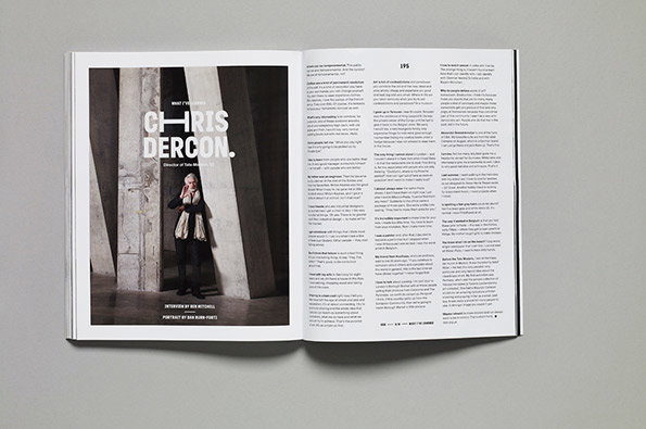
Esquire: The Big Black Book Autumn/Winter 2013
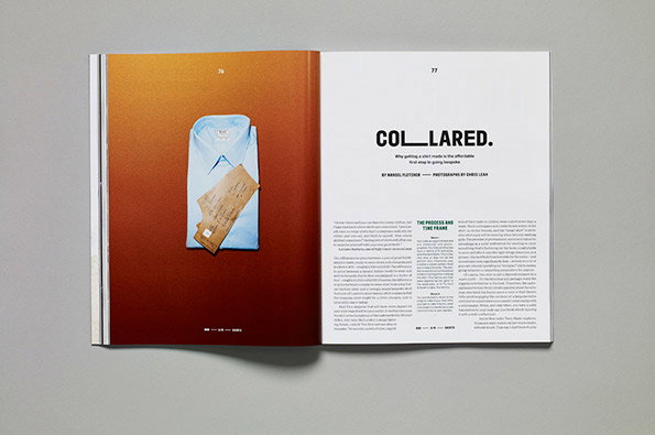
Esquire: The Big Black Book Autumn/Winter 2013
Share Article
Further Info
About the Author
—
Rob Alderson is a freelance writer, editor and strategist. He was previously editor-in-chief of It’s Nice That and WePresent, and editor of Design Week. He publishes the newsletter Undo, which tries to make sense of how AI is changing design work, the design process and the design industry.