Graphic Design: Rising star Fleur Isbell tells us about her code-generated design for the D&AD Annual
Legendary designer Neville Brody has often stated that he would use his presidency of D&AD to focus on promoting up-and-coming talent. Of course talking the talk is all well and good, but Neville has made good on his promises, not least in his selection of the designer for the organisation’s 51st Annual. Eschewing big, established names, Neville instead plumped for Fleur Isbell, a recent member of the D&AD Graduate Academy now at Wolff Olins.
As a starting point Fleur took the geolocation and weather data for each of the 196 countries in the world and created a code-generated coloured pattern for each; the 42 countries whose work appears in the book were in this way represented on the cover.
We had a chat with Fleur about working on this prestigious commission…
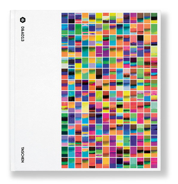
Fleur Isbell: D&AD Annual
What were your immediate thoughts when Neville commissioned you for the D&AD annual?
Shock, surprise, stunned – I was pretty much blown away by the thought of being asked given that it was completely unexpected. As we all know it’s a tremendous honour to even win a D&AD Pencil let allow to be given rein to go off and design the annual that the winning work goes into.
You followed in some pretty big footsteps designing this, did that play on your mind or did you find that pressure motivating?
Of course there’s going to be bit of heat – especially when you consider the past creatives who have designed the annual; but I knew if I let let this get to me then there’s no hope of creating a good piece of design. Instead I focussed on the book’s audience – as these are the people who I am actually designing for.
I used the idea that “the world’s creative industry is going to see this,” "as inspiration to drive the design so that I was always pushing and challenging every decision I made with them in mind.
What were the initial inspirations/reference points?
A big inspiration for me was John Maeda’s reactive books. I was also inspired by user-generated work examples, such as Wallpaper*’s handmade issue back in 2010.
Finally as the main theme of the annual was about D&AD’s global reach and potential; naturally I spent a long time studying and analysing maps and data. There’s a wealth of knowledge one can obtain from maps and looking at our planet: latitude and longitude lines, national boundaries, heat, weather, terrain, elevation, climate, geography, co-ordinates etc. So quite a bit of time was spent analysing this data for each country; as you can imagine the CIA World Factbook was bookmarked for a while!
How would you sum up the design approach of this year’s annual?
Research, experimentation (lots of this), play, systemise. I was always trying to explore new ways of doing things and work out how I could implement this into the annual.To get a strong result I believe that you always have to push experimentation and process so I explored and played with light, perspective, angles, glitching, data, sound, colour, pattern, processing, shape and form.
I really wanted to challenge the way a book is seen and push its boundaries. So I had to be open, ambitious, and take risks. I wanted the annual to embrace technology reflecting a shift in our creative field and to create something that would live on and incorporate the user, so it had to be reactive.
How pleased are you with the finished product?
I am extremely happy with the result. I think seeing something printed can be a bit of a tipping point and I think it wasn’t until I saw the running sheets come off the press in Trento – where the book was printed – that I could be happy with it all. Seeing the finished book was super exciting and pleasing too and seeing the effect of the print pages on the edge of the book.
D&AD 2013 published by TASCHEN, is out tomorrow.
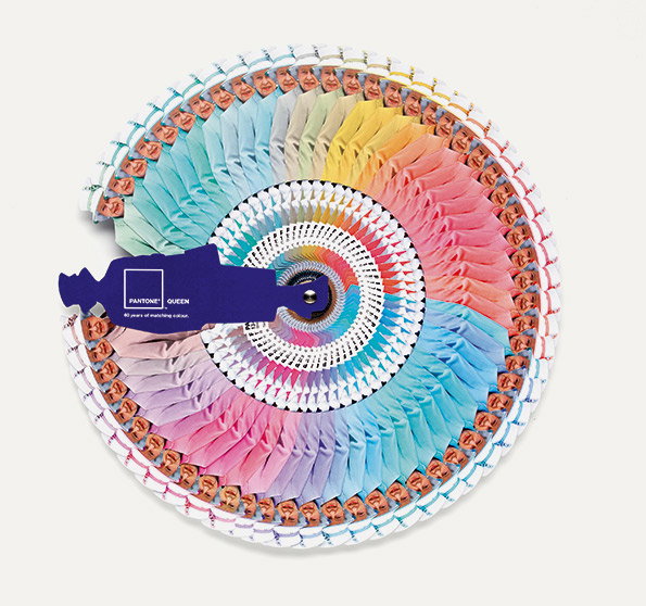
Leo Burnett London: Pantone Queen
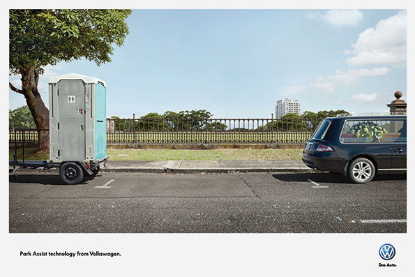
DDB Sydney: Park Assist Technology
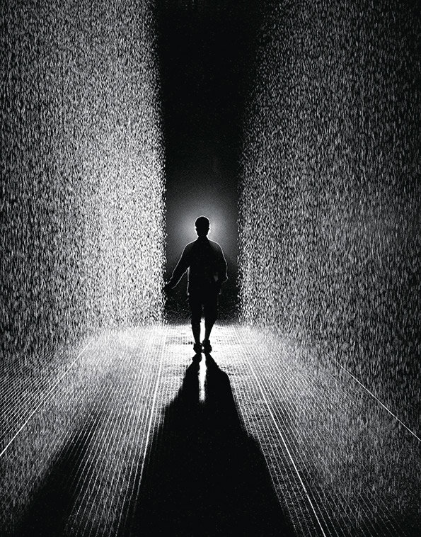
rAndom International: Rain Room
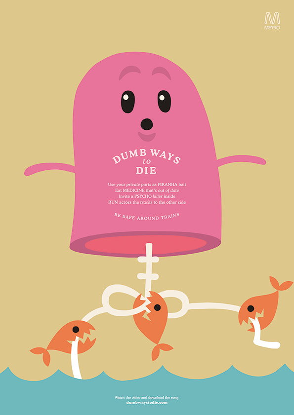
McCann Erickson Melbourne: Dumb Ways To Die

Taku Sotah Design Office: Pleats Please Happy Anniversary Posters
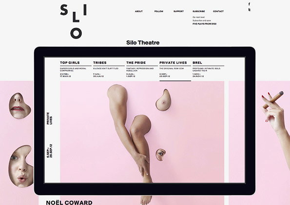
Alt Group: Silo Theatre Identity

Fleur Isbell: Code-generated colour pattern – Algeria

Fleur Isbell: Code-generated colour pattern – Belarus

Fleur Isbell: Code-generated colour pattern – Colombia

Fleur Isbell: Code-generated colour pattern – Finland

Fleur Isbell: Code-generated colour pattern – India

Fleur Isbell: Code-generated colour pattern – Indonesia

Fleur Isbell: Code-generated colour pattern – Jamaica

Fleur Isbell: Code-generated colour pattern – Spain

Fleur Isbell: Code-generated colour pattern – Tajikistan
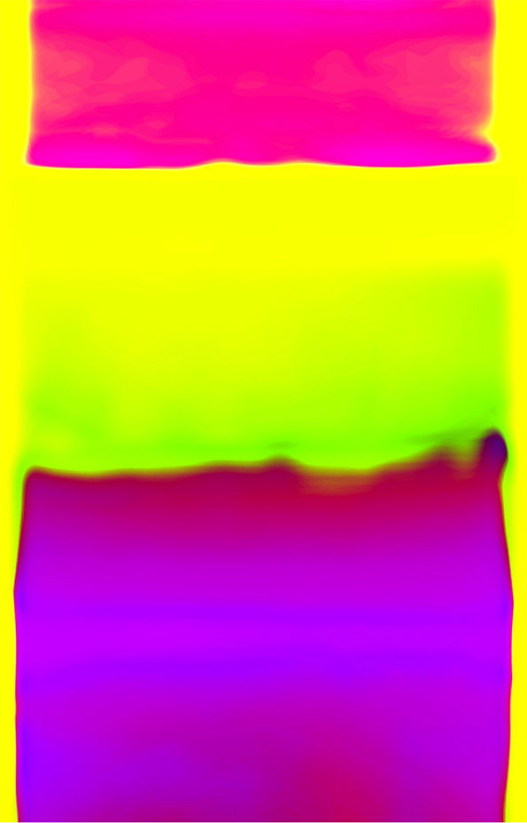
Fleur Isbell: Code-generated colour pattern – Turkey

Fleur Isbell: Code-generated colour pattern – Vietnam
Share Article
Further Info
About the Author
—
Rob Alderson is a freelance writer, editor and strategist. He was previously editor-in-chief of It’s Nice That and WePresent, and editor of Design Week. He publishes the newsletter Undo, which tries to make sense of how AI is changing design work, the design process and the design industry.