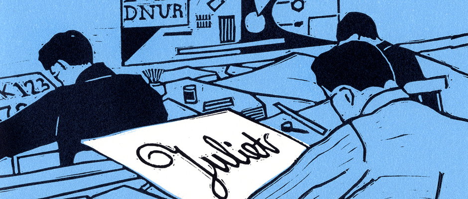
Giulia Garbin's gorgeous new book pays homage to the typographers of Turin
Giulia Garbin is carving out a very particular niche for herself, as a creator of great-looking tributes to the graphic design days of old. Her graduation project from the Royal College of Art was a stunning book celebrating the last printers in London’s Fleet Street and her new offering is a visual homage to the typographers of Turin.
The latter grew out of the former, after Stefano Riba of the Print About Me press saw a copy of her hand-printed The Street of Ink book and invited her to the Italian city to work her magic there. The result is Tipi di Torino, which is described as “five tales and five typefaces describing the splendour, the decline and the rebirth of letterpress and typography in Torino.” The title is a play on the dual meaning of “tipi” which translates both as “dudes” and as “movable type fonts.”
Giulia set about the task by immersing herself in Turin and the historic type scene which can be found there. “I wasn’t very familiar with the city and its history before,” she says. “For decades Turin was inextricably connected to the idea of a foggy, grey, polluted industrial city. To the masses the name just recalled Fiat (the car factory) and Juventus (the football team).
“But it was the first capital of Italy, so the buildings reflect the grandeur of the monarchy, then it has the second biggest Egyptian Museum in the world. It’s definitely an interesting city.”
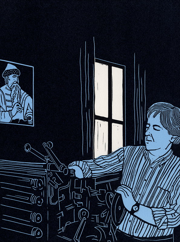
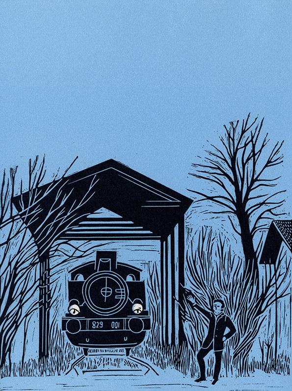
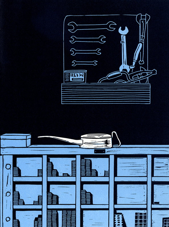
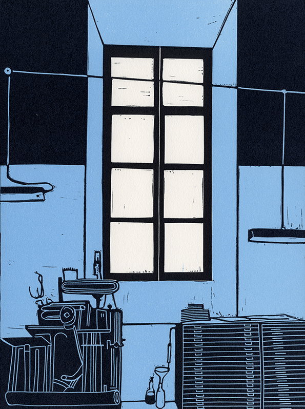
Giulia visited Turin a couple of times and was introduced to the people who would become the protagonists of the handsome tome. The final book is gorgeously produced, with each chapter using a different letterpress typeface smelted at the famous Nebiolo Foundry. Her linocut illustrations are fabulously evocative, and it’s French folded which helps it feel extra special.
We can’t wait to see to which graphic design scene Giulia turns her prodigious talents next.
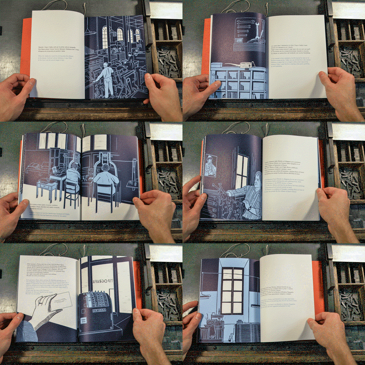
Giulia Garbin: Tipi di Torino
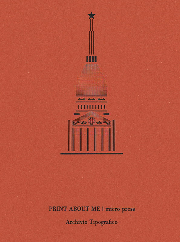
Giulia Garbin: Tipi di Torino
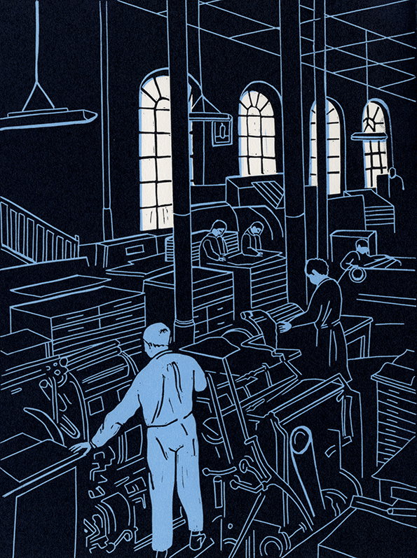
Giulia Garbin: Tipi di Torino
Giulia Garbin: Tipi di Torino
Giulia Garbin: Tipi di Torino
Giulia Garbin: Tipi di Torino
Giulia Garbin: Tipi di Torino
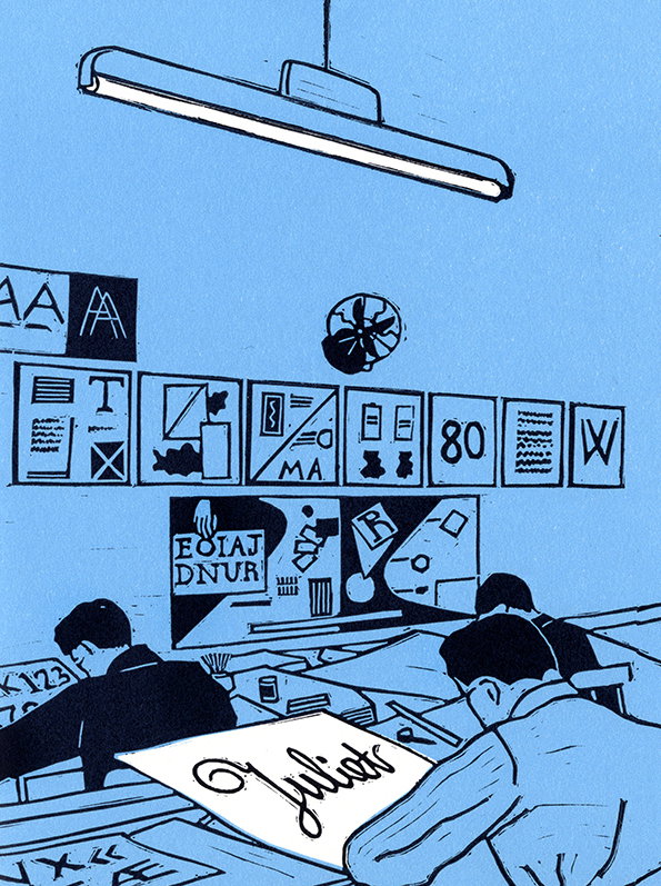
Giulia Garbin: Tipi di Torino
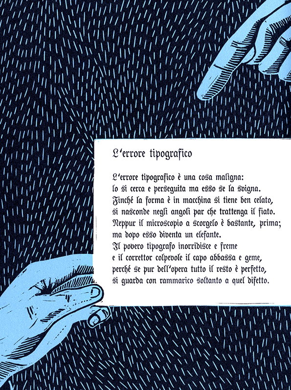
Giulia Garbin: Tipi di Torino
Share Article
Further Info
About the Author
—
Rob Alderson is a freelance writer, editor and strategist. He was previously editor-in-chief of It’s Nice That and WePresent, and editor of Design Week. He publishes the newsletter Undo, which tries to make sense of how AI is changing design work, the design process and the design industry.