



Launch Recite Me assistive technology
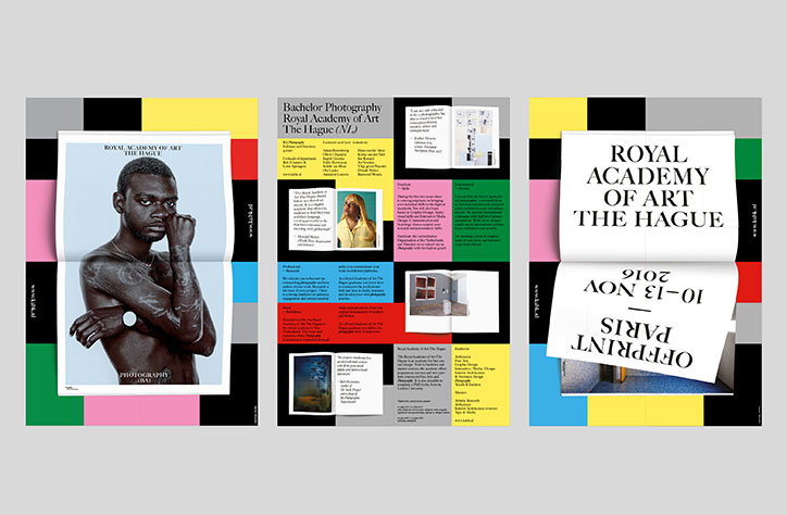
A three-panel layout showing the design of a brochure for the Royal Academy of Art The Hague. The pages feature a mix of bold colour blocks, black-and-white typography and a portrait of a person.

The stand out work from GDFS’ International Poster Competition

—
Date
3 November 2016

From 17th — 23rd October, the Graphic Design Festival Scotland filled Glasgow with live projects, talks from industry leaders, and conferences discussing all elements of visual culture. In the run up to the event, the festival ran an international poster competition, which received a staggering 3,443 entries from more than 70 countries in just three months. As a result they have created one of the largest private poster collections in the UK.

Judged by design studios Unfun, Lamm & Kirch, Warriors Studio and Étienne Hervy, 200 of the submissions are currently being exhibited at The Lighthouse in Glasgow as part of the festival. The collection of wide scoping contemporary graphic design will run until the 25th November.

In order to tackle the thousands of submissions the team received they chose three categories to question and consider the work: concept, content and delivery. In this sense they judged the work on the originality of it’s content but most importantly, “What message is the designer trying to communicate?” Secondly, whether this message communicated is worth telling, “Have they managed to simplify or successfully communicate a complex issue or topic?” Lastly, the poster in question was judged on it’s final delivery, taking into consideration the tone that the poster emulates, “Does the medium(s) they use support the message they’re trying to convey?”

On choosing one stand out poster to be awarded first place, Beth and James explained that they were looking for work that “makes innovative use of media or medium” but also, “alters perceptions or ways of thinking”. The winning poster, designed by Koos Breen was chosen due it’s “strong combination of an interesting concept with an original, engaging and practical resolve. It also works well as a functional and practical piece of communication design.”
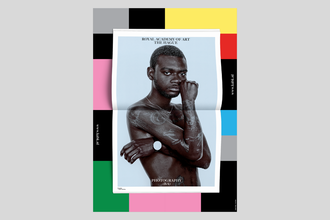
A brochure for the “Royal Academy of Art The Hague” featuring a black and white portrait of a person with tattoos on their chest and arm. The text “Photography (BA)” is printed at the bottom of the page. The brochure is set against a background of bold, colourful geometric blocks.
Above

GDFS International Poster Competition: Koos Breen
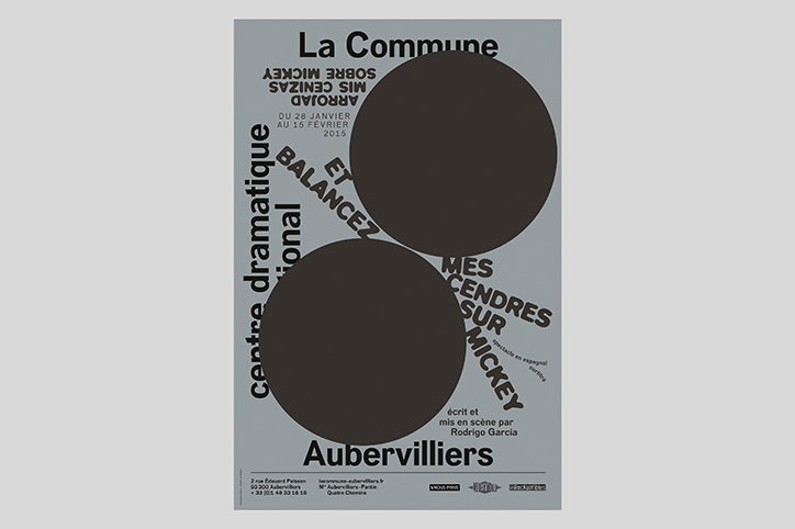
A minimalist black and white poster for a production at “La Commune Aubervilliers”. Two large black circles overlap the centre, partially obscuring the text “Mes cendres sur Mickey”.
Above

GDFS International Poster Competition: deValence
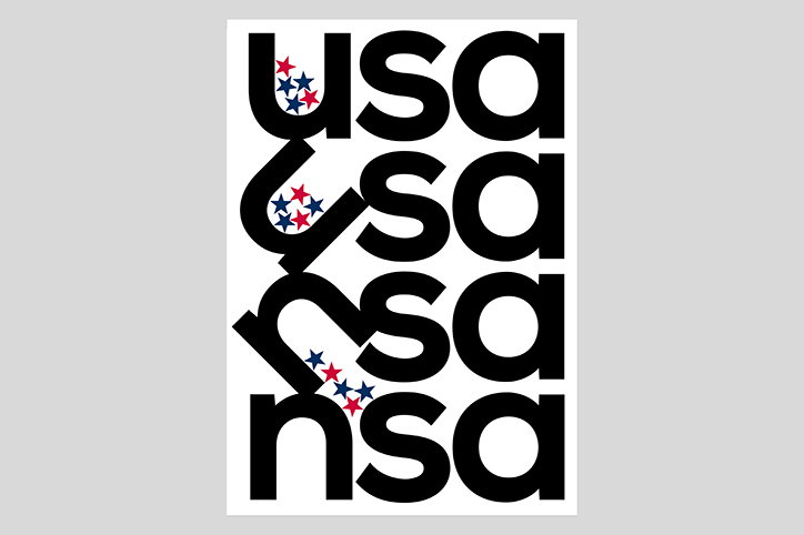
A typographic poster featuring the letters “usa” and “nsa” repeated in four rows of bold, black text. Small red and blue stars are scattered across the letters in the first three rows.
Above

GDFS International Poster Competition: Timm Henger
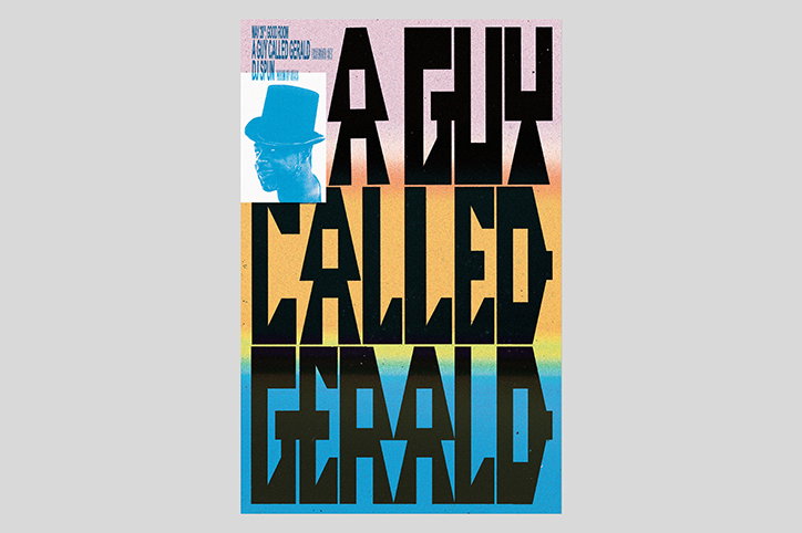
A bold typographic poster reads “A GUY CALLED GERALD” in large, black block lettering. A small blue image of a person wearing a top hat is positioned in the top left corner.
Above

GDFS International Poster Competition: Braulio Amado
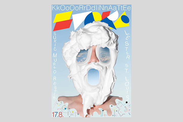
A digital collage of a person whose head is covered in a thick, white, sculpted mass. Cut-outs in the mass reveal a blue sky with clouds where the eyes and mouth should be. The image is framed as a poster with the text “KkOoOoRrDdLiNnAaTtEe” across the top and “LESTER ST. LOUIS” and “SUKIC MURTO RESNIK” along the sides. Geometric shapes in red, yellow and blue sit behind the figure, with the date “17.8.” in the bottom left corner.
Above

GDFS International Poster Competition: Nejc Prah and Klemen Ilovar
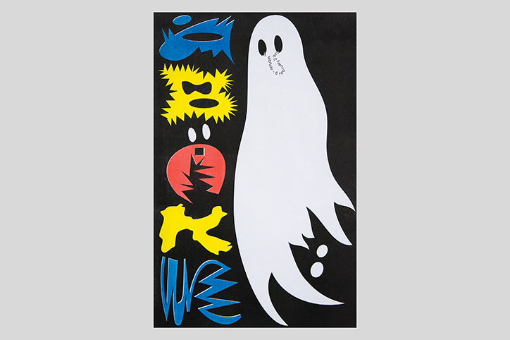
An illustration of a tall, white ghost figure on a black background. To the left, a vertical stack of five abstract, colourful shapes in blue, yellow and red.
Above

GDFS International Poster Competition: Biba Košmerl and Nejc Prah
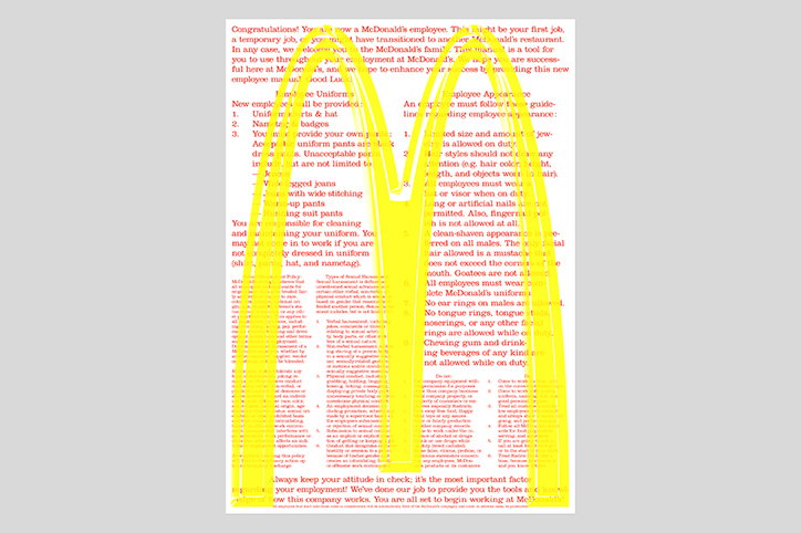
A document of McDonald’s employee guidelines is partially obscured by a translucent yellow overlay. The overlay is shaped like the brand’s golden arches, with the text of the manual visible through the yellow film.
Above

GDFS International Poster Competition: Marcel Mrejen
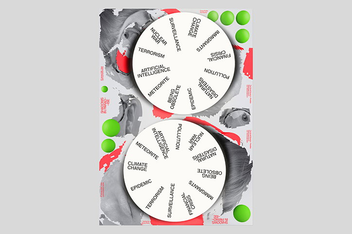
A collage featuring two white circles containing a list of global anxieties in black text. Phrases include “climate change”, “nuclear war”, “artificial intelligence” and “financial crisis”. The circles are set against a grayscale image of a face, accented with bright red shapes and lime green spheres.
Above

GDFS International Poster Competition: Tereza Ruller
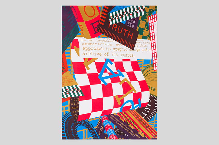
A vibrant collage of overlapping geometric shapes, patterns and text. A red and white checkered square sits centrally, layered with a blue letter “A” and a gold letter “L”. Fragments of text include the word “TRUTH” in white on a dark brown background and a paragraph describing an “approach to graphic design”.
Above

GDFS International Poster Competition: Richard Niessen
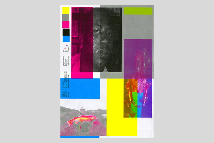
A collage of fragmented photographs and bold blocks of neon pink, yellow and green. A black and white portrait of a person is centrally placed, surrounded by distorted, colour-saturated images and technical printer marks.
Above

GDFS International Poster Competition: Marcel Mrejen
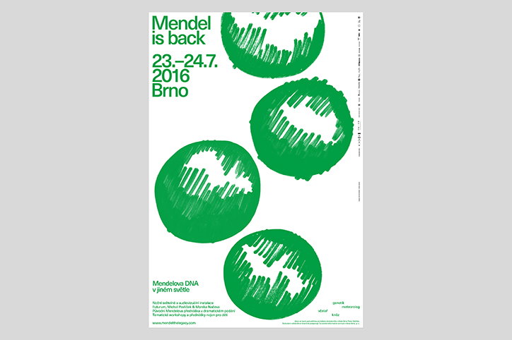
A graphic poster in green and white featuring four scribbled, circular shapes. Bold text at the top reads “Mendel is back” followed by the dates “23.–24.7. 2016” and the city “Brno”.
Above

GDFS International Poster Competition: Nedelka & Báchor
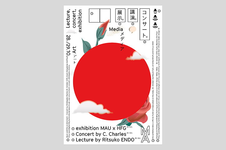
A graphic poster featuring a large red circle centered against a white background, reminiscent of the Japanese flag. Stylised red flowers and white clouds drift across the circle, accompanied by vertical Japanese and English text. The layout includes the words “Lecture, concert, exhibition” and the date “28/29.10”. At the bottom, a list reads “exhibition MAU x HFG”, “Concert by C. Charles” and “Lecture by Ritsuko Endo”.
Above

GDFS International Poster Competition: Sascia Relbel
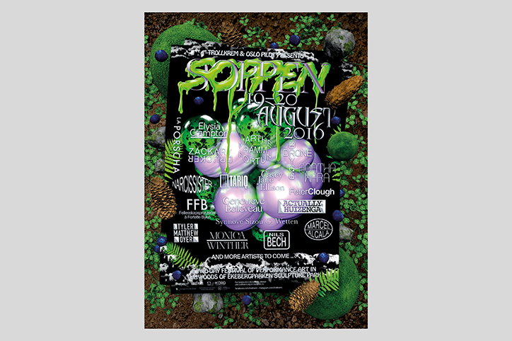
A poster for “Soppen”, an event presented by Trollkrem and Oslo Pilot in August 2016. The design features neon green dripping text and a list of artists over a dark background, surrounded by moss, berries and organic shapes.
Above

GDFS International Poster Competition: Sara Risvåg & Sepus Noordmans

Share Article

About the Author

Lucy Bourton

—

Lucy (she/her) was part of the It’s Nice That team from 2016–2025, first joining as a staff writer after graduating from Chelsea College of Art with a degree in Graphic Design Communication, eventually becoming a senior editor on our editorial team, and most recently at Insights, a research-driven department with It’s Nice That.


It's Nice That Newsletters

Fancy a bit of It's Nice That in your inbox? Sign up to our newsletters and we'll keep you in the loop with everything good going on in the creative world.