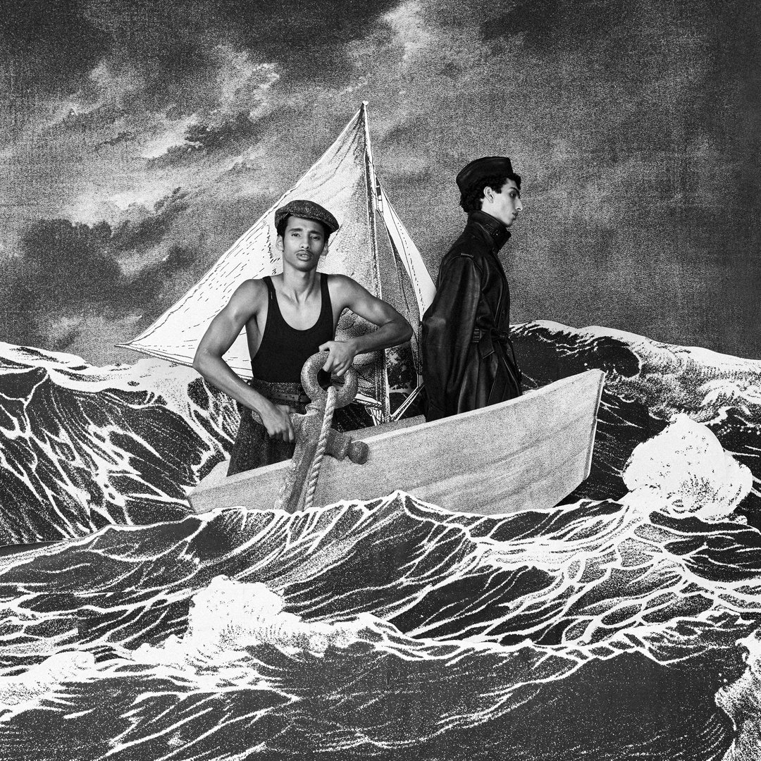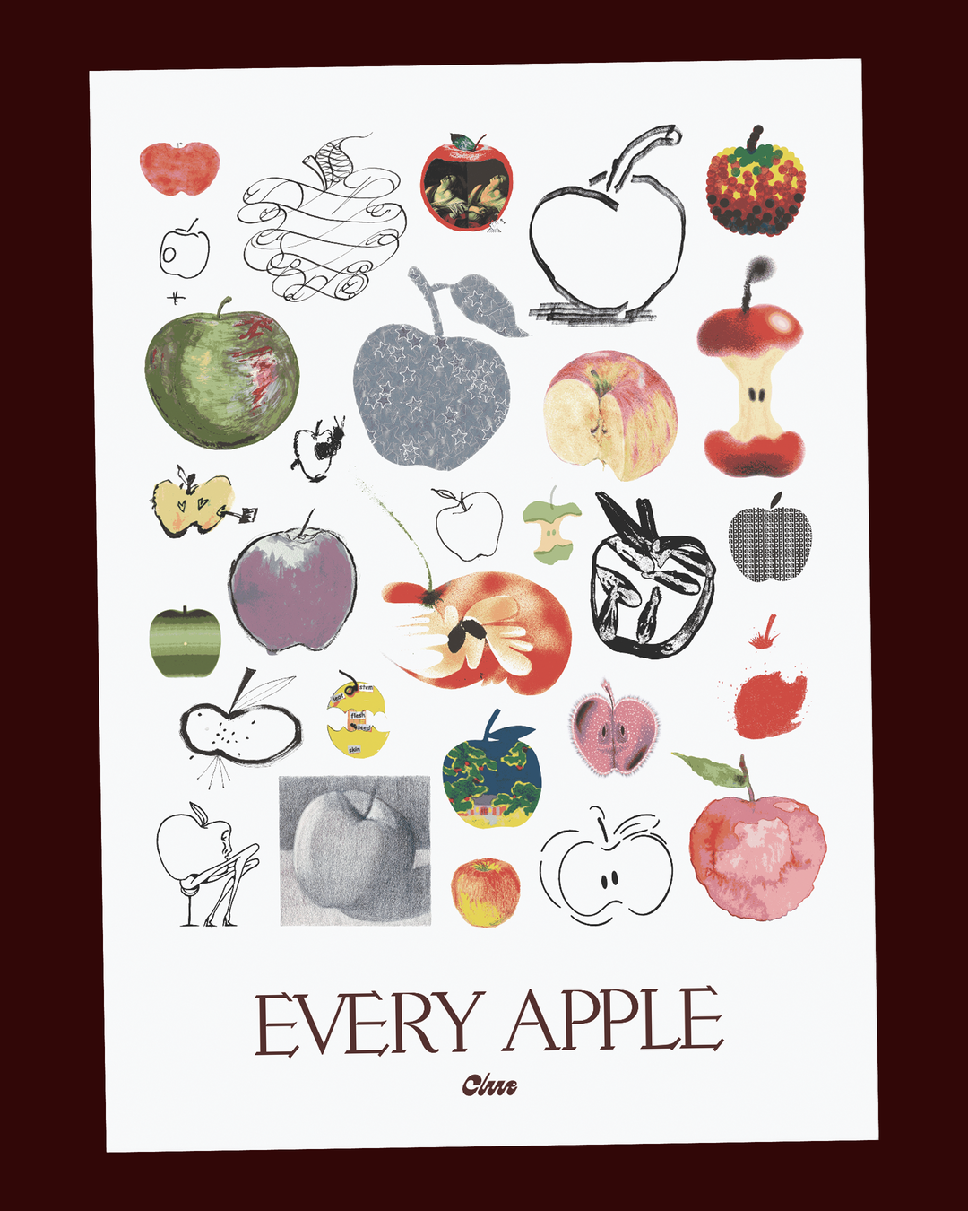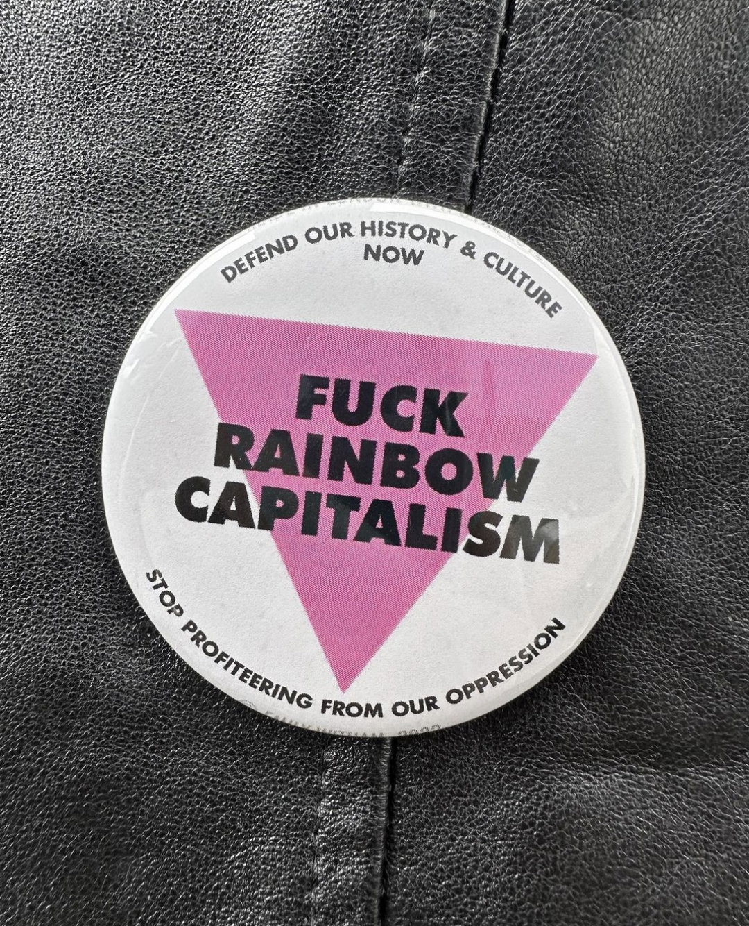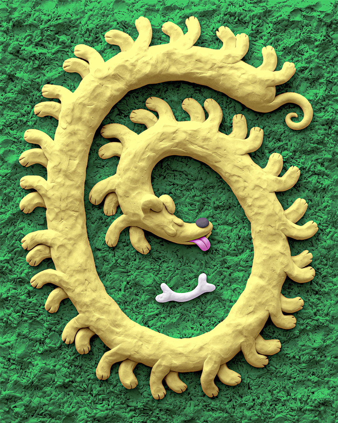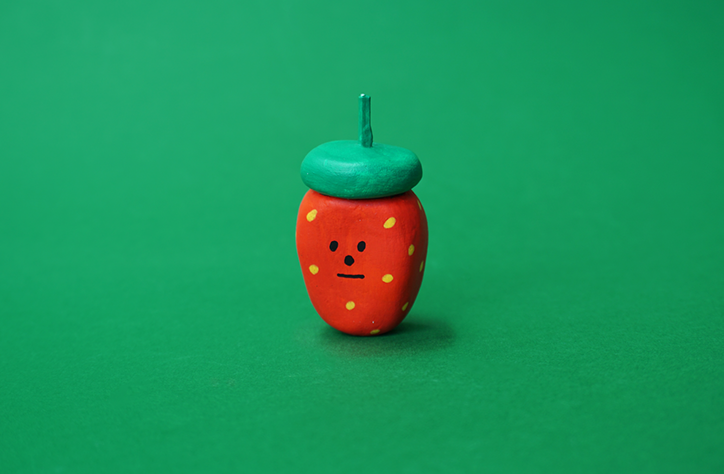
Illustrator Holly St Clair uses the rhythm of a joke in her portfolio of sculptures, textiles and prints
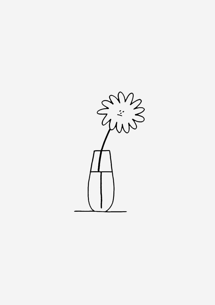
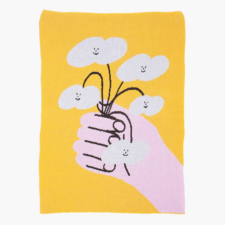
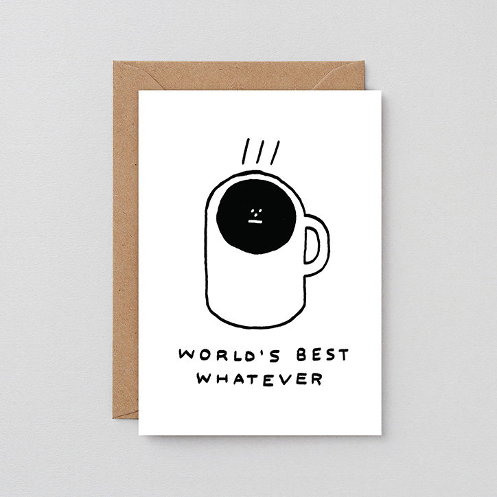
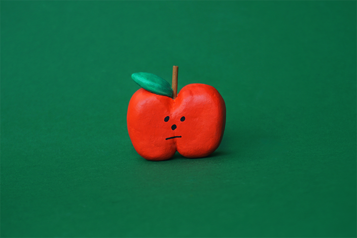
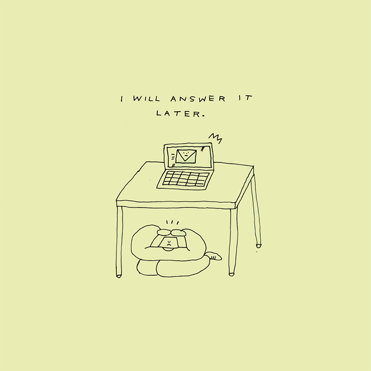
“I use about six stock facial expressions,” explains London born-and-bred illustrator Holly St Clair, “I just love simplicity!” Holly’s portfolio, whether you’re looking at an editorial commission, a sculpture, or taking part in a workshop, is consistent in one aspect: it makes you smile, or laugh, and usually at yourself. “I think it stems from a desire to make work that’s as direct and relatable as possible,” she continues. “I want the drawing to say, ‘This is how I feel. Exactly this.’ Nuance and deeper meaning are purely incidental. It’s my favourite thing in the world when people look at my work and go, ‘That’s me!’”
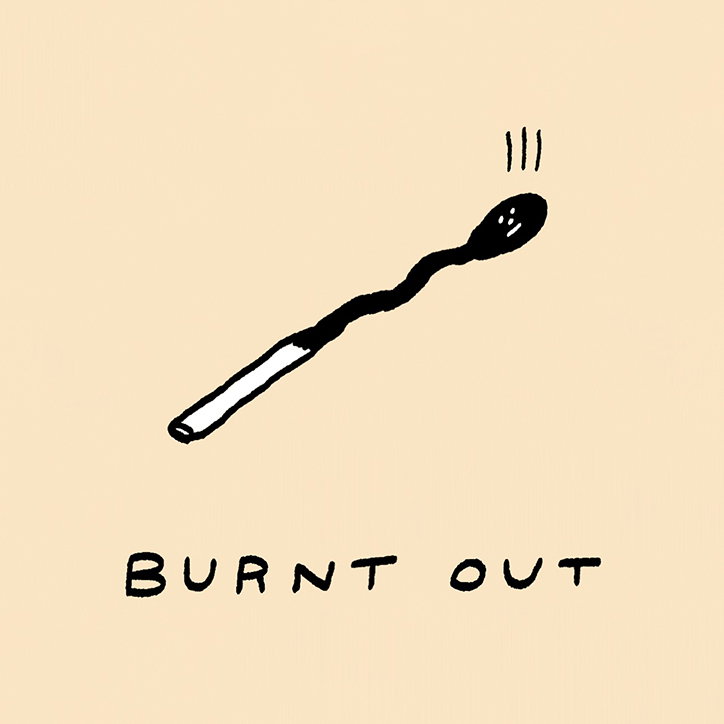
Despite Holly’s self-proclaimed simplicity, there definitely is a subtly to her work which, more often than not, features a punchline of some sort. “I used to be really into stand-up comedy so a lot of my work has the rhythm of a joke, you raise an expectation then Missy Elliot it. (Flip it and reverse it.),” she continues. Simplicity is also the reason she constantly pushes herself out of the medium of illustration, producing 3D sculptures, installations, working with fabric, making rugs, books, prints. “Anything to force me away from the screen for a bit,” she adds.
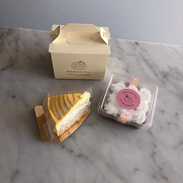
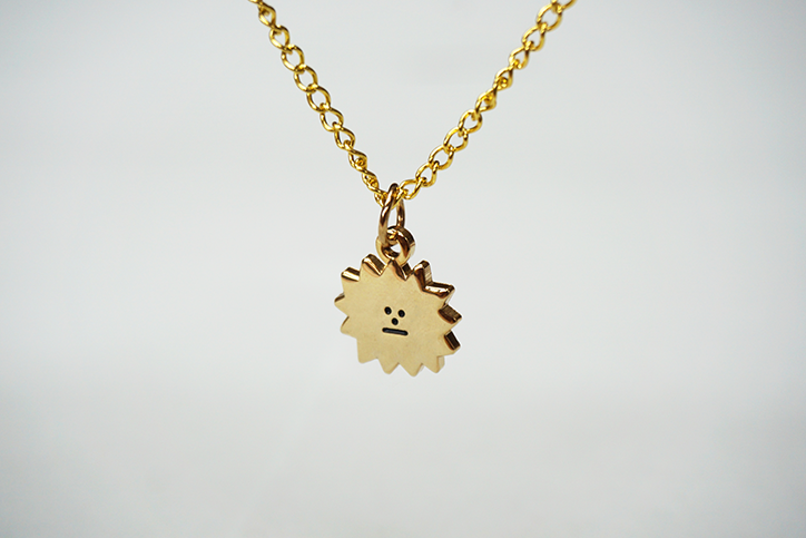
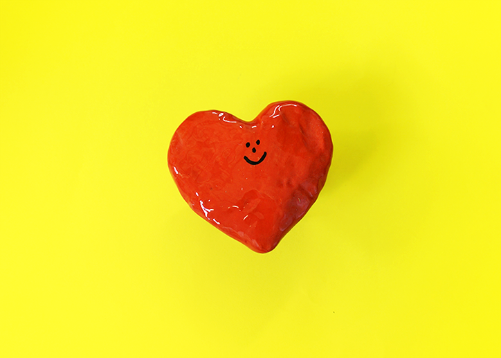
As a result, Holly has a thriving shop selling everything from a slightly bored sun necklace (which we are obsessed with), to sticker packs and tote bags. “I’m not experienced in product design or retail manufacturing at all, so it’s a massive undertaking, but I’m also really enjoying the freedom of designing my own line of stuff,” Holly explains. “I’ve also been doing a lot of collaborative projects, for example I recently made some pots for DIY Art Shop. The dream would be to collaborate on a really fun clothing line.”

Holly St Clair
Holly St Clair
Holly St Clair
In 2017, Holly graduated from Camberwell College of Arts, where she studied illustration and, despite the fact that her portfolio would make you think she’s been doing this all her life, it was only really on her foundation that she discovered the medium. “I got really into anime and manga when I was about ten. That introduced me to the idea of comics and arts as a career. It’s what I always secretly wanted to do, but I went to a very academic grammar school. You either became a lawyer, engineer, or doctor. Luckily, my parents saved me and persuaded me to pursue art,” she recalls. While studying at CCW, she found the illustration pathway the most fun – and the least stressful. “I figured, if I can do this for the rest of my life, that wouldn’t be bad at all,” she adds.
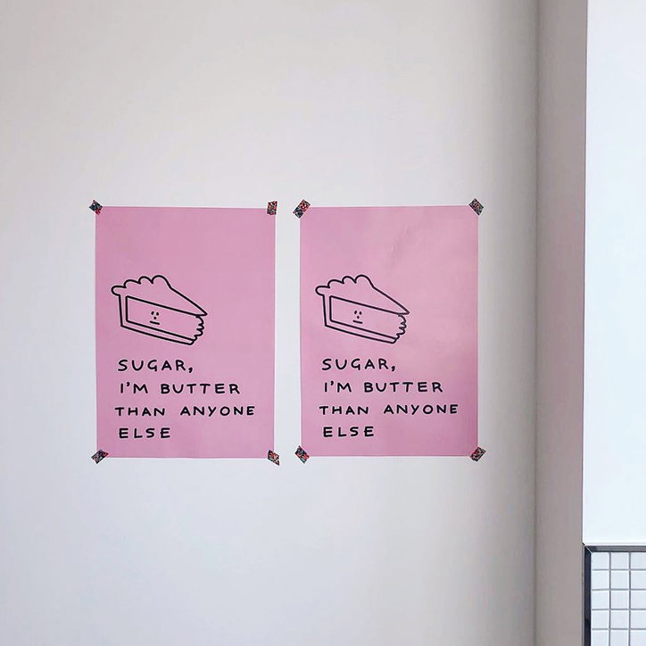
Stylistically, Holly’s work is incredibly distinctive (largely thanks to those stock facial expressions), and is heavily inspired by the world of heta-uma. Heta-uma, which roughly translates to English as “bad but good”, is a Japanese art style originating in the 1970s in reaction to Western cultural influence in Japan. “I’m half-Asian so I really relate to that, I mean, this is what my house is like! An eclectic mix of East Asian and European stuff,” Holly tells us. Conceptually, however, Holly’s work is concerned with language, and the way in which we use it. “Playing with words and meaning is an endless source of material – I get a real kick out of malapropism. It’s why a lot of my work is accompanied by text,” she continues, unearthing some of the tactics behind her hilarity.
On what it is she ultimately finds most exciting about illustration, Holly explains: “It’s so cheesy to say, but I love this community. I have so many friends made through illustration! It’s an exciting thing to feel a part of. Particularly within more marginalised communities, we have to work twice as hard for recognition with a bunch of hurdles in the way. The support amongst QPOC illustrators is so real.”
Holly St Clair
Holly St Clair
Holly St Clair
Holly St Clair
Holly St Clair
Holly St Clair
Holly St Clair
Holly St Clair
Holly St Clair
Holly St Clair
Share Article
Further Info
About the Author
—
Ruby is Senior Creative at It's Nice That, overseeing our visual output across platforms and projects. Before that, she was associate editor on the editorial team, after joining in September 2017 following graduation from Central Saint Martins.