From hand-drawn type to doodled logos, illustration takes the lead in the visual identity for Florence’s first art book fair
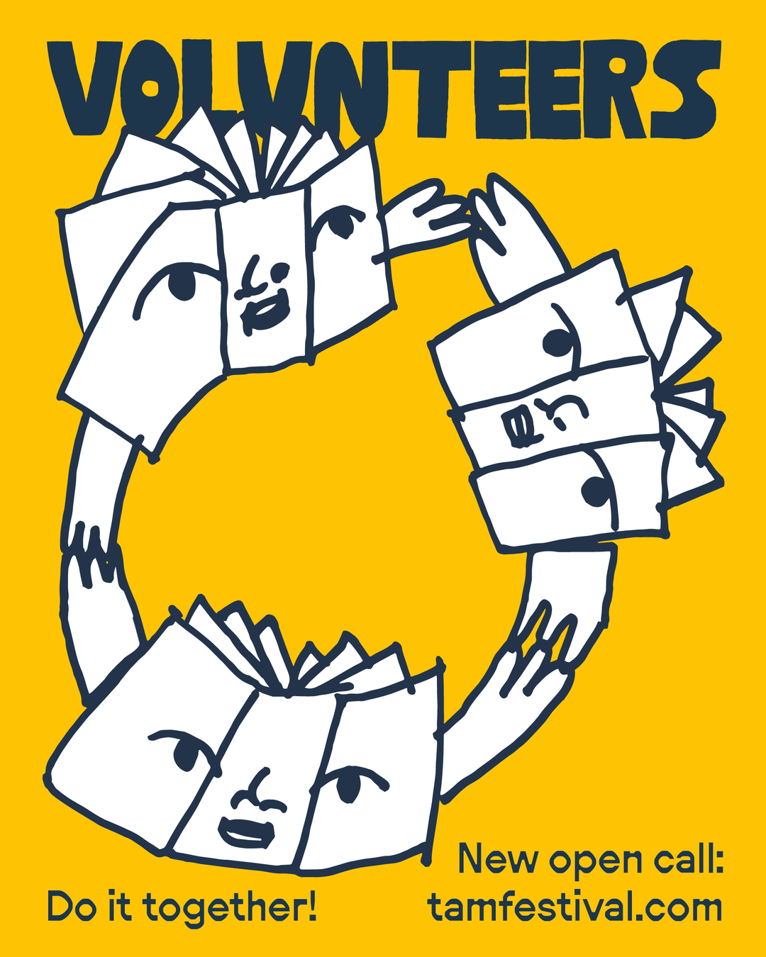
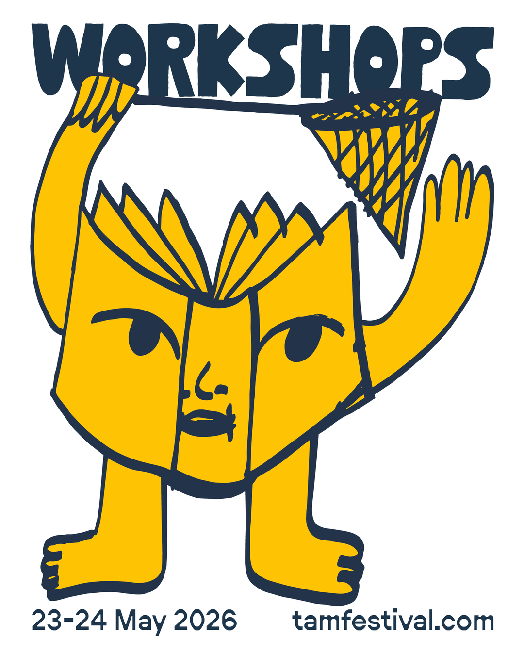
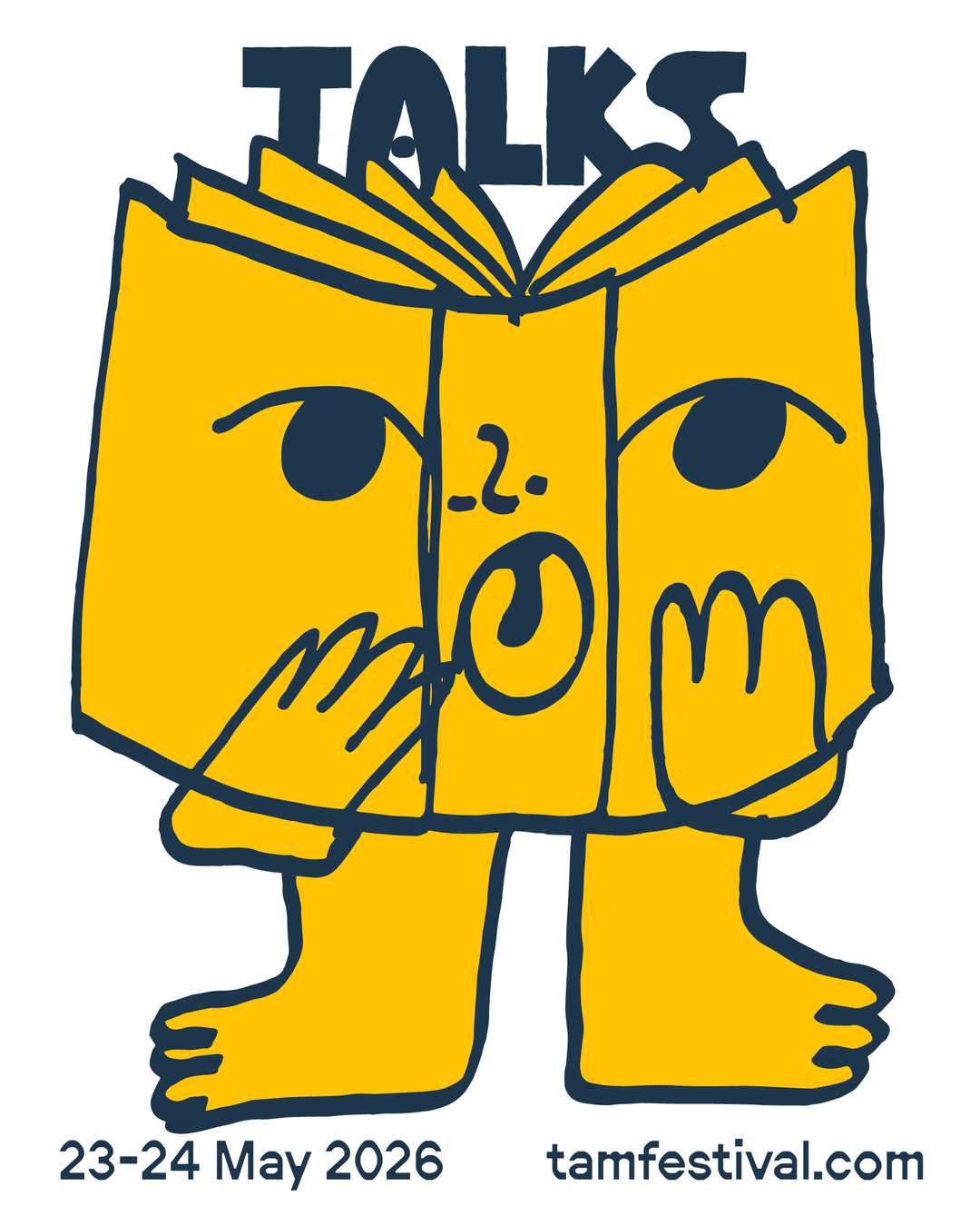
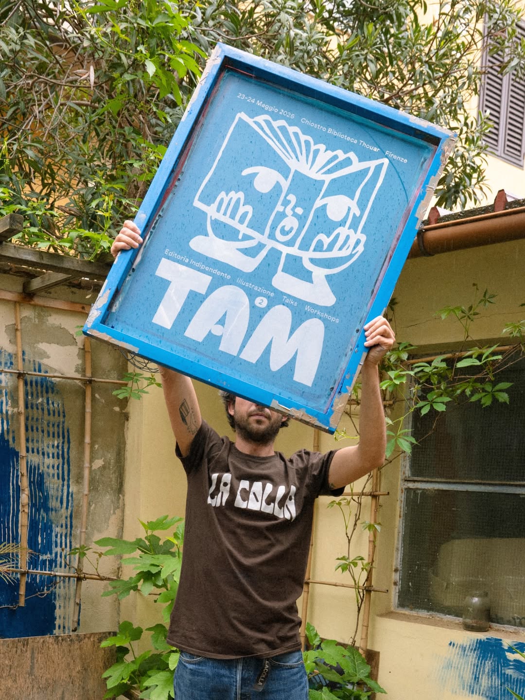
Tam festival’s loveable book character logo is made of “one single, slightly crooked line” – that’s what makes it so special.
Graphic designer Edoardo Cantarella and illustrator Livia De Magistris – co-founders of Tam Festival – first crossed paths in 2024 when Livia began working at Eduardo and Guilia Tordi’s joint graphic design practice Weird Studio, in Florence. The pair immediately bonded over a love for independent publishing, and their collaboration and ideas for a festival for artist books emerged during their time working together: and so, Tam Festival (Florence’s first fair for independent publishing) was born. “The complete lack of a festival or any event representing the world of independent publishing in Florence was what led us to consider creating something tangible,” Livia says. So the designer and illustrator joined forces with Elisa Basilissi, fellow Tam co-founder – “who has been active in the Florence area for years with projects and initiatives related to graphic design and independent art,” says Livia, to bring the event to life.
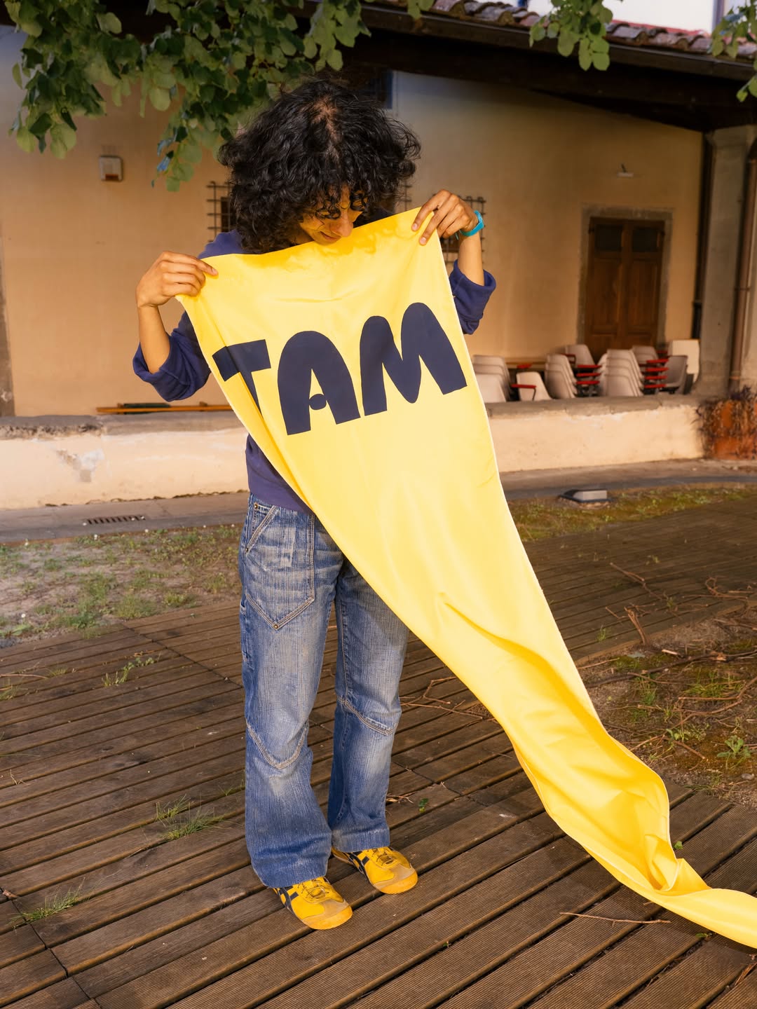
Livia is an illustrator and sculptor who blends publishing with ceramics, and Edoardo specialises in brand identity design, web development and communications strategies through Weird Studio – so the pairing was the perfect recipe for the making of a bold festival identity for Tam’s debut run. To start on branding the event, the designers were keen to take an analogue approach and lean into hand-drawn elements. The custom typography for Tam was constructed with illustrated letterforms inspired by the first letters of the Etruscan alphabet. “The Etruscans were the first people in Italy to use an alphabetic writing system, derived from the Western Greek alphabet,” Edoardo says. “This was the key research finding that allowed Weird Studio to work directly on a custom typeface to steer the festival’s identity. As a secondary font, we chose Neureal by Ecal Typefaces.”
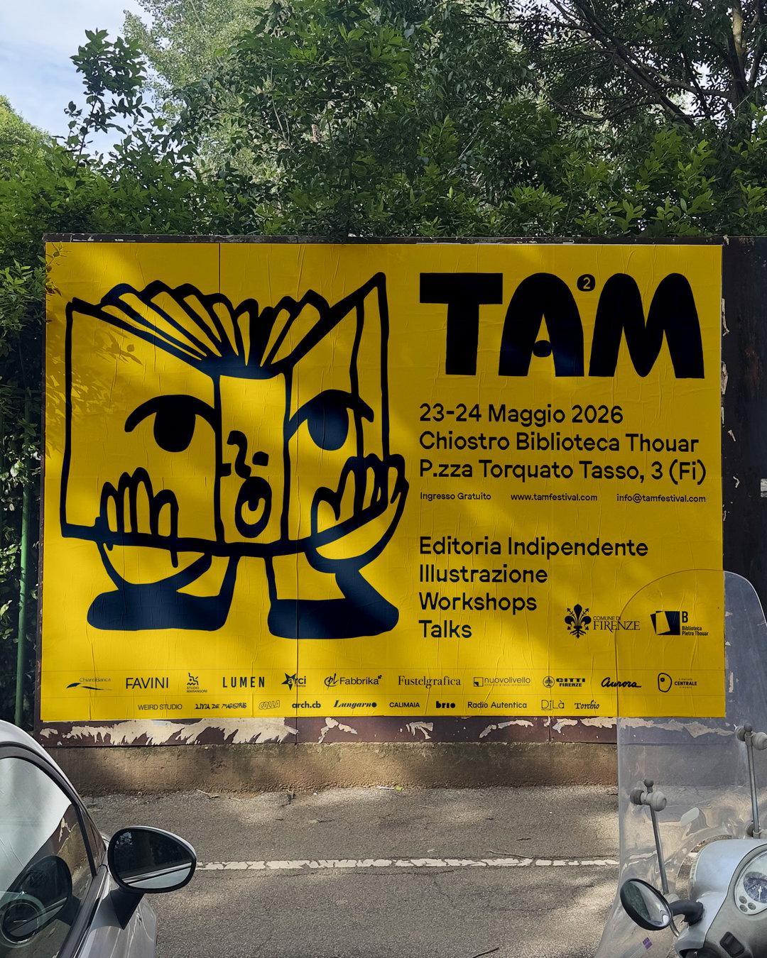
Weird Studio, Livia De Magistris: Tam festival identity, Photography by Roni Blen (Copyright © Weird Studio, Livia De Magistris, 2026)
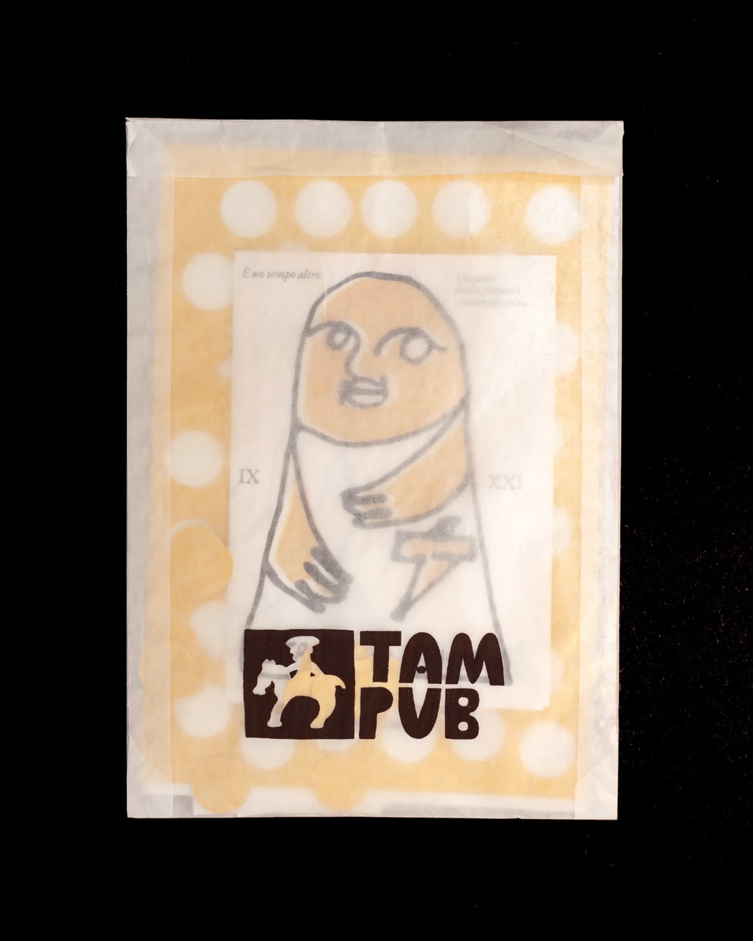
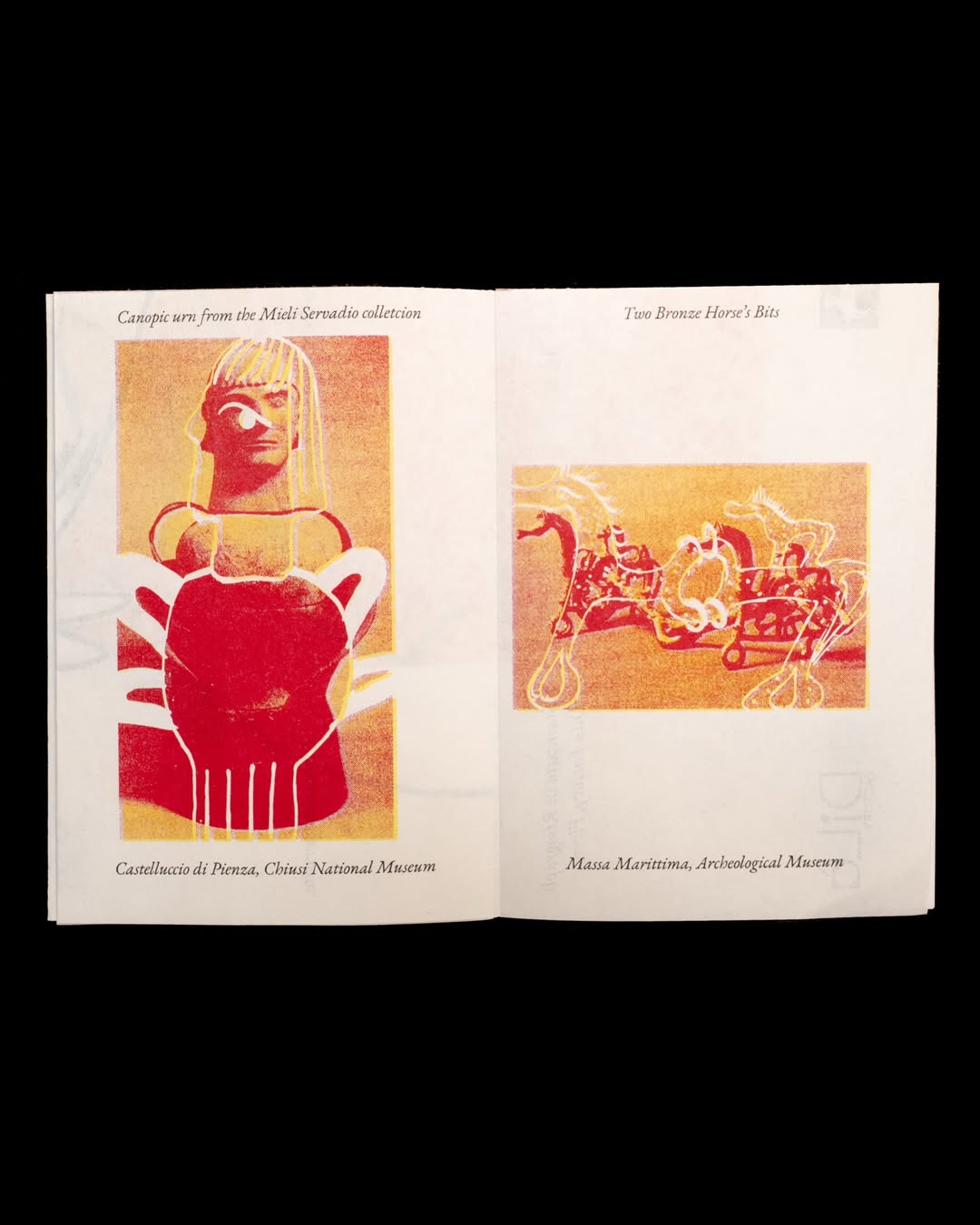
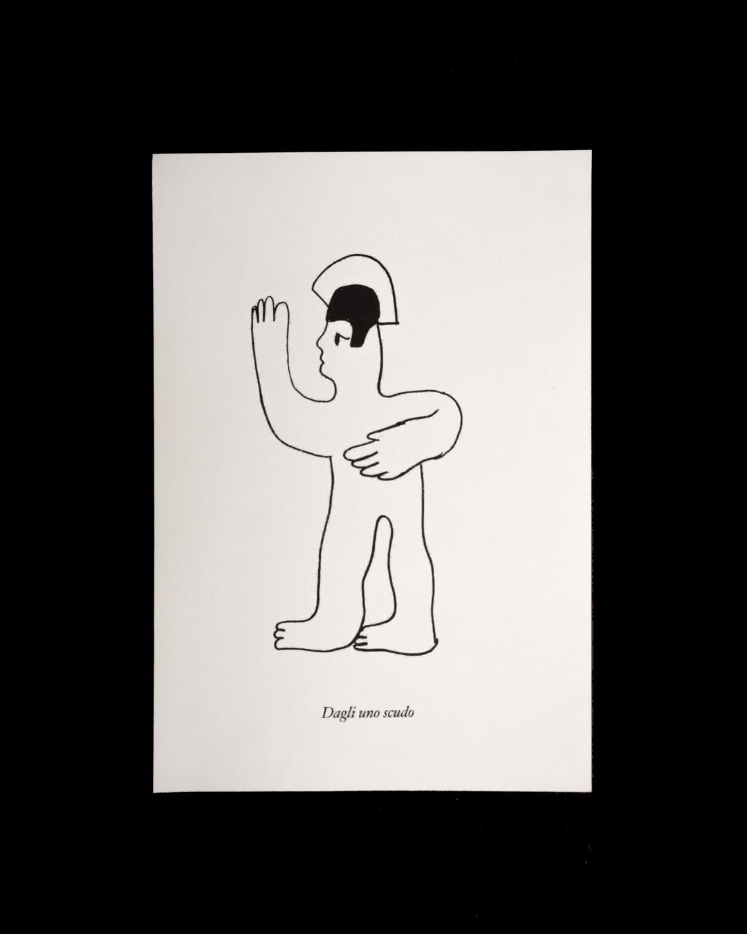
The illustrated characters that shaped the visual imprint of the festival’s first edition also pay homage to this period of history: Livia immersed herself in research into ancient Etruscan symbols: vases, terracotta soldiers, bronze horses in order to shape the fairs illustrated language. “The style was meant to be simple; the lines of the illustrations were drawn with a brush and marker – a single, slightly crooked line that makes each character special,” she shares.
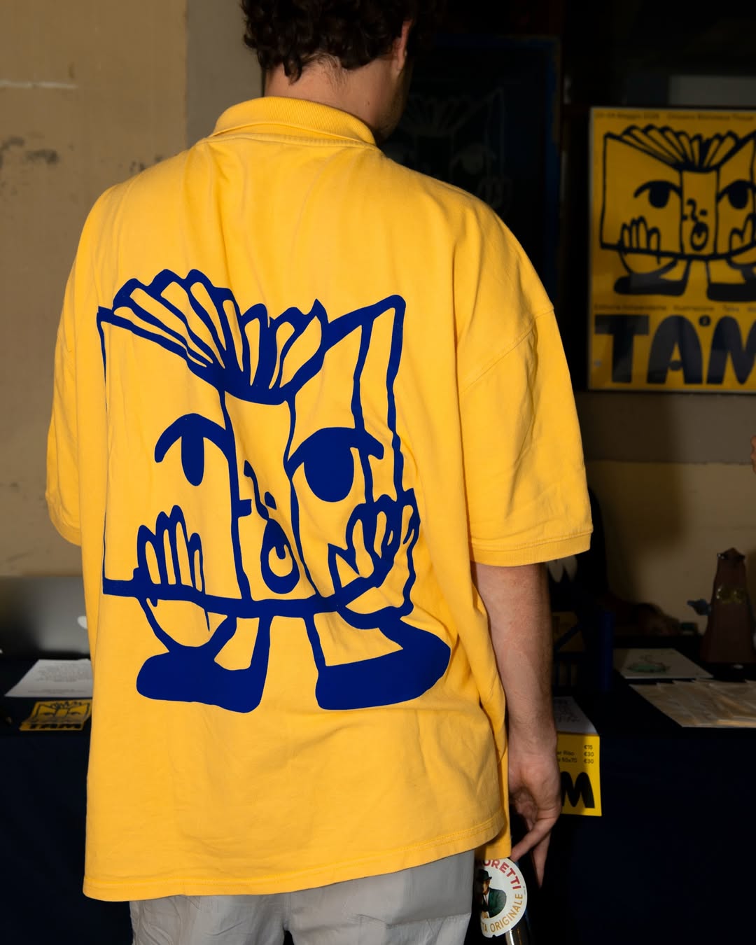
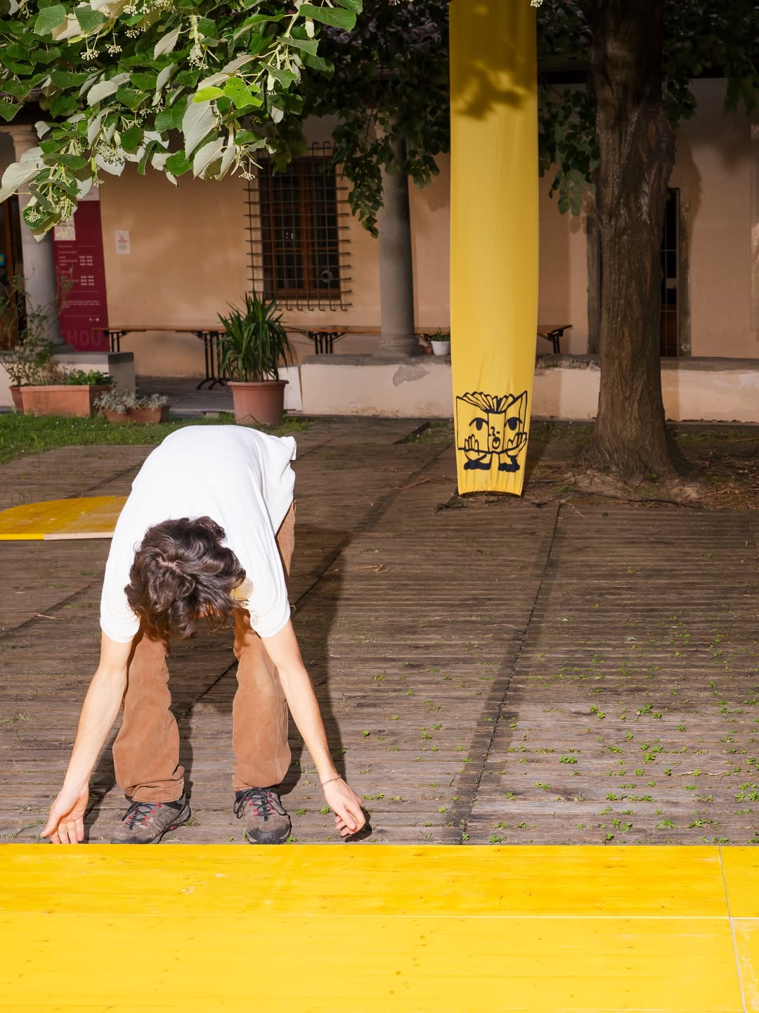
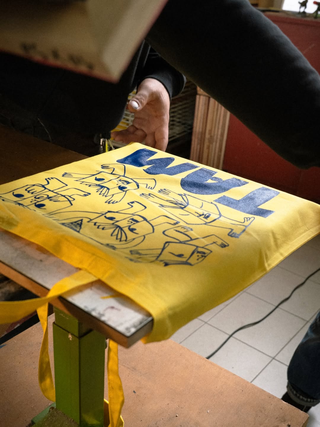
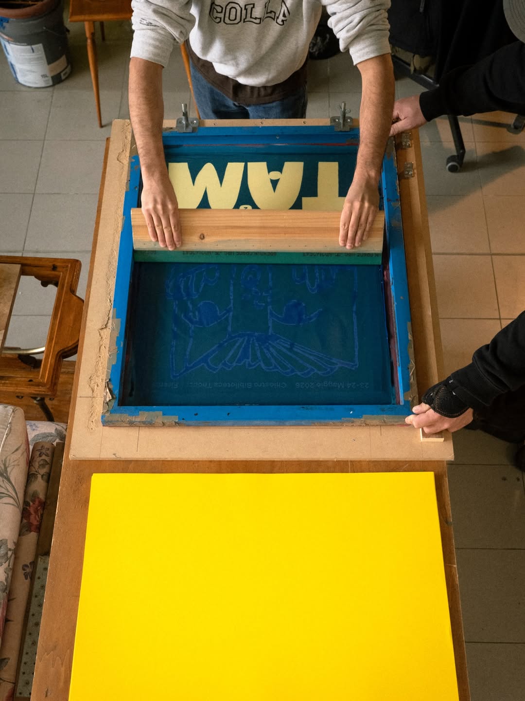
Out of all the iterations of these friendly faces the pair decided to develop one character further to become the festival’s official mascot: the book, which they named zix – “in Etruscan, zix means to write, book, or document,” shares Livia, “zix is therefore the festival’s star, and has become the thread that ties all the activities together.” This cheerful logo covered banners, T-shirts and tote bags with the wonderful inky overspill of screen print across the festival’s applications by Colla (the festival’s lead printer), as well as Risograph printed guides by Todo Modo Dilà, digital printing by Fustelgrafica and letterpress printing by Torchio Letterpress.
To draw the city into this wonderful world of independent print, “our intention was to find a new visual identity that could, in some way, distance Florence from the visual imagery of the Renaissance, which, as wonderful as it is, we felt was too overused and reductive,” shares Livia. Delving further back into Tuscany’s past and arriving at the Etruscans – “a civilisation that unites history, writing, culture, territory, and design” the illustrator says, was the thing that set the festival’s visual attachment to place apart. It also gave the festival its name: “In Etruscan, to create, design or build translates to Tham, and this is the origin of the festival’s name, Tam, as well as the root of its entire visual identity,” Livia ends.
GalleryWeird Studio, Livia De Magistris: Tam festival identity, Photography by Roni Blen (Copyright © Weird Studio, Livia De Magistris, 2026)
Hero Header
Weird Studio, Livia De Magistris: Tam festival identity, Photography by Roni Blen (Copyright © Weird Studio, Livia De Magistris, 2026)
Share Article
About the Author
—
Ellis Tree (she/her) is a staff writer at It’s Nice That. She joined as a junior writer in April 2024 after graduating from Kingston School of Art with a degree in Graphic Design. Across her research, writing and visual work she has a particular interest in printmaking, self-publishing and expanded approaches to photography. ert@itsnicethat.com
To submit your work to be featured on the site, see our Submissions Guide.