Koto launches CCType foundry to create typefaces that meet the demands of modern brands
The global creative studio has expanded into the letterforms landscape with a backdrop of bespoke type systems for brands under their belt and one debut release: CC Timeline.
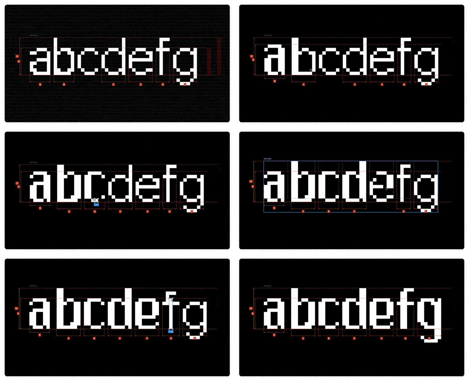
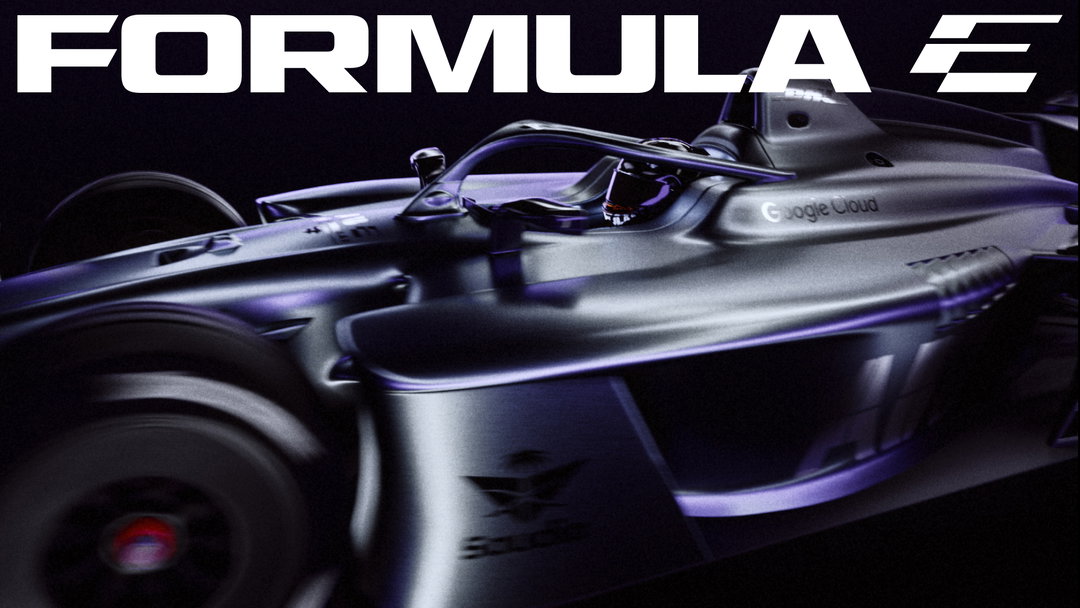
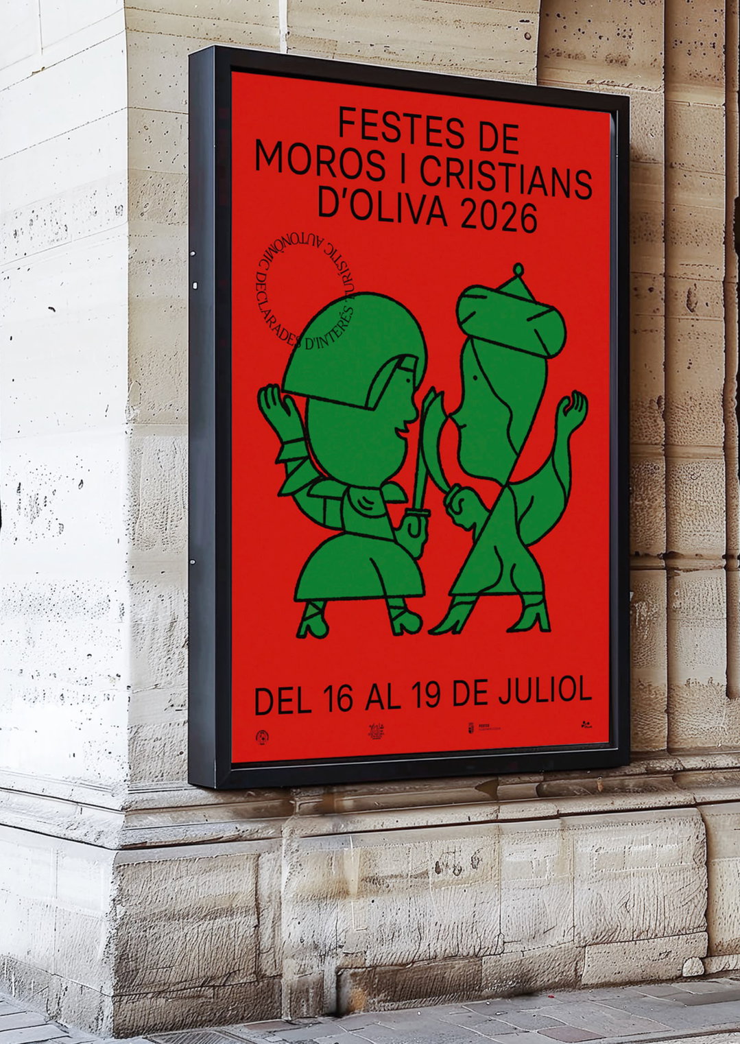
Seasoned in the game of branding, global creative company Koto has worked on countless identity systems that stretch seamlessly across brand, broadcast and digital environments with hundreds of moving parts. But finding typefaces that are flexible enough to do this work over the years has proved no easy feat – existing typography has often delivered in one context but completely collapsed in another. This has led Koto to develop a number of custom fonts across various identity projects in house to compensate for what modern brands truly need from a typeface.
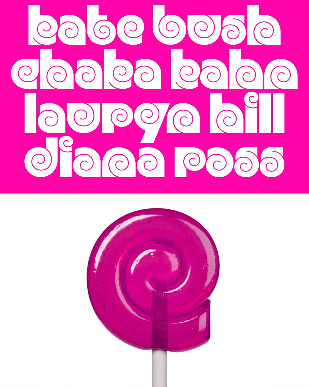
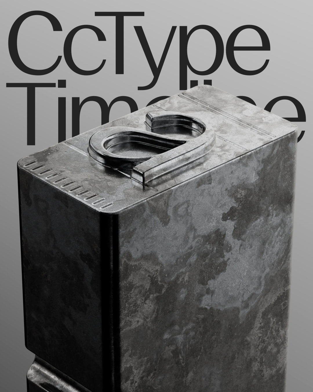
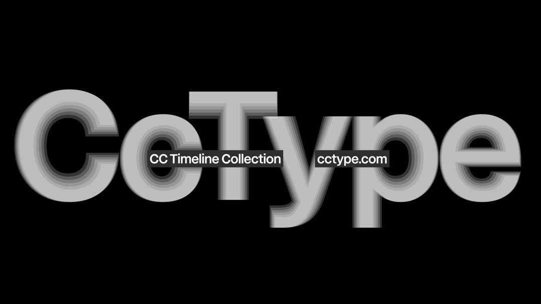
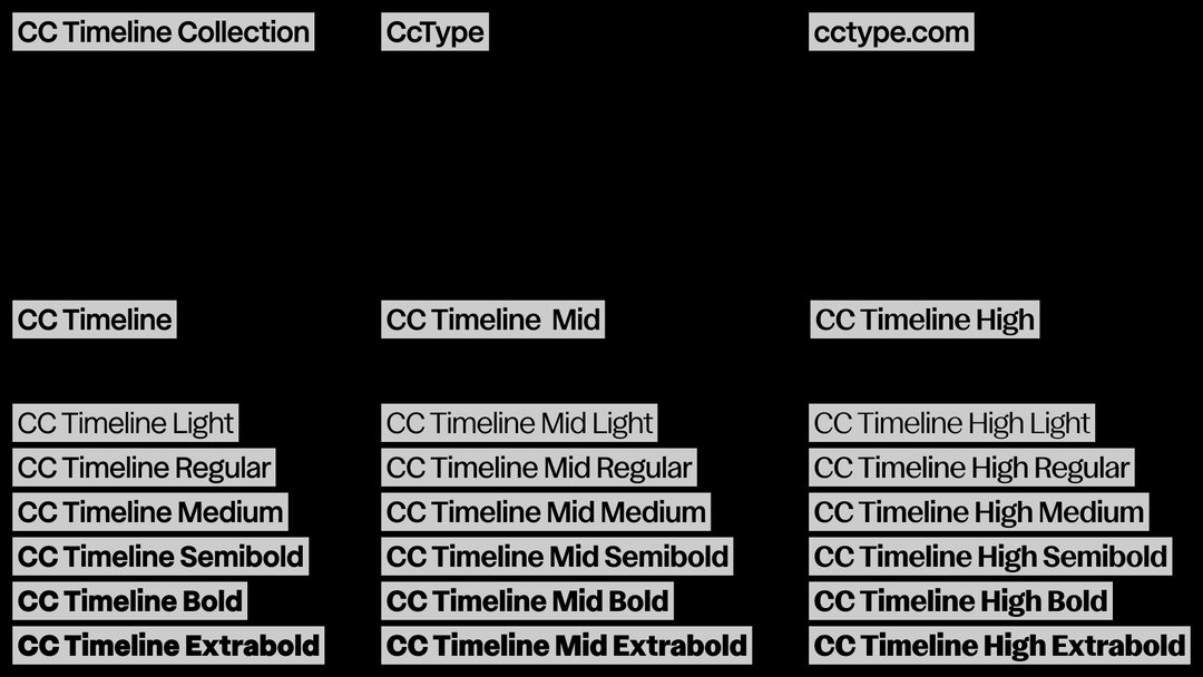
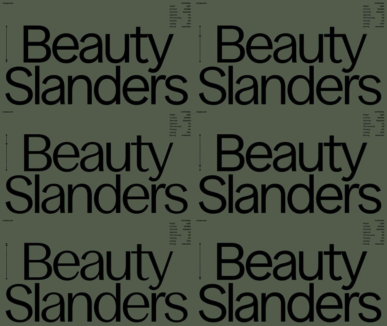
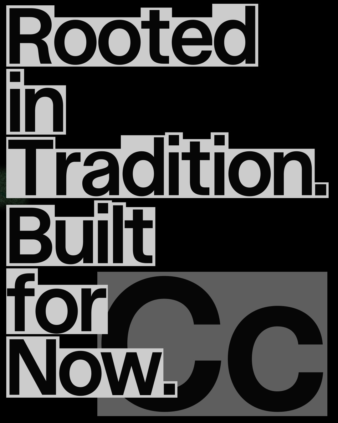
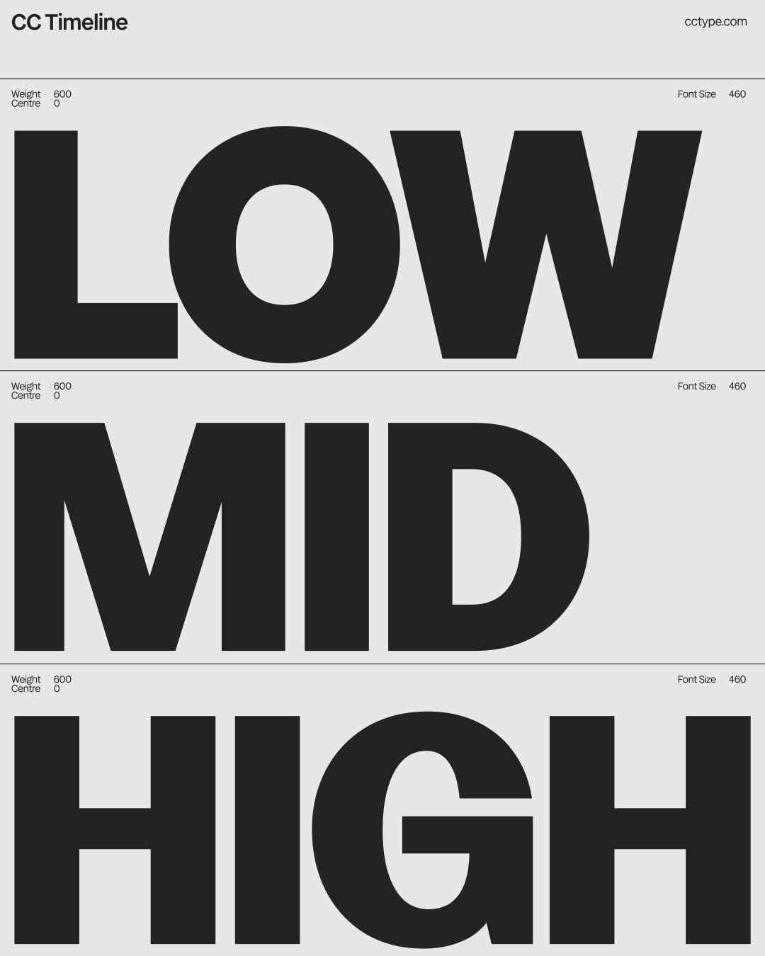
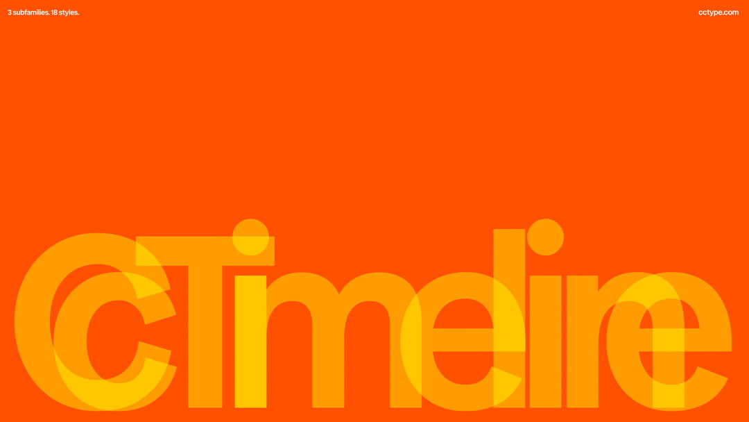
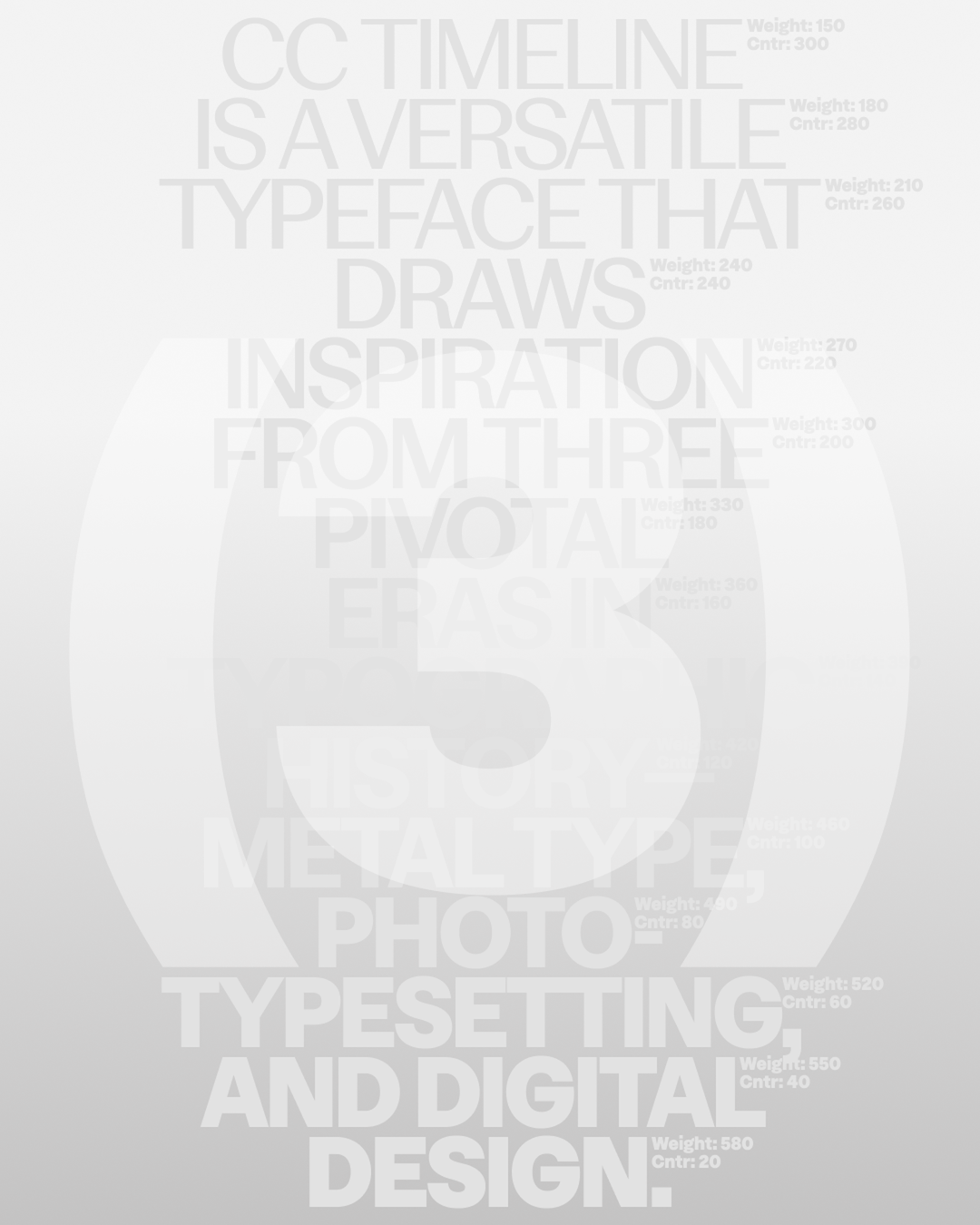
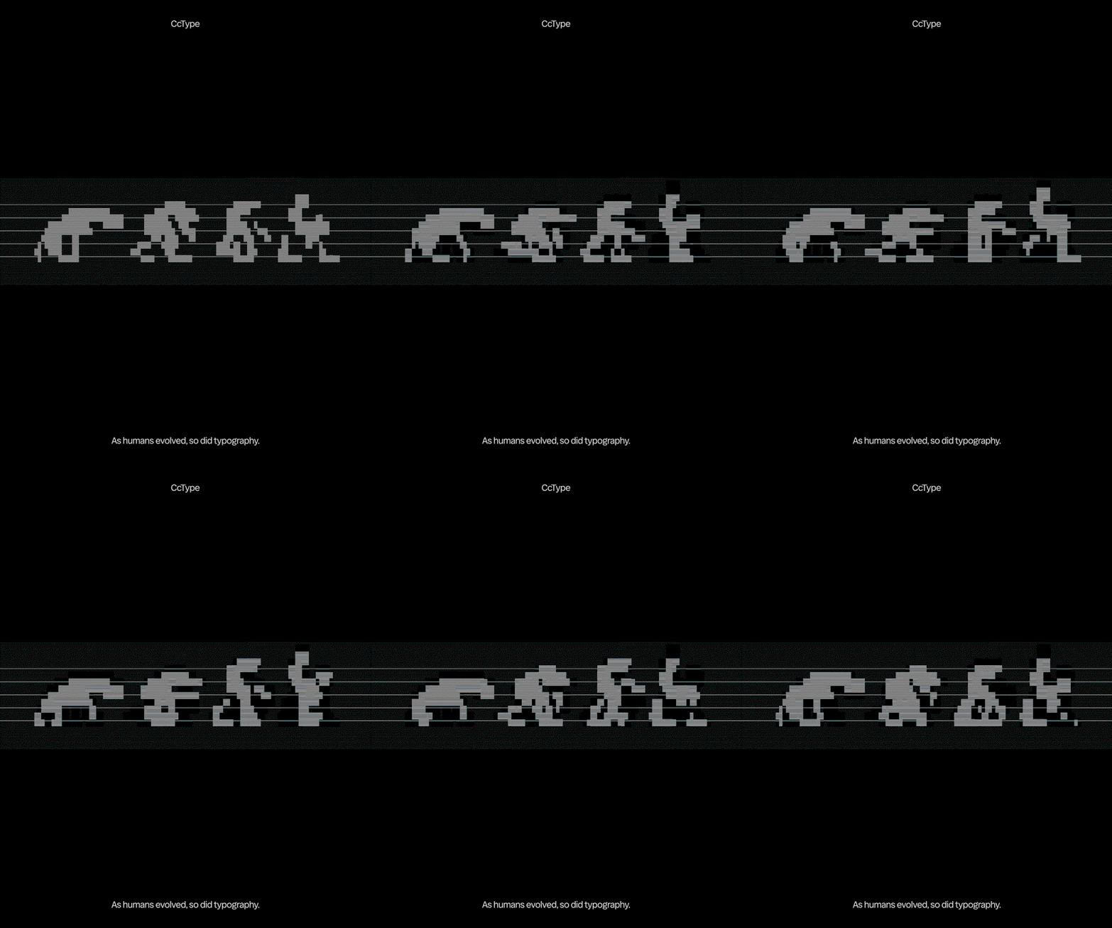
Built off the back of years of bringing these bespoke type systems to life, and a clear appetite from the design community for the typefaces the company has already released through Google Fonts (including Polkadot, Faculty, and Stack Overflow), Koto has launched a type foundry of its own today: CCType. The foundry announcement has come along with the release of Koto’s first font, CC Timeline – a display serif that combines influences from early British metal type, modernist Swiss and German photo-typesetting and contemporary digital typography. A typeface that boasts a huge amount of versatility through its adjustable axes and OpenType features, CC Timeline is a tool that keeps visual continuity and balance whilst still allowing designers to swap alternate characters, play around with contrast and much more – it has a sliding scale of expression built in from the beginning.
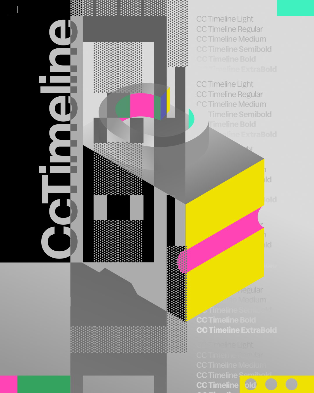
Koto: CcType (Copyright © Koto, 2026)
The foundry has launched with a clear framework and ambition from Koto – to fill a gap in the market for typefaces that are shaped by how brands are operating in 2026. “Koto comes at typography from the reality of execution,” says Jowey Roden, chief creative officer at Koto. “We’re not just looking at type in isolation. We’re seeing how it behaves inside global brand systems, on websites, in motion, in campaigns, in products, on billboards, everywhere. CCType is built from that experience.”
The launch of CCType comes at a time when the number of surfaces a typeface needs to cover digitally is constantly on the rise and the production of branded content is changing at speed with the use of AI. From Koto’s point of view, traditional licensing models have remained costly, restrictive and unnecessarily complex, so the new foundry seeks to shake this existing structure up by introducing a straightforward one-time purchase model for its typefaces, to make its crafted fonts more accessible to freelancers, independent studios, larger agencies and brands directly.
The foundry’s plans for its new fonts is not to skip out on innovation in the type space, but to focus on stretch testing intelligent type systems so that everything that comes out of the foundry doesn’t break under pressure of contemporary branding systems. “There’s incredible experimentation happening in independent typography”, ends Joey, “but sometimes there is less confidence around scale and execution. At the other end, some of the largest players feel increasingly standardised. We saw an opportunity in the middle: highly considered, contemporary type systems built to perform in the real world.”
CCType has launched with CC Timeline available through the CCType website.
GalleryKoto: CCType (Copyright © Koto, 2026)

Hero Header
Koto: CCType (Copyright © Koto, 2026)
Share Article
About the Author
—
Ellis Tree (she/her) is a staff writer at It’s Nice That. She joined as a junior writer in April 2024 after graduating from Kingston School of Art with a degree in Graphic Design. Across her research, writing and visual work she has a particular interest in printmaking, self-publishing and expanded approaches to photography. ert@itsnicethat.com
To submit your work to be featured on the site, see our Submissions Guide.