Art school students and Bob Design brand refresh a 750-year-old London market with collaged pictograms
How do you visually represent something that’s been around for over seven centuries? Bob Design teamed up with the young creatives of Croydon School of Art to make the titanic task possible.
Surrey Street is one of London’s oldest markets in a country full of ancient markets, from St Albans Market in Hertfordshire being around since 860 AD and Leadenhall Market, which has Roman ties to the very first century. Surrey Street is a whopping 750 years old – and to celebrate its septuacentennial (plus 50 years…) anniversary, the female-owned and led graphic design practice Bob has collaborated with Croydon School of Art students to create a new visual identity. The project is part of a wider Greater London Authority-funded initiative extended to green infrastructure, cultural programming and vacant unit activations – all of which are integral to the market spaces in London. Donning aprons, paint and tools, the two design bodies launched the identity alongside the mayor with pop-up printing workshop stalls during the midst of a Saturday market.
Croydon’s council invited Bob to the space’s diverse histories to learn more about Surrey Market, and since Bob specialises in architecture and built environments and as a London-based practice, its team is well aware of what the public want from their markets. Synthesising histories of royal charters, medieval vaults, mathematical tiles and even the birthplace of dubstep with new ways to visually manifest the market’s bustle of trading and day-to-day hustles, Bob designed and facilitated participatory workshops, public consultations and teaching sessions with Croydon art students to draw out a toolkit of typeforms, colours and shapes iconic to the market.
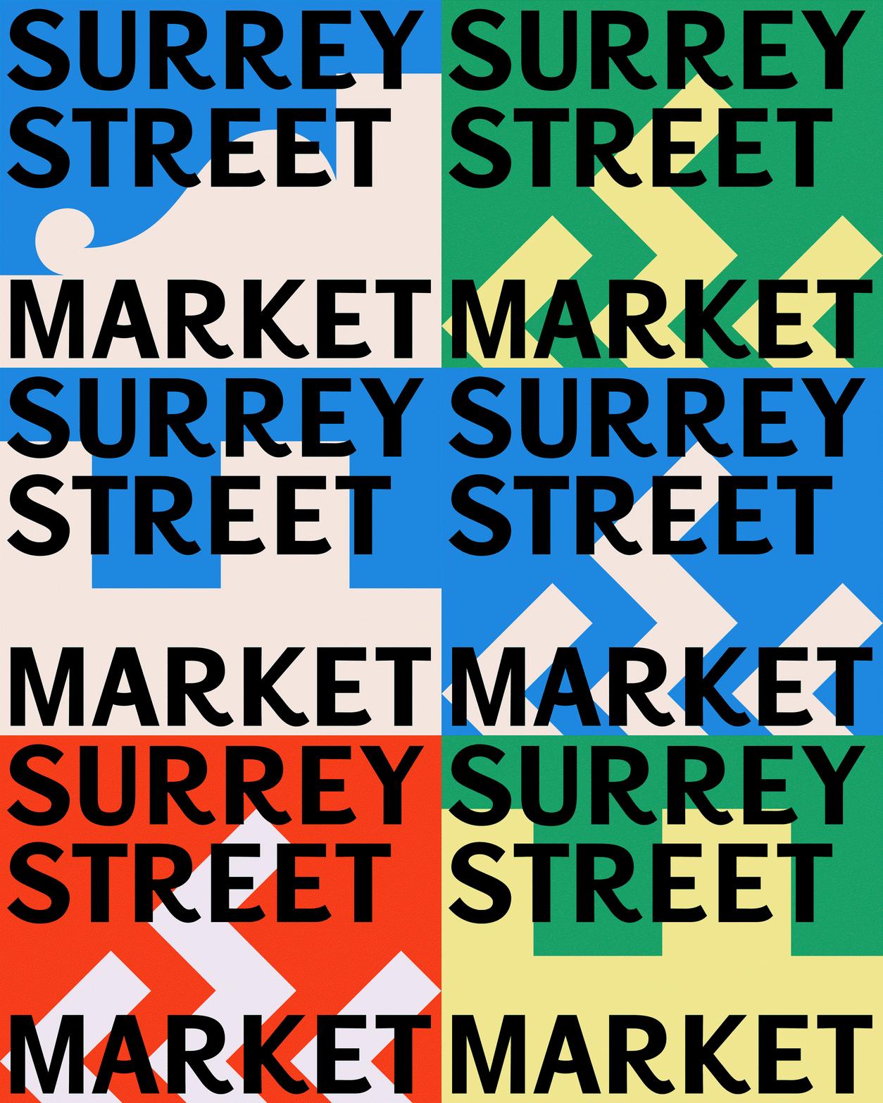
Bob Design & Croydon School of Art: Surrey Market (Copyright © Bob Design, 2026)
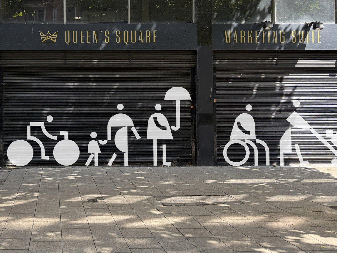
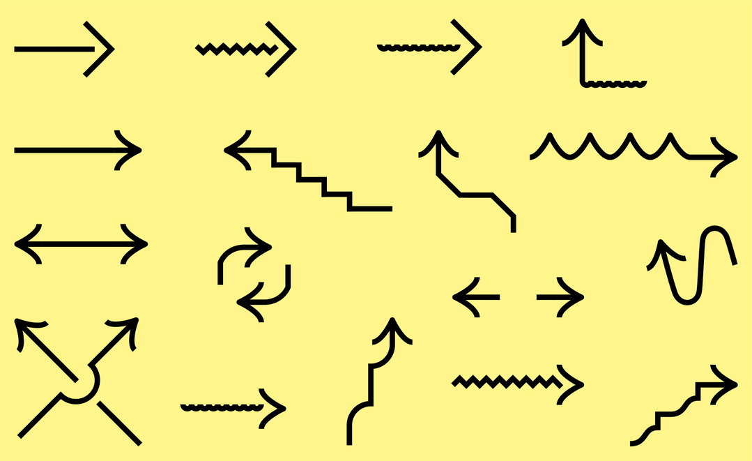
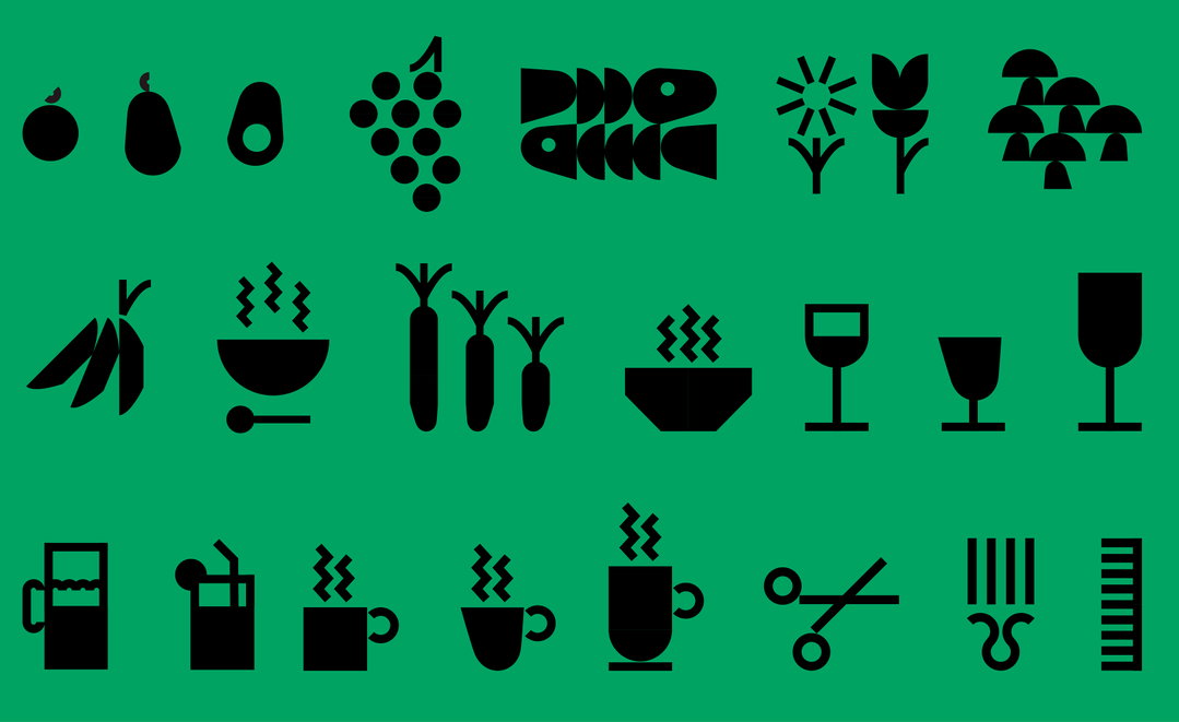
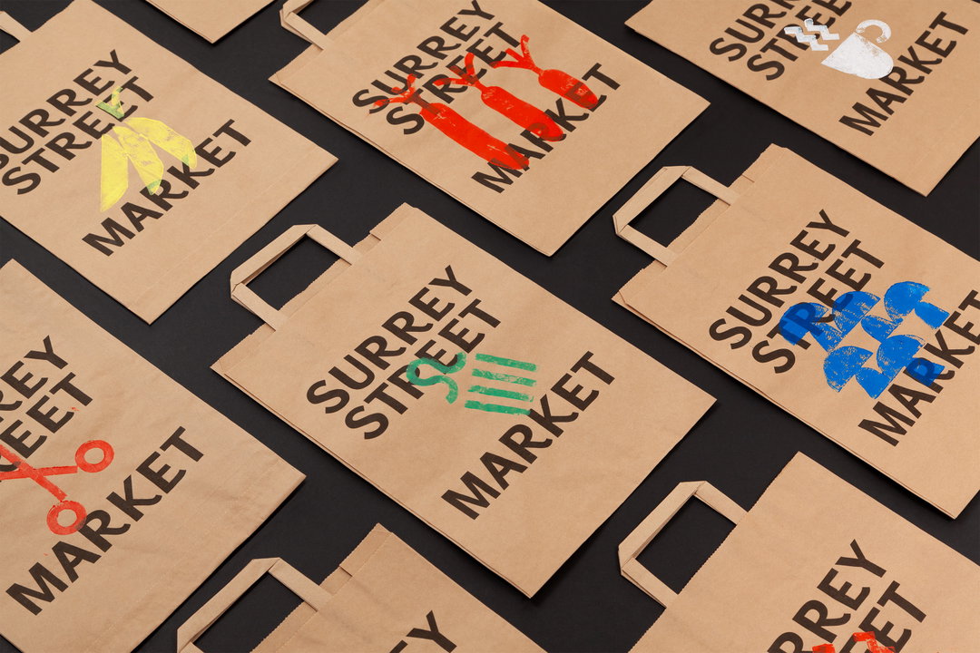
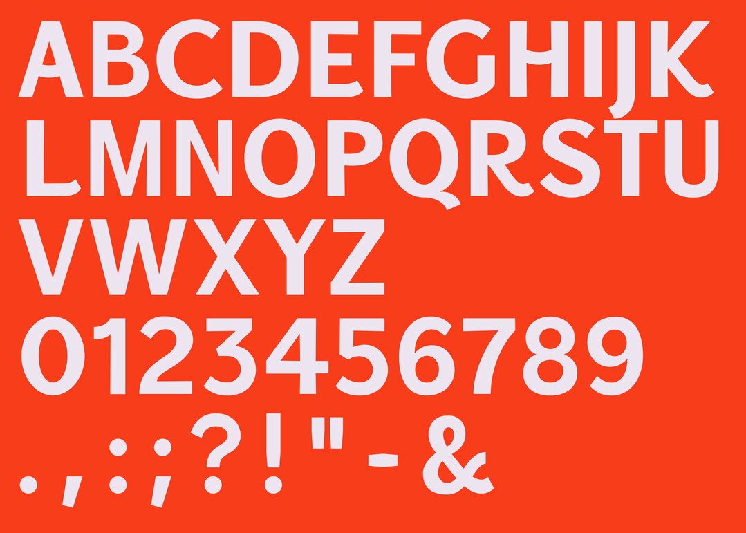
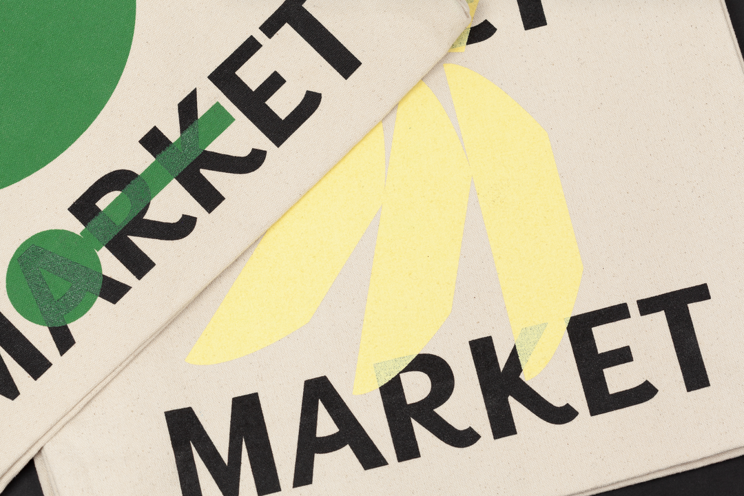
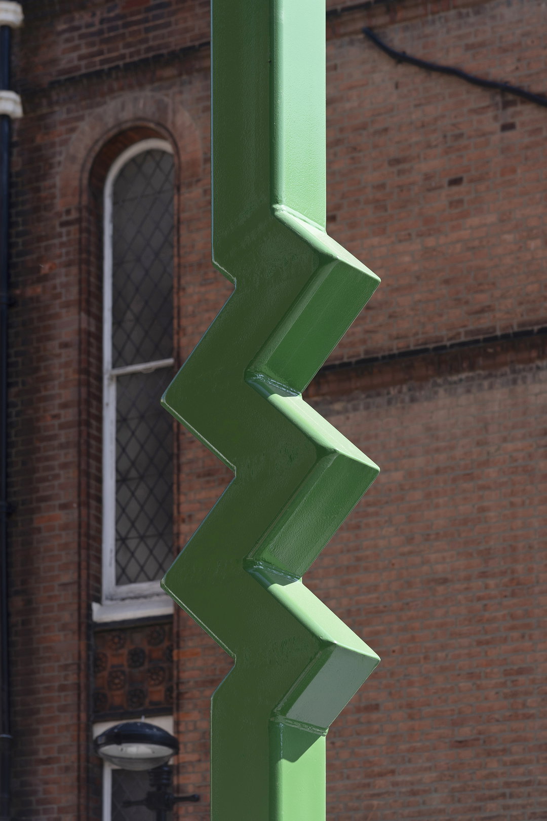
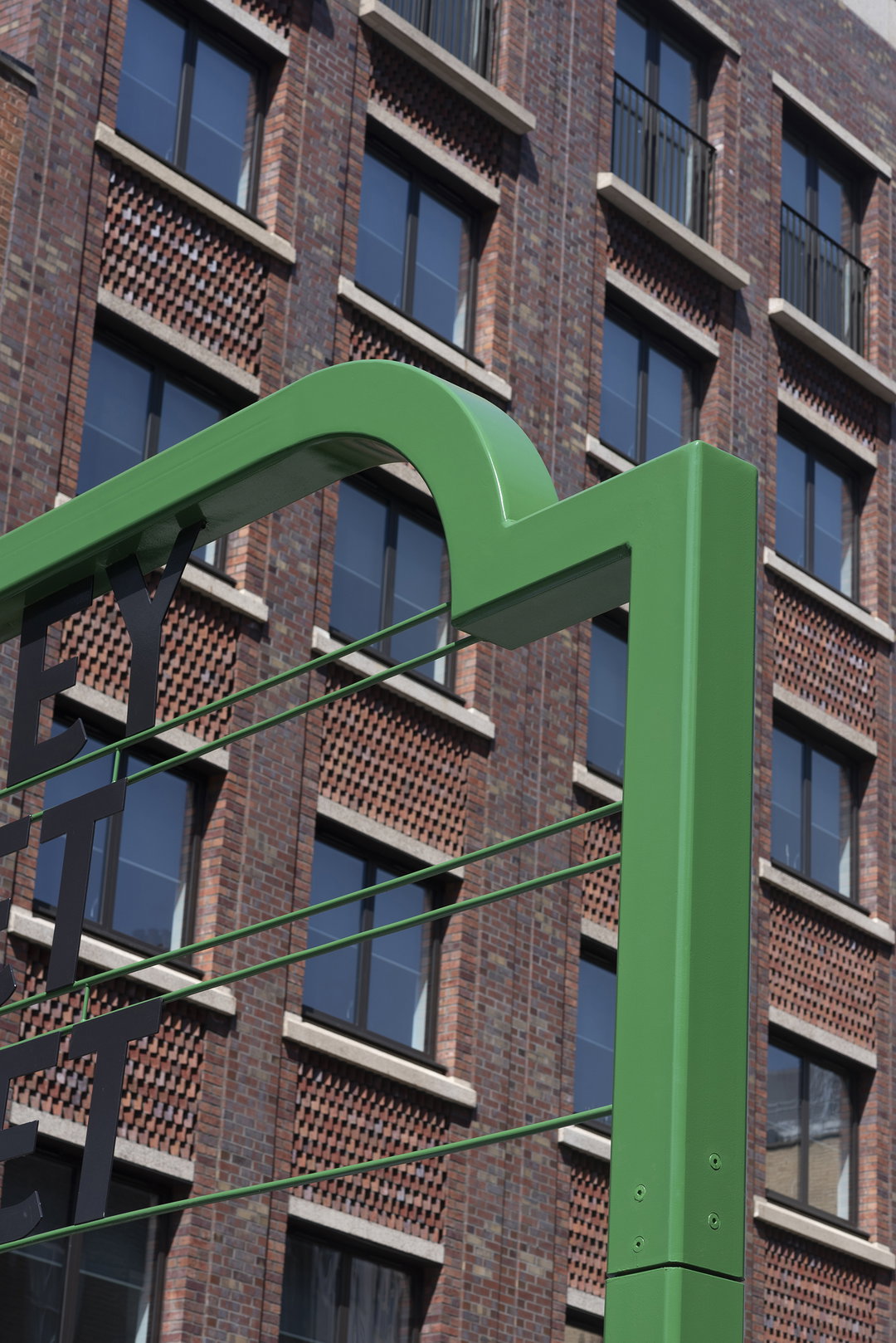
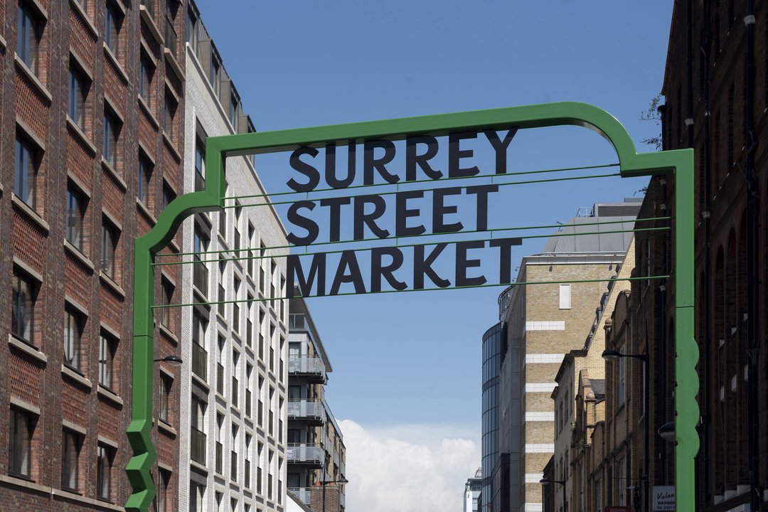
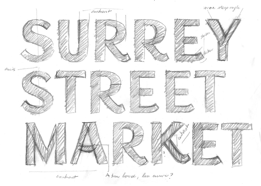
The new typeface references market signage unearthed in archives, and you’ll notice informal quirks in the architectural and type design – this is to convey randomness, grassroots creativity, originality, bursts of imagination. Wayfinding assets such as arrows don’t just point one way, but take wiggly and wacky shapes such as stairs or spiky waveforms. Quirky pictograms embody inclusivity through charming geometry, emerging from dialogue between local stakeholders and Croydon School of Art, beginning as collaged cut outs and ending up as flexible graphics across the entire identity. The collaboration brought significant architectural angles to the project, through heritage markets, banners, awnings, street furniture and new gateways, also.
“We met a lot of invested people during the course of this project but the enthusiasm and care of the students at CSA really left its mark on us as a studio. We invited a whole year group under the tutelage of lecturer Levi Goff to play with and road test the visual identity as a kit that could be put together by others,” says Camille Le Flem from Bob. “We went to the school, they came to our studio, we all convened in the market. They produced such brilliant work that we invited seven students afterwards for internships.”
GalleryBob Design & Croydon School of Art: Surrey Market (Copyright © Bob Design, 2026)
Hero Header
Bob Design & Croydon School of Art: Surrey Market (Copyright © Bob Design, 2026)
Share Article
Further Info
About the Author
—
Paul M (He/Him) is a Junior Writer at It’s Nice That since May 2025. He has a strong interest in graphic design, digital kitsch, multimedia painting, collage, nostalgia, analogue technology and all matters of strange stuff. pcm@itsnicethat.com
To submit your work to be featured on the site, see our Submissions Guide.