- Words
- Poppy Thaxter
- —
- Date
- 17 August 2026
- Tags
Designing for 3 billion: how Instagram built a brand system that celebrates everyone’s point of view
From a huge collaborative team to millions of tiny decisions, Meta’s Jasmine Probst and May Hartono reveal how a decade-defining rebrand comes together – and why the hardest work is meant to look effortless.
Share
Share
In partnership with

Meta builds technologies that help people connect, find communities, and grow businesses. When Facebook launched in 2004, it changed the way people connect. Apps like Messenger, Instagram and WhatsApp further empowered billions around the world.
There’s a familiar ritual whenever a major brand unveils a change: the raised eyebrows, the “why?”, the inevitable “I could have done that.” But as Jasmine Probst, director of product design, and May Hartono, director of brand design, share, a project like the Instagram refresh is really a series of tiny, meticulous decisions that add up to a seamless whole. Tasked with a hefty design brief and alchemising an entire brand identity system, they’ve delivered something built to last a decade and evolve well beyond it.
What comes through in our conversation is a sense of responsibility and excitement in equal measure. “There’s something deeply motivating,” as May puts it, “about knowing that the decisions you’re sweating over will become part of so many people’s daily lives and culture at large.”
“You’ll never get instant universal approval. That’s just the reality of change. But playing it safe is a disservice to our community.”
May Hartono, director of brand design
Collaboration on this scale – with numerous internal and external contributors – is grounded in pragmatism, discipline and communication. When different viewpoints surfaced, the team leaned in with curiosity rather than resistance.
For a brand that is about people, it’s no surprise that Jasmine and May reflect on the work with a level-headed clarity, deep knowledge, and a genuine understanding of the people who use Instagram. Because they know that the moment it goes live, everyone – and everyone’s friends, family and colleagues – will have something to say. “The scale inspires a real sense of responsibility,” says Jasmine, “because we want to make sure we’re creating something that’s meaningful and appropriate for the world, not just interesting to us. But the scale also inspired a real sense of possibility.”
Here, Jasmine and May tell us how a project of this magnitude comes together, from the first brief to the day it meets the world.
Instagram: Copyright © Meta, 2026
“When people know that they are really being listened to, that invites them to also listen.”
Jasmine Probst, director of product design
It’s Nice That (INT):
Take us back to the beginning of this project… Instagram serves an audience of billions across every corner of the globe – what did that sheer scale mean for the brand team on day one?
Jasmine Probst (JP):
Designing for billions of people is a design challenge that is rare to encounter in most design exercises. For us, that means we really cannot presume comprehension or resonance the same way you would with a much more clearly defined audience. In our case, the audience truly is global.
May Hartono (MH):
The scale is also what makes this kind of project especially exciting. There’s something deeply motivating about knowing that the decisions you’re sweating over will become part of so many people’s daily lives and culture at large. It sharpens the whole team’s focus in the best way.
INT:
With this global reach in mind, touching billions of screens daily, did that massive footprint breed caution, or push the team to be bolder?
JP:
Both, and they actually fuel each other. The scale inspires a real sense of responsibility because we want to make sure we’re creating something that’s meaningful and appropriate for the world, not just interesting to us. But the scale also inspired a real sense of possibility. It makes us reflect on what the world is asking of us. Don’t pressurise perfection, celebrate authenticity. Don’t jump on trends, help define culture.
MH:
You’ll never get instant universal approval. That’s just the reality of change. But playing it safe is a disservice to our community.
INT:
Between in-house teams, external partners, independent typographers, and artists, this was a massive ecosystem! At its peak, how did you align that many voices behind a single vision/ north star?
JP:
Curiosity. I think being genuinely curious about what every person involved has to offer is the best way toward group alignment. That runs in all directions. It spans all functions, levels of leadership, and I think when people know that they are really being listened to, that invites them to also listen.
MH:
We were grounded in a really clear creative brief and set of brand values from the start. Even though we didn’t know where we’d end up visually, we always knew that Instagram stands for creativity and connection. That shared foundation meant we could explore freely without losing the plot.
Instagram: Copyright © Meta, 2026
Instagram: Copyright © Meta, 2026
Instagram: Copyright © Meta, 2026
INT:
Please could you walk us through asset management on a project like this? How do you keep a dynamic library – from the master wordmark to expansive type families – organised across teams without version control getting messy or descending into chaos?
JP:
I don’t think you can avoid some messiness in a project of this scope – but messiness doesn’t have to mean chaos. You hold the right degree of tolerance for ambiguity and then lean hard into communication. We’re really intentional about orienting each other: What are we looking at today? What did the latest version evolve from? Where is this direction moving us now?
MH:
At this scale, asset management is an operations challenge as much as a creative one, and our team is as pragmatic as it is creative. That means we can stay focused on the work without drowning in files. It all comes down to communication: no egos, but real discipline about staying aligned.
“That’s the goal: the extreme level of intention actually reads as effortless.”
May Hartono, director of brand design
INT:
The core wordmark is built to last a decade, whereas the identity system needs to flex and evolve continuously. How did designing across two very different timescales change your process for each?
JP:
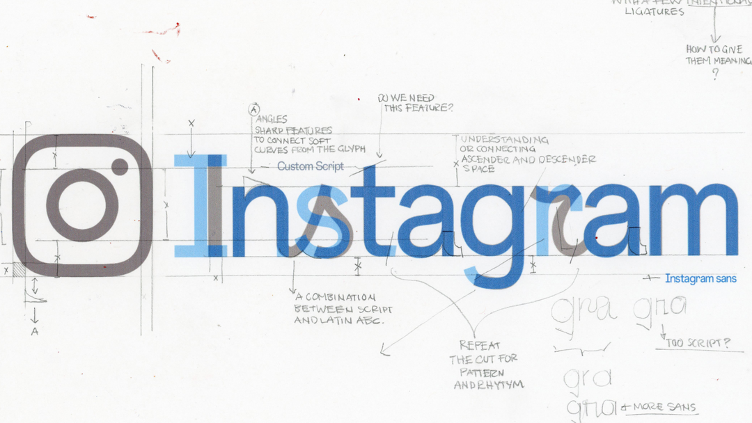
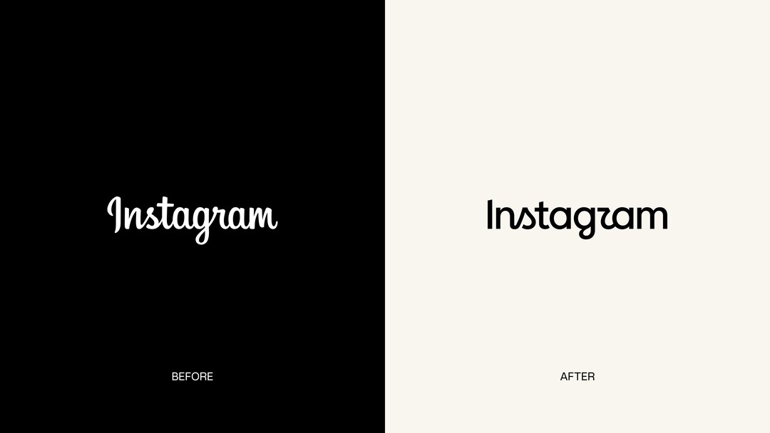
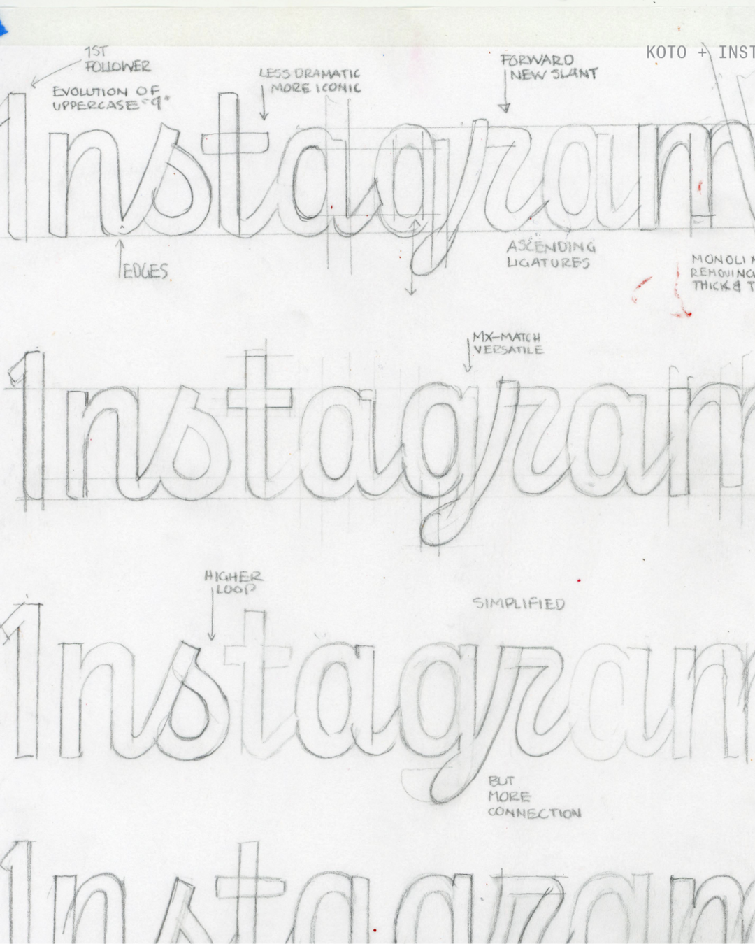
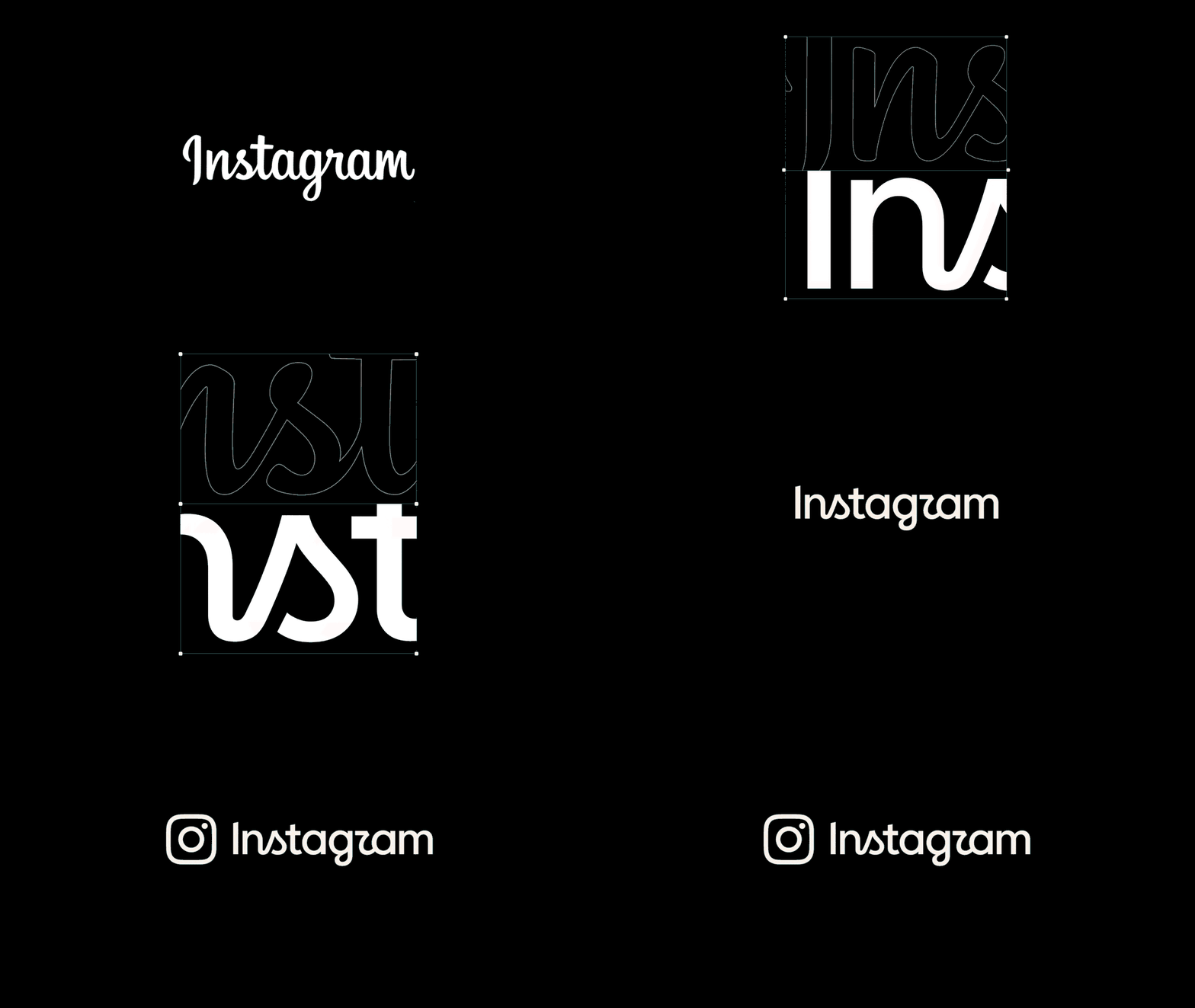
For the wordmark, we knew we needed something that exudes a quiet confidence. Bold, distinctive, with just the right amount of individuality, because that’s so core to what Instagram represents. We kept returning to what’s always been special about the brand: personal expression, and the expressiveness that script signals. The new wordmark modernises, simplifies, and elevates, while maintaining that emotional connection.
MH:
For the broader system, we gave ourselves intentional breathing room to continue adapting. We had a lot of conversation about which elements needed to endure and which were open for reinvention. The result is a system that creates continuity with where we’ve come from, while leaving space to grow into where we’re going.
INT:
With that global perspective in mind, how does regional and cultural context enter the process? Is high-level design direction set centrally and then localised, or do regional hubs feed into core decisions from the start – and how do you make sure the system reads authentically for creator communities across different regions?
JP:
We have a bi-directional approach. We have a central point of view on our brand identity and values, and we work to understand regionally what considerations we need to bake in from the start. Then, as we developed design directions, we continued the back-and-forth, seeking feedback to ensure we weren’t moving in a direction that only resonates in one corner of the world.
“A genuine design flaw tends to nag; it doesn’t go away after one conversation. A passing thought does.”
Jasmine Probst, director of product design
INT:
For the typeface releases, how do you ensure that the designs hold up internationally, across different writing scripts?
MH:
It’s a real balance between honouring what makes each script unique and maintaining a cohesive design language globally. Every writing system has its own structure, its own rhythm, its own cultural context, so you can’t just assume what works in one system will carry over to another.
INT:
What did your feedback and testing loops look like during development? How did real-world stress-testing shape or pivot the final system?
MH:
We went through several rounds of external feedback to understand what was resonating and why. And equally important, what wasn’t landing and why. Each round helped us build clarity. We took the insights to heart in shaping where we ended up.
JP:
It’s important to balance research with creative conviction. Good design isn’t done by committee: we invest a lot to collect feedback, and at some point you need to interpret, make a call, and trust your gut as a creative team.
Instagram: Copyright © Meta, 2026
“Ideally what you’ve created looks obvious. Natural. Easy. That’s the goal: the extreme level of intention actually reads as effortless.”
May Hartono, director of brand design
INT:
Were there any micro-decisions or seemingly tiny details that suddenly ballooned into major structural challenges once applied at Instagram’s scale?
JP:
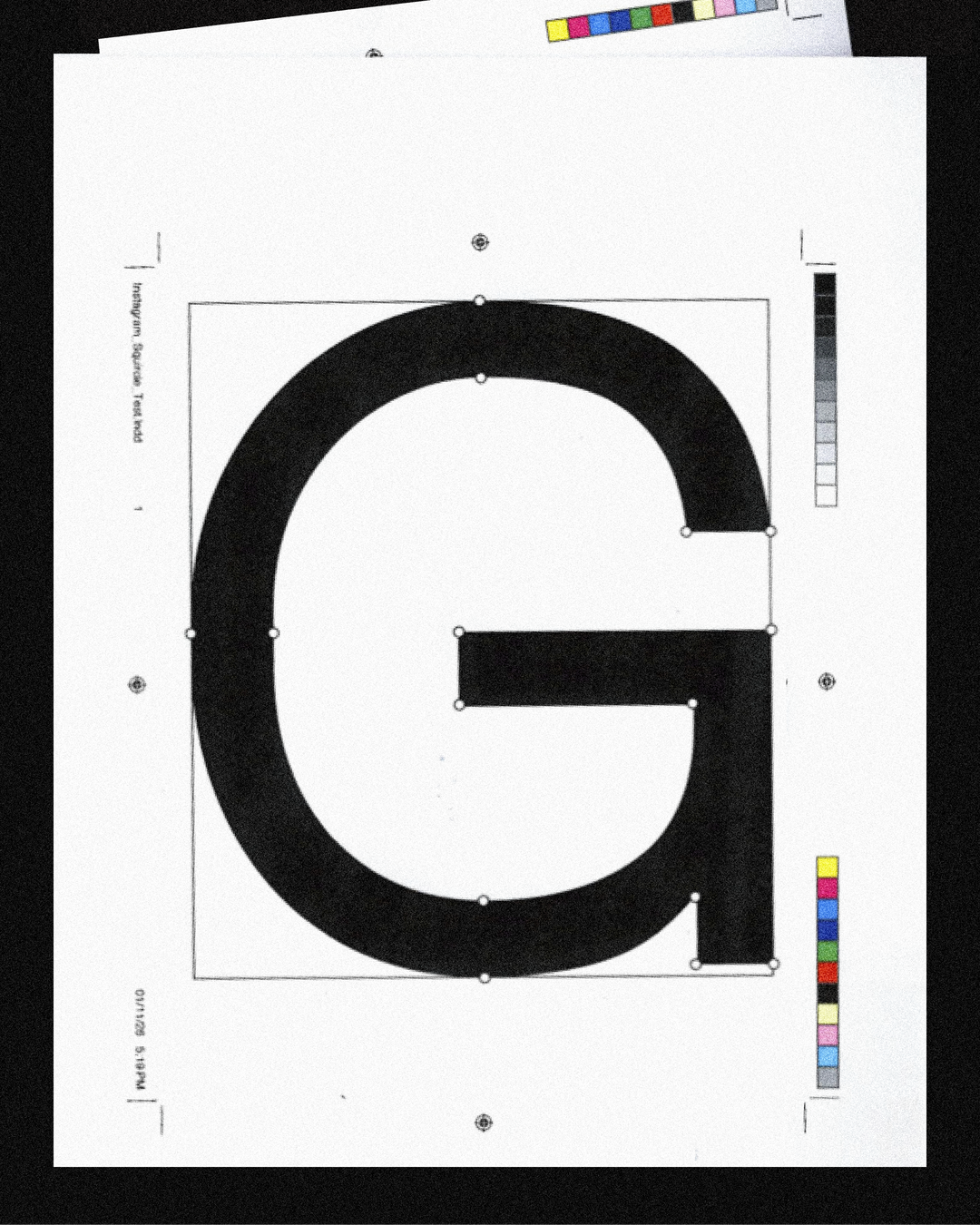
It is fair to say that every decision that we made was made at the micro level. None of them ballooned into major structural challenges, because when you keep in mind the breadth of scale that we’re designing at, those micro decisions add up to a comprehensive system. It’s why a strong brief and crit culture is important. Every ligature, curve, hue, width, spacing, lockup… that’s all been very thoroughly considered and discussed.
MH:
Then you step back and, ideally, what you’ve created looks obvious. Natural. Easy. That’s the goal: the extreme level of intention actually reads as effortless. That’s one of the best parts of designing at scale, making so many teensy decisions that add up to something that seems like it’s been there all along.
Instagram: Copyright © Meta, 2026

Instagram: Copyright © Meta, 2026
INT:
When designing at this level, everyone has an opinion. During development (pre-rollout), how do you filter out subjective personal taste to focus on feedback that uncovers a genuine design flaw?
JP:
Two phrases we come back to a lot: ‘Strong opinions, loosely held’ and ‘Hard on the work, soft on the people.’ The biggest signal for us is pattern recognition. A genuine design flaw tends to nag; it doesn’t go away after one conversation. If we can’t all understand or align on why something is the way it is, it’s a pretty good signal we haven’t nailed it yet.
MH:
We’re intentional about pacing, too. Creating space for disagreement, knowing when people need time to digest and when it’s time to lock in and move on. When everybody on the team knows that we’re all here to create the same thing, that makes it actually quite easy then to put your own subjective perspective to rest.
“We want brand love. But we have to keep earning it again and again.”
May Hartono, director of brand design
INT:
You’ve noted that discourse around a rebrand this familiar is inevitable. What’s your philosophy for engaging with that public reaction once it’s out in the world, rather than trying to shield against it?
JP:
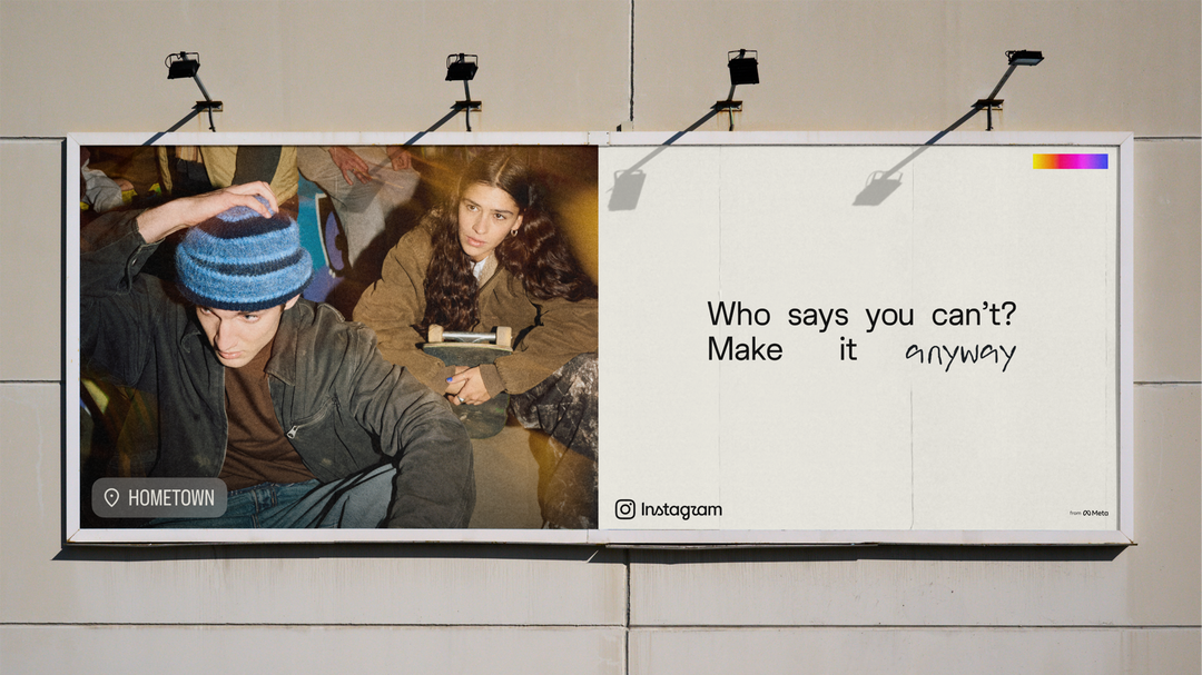
Our philosophy is to listen. Instagram is fundamentally about creativity, connection, people expressing themselves, exploring interests, and that extends to how people respond to us. We’re honestly interested in what people think. We’ll embrace the praise, and we’ll pay attention to the critique. We put an enormous amount of rigour into our work precisely because we know it’ll be met with strong reactions.
MH:
I think we know that rebrands can be challenging for people to accept. We want brand love. But we have to keep earning it again and again. A new identity needs to live in the world for a while before people feel it as theirs. That’s okay. We’re patient with it.
Instagram: Copyright © Meta, 2026
INT:
How do you prepare a design team for the fact that years of work may be judged publicly within minutes? Is there anything you CAN say?
MH:
That’s the responsibility and the honour of working at such scale. You can’t get away from judgment. I think it’s just one of the trade-offs you make for doing something that’s so prominent.
JP:
What you can do is make sure the team feels genuinely aligned and supported before that moment arrives. That means creating space throughout the process for the difficult conversations, the awkward reviews, the moments of uncertainty. The preparation isn’t a speech at the end; it’s embedded in how you work and back each other along the way. When everyone’s done their best, you’re not bracing for impact; you’re excited to share it.
INT:
What does it feel like when the major rollout finally happens after years of pixel-tweaking inside confidential pitch decks and private Figma files? Do you have a personal ritual to navigate that transition, or does it feel like the dust never truly settles?
MH:
We move fast, and we completed the wordmark and brand system in under a year. And it’s incredibly exciting to see the work out in the wild – how people interpret it, interact with it, and build on it. That’s what makes it all worth it.
JP:
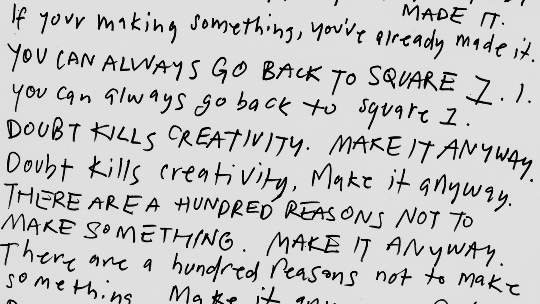
As excited as we are to see this work out in the world, it’s not a sit-back moment. We’re driven by what we can do to keep on inspiring, supporting and celebrating our community. We’re also always pushing ourselves to refine and evolve and respond.
Instagram: Copyright © Meta, 2026
Instagram: Copyright © Meta, 2026
Hero Header
Instagram: Copyright © Meta, 2026
Share Article
About the Author
—
Poppy Thaxter is a freelance writer based in the South West of England, specialising in graphic, branding, and type design. She’s contributed to publications such as TYPE01, The Brand Identity, Imperfect Index, and Frontify.