- Words
- Elizabeth Goodspeed
- —
- Date
- 14 July 2026
- Tags
Tinder’s first rebrand in nearly a decade channels the voice of a dating columnist
I couldn’t help but wonder… can a dating app have a point of view? Elizabeth Goodspeed speaks with the Porto Rocha team behind Tinder’s rebrand about designing for contradiction and giving an app a voice.
Share
Share
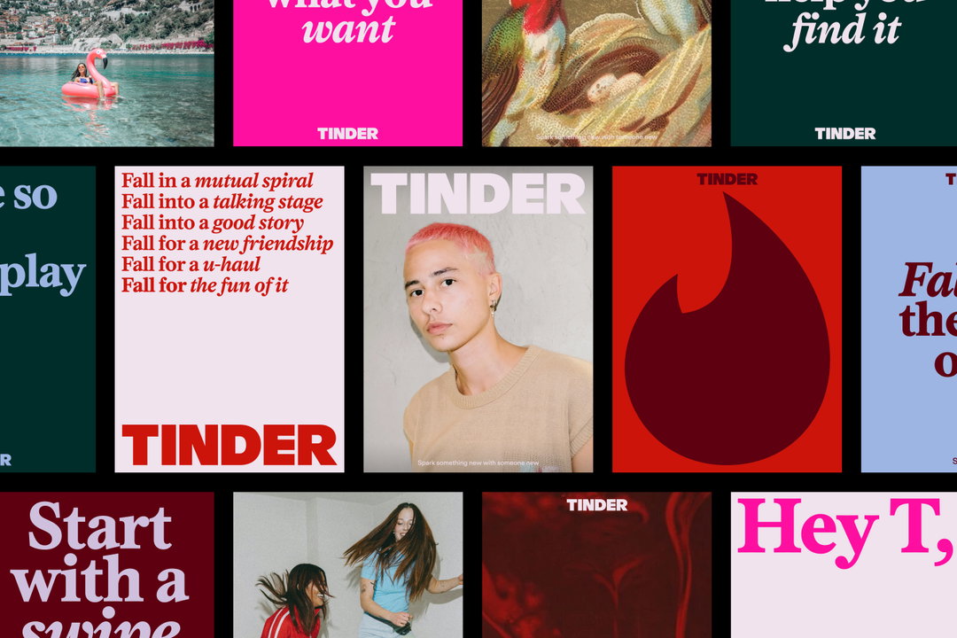
For its first rebrand in nearly a decade, Tinder brought on the team at Porto Rocha to convince a new generation to swipe right on one of the first dating apps. In our conversation, strategy and copy director Natalee Ranii-Dropcho and senior designer Yedo Han get into the expressive new design system – which includes a reworked wordmark and a new serif typeface, plus a mix of anime screenshots, oil paintings and “it us” memes – and how to make a dating app that doesn’t try to speak to everyone, while still feeling like it’s for everyone.
Porto Rocha: Tinder rebrand (Copyright © Tinder, 2026)
Elizabeth Goodspeed:
As a writer, I appreciated that such a good chunk of the rebrand is focused on voice and language (especially nice when you have such a good headline typeface!) Can you tell me more about how that verbal identity was shaped?
Natalee Ranii-Dropcho:
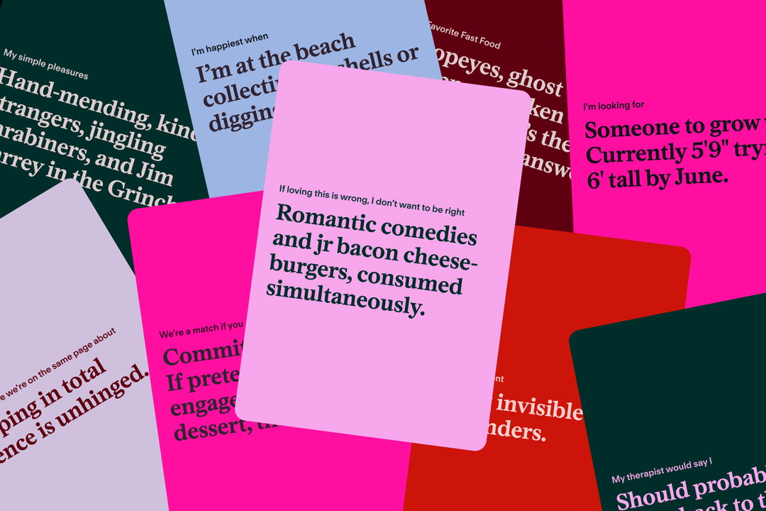
We really wanted to make the voice a huge part of the identity. We imagined our voice as a kind of trusted dating columnist. We looked at a lot of really interesting inspirations – the Dear Karen dating column, which ran in UK Sky Magazine in the 90s. And, Carrie Bradshaw. I think both of these columnists have the ability to switch from humour to honesty while navigating the disparate landscape of dating, and hold it all with a sense of care and respect.
We wanted to make the voice feel like it had the experience, but was also living alongside you. This voice has made her mistakes, she’s learned with you, and she’s also having the time of her life doing it. So, we created a fictional persona of ‘T’, who is our dating columnist. It lets us re-imagine that cultural savvy and a sharp wit, but paired with empathy. Someone who’s been there, done that, and can give you advice – now that she’s on the other side.
Yedo Han:
It’s funny, because Tinder was one of the first, if not the first, dating apps, so it kind of is the wise older sister of the category. But there’s been such a shift in the number and purpose of dating apps in culture since Tinder first launched in 2012. How do you approach making the identity feel surprising to a new generation, while still feeling like itself?
N R-D:
Tinder is the original challenger in many ways, so there was a lot of equity that we had to work with – it’s really bold and iconic and really recognisable. We wanted to champion that and hear that, but give it a fresh look and feel and voice. A big part of this was reclaiming what Tinder is for Gen Z, particularly Gen Z women – for us it’s a fun, often playful way of connecting and meeting people.
YH:
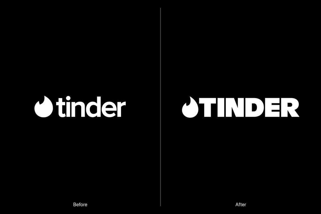
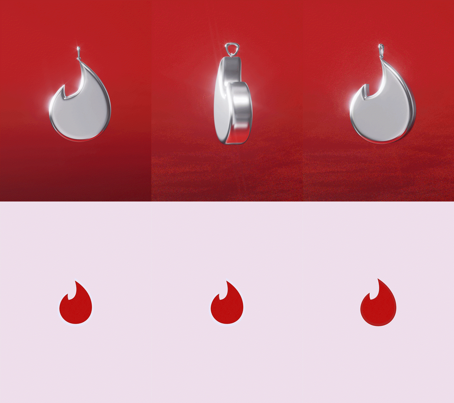
In terms of specifics, we updated the shape of the flame so that it feels a bit more sleek and a bit sharper compared to the previous version. It needed to match the daringness and the wittiness that we want to bring into the brand without losing the warmth and the approachability of the existing flame.
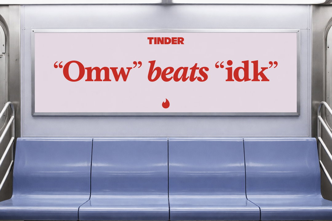
Previously the Tinder wordmark was a lowercase sans serif, and we’ve updated that to all caps. It really balances out the softer side of the brand now, especially with the updated colour and the serif we’re bringing in. Because we updated the wordmark to be all caps, that headline serif brings in boldness and confidence, and a little bit of edge. It feels a little bit more declarative of how Tinder is now, this new force reclaiming the dating scene.
The colour palette was interesting because it was a pretty big jump from the previous palette. It’s in the same spectrum – warm red to orange to pink – but some of the gradients and colours didn’t have a clear purpose previously in terms of when and how they should be used. This time, we tried to balance some of the red hues with hues of blue and green, so it speaks to a wider spectrum of the emotions you feel throughout using the app.
Porto Rocha: Tinder rebrand (Copyright © Tinder, 2026)

Porto Rocha: Tinder rebrand (Copyright © Tinder, 2026)

Porto Rocha: Tinder rebrand (Copyright © Tinder, 2026)
“They’re burnt out on dating but holding out hope it could work; nostalgic for tradition but inventing a lot of new norms; maxing and rotting; craving reality, but escaping to fantasy.”
Natalee Ranii-Dropcho
Porto Rocha: Tinder rebrand (Copyright © Tinder, 2026)
EG:
I noticed the new brand also uses a lot of swiping motions as a nod to the ‘swipe right’ action on the app. Tinder basically invented swiping, but that’s now become standard across every competing app. How did you think about reinterpreting it visually?
YH:
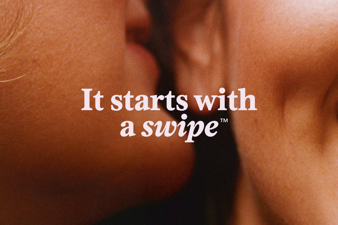
The idea of swipe was interesting from a design perspective, because there are so many ways to interpret it. Instead of connecting swipe behaviour to doom-scrolling, we wanted to connect it to the idea that it reveals something underneath; so when there’s a swiping motion, it reveals the typography, or the logo, or the imagery beneath. It signals the possibility, the excitement, the anticipation that comes from the dating app experience.
N R-D:
Something else that really strategically underpinned the project was a sense of contradiction. Gen Z is surrounded by contradiction everywhere they turn. That’s the time we’re living in. They’re burnt out on dating but holding out hope it could work; nostalgic for tradition but inventing a lot of new norms; maxing and rotting; craving reality, but escaping to fantasy. There are all these contradictions inherent to how we all exist as humans today. The cool thing is, you don’t have to choose a side. While other apps had the urge to simplify, or make you pick a lane, we wanted to make space for contradiction within the brand.
“This kind of imagery is just all part of the Gen Z experience in daily life.”
Yedo Han
EG:
That idea of contradiction seems really baked into the rebrand. For example, the identity approaches art direction from a few different angles simultaneously: photos of actual daters, more metaphoric photography – like a picture of two toothbrushes smashing together – and then a third category that pulls in found material and mixed media – like an anime screenshot or a close-up of a painting. The latter was particularly interesting to me, because it was something I really haven’t seen done by brands before; blending what might previously be thought of as social imagery into the core brand identity.
YH:
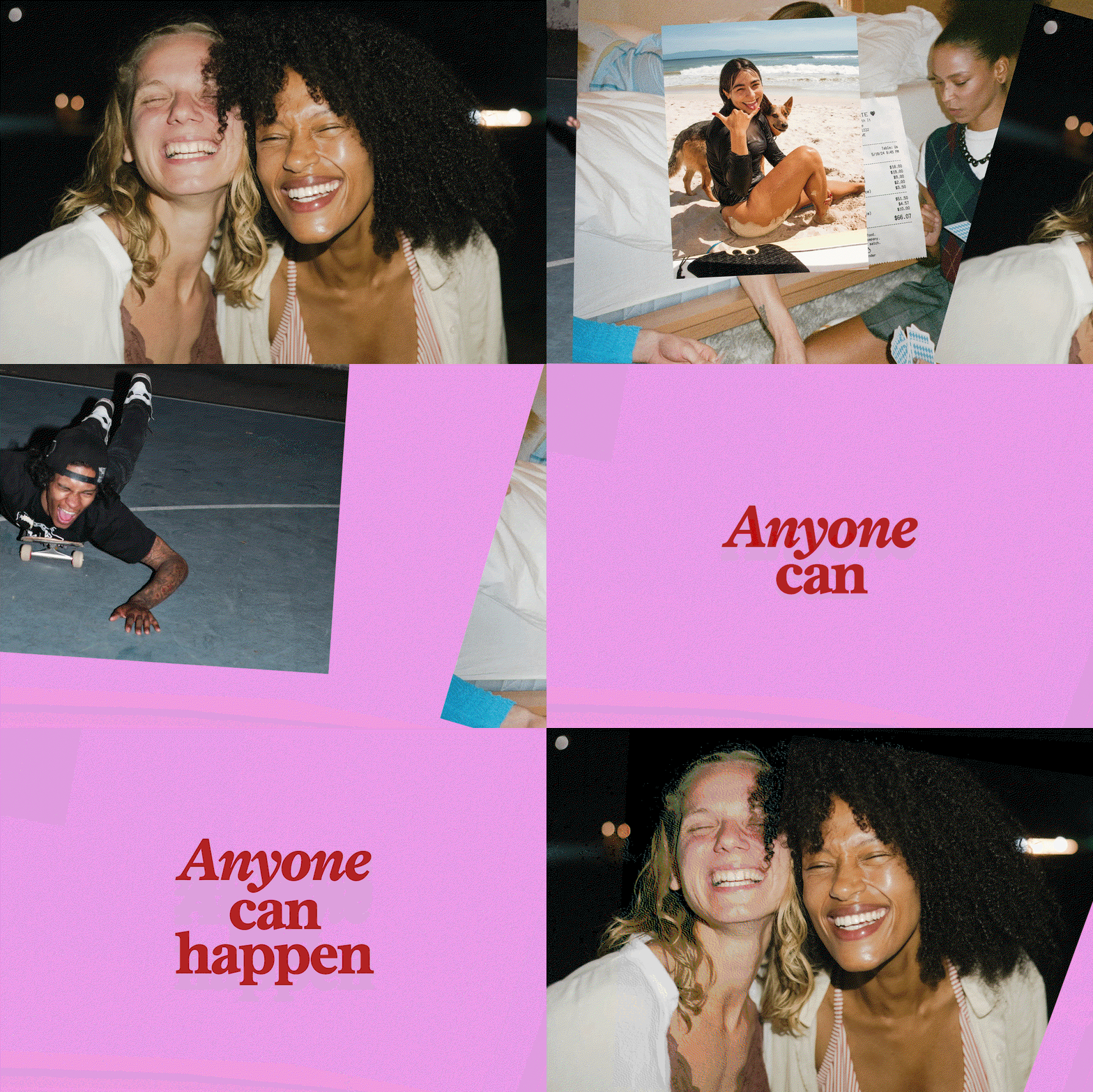
Generally, we really focused on looking for images that showcase the actual Gen Z experience, not just the idea of a Gen Z experience. We tried to look at different kinds of relationships – whether serious, or light, or friendship – and the diversity and character of the people coming through. A lot of competitor photography was focused on feeling stockish, or a little too nostalgic, or just high flash. It was bringing in that excitement in a forced way. We wanted to showcase images that feel natural and real.
While I was working on the project, I was constantly asking myself: if Tinder goes through this brand refresh, will I actually be on it, meeting people? That was my rule of thumb for deciding whether a visual was working – designing this world as a Gen Z woman myself, knowing it would also influence my own world.
As to the mixed-media images, I don’t think the portrayal of dating or love has to just come from a photo of two people on a date. It can just be simple, like a beautiful picture of a flower. People might feel possibility or excitement or love, coming from it depending on where they are. We wanted to lean into a world where love can be expressed in different ways, not just through people. This angle also connects Tinder very culturally to different visuals: illustrations, fine art, pop culture, memes and all of that. I think Gen Z is exposed to so many visuals every day – it’s very natural for them. So this kind of imagery is just all part of the Gen Z experience in daily life.
Porto Rocha: Tinder rebrand (Copyright © Tinder, 2026)
EG:
It starts to feel – and I say this in a positive way – like it’s tapping into the meme culture, but without being a meme. Like sending a photo of two ducks in a puddle to your crush with the caption “us”. It’s a little informal and cheeky, as well as how a lot of people now communicate about relationships.
N R-D:
Sometimes an image can just be too literal. That’s what we were seeing in the competitive space, that other people weren’t getting right. The photo says “this is what a first date looks like,” or “this is what laughing together looks like.” But that’s not always what those things are, and so we shouldn’t project our own experience onto that. These different categories let us give that expansion and sense of exploration, so you can use your imagination to identify whatever it means to you – we’re still able to amplify the thrill, the anticipation, the excitement, without giving you a literal depiction of it.
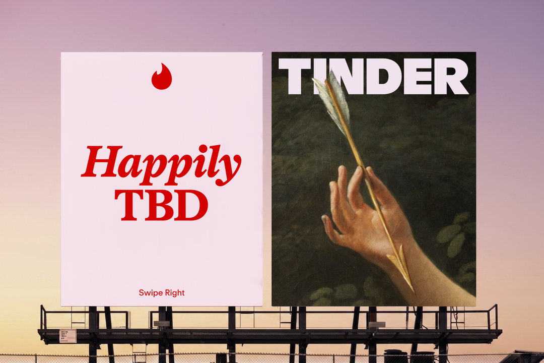
That came up in our voice, too. We played with actively flipping the script on tropes like “finding the one” or “happily ever after” – it turned into happily TBD instead. Basically, as far as fairytales and most apps are concerned, the goal is to find your love at the end of the story. And while that might happen for some people – if you want that, it’s here for you on Tinder – we wanted to celebrate all the different ways you could experience connection.
EG:
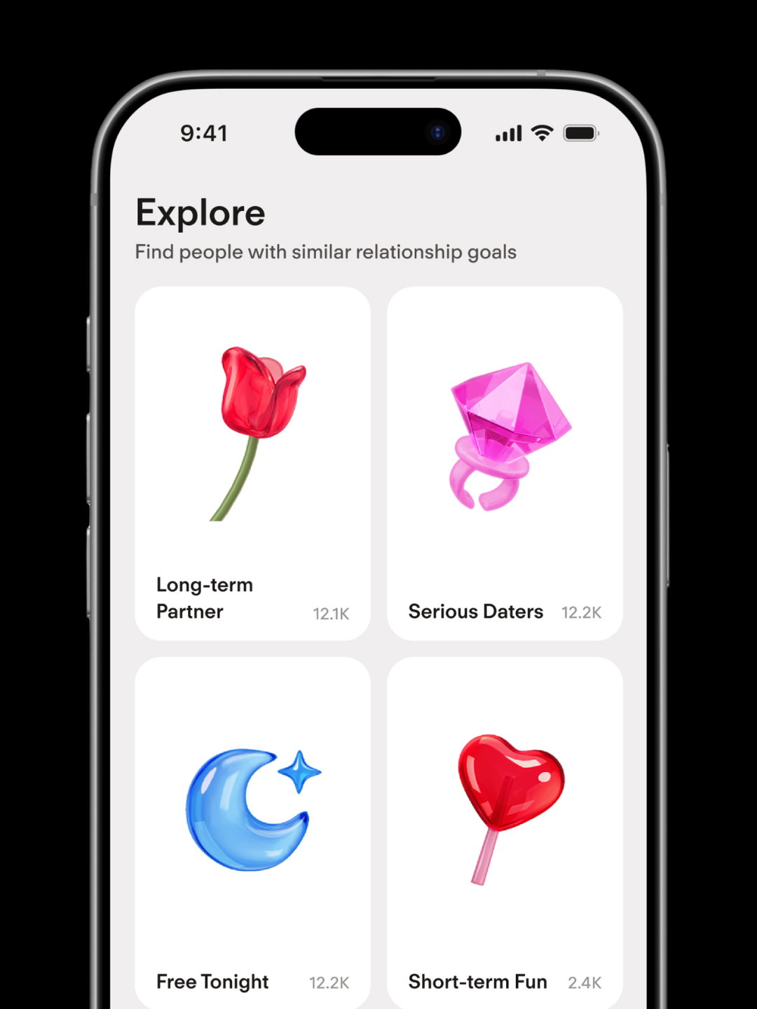
The rebrand does introduce iconography that leans into more cliche depictions of love though: the bow and arrow, the cupid arrow, the heart, the roses. So, how did you choose when to lean into these kinds of tropes versus rejecting them?
YH:
Well, in some places, we really wanted to focus on more down-to-earth, realistic specific moments of the dating experience. Obviously there are more abstract, metaphorical ways of representing the idea of love, but there are times when the product needs to be literal and very understandable for the audience. That’s why we tried to make the illustrations feel a little bit more obvious. With those illustrations, we were also really focused on bringing that translucent material in because we felt like it made the icons juicier, and it brought in a little bit of edginess.
Porto Rocha: Tinder rebrand (Copyright © Tinder, 2026)
Porto Rocha: Tinder rebrand (Copyright © Tinder, 2026)
Porto Rocha: Tinder rebrand (Copyright © Tinder, 2026)
“We played with actively flipping the script on tropes like ‘finding the one’ or ‘happily ever after’ – it turned into happily TBD instead.”
Natalee Ranii-Dropcho
EG:
It’s a difficult challenge, figuring out how to design for people of all genders, all ages, all sexualities, all gender orientations. Many other dating apps are more narrow in their audience and can art direct accordingly. How do you think about designing for everybody without losing specificity?
N R-D:
Something important to keep in mind, especially with a mass audience, is that designing for everyone doesn’t mean you can’t have an opinion. We still wanted to make sure Tinder had a point of view. That’s part of why we chose a dating columnist as the reference point for the voice we created – point of view is more important to hold onto, because it’s easy to lose if you’re trying to reach everyone.
YH:
It not only brings in people that agree with that point of view, it also brings in the people who are against it. Everybody has their own opinion, so if they hear something they disagree with, that’s a chance for them to get into the conversation. I also think one of the key things while designing is that we didn’t want to lose the warmth and approachability of the brand – being more daring and witty doesn’t mean losing that. Making sure the audience feels safe, and has less pressure, opens the door to everybody.
Porto Rocha: Tinder rebrand (Copyright © Tinder, 2026)
Share Article
Further Info
About the Author
—
Elizabeth Goodspeed is It’s Nice That’s US editor-at-large, as well as an independent designer, art director, educator and writer. Working between New York and Providence, she’s a devoted generalist, but specialises in idea-driven and historically inspired projects. She’s passionate about lesser-known design history, and regularly researches and writes about various archive and trend-oriented topics. She also publishes Casual Archivist, a design history focused newsletter.