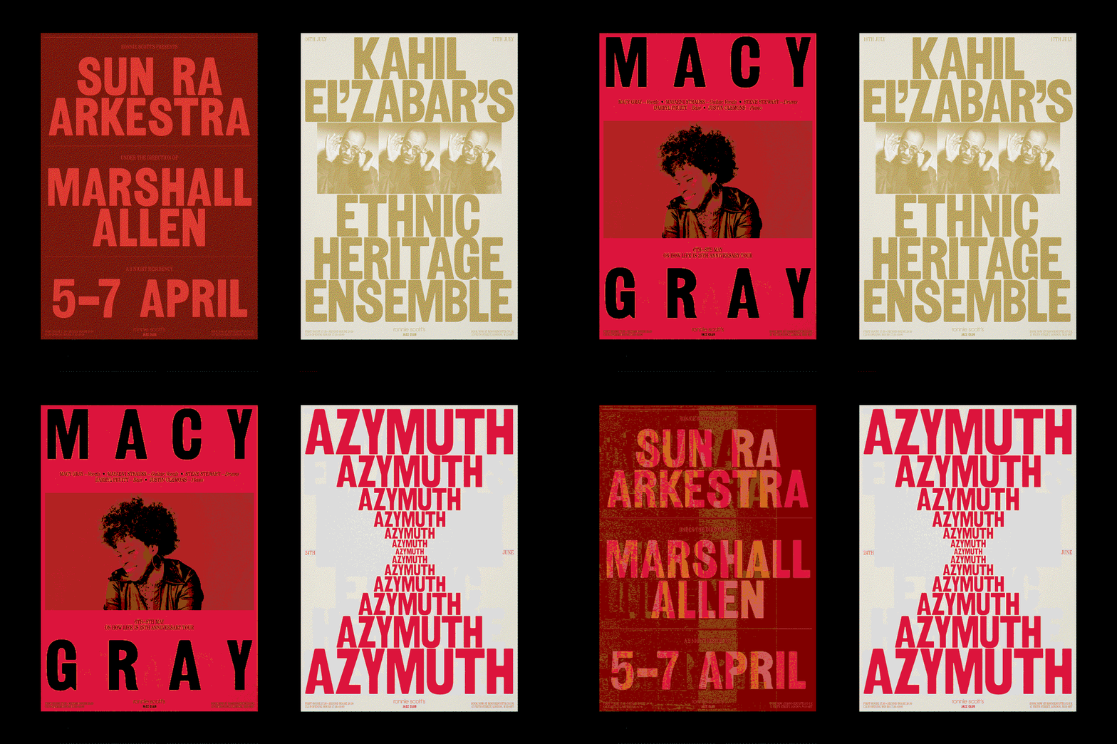
More of a performance than a fixed system, Ronnie Scott’s new identity does a typographic dance
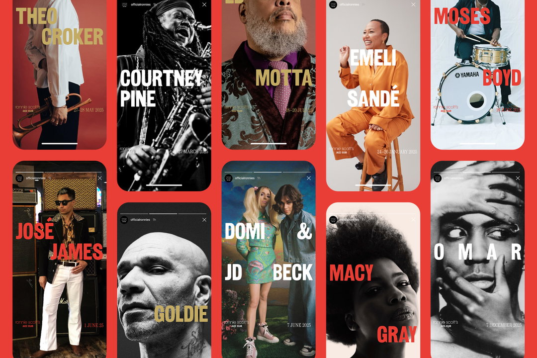
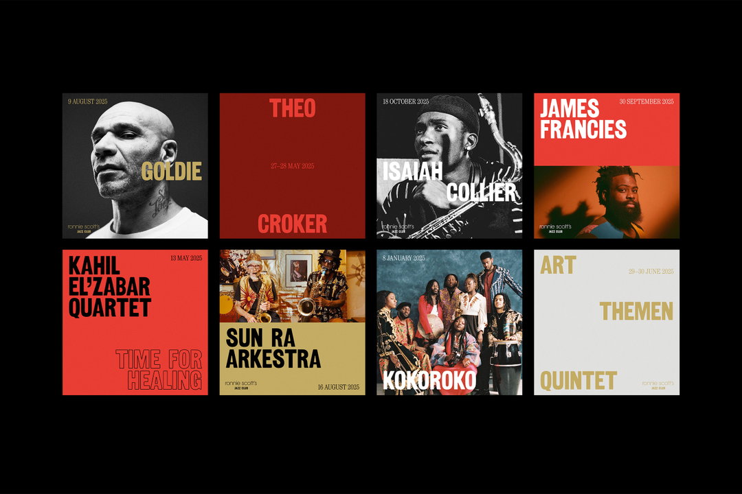
This new visual language is inspired by the “rhythm and spontaneity of jazz” – type, image and colour dance across a new digital world for the venue.
Dan Cottrell first encountered legendary Soho Jazz Club Ronnie Scott’s when he moved to London as a student. The designer, who runs Dan Cottrell studio – an independent studio for graphic design and creative direction based across London and Barcelona, has remained a big fan of the venue and ran into some luck from the graphic design gods earlier this year when it’s team reached out asking his studio to revive its signature brand identity to help the world-famous jazz club ace the future.
Ronnie Scott’s previous identity hadn’t been changed since the noughties. With its gold vector saxophone logo and a lot of gradients going on, the old branding system “had worked for some time but it was starting to feel dated”, says Dan. “But more importantly, the logo was doing almost all of the work, with little design system underneath to flex across the club’s different touch points.” While the club has a loyal following, it didn’t have a clear visual approach to showcase its large and varied music programme (over 25 performances a week) with one unified digital design language.
Dan Cottrell Studio: Ronnie Scott’s Jazz club (Copyright © Dan Cottrell Studio, 2026)
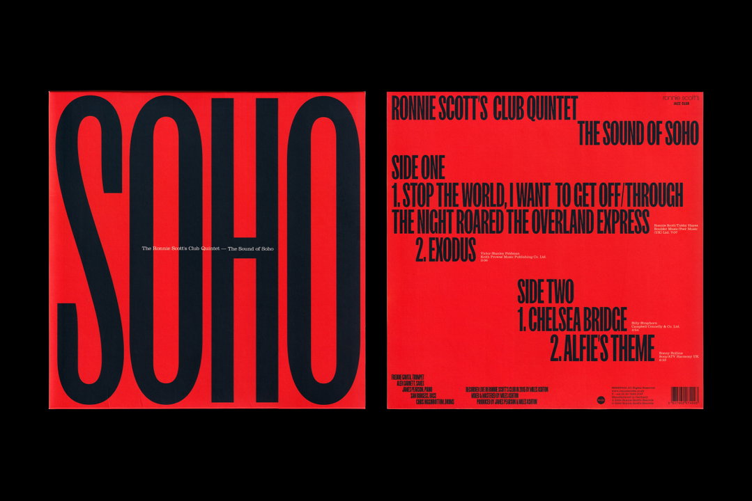
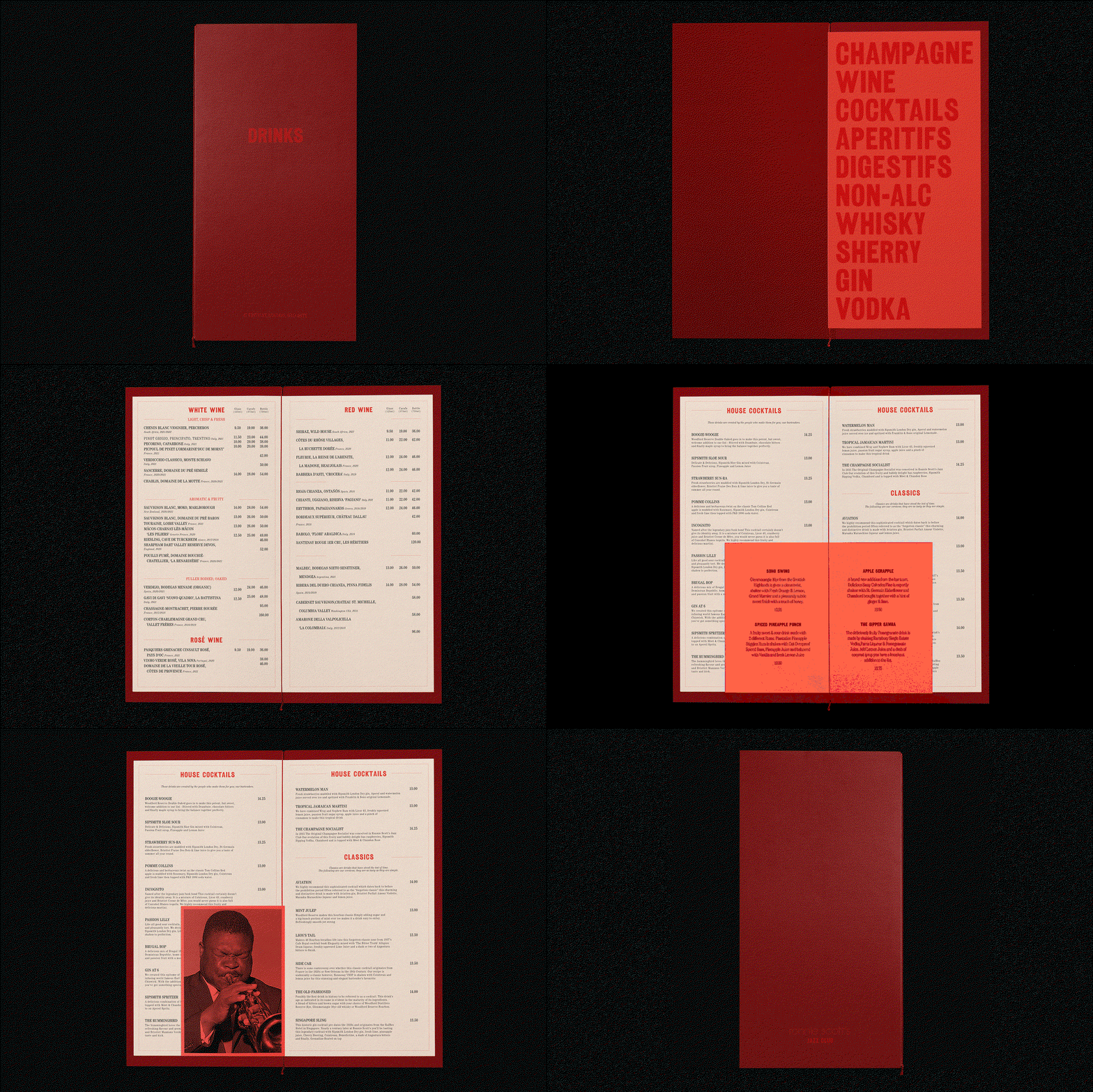
Dan’s new visual system for the venue started out by bringing two new typefaces to the brand: “Railroad Gothic, a bold, condensed font that gives impact, scale and structure and Century Condensed sits alongside as a more restrained secondary layer – inspired by the club’s elegant interiors and late-night hospitality,” he says. Jazz is a genre with a rich typography history to draw on, and Dan found himself researching record covers from the 50s and 60s by designers such as John Hermansader and Reid Miles to get inspiration for the shape of the brand’s new lettersets. The resulting typographic fabric was built in and around the “rhythm and spontaneity of jazz itself”, the designer says. Rather than a “fixed system”, the type pairing was chosen for its ability to behave “more like a performance”, bringing energy to all of the venue’s digital applications.
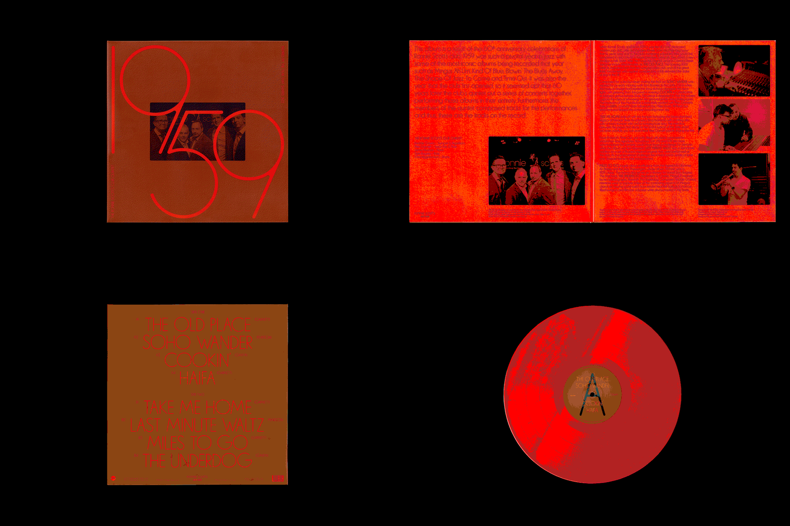
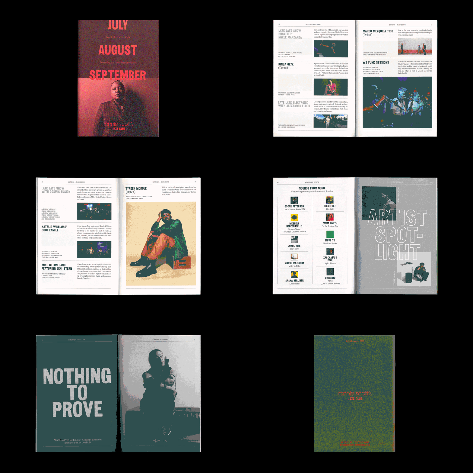
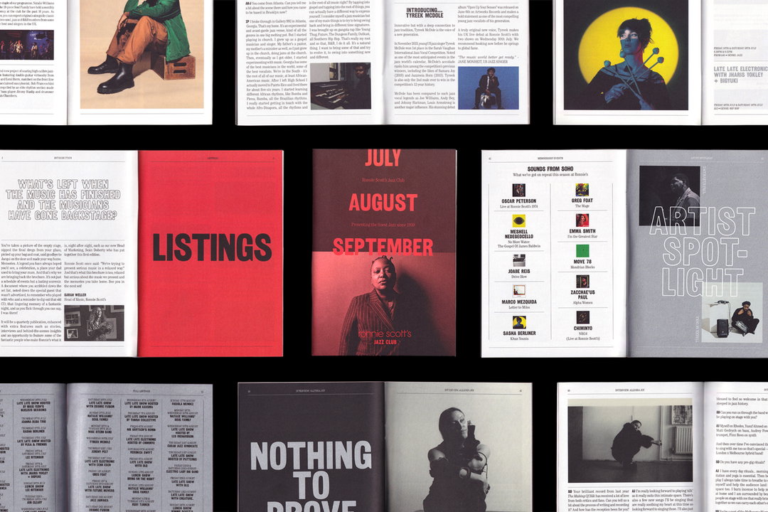
Whilst the focus was on making the jazz clubs online presence as smooth as its sounds, the designer did return one thing back to the club’s largely offline days of print and publishing by reintroducing and redesigning Ronnie Scott’s quarterly programme. Containing upcoming event listings, interviews, archival spotlights and more the magazine-style piece of print ends up in the hands of thousands of jazz fans.
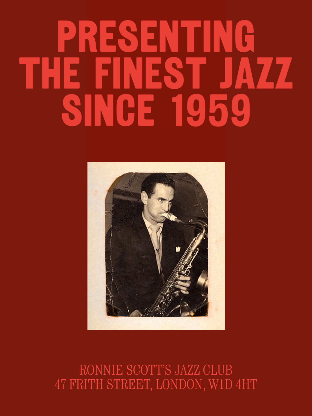
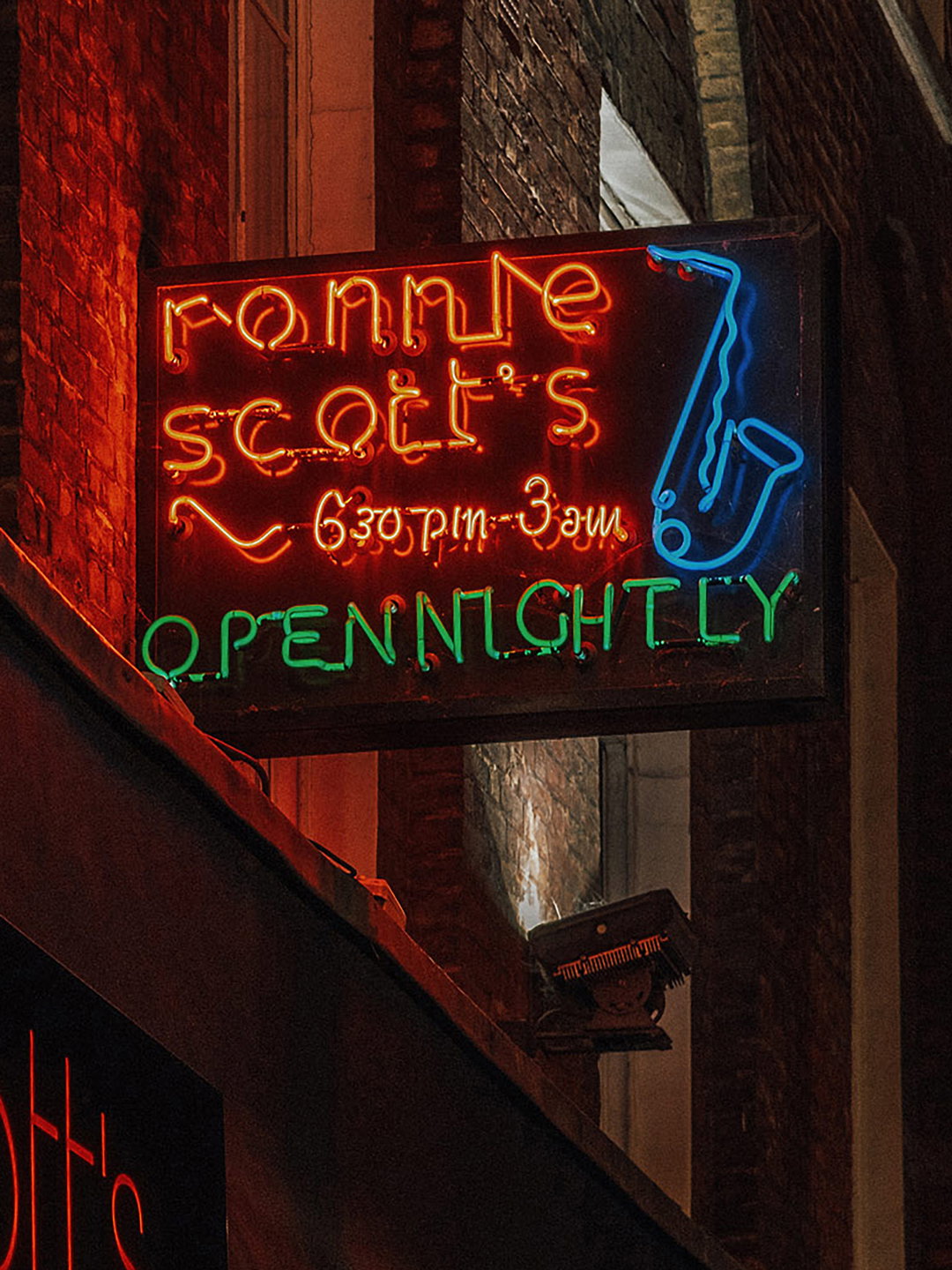
Since the logo played such an important role in preserving the clubs heritage the designer was hesitant to give this last detail an overhaul – instead Dan took “a more sensitive approach”, he says. “It’s been on the building’s facade for years, and its curved forms come directly from the iconic neon sign that’s hung on Frith Street for decades – something we never wanted to change.” In order to bring this element up to date, the designer created a new lockup with the secondary line ‘Jazz Club’, in the brand’s new headline typeface to give more weight to the iconic symbol. Whilst the club continues to host both old time legends and a new generation of Jazz artists, this new era of its identity stays rooted in its legacy but will be “energetic and flexible enough” to look forward, Dan ends.
GalleryDan Cottrell Studio: Ronnie Scott’s Jazz club (Copyright © Dan Cottrell Studio, 2026)

Hero Header
Dan Cottrell Studio: Ronnie Scott’s Jazz club (Copyright © Dan Cottrell Studio, 2026)
Share Article
Further Info
About the Author
—
Ellis Tree (she/her) is a staff writer at It’s Nice That. She joined as a junior writer in April 2024 after graduating from Kingston School of Art with a degree in Graphic Design. Across her research, writing and visual work she has a particular interest in printmaking, self-publishing and expanded approaches to photography. ert@itsnicethat.com
To submit your work to be featured on the site, see our Submissions Guide.