Launch Recite Me assistive technology
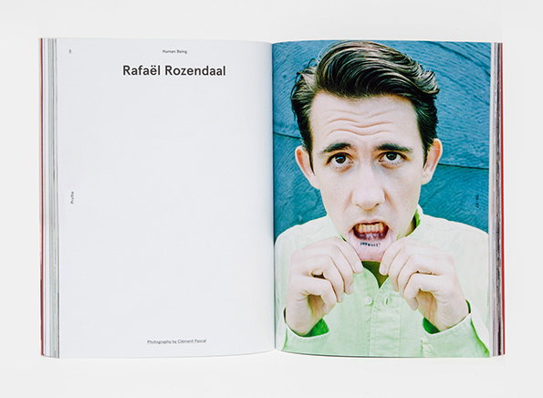
An open book shows a portrait of Rafaël Rozendaal on the right page. He wears a pale green shirt and makes a strained expression, pulling at his lower lip. The left page is white with the name “Rafaël Rozendaal” in bold black type.

The Human Being Journal is a beautifully designed, mightily impressive publication

—
Date
2 December 2014

A late contender for my favourite editor’s letter opening line of the year comes courtesy of the new issue of Human Being Journal, the magazine produced by US-based clothing and lifestyle store Need Supply Co.

It begins: “When the internet first smashed the world flat, we all jostled for position. With everyone at eye level, it seemed obvious that to be different was paramount. And so we curated the prettiest lives possible and pushed off into the arcane and obstinately unconventional.”

It’s a fitting opening for this fascinating little magazine; classy, intriguing and beautifully considered. New Editor-In-Chief Tag Christof has put together an issue which celebrates “humans who have made a mark through brilliant riffs on the regular” including Rafaël Rozendaal, Unit Editions, David Wilson and the teams behind both Apartamento and boat magazines. Chen Chen and Kai Williams have produced a series of improvised shanks (an aggressive homage to Martino Gamper’s 100 chairs in 100 days) and photographic talent on show includes Yann Faucher, Clement Pascal and Marcelo Gomes (whose portrait of Ana Kras adorns the cover).

It’s a real lesson in how to make a beautiful printed object without drifting into self-indulgence, and creative director Gabriel Ricioppo and designer Eric Gilkey deserve enormous credit for such assured use of different paper stocks to manage the rhythm of the magazine.

Now available in the UK, Human Being Journal is definitely a publication worth tracking down.
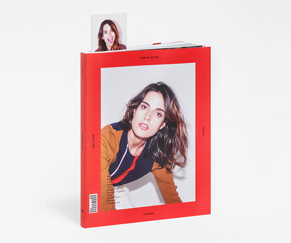
A red magazine cover features a portrait of a person looking at the camera. The text “Human Being” appears at the top and “Journal” at the bottom.
Above

Tag Christof/Gabriel Ricioppo: The Human Being Journal Issue 5
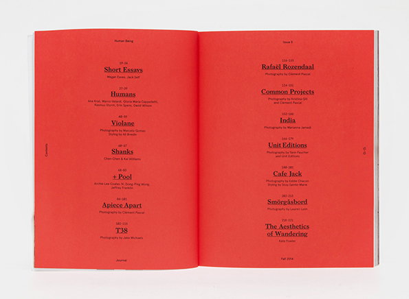
An open magazine with bright red pages showing a table of contents. The text is printed in black and lists various articles and contributors, including “Short Essays”, “Humans” and “India”.
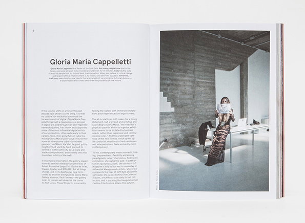
An open magazine spread featuring an article about Gloria Maria Cappelletti. The right page shows a person standing in a concrete room, holding a piece of paper over their face.
Above

Tag Christof/Gabriel Ricioppo: The Human Being Journal Issue 5
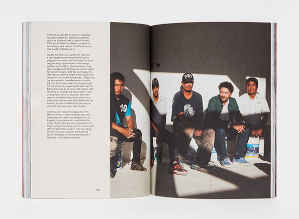
An open book shows a black and white photograph of five people sitting on a concrete ledge. To the left, a page of text discusses urbanism and architecture in Tijuana.
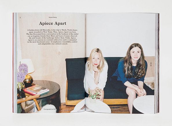
An open magazine spread featuring an article titled “Apiece Apart”. Two people sit on a dark blue sofa, looking towards the camera.
Above

Tag Christof/Gabriel Ricioppo: The Human Being Journal Issue 5
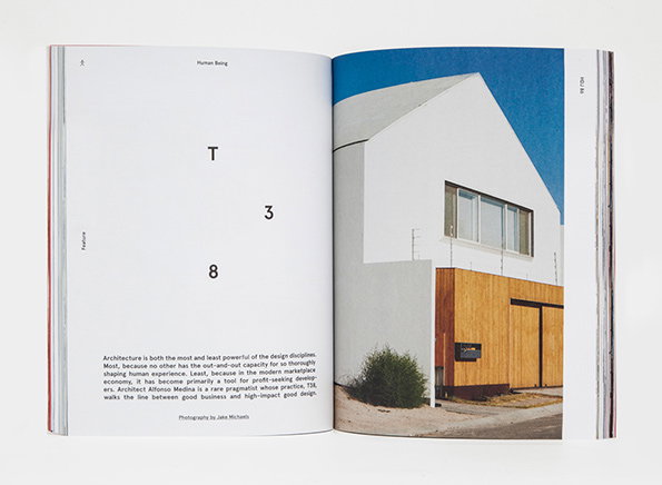
An open magazine spread. The left page features the letters “T”, “3” and “8” arranged in a loose cluster above a block of text about architecture. The right page shows a photograph of a white, gabled building with a wooden lower section under a clear blue sky.
Above

Tag Christof/Gabriel Ricioppo: The Human Being Journal Issue 5
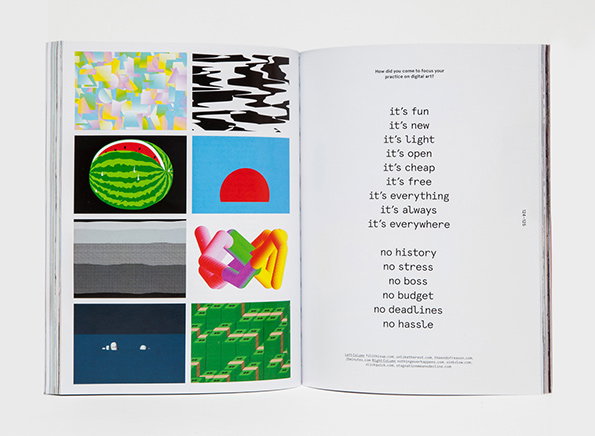
An open book shows a grid of eight abstract digital artworks on the left page. The right page features a poem with short phrases including “it’s fun”, “it’s new” and “no stress”.
Above

Tag Christof/Gabriel Ricioppo: The Human Being Journal Issue 5
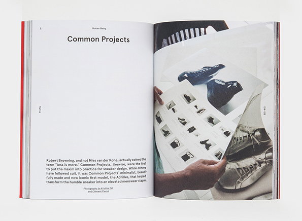
An open book features a profile on the brand Common Projects. The left page contains a short text about the brand's minimalist approach, while the right page shows a person holding a series of photographs of sneakers.
Above

Tag Christof/Gabriel Ricioppo: The Human Being Journal Issue 5
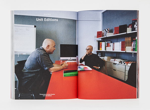
An open book shows a photograph of two people sitting at a bright red table in a studio. One person leans forward while the other sits back, surrounded by shelves of books and design objects. The page is titled “Unit Editions”.
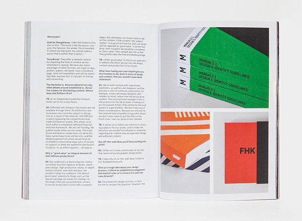
An open book showing a two-page spread. The left page contains a text-heavy interview, while the right page displays a collection of green and red brand guidelines manuals.

Share Article

Further Info

About the Author

Rob Alderson

—

Rob Alderson is a freelance writer, editor and strategist. He was previously editor-in-chief of It’s Nice That and WePresent, and editor of Design Week. He publishes the newsletter Undo, which tries to make sense of how AI is changing design work, the design process and the design industry.
It's Nice That Newsletters

Fancy a bit of It's Nice That in your inbox? Sign up to our newsletters and we'll keep you in the loop with everything good going on in the creative world.