




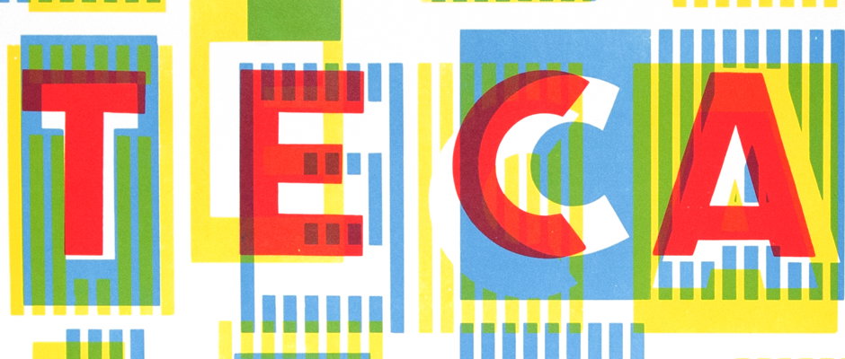
We speak to RCA letterpress technician Ian Gabb about his work, his new website and his nickname...
Much to my immense frustration I’ve never had a cool nickname. My colleagues seem immune to my attempts to instigate The Big Dog around the studio and my friends don’t understand who I’m talking about when I casually drop The Robmeister Gerneral into conversation. It’s not a problem Ian Gabb, letter press technicnian at the Royal College of Art has,having been dubbed The Letterpress Monster by his students, a monocle that has endured for 12 years.
Not only that but the man is a magician at his craft, producing beautifully designed and exquisitely executed work for a whole range of interesting briefs. And not only that but he also can now boast a brand spanking new website created by tremendous studio Julia (some fo his former students).
The new site doesn’t just act as an excellent showcase of his sheer skill, it’s also fantastically designed and is a happy place to wile away some time. We spoke to Ian, aka Mr Monster, to find out more…
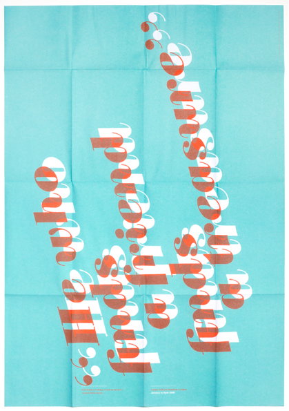
Ian Gabb: Italian Cultural institute with Brighten the Corners (2008)
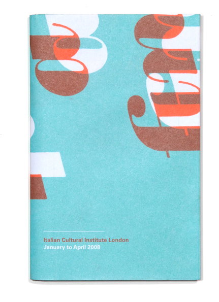
Ian Gabb: Italian Cultural institute with Brighten the Corners (2008)
Hi Ian. First things first – where did the name Letterpress Monster come from?
The name Letterpress Monster was coined back in 2000 by a student. For the record the student’s name was Lisa Hansen. So thank you Lisa, I owe you my entire existence.
How did you come to be in your current position at the RCA?
I’d love to say that I found the job advertised in the South London Trader, but that would be outrageous fantasy. The real reason is that back in the mid nineties I was doing some work for Alan Kitching, who was then a visiting lecturer at the college. Anyway, it was through Alan that I learnt that the then letterpress technician was due to retire. When he retired I applied for the vacant position, and eventually I got the job.
"It can be time-consuming but that is part of the reason it is so good, because it forces people to slow down – it forces them to think about the words in their hands and the rhythm that they have. "
Ian Gabb
How has the job changed over the years?
Clearly the everyday housekeeping tasks haven’t changed. When I first started I was riding shotgun for Alan, helping him with the programme of letterpress workshops that he ran. When Alan retired, I began running the courses on my own. My role is more of a didactic one now.
Why do you think people are still so drawn to letterpress?
From an educational point of view, I think it is a reaction to the anonymity of working with a computer. With letterpress you can see what’s going on. It can be time-consuming, certainly when you are new to it, but that is part of the reason it is so good, because it forces people to slow down – it forces them to think about the words in their hands and the rhythm that they have.
From an aesthetic point of view, there is a warmth in the way that the letters sit on the page – ink on paper. It is different from a planographic process like lithography, it is different from a digital print – these are flat in comparison.
I should add that I am not a big fan of heavily impressed letterpress printing – to me this is an affectation. The craft of letterpress printing is about getting the optimum amount of ink and balancing it with the right amount of pressure. This is good practice.
From a personal point of view, I love the whole process of making things – from concept right through to execution.
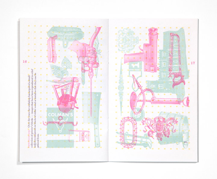
Ian Gabb: RCA Workshop Prospectus (2001)
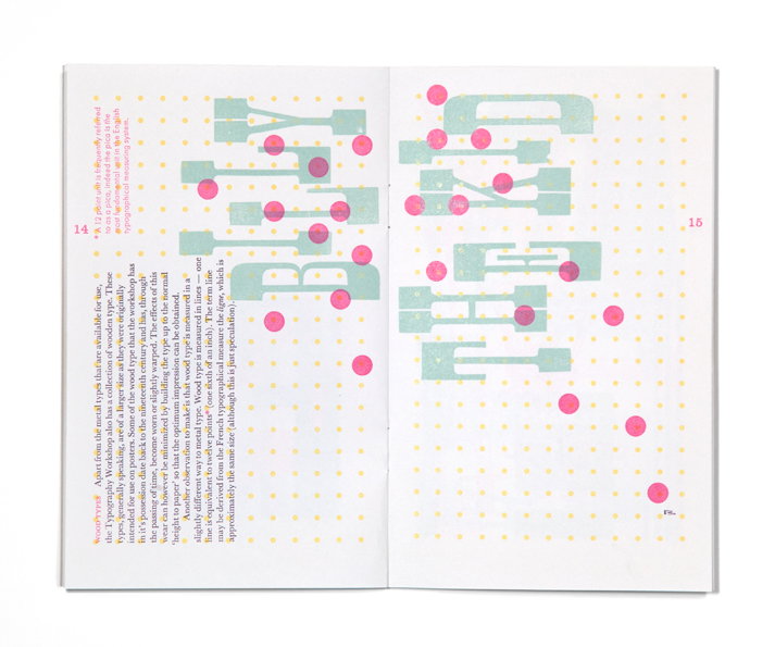
Ian Gabb: RCA Workshop Prospectus (2001)
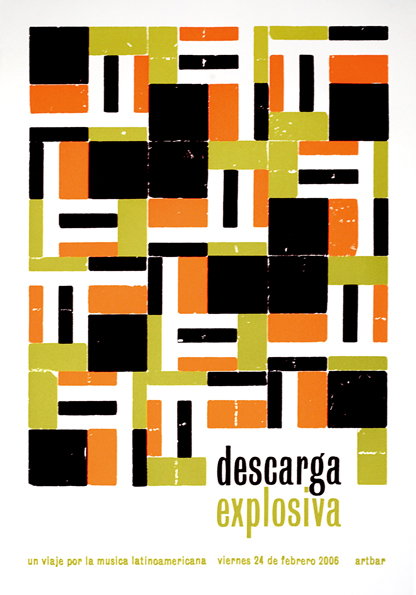
Ian Gabb: Descarga Explosiva Flyer (2006)
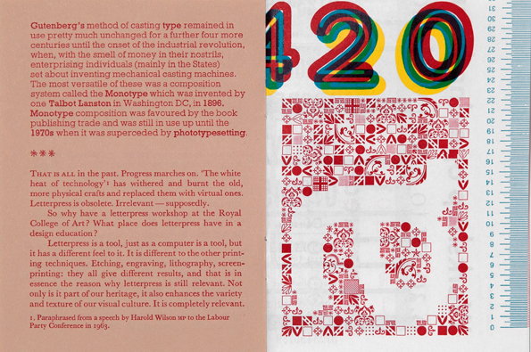
Ian Gabb: RCA Workshop Prospectus Booklet (2009)
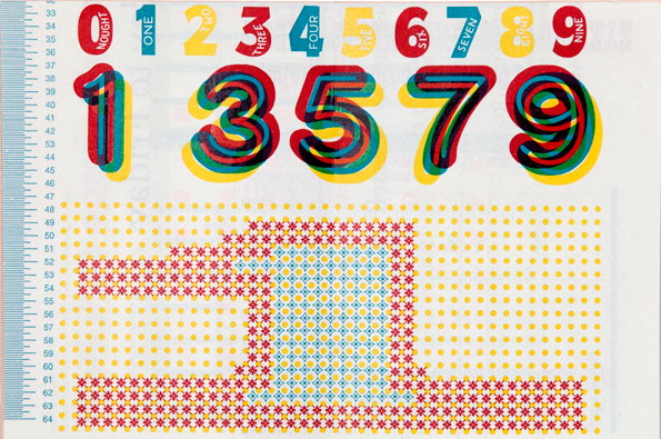
Ian Gabb: RCA Workshop Prospectus Booklet (2009)
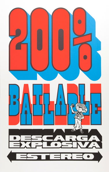
Ian Gabb: Descarga Explosiva (2011)
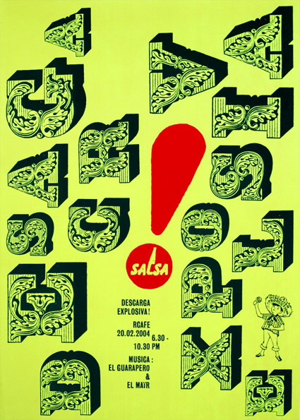
Ian Gabb: Descarga Explosiva Poster (2004)
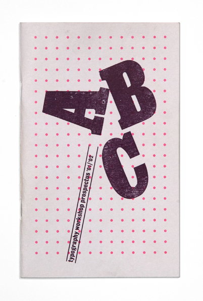
Ian Gabb: RCA Workshop Prospectus (2001)
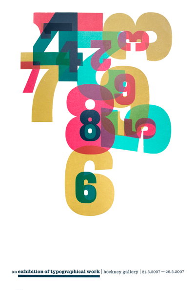
Ian Gabb: RCA exhibition poster (2009)
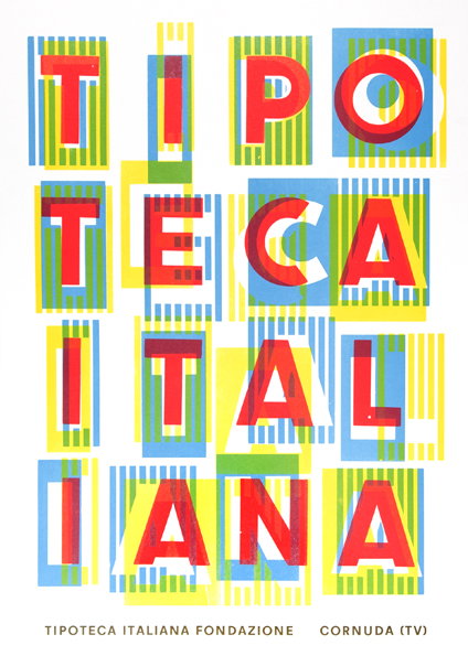
Ian Gabb: Tipoteca Poster (2011)
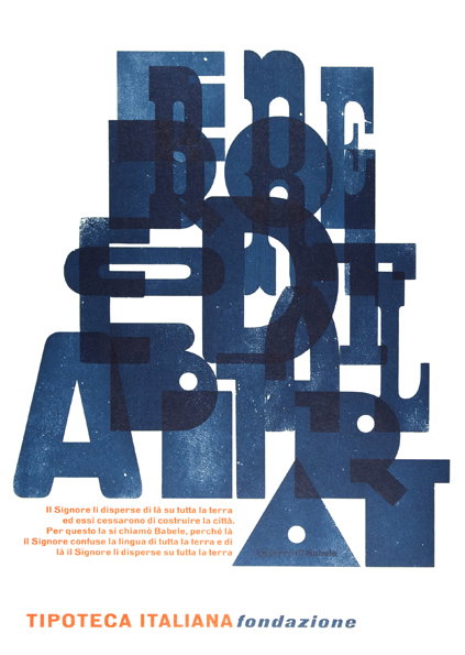
Ian Gabb: Tipoteca Poster (2010)
Share Article
Further Info
About the Author
—
Rob Alderson is a freelance writer, editor and strategist. He was previously editor-in-chief of It’s Nice That and WePresent, and editor of Design Week. He publishes the newsletter Undo, which tries to make sense of how AI is changing design work, the design process and the design industry.
