Decoding 22, A Million: Eric Timothy Carlson on carving Bon Iver’s iconic visual universe ten years later
Bon Iver’s esoteric and mysterious music spills out into it’s album cover in clusters of meaningful symbols, all thanks to this designer.
In 2016, Bon Iver released 22, A Million. You may remember it well – the fabulous foreign production of his new-spangled sample sound: digi-instrument textures, warbled saxophones, pitched-up vox, off-kilter percussion. Bon Iver had never been better. Everything about his woodsy, whiskey-soaked and emo-tinged acoustic guitars had been translated through synthesisers, unstable autotunes, broken up and bit-cruched through Bon Iver’s embrace with an emerging technological landscape. This is all communicated through Minnesotan designer Eric Timothy Carlson’s fascinating, beguiling album cover design and music videos which looked like karaoke slideshows from alternate reality. Perhaps, one where 22, A Million is the type of karaoke its inhabitants sing in dusty bars every night.
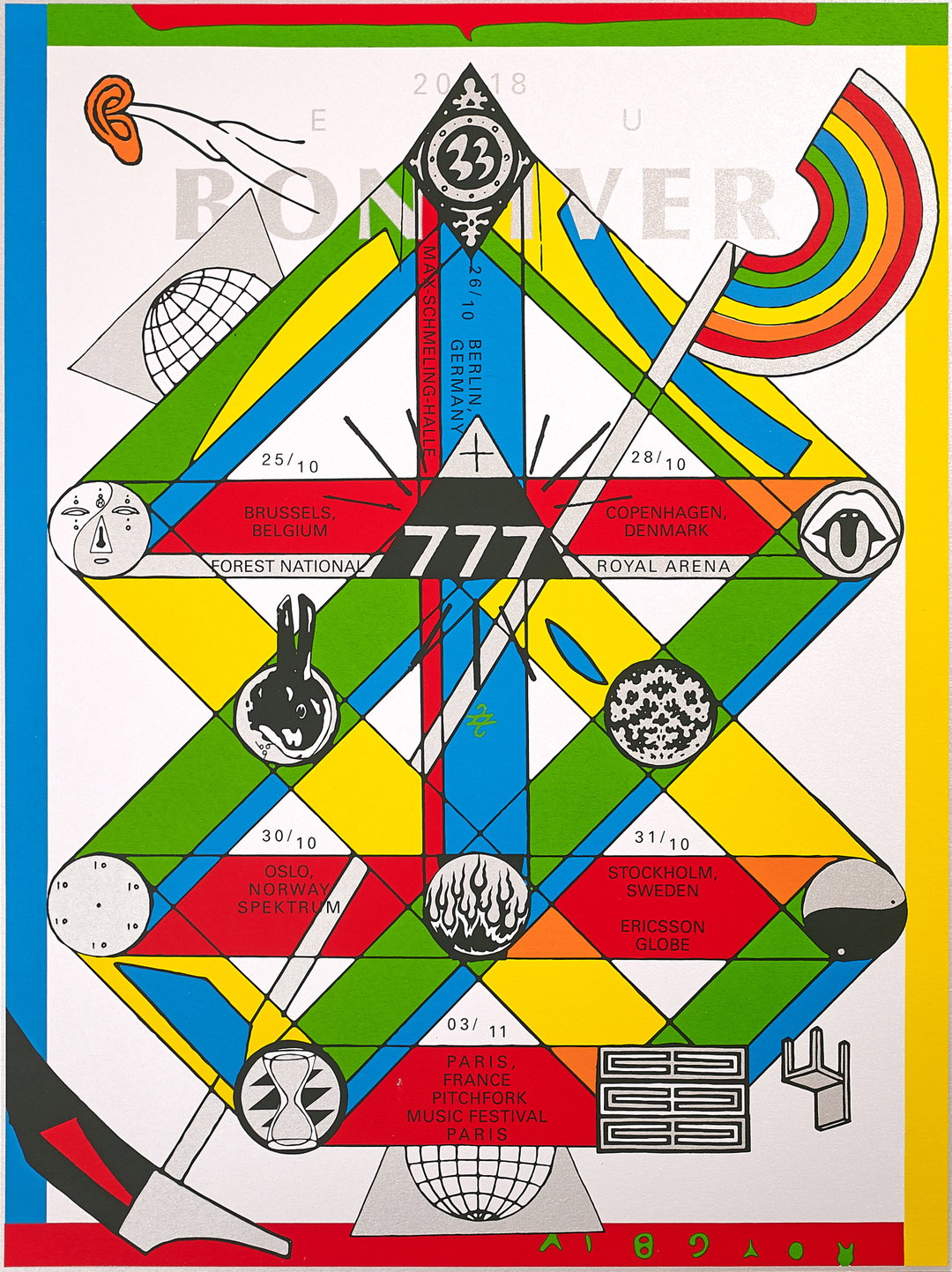
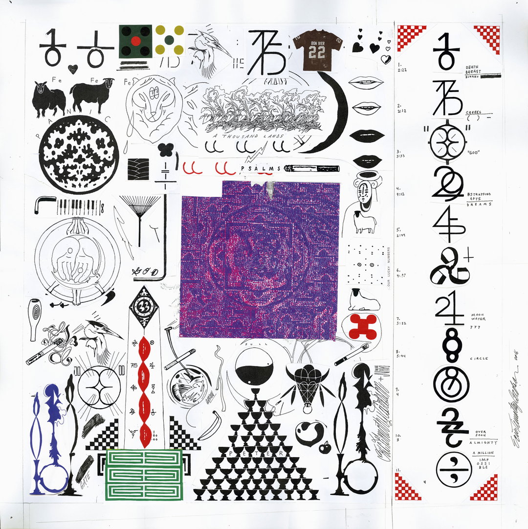
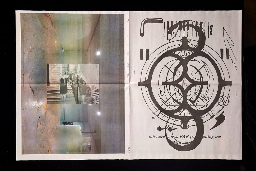
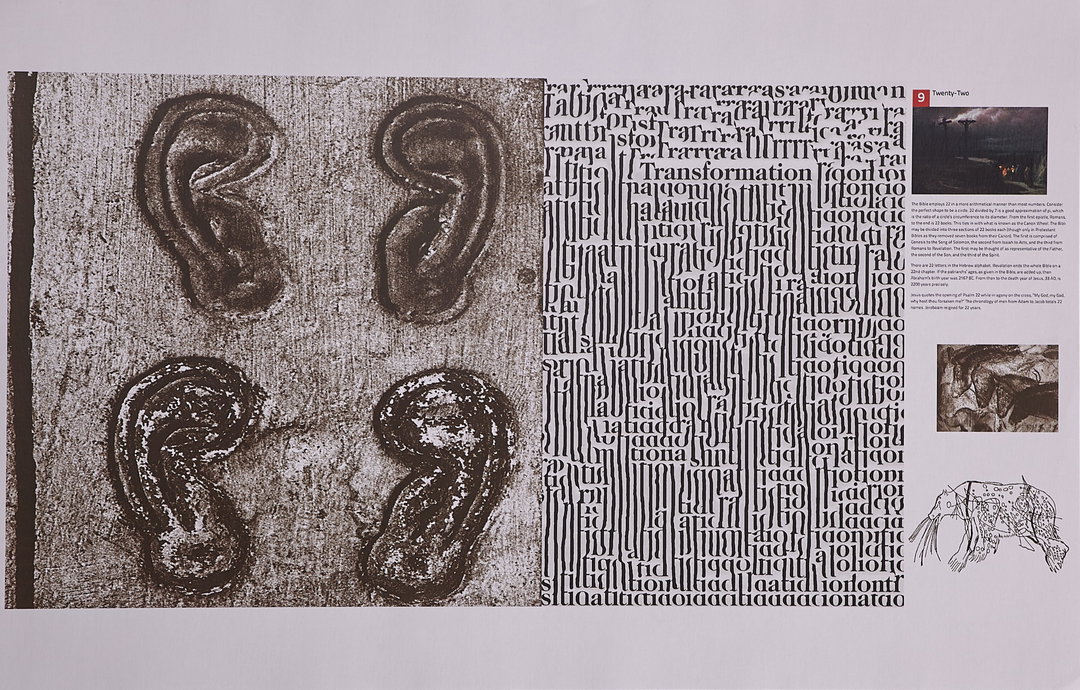
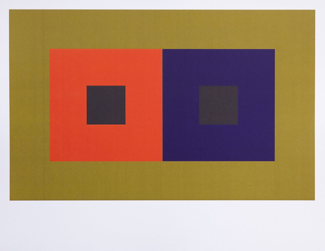
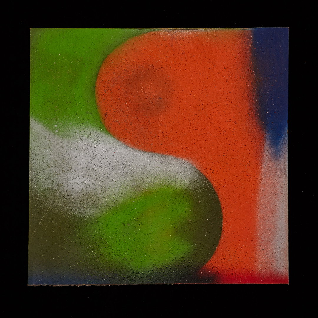
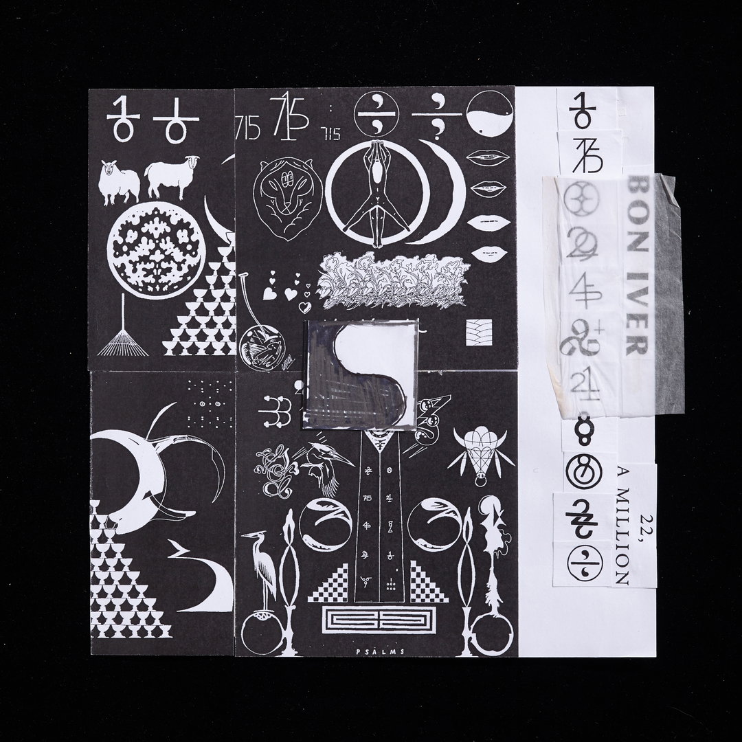
“The first time I met Justin Vernon he showed me a tattoo he had of one of my designs. We spoke on working together – someday – and two or three years later, I was invited to visit the studio while they were working through early drafts of the not-quite-yet named album 22, A Million,” says Eric. The designer was approached with the fascinating prompt of the titular 22, a visual way of expressing duality, a mirror, a yin-yang – and the ‘million’ was meant to represent everyone. In essence, everyone is one in the same, together. The album cover features a truckload of symbols, some of which represent exactly that zen-like synchronicity, but also you can get a good impression of Eric’s knack for pretty neat tattoo flashes. For the tenth anniversary of 22, A Million, Eric returned to work on an inverted version of the now-classic album cover.

Eric Timothy Carlson: 22, A Million 10th Anniversary (Copyright © Eric Timothy Carlson, 2026)
“Initially, the research was the music and the process of its creation. We spoke on films and photography. We made art at the studio with no intent of it being for the album, it was more about connecting,” says Eric. “While we arrived at a tone of things aesthetically – ancient, esoteric, spiritual and alchemical, the references were largely internal.” Eric doesn’t give away too much about his personal relationship to the symbols, nor how he came across them – that’s for us to decode. However, Eric sheds light on how the ‘10’ is an inverted Ankh, or how the ‘21’ is similar to an astrological sign for a moon of Jupiter. Eric sketched 100 drawings, they needed to read like real symbols in order to hold significance. Once sketched, they were printed out and created on three 33 inch by 33 inch collages, the dimensions themselves representing symmetrically. The inversion, from black to white? It represents that aforementioned ying-yang. It’s all so well thought out and coherent, it ought to make you jealous how bulletproof the concept is.
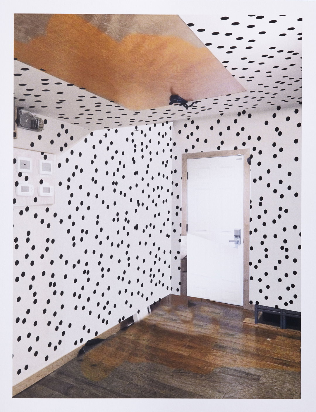
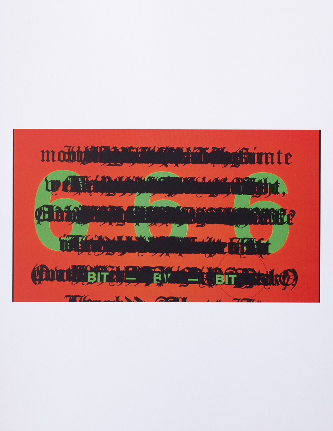
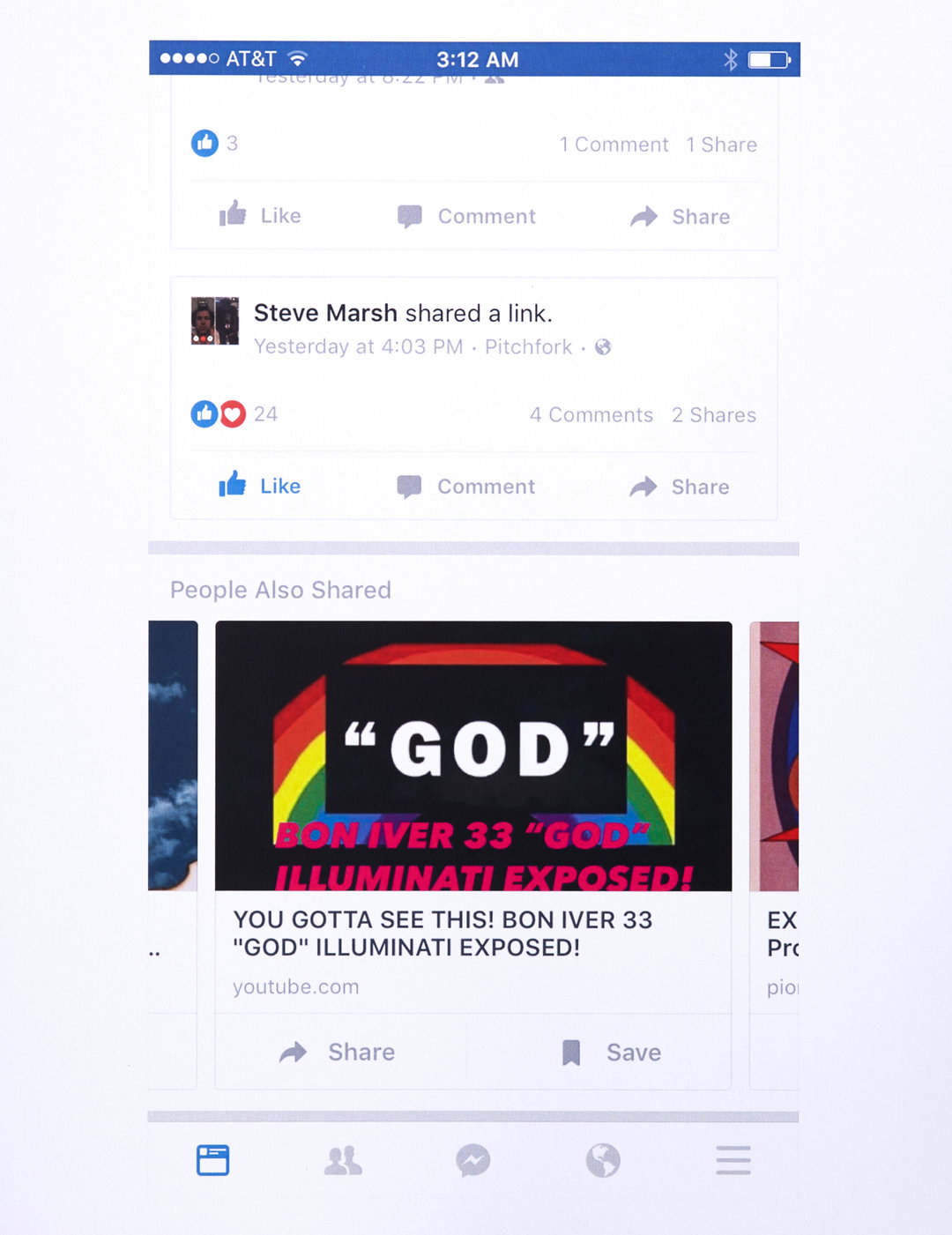
A supercut of the alien-like visualisers was created for the tenth anniversary – and it made sense to Eric to create a seamless listening experience because once you begin the album, you can’t really stop. “There was this other very digital vocabulary that developed [in parallel to the physical art]; text edit files of elaborate system font layouts, waterlogged iPhone 4 videos and noiseless RGB vector fills. This duality of aesthetic tones exists within the music; an earthy physical analog (the voice, strings and saxophones) alongside the thick and expertly produced digital atmospheres,” shares Eric. “The lyric video is easily a ‘less-than’ format. It’s not a music video, and absolutely does not need to be experienced as art. On the other hand, the words of a Bon Iver song are important, beautiful, strange and complicated. It made sense to address and consider the lyrics.”
Catering to a global audience that they could address with music for free online, Eric and collaborator Aaron Anderson carved out alternate versions of the visualisers in Spanish, French and Japanese. The videos are economically produced, made almost exclusively of “cell phone videos, desktop screen captures and After Effects”. Aaron and Eric have been working together since 2006, drawing together and establishing a workflow online, breaking ‘wysiwyg’ tools to aesthetic effect, moulding a DIY-zine meets desktop publishing ‘thing’ that developed later into the 22, A Million videos. “In whole, the mix of a hand craft and a kind of LCD formalism was naturally extracted from the ethos of the album. It asked for both worlds. Alongside the physical artwork, the videos offered the natural platform to express the digitally native aspect of the 22 visual world,” says Eric.
GalleryEric Timothy Carlson: 22, A Million 10th Anniversary (Copyright © Eric Timothy Carlson, 2026)
Hero Header
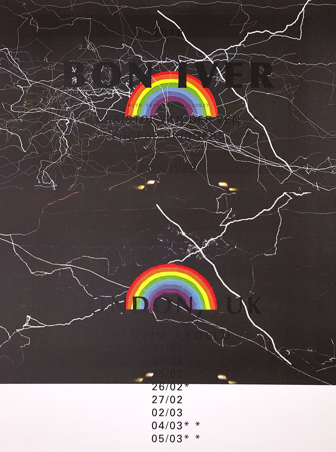
Eric Timothy Carlson: 22, A Million 10th Anniversary (Copyright © Eric Timothy Carlson, 2026)
Share Article
About the Author
—
Paul M (He/Him) is a Junior Writer at It’s Nice That since May 2025. He has a strong interest in graphic design, digital kitsch, multimedia painting, collage, nostalgia, analogue technology and all matters of strange stuff. [email protected]
To submit your work to be featured on the site, see our Submissions Guide.