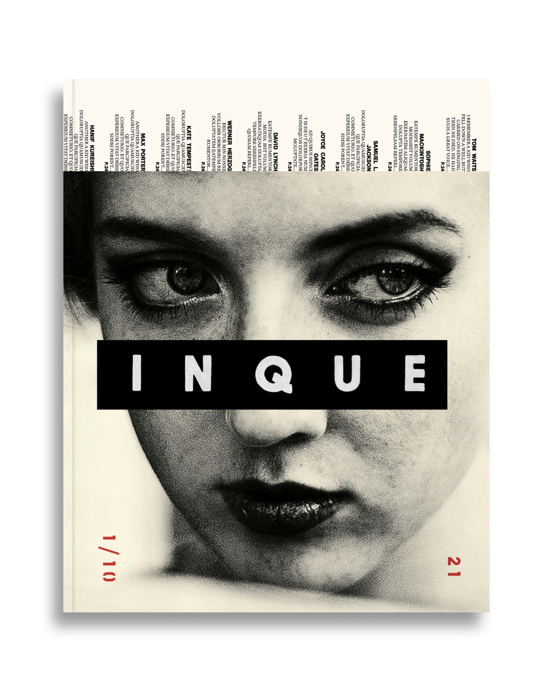
Inque is an ad-free annual publication with a fixed ten-year shelf life
Founded by Dan Crowe and Matt Willey, the magazine has already lined up an exceptional group of contributors, including Chimamanda Ngozi Adichie, David Lynch, Kate Tempest, Samuel L. Jackson, Tom Waits, Tilda Swindon and Werner Herzog.
A printed magazine without any adverts seems like a far-reaching dream, doesn’t it? Well this dream has become a reality for new publication Inque, launched in collaboration by magazine connoisseurs Dan Crowe and Matt Willey. Set for a ten-year life span and, making its debut with absolutely no ads in 2021, issue one of this annual magazine features an incredible roster of writers and artists, including contributions from the likes of Chimamanda Ngozi Adichie, David Lynch, Kate Tempest, Samuel L. Jackson, Tom Waits, David Lammy, Tilda Swindon, Werner Herzog to name a few.
“It seemed natural,” says Dan, Port magazine editor and publisher, of the moment the two decided to go about this venture. “I think we share a similar taste when it comes to literature and art, and we’ve found that the things we really love when working (collaborating, commissioning, perhaps doing something not immediately obvious, but always in some way framed by great writing) were becoming more and more difficult. Everything feels branded now.” Posing the question of what makes an “ideal” magazine, it turns out that the answer is very much rooted in advertising and the fact that it has much control over the freedom of editorial and printed matter. So, a mag without any of this seemed like a “natural, exciting and fun” next step.
A hybrid of sorts, Inque is part book, part literary magazine and “part something else,” Dan continues to tell It’s Nice That. Published only in print and without any digital edition, the pages are there for the writers and artists to freely create and “let loose”. Dan adds on the matter: “This doesn’t always work, but when it does, it’s a magical thing and makes us understand what magazines are for.” Working alongside Matt on the art direction, the pages are decorated with long-form features, photo stories, essays and collaborations. “It’s a ten-year art document, basically – in some way tracking culture and creative development from all over the world.”
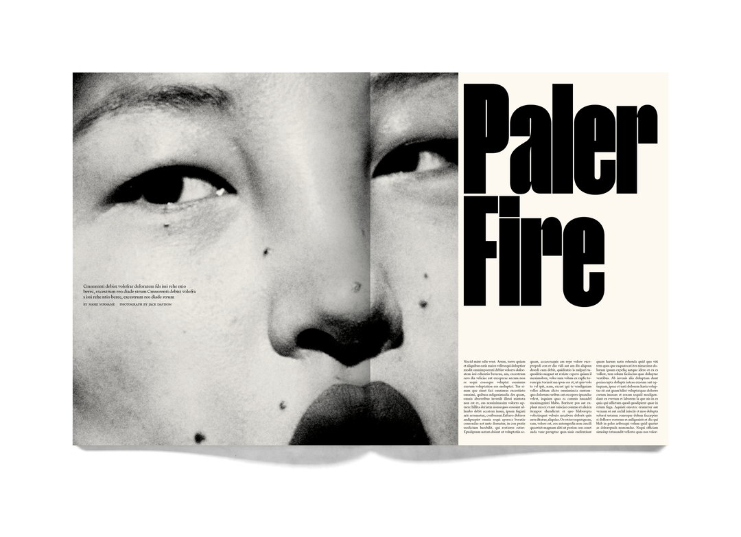
Inque: Photograph by Jack Davison
Inque is undeniably one of those coffee table publications that are there to be savoured and enjoyed over a long period of time, with its contents signifying a moment, or even a part of history. It takes us back to the crux of what printed publishing is about; so often do we flip through magazines for it to be majority filled with empty ads or articles there to sell you a false dream. “We wanted it to be something worth buying, something unique, and one way of doing that is to reduce the frequency and availability,” says Dan of the decision for committing to the ten years of publishing. “Also, we’re not interested in launching another magazine brand. Admittedly, it does seem like we are launching another magazine brand… but the fact that we will shut it down after ten issues, regardless of how it’s going, gives more focus to the shape of each issue and, in a way, more creative weight to the project as a whole.”
Engaging in the issue as a one-off project, or “pop up”, the Inque’s founders were particularly drawn to the idea of having something physical to reflect this decade – one that’s already brimming with tremulous occurrences and will, presumably, continue to with even more. Lensed through impeccable writing, art and photography, there will also be an option for exclusive art prints available with each issue. The launch sees prints by photographer Jack Davison and Magnum photographer Christopher Anderson kick things off, which Dan refers to as “incredibly exciting” and the pinnacle of why they’re doing this.
There’s no doubt that seeing a magazine successfully catapult its way through the industry without any advertising is going to be an incredible thing to watch. Seeing it grow with pure focus and intention on its contributors and, indeed, thriving without the ads, is unequivocally going to change the landscape for us all. “We are focusing on the things we want to do and leaving everything else out,” says Dan, pointing out how it will only work if the Kickstarter campaign reaches its target for the debut issue. What’s more is that a novel will be written across the ten issues by author Jonathan Lethem, “which will obviously be influenced by global events, and I think is going to be extraordinary; we’ll also publish a ten-issue-long photo essay, so we are excited to see the content develop and conclude with the final edition.”
Of course, the knowledge that after the ten issues this magazine is going to end may cause a little heartbreak for some, but it’s an appealing endeavour no less. “Also, to be honest,” Dan says, “after ten issues of this, Matt and I will probably want a break from each other.”
GalleryInque
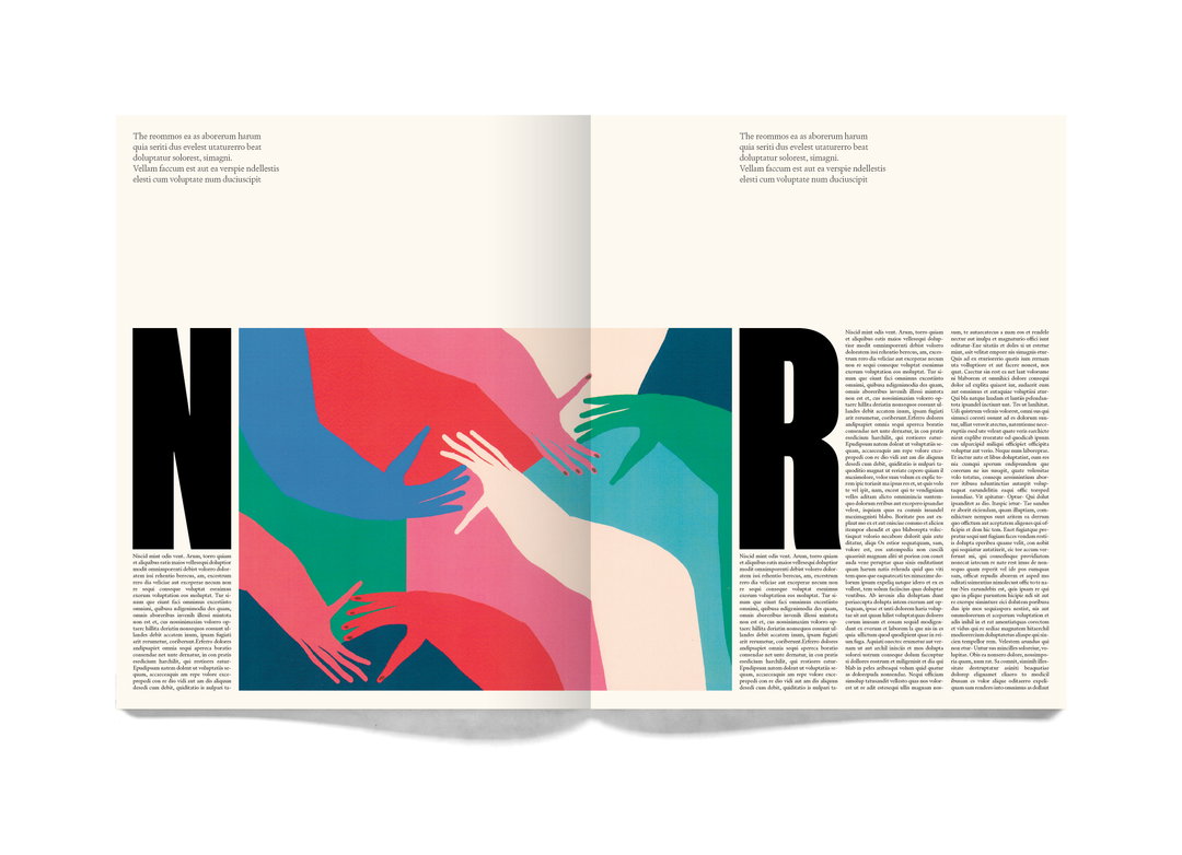
Illustration by Amber Vittoria
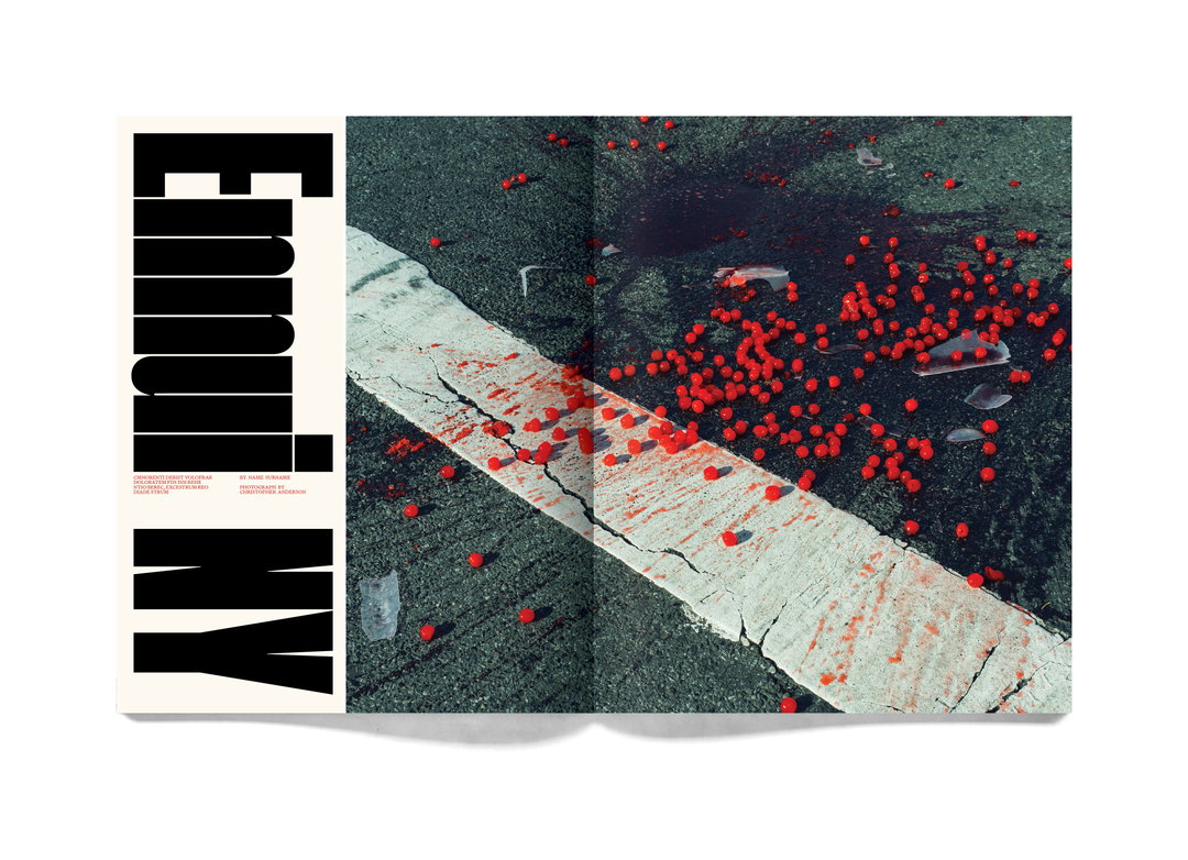
Photograph by Christopher Anderson
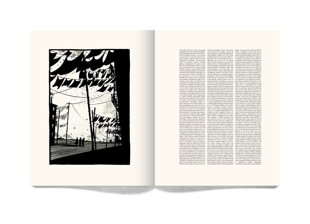
Illustration by Bill Bragg
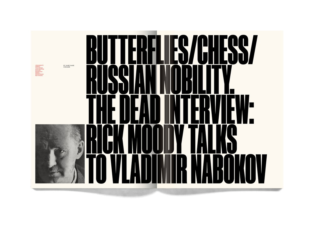
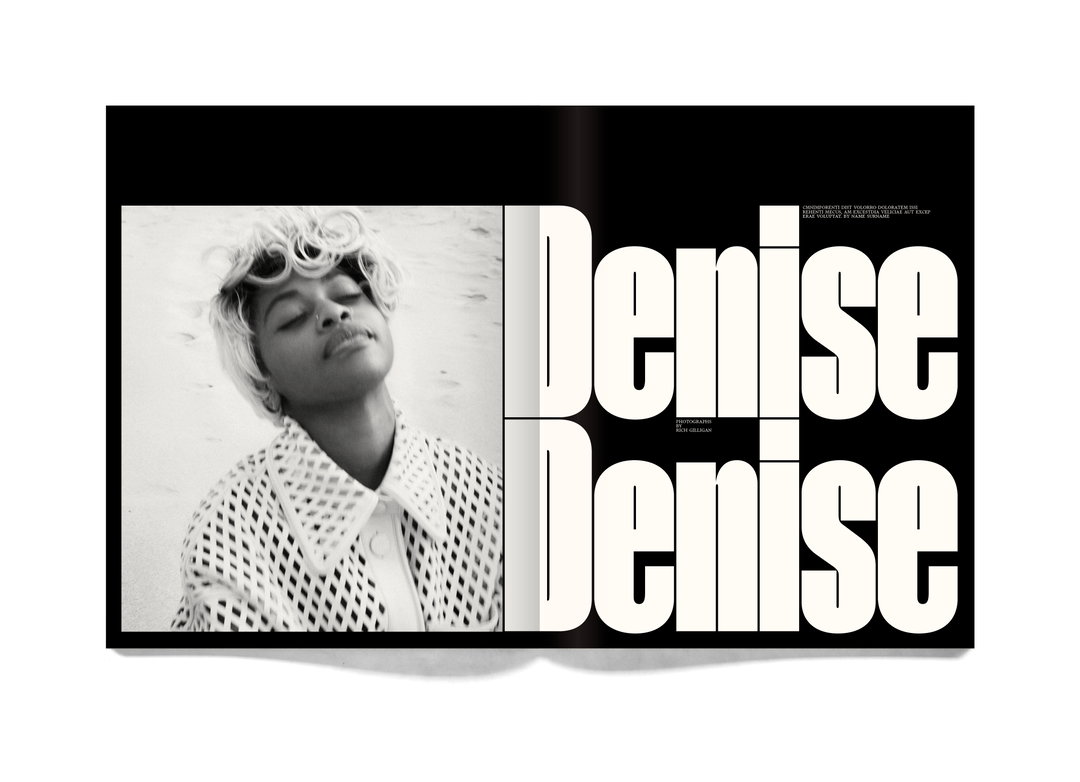
Photograph by Rich Gilligan
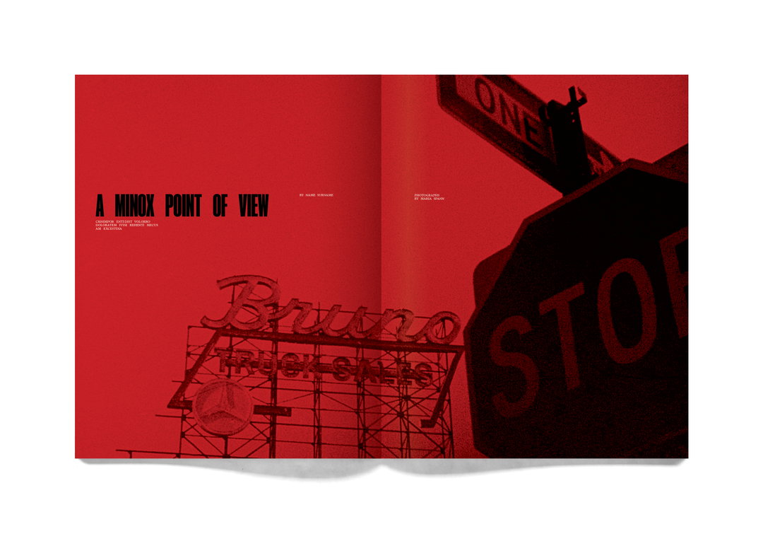
Photograph by Maria Spann
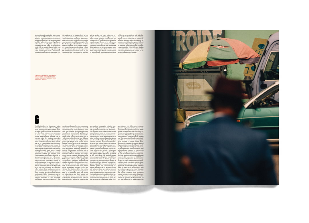
Photograph by Robbie Lawrence
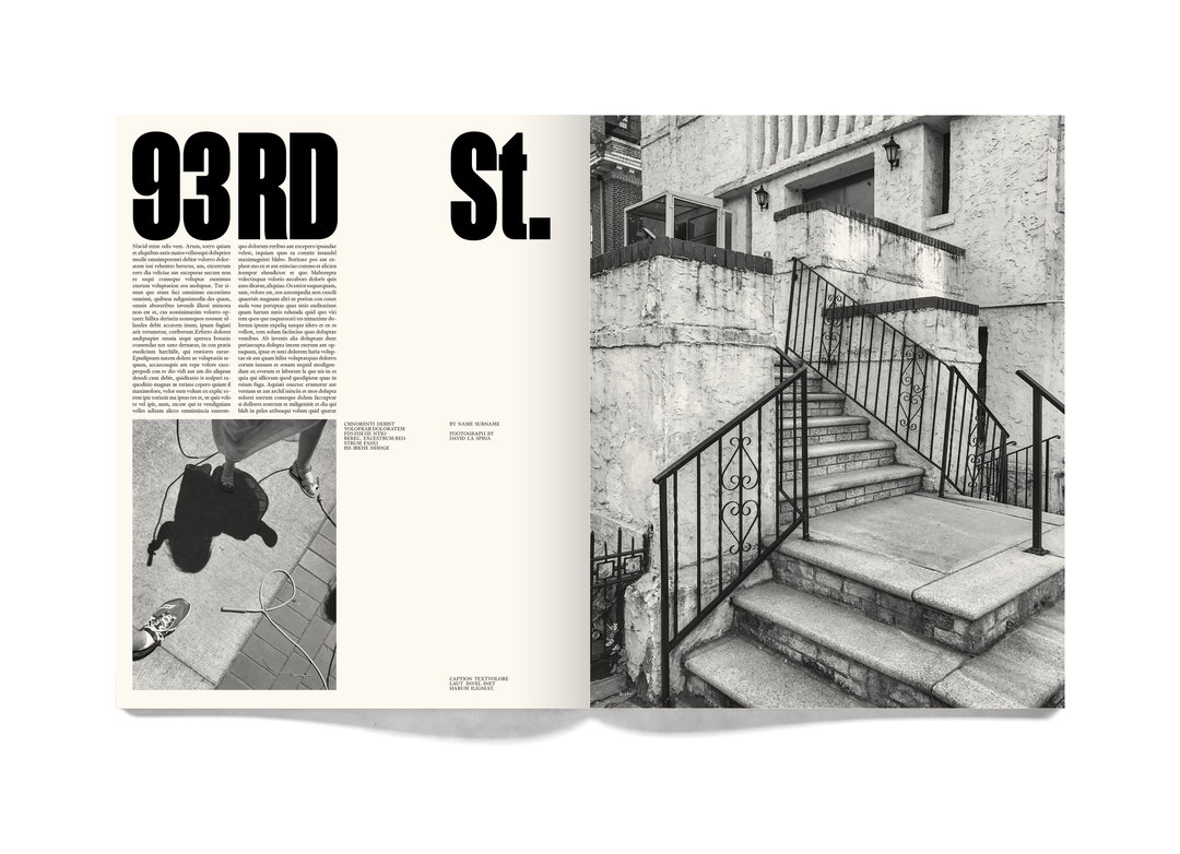
Photographs by David La Spina
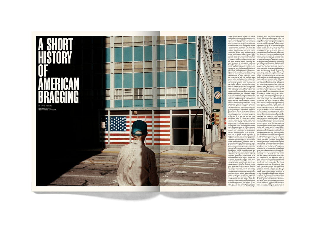
Photograph by Christopher Anderson
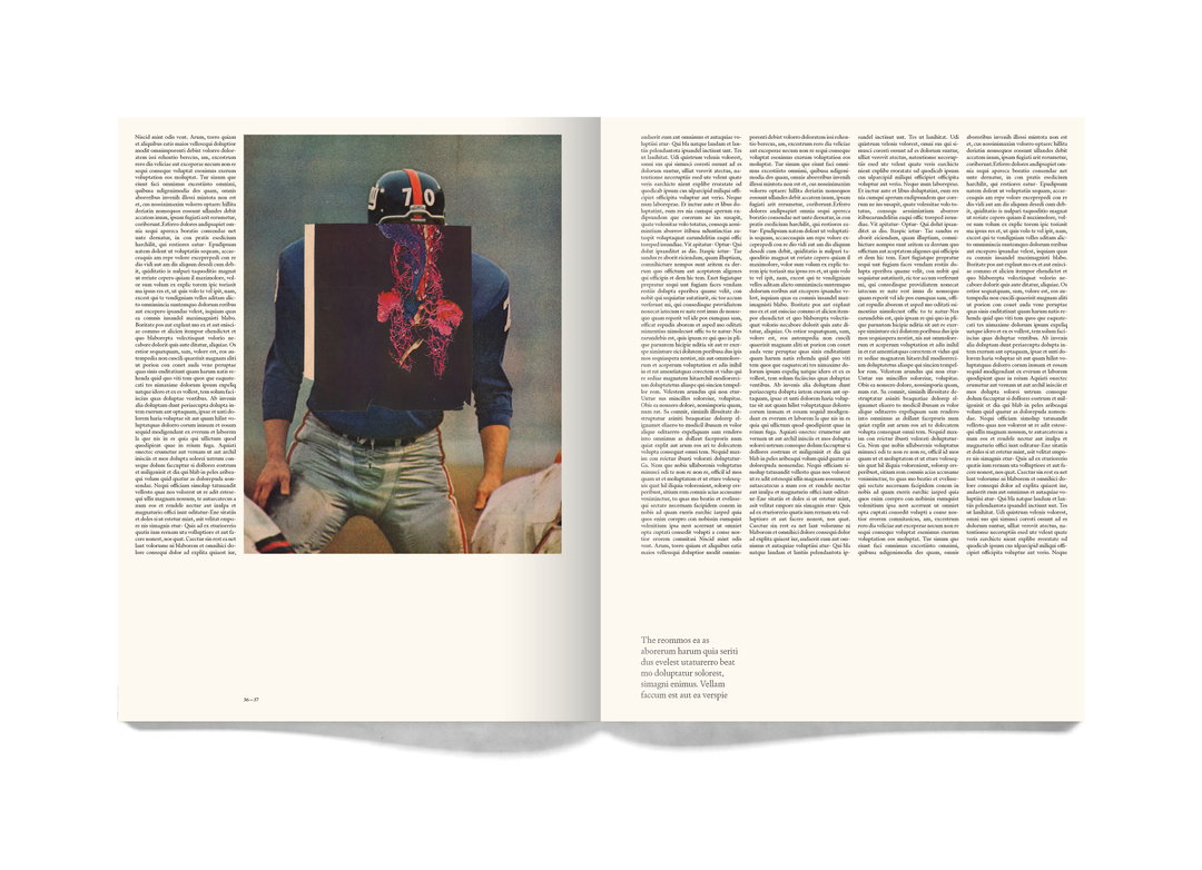
Illustration by Mike McQuade
Share Article
About the Author
—
Ayla is a London-based freelance writer, editor and consultant specialising in art, photography, design and culture. After joining It’s Nice That in 2017 as editorial assistant, she was interim online editor in 2022/2023 and continues to work with us on a freelance basis. She has written for i-D, Dazed, AnOther, WePresent, Port, Elephant and more, and she is also the managing editor of design magazine Anima.