Illustrator Jack Hudson tells us the story behind the new Computer Arts cover
We love Jack Hudson. Sometimes I find myself staring at his drawings open-mouthed like a magic eye image – the level of minuscule is like in a Wes Anderson film, every time you go back to an image you’ll find something you didn’t notice before. The clever bunch over at Computer Arts decided to commission London-based Jack to make their magazine look sweet, and so he did. We caught up with him to find out how on earth you go about designing a magazine cover, and to find out the back-stories of the teeny characters featured within it. First one to spot Mr Bingo wins a Kit-Kat!
First up, are you a reader of Computer Arts?
I am actually, so it was particularly great receiving the commission from the CA team about doing the cover feature. I first started picking up Computer Arts issues whilst on my foundation course before uni, when I first began geeking up on how to be a “real” illustrator.
What was the brief for the Computer Arts cover?
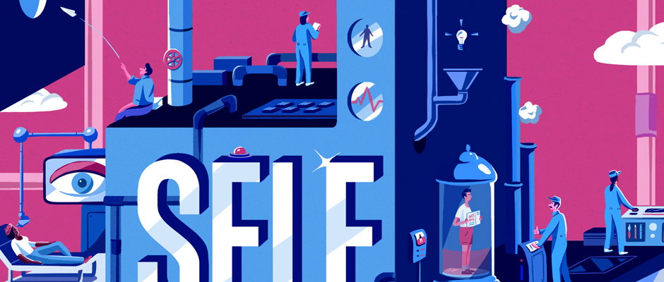
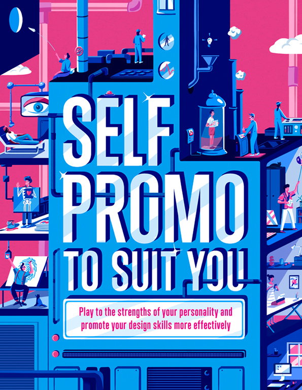
The brief was to create a huge self promo machine that featured different variations of identity recognition machinery, things like retina reading, thumbprint readers and X-ray machines. The guys at Computer Arts also asked me to include various extroverted or introverted personalities shown using the machine, I harked back to my university days for inspiration where you’d see all types of art school stereotypes thrown into one room.
Jack Hudson: Computer Arts
Tell us about the stages of putting it together.
When I’ve got a short timespan to work on something quite complex I usually start with a few small thumbnail compositional sketches and then jump straight onto the computer and begin drawing in the biggest elements. I’ll then spend a while sketching up a few different character types which I think to be quite fun and add them into the linear structure. Once I’m happy with how it’s all looking I’ll begin working this up with colour digitally and add a series of scanned in textures where appropriate.
We’ve heard there are some hidden characters including a certain Mr Bingo – can you help us spot more?
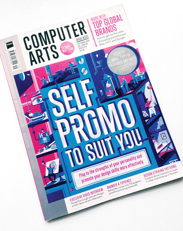
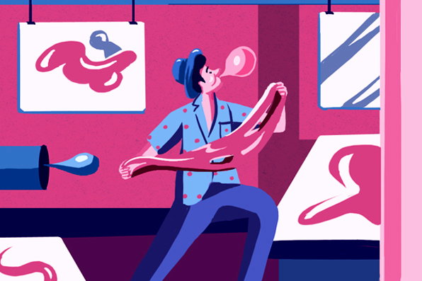
The majority are a bunch of fictional characters to be honest, but what with Mr Bingo being a fellow studio neighbour and his name also being mentioned in the article I couldn’t resist the chance to make the man proud. I also felt inspired by Aries Moross as a big personality character, so that’s where the wild shirt and the cheeky bowl cut came into play.
Jack Hudson: Computer Arts
Was there much back and forth with the client?
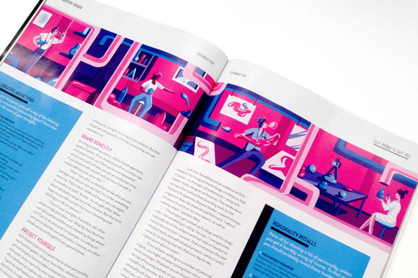
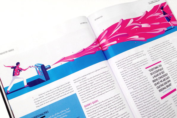
Not at all actually, It all felt very straightforward compared to what I’m used to, which was great, just a few minor tweaks here and there to the cover which made life easier. I pretty much had complete freedom with the inside feature illustrations, so I decided to illustrate an idea I had forming around this question: “What if four completely different personality types were given the exact same materials to create something original, how would their outcomes differ?” This is where you can see the characters creating shapes and paintings out of giant blobs according to their own personality types.
Do you enjoy designing magazine covers, and is there anything you’ve learnt from creating this one?
Yeah, I actually really enjoy it when a client gives me the exact layout with typography in place so that I can work my illustrations around it. It’s not as daunting as the empty white page. The type on this cover had to be quite large so it was interesting when I came to sketch around the piece, I didn’t think there would be enough room initially and it took me a while to work things out. Things I’ve learnt? To be a bit more experimental with my ideas and concepts, as I did for the inside feature illustrations.
Can you tell us a little about the GIFs?
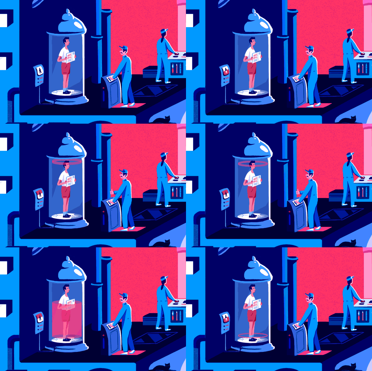
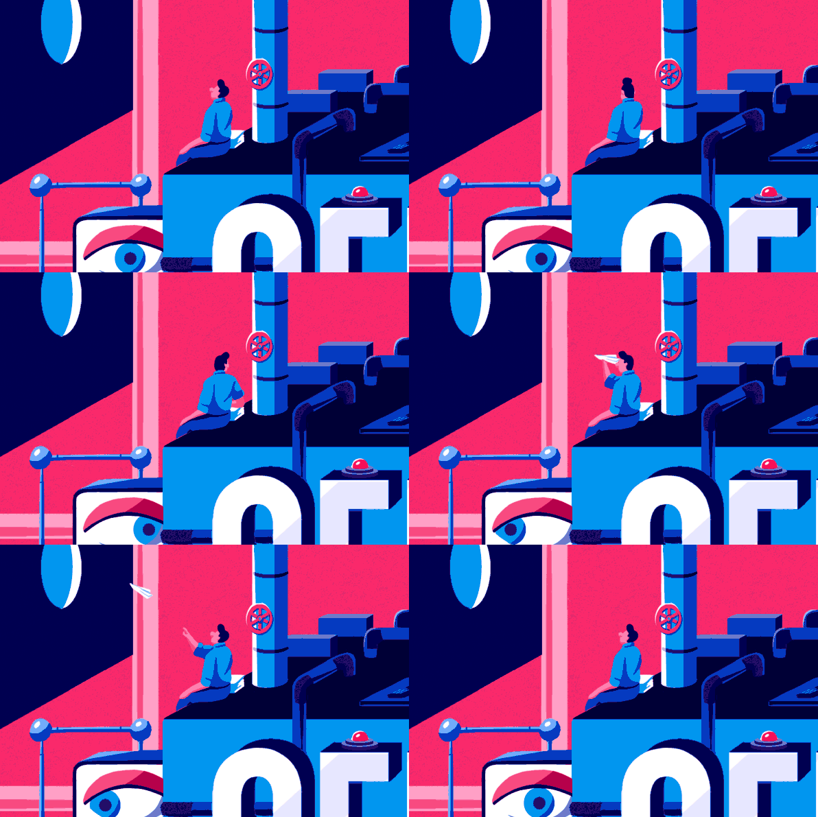
I was asked if I knew of anyone who could animate my cover for the iPad edition of the magazine and fittingly the talented Joe Sparkes sits directly next to me in our studio so it seemed like a perfect excuse to collaborate. I must admit it’s a beautiful thing seeing your flat 2D characters start moving around the page and even the tiniest of things can become special such as the powerful quiff wobble and the steady thumbs up!
Jack Hudson: Computer Arts
Jack Hudson: Computer Arts
Jack Hudson: Computer Arts
Jack Hudson: Computer Arts

Jack Hudson: Computer Arts

Jack Hudson: Computer Arts
Jack Hudson: Computer Arts
Share Article
Further Info
About the Author
—
Liv joined It’s Nice That as an intern in 2011 and worked across online, print and events, and was latterly Features Editor before leaving in May 2015.